This is an Eval Central archive copy, find the original at depictdatastudio.com.
Last year, I finally enrolled in the Great Graphs in Excel course. After 2 years of thinking about it. And thinking I’m retired and I don’t really make graphs anymore. But I knew I had 10 years of mentoring data I wanted to analyze by the end of 2021.
Beyond Graphs 1: I made a Great Graph after just a Few Course Modules
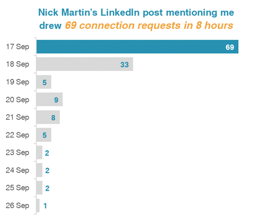
Soon after the course started, I brought Ann data about who connected with me on LinkedIn after I was listed as one of Nick Martin’s 9 Amazing Humans to Follow. Nick has a HUGE network and I got over 69 connection requests in the first day. And requests continued for more than a week!
So I made a graph to go with a post on LinkedIn, applying all the learnings from the first few course modules.
Beyond Graphs 2: 2 Things I Learned in 10 Minutes of Help in 1 Office Hour Session
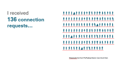
I examined the few data variables on the LinkedIn connection requests. My impression was validated. Only 2 of 136 requests had a personalized message (despite LinkedIn experts emphasizing the need to personalize connection messages).
I tried different ways to display this finding (waffle chart, pie chart, and this one). Luckily, Office Hours were the next day. (Office Hours are a CAN’T MISS opportunity for immediate feedback!)
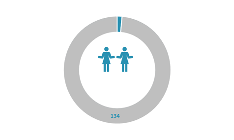
Ann took one look and exclaimed, “Ooh, let’s try the WeePeople font!” (Well, maybe not exactly like that!)
She then quickly used WeePeople to show the data.
Learning 1: More relevant and representative visuals with icons showing diverse silhouettes
(Hooray – No more using just the standard male icon.)
And then Ann taught us all how to make a gif which was even more effective at telling the “only 2 of 136 people” story.
Learning 2: Using a gif can give readers a quick result from your data
And, for those who follow LinkedIn stats to see how their posts engage, the post with the bar graph got 4,765 impressions and the 2nd post (the next day) with the gif got 8,778 impressions!
Beyond Graphs 3: Now I’m Applying a Mental Checklist to Graphs and Charts
No – not only to the few graphs I’m making.
The course taught me and heightened my awareness to look at all the visual elements in the many graphics we see each day. There was so much learning from the course modules. And then many great opportunities in Office Hours to learn from what others were working on.
Here are things I find I am automatically looking for in these graphics:
- Color choice(s)
- Is it a Traditional or Storytelling title?
- The clarity of the data message
- Is the graph or chart the best for that message and the data being used?
- What elements could be removed for better clarity?
And a Beyond Graphs Bonus: Consistency and Efficiency
I consider myself a digital pioneer. But I didn’t know what I didn’t know, even being a longtime Word, PowerPoint, and Excel user.
I jumped into the course, and my efficiency increased in the first week! The course started – not with graphs – with ensuring basics including branding by setting my color and font defaults.
And then, a couple weeks later, I set up branding for a 3-part seminar series I did for Waey, the Association for Community Health in Saudi Arabia.
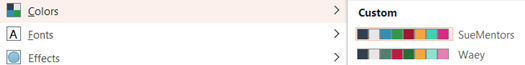
And I now have the consistency across Excel, Word, and PowerPoint and across my different PCs. What a difference!
This is just the tip of the iceberg of everything I am doing differently after Great Graphs – Excel!
| Ann’s wise counsel and breadth of experience shared unstintingly! |
Connect with Sue Griffey
LinkedIn: https://www.linkedin.com/in/suegriffey/
Twitter: @SueMentors
Youtube: https://www.youtube.com/channel/UC-rjWX4ZmTdo0S3ssKbut_A
SueMentors Resources: https://suegriffey.fyi.to/suementors-resources-for-your-professional-presence
A no-cost short course: Build and Update Your Professional Presence in 4 Steps at this page: https://www.linkedin.com/company/4-steps-to-build-update-your-professional-presence