This is an Eval Central archive copy, find the original at depictdatastudio.com.
What type of dashboard do we need for our project?
I want to talk about something that’s a little controversial in the dashboard space: There are 4 types of dashboards, all of which are correct.
You might need one type.
Or, you might need all four.
Every audience and every project is a little bit different.
Our goal is to deliver the right data, to the right audience, at the right time.
Watch the Video
Here’s a 12-minute video to help you narrow down which type(s) of dashboard you need for your next project.
First, you’ll think about your audience. Are they technical or non-technical? Leaders or doers?
Then, you’ll choose a software program. Sometimes you’ll need spreadsheets (like Excel), and other times you’ll need dashboard programs (like Tableau or PowerBI).
Here’s a summary of what’s inside the video.
Dashboard Mismatches to Avoid
What if the audience has one idea in their mind… and we design something completely different??
Sometimes we get lucky, and we make exactly what they want.
Other times, I see mismatches.
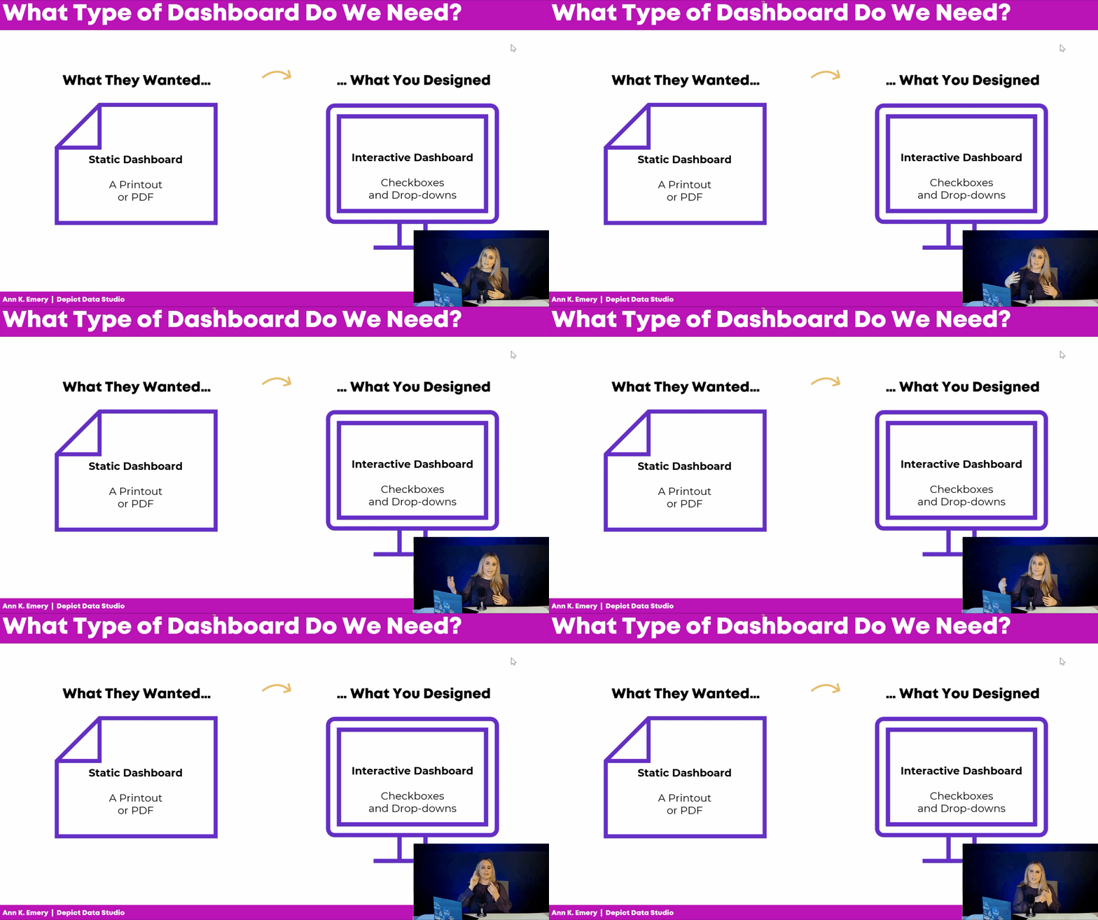
Common Dashboard Mismatch: Static vs. Interactive
Sometimes the audience really wants an interactive dashboard, but we make a static dashboard.
In real projects, that almost never happens. I typically see the opposite issue: We design an interactive dashboard, but they really needed a static dashboard.
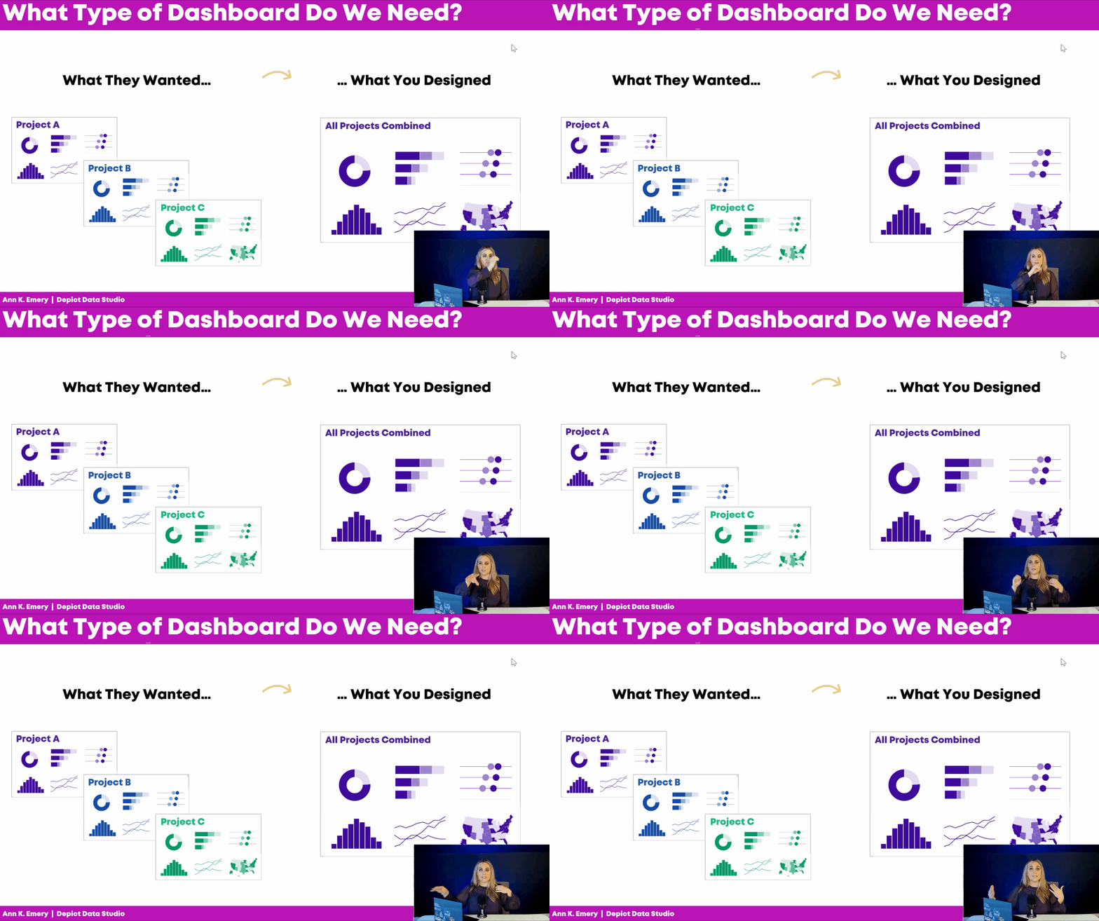
Common Dashboard Mismatch: Single or Series
Here’s another dashboard mismatch I see a lot:
Sometimes the audience really wants a single dashboard, but we design a series of matching dashboards.
Or, I see the opposite:
The audience really wants a series of matching dashboards (e.g., one for Project A, one for Project B, and one for Project C), but we give them a single overview showing all three projects combined.
The Four Types of Dashboards
Let’s be proactive and avoid these dashboard mismatches altogether.
Here are some factors to consider at the very beginning of your next dashboard project.
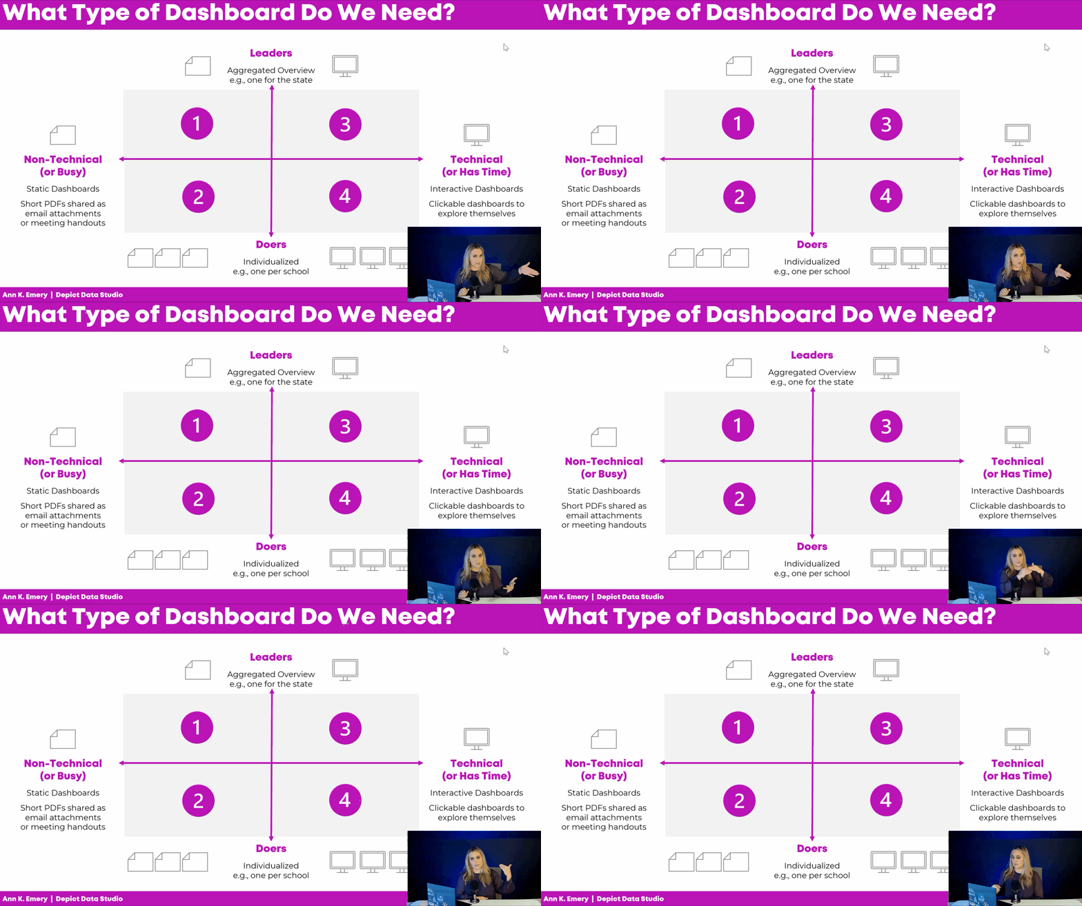
Technical or Non-Technical?
Is your audience technical or non-technical?
Technical audiences love data, details, and decimal places.
Non-technical audiences would rather be doing something else, like leading the project, developing new policies, or managing the team.
Time is another factor: Are they busy? Or, do they have time to explore a dashboard on their own?
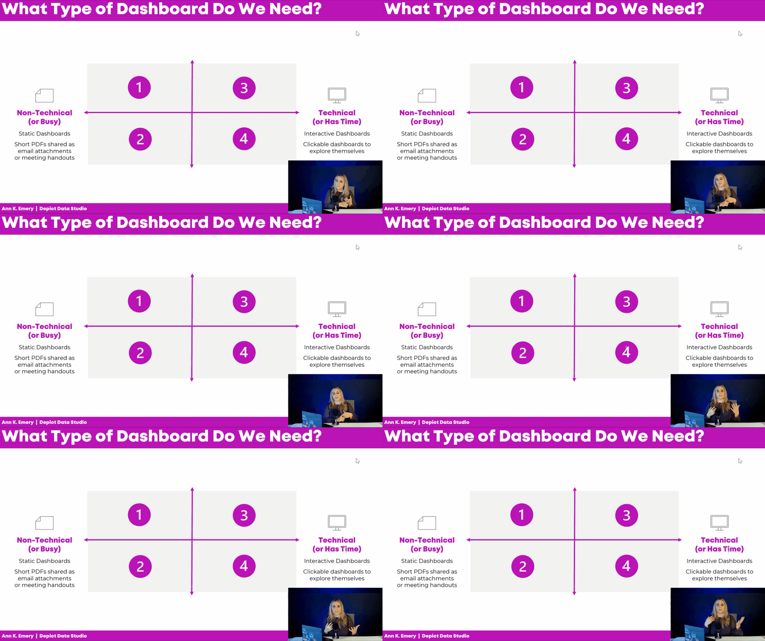
Non-technical or busy audiences tend to prefer static dashboards. These short PDFs can be shared as email attachments or as printed meeting handouts.
Technical audiences (or those with plenty of time available) tend to prefer interactive dashboards. They love exploring these clickable, dynamic dashboards and coming up with their own insights.
Leaders or Doers?
Next, figure out whether your audience is mostly leaders or doers.
The leaders need an aggregated overview of the work, e.g., one dashboard for the state as a whole.
The doers need individualized, disaggregated data, e.g., one dashboard for their charter school x dozens of charter schools in the project.
If we give the leaders the disaggregated dashboards, we risk that they’ll get lost in the weeds.
And if we give the doers the aggregated dashboards, we risk that it’s not actionable enough for them to do anything about the data.
Audience First, Software Second
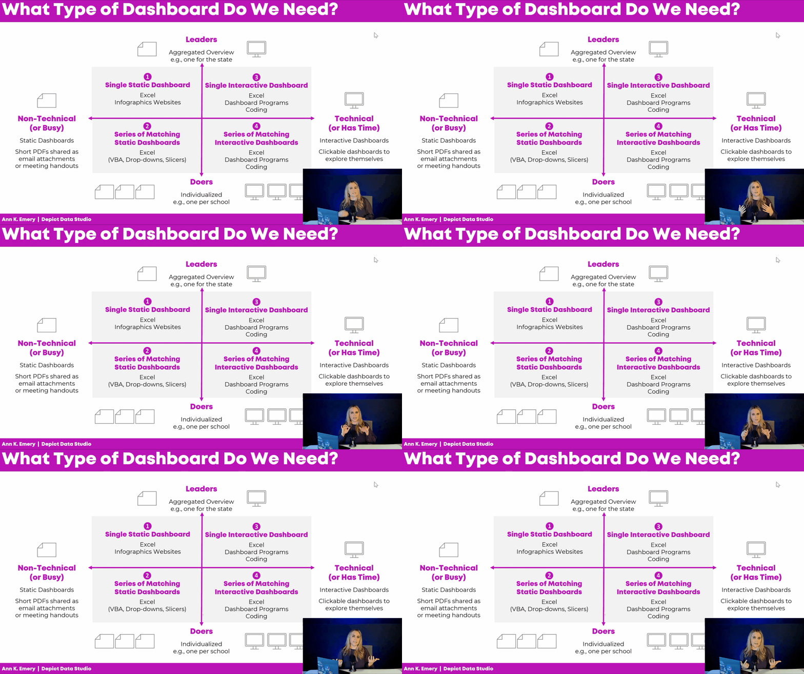
AFTER we narrow down our audience, then we can choose a software program.
Single static dashboards can be made in spreadsheet programs, like Excel, Sheets, or Numbers. We can sorta make them in infographics programs like Canva or Piktochart; those templates are meh but they’re getting better all the time.
Need a series of matching dashboards? Spreadsheet programs can handle those, too. I make one template in Excel and then automatically populate it with all the dozens of dashboards’ data. You can write VBA code, connect everything with drop-downs and lookup formulas, or use Slicers.
Have a technical audience? Interactive dashboards are possible in Excel (via Excel Tables, pivot tables, pivot charts, and slicers). Or, you can make them in dashboard programs like Tableau or PowerBI. Or, you can learn coding (e.g., R).
In the video, you’ll see real-life examples of these dashboards, too.
Download the Diagram
Want to download this diagram? Share it with your team, and discuss it together at the beginning of your next dashboard project. Let’s avoid those mismatches altogether.
Your Turn
Do you currently have any dashboards?
Who are they for? Non-technical or technical audiences? Busy people, or those with time available? Leaders or doers?