This is an Eval Central archive copy, find the original at depictdatastudio.com.
This guest post comes from Amadu Sidi Bah, who’s graduated from our Simple Spreadsheets, Great Graphs, Report Redesign, and Dashboard Design courses. Great work, Amadu! — Ann K. Emery
All too often, written submissions from stakeholders come in dense, long reports. That’s what happened in our project when stakeholders were consulted on the changes that would be required to improve student outcomes.
Policymakers find it difficult to read and digest, let alone find time to act upon the contents of these reports.
This is because the reports contain little or no visuals. They’re often written in a language style that is not easily comprehensible, boring, and has little consideration for formatting to increase visual appeal.
In the end, these reports end up on dusty shelves. Over time, they are discarded and forgotten.
The Forgotten “Stakeholder Submissions” Folder
This was the situation I found myself recently when I was recruited as Policy Analyst and Researcher. I was tasked with supporting the project team with data analysis and preparing the policy options paper.
In the shared folder drive, I accidentally found these papers lying idle in a folder named “Stakeholder Submissions.”
Several questions came to my mind:
- How will the reports’ key findings and recommendations be given a spotlight in subsequent policy discussions within and across the project team and policy makers?
- How can I bring some critical points to attention that will shape the policy options paper in ways that their concerns and recommendations are fully heard?
These among many questions were the driving forces that influenced my decision to do something about it.
The Idea: Visualizing the Findings
One day in our usual project update meetings, I bought the idea of visualizing the findings and recommendations in a simple visual format so the team will have a picture of what the key issues were and how they are ranked in comparison with each divisional authority’s sphere.
The idea was warmly welcome by the project lead.
I then set about the task of producing a comprehensive summary of all 24 written submissions.
Even as a participant in the previous Depict Data Studio courses on Simple Spreadsheets, Great Graphs, Report Redesign, and now Dashboard Design, this was actually my first opportunity to work in a real-time data situation as a new employee since 2019. This was an opportunity to showcase what I have learnt for a long time during my COVID stay-at-home period.
I was a bit nervous at the same time because I have not revised these past skills for a long time during my search for a job. I then quickly realized by enrolling In the Dashboard Design training course, the foundational data viz skill were laying asleep in me only to be woken up at a slightest chance.
Enough of this long story. Let me now explain what I did today as I am writing this blog.
Step 1: Creating an Excel Spreadsheet
I created a spreadsheet from Excel using all the acquired skills I learnt and as professionally as I could.
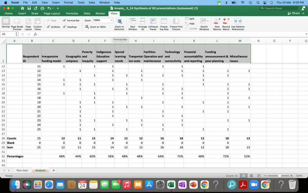
From reading each and every report, I created the variable heading and then started inputting the information.
The first step was creating the raw data sheet. Using the skills to freeze top rows, bolding the headings, and saving in Excel format and among other features I leant a while ago.
I spent some time glossing through some videos quicky. I must confess at some points while I enjoyed Ann videos, I keep saying to myself, “Thank you Ann, God bless you for creating this course and I have no regret to pay for all these courses.”

From the raw data sheet, I then opened a new sheet for clean data analysis, and then another sheet for tables and graphs.
Step 2: Creating Graphs and Visual Features
Next, my attention went into considering what graphs or visual features could best depict my summary finding and recommendations.
Having a preliminary and broader overview of all the concerns/challenges I gleaned from the 24 reports was the first step.
I then wasted no time in deciding on a one-pager dashboard.
Next is the question, what features of charts or graphs should be used? Several options came to mind and I started toying with the idea of doing multiple mini donut chats, pie charts, bars charts, waffle charts, or column charts. The options were many in my toolbox. I consulted again the Chart Chooser paper to explore the best options and the tradeoffs.
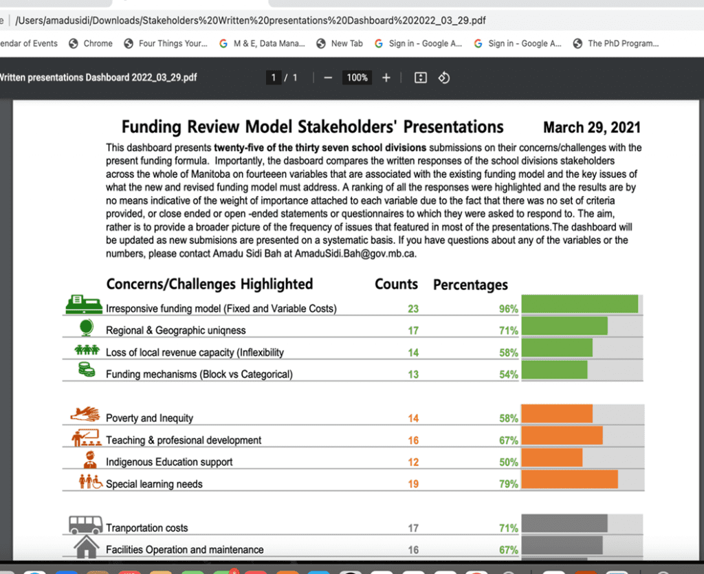
Finally, my intuition told me to choose the Data Bars that are found in the Conditional Formatting menu of excel.
The Final Dashboard
In the end, I created the dashboard, having a bold title at the top, creating a short introductory story-telling paragraphs, with a date on the right-hand corner of the page.
I thoroughly used all the best features one can find to prepare a visually appealing dashboard using the power of Excel and my newly-acquired data viz skills.
A few of these features deserve special mentions:
- customizing my colour and font;
- using the heading style options;
- adding white space;
- formatting the margins; and
- having a professional one-pager dashboard that can be viewed on the computer or printed out.

The Project Manager’s Reactions
On sending this final dashboard to the project manager and colleagues, the project manager sent a reply in less than five minutes, and I quote him:
“…Wow, comprehensive and nice visuals! This should help us prepare for the Review Team meeting and help shape the option paper.”