This is an Eval Central archive copy, find the original at depictdatastudio.com.
by guest author Kate Hall
Creating a Customer Service Visual Framework
I present a lot and have given customer service presentations in different forms and fashions for over 15 years. I usually get compliments on my presentations, but I wanted to make sure the information I was presenting was sticking with people. I needed to refresh a customer service presentation and decided to use it as an opportunity to apply the lessons from Powerful Presentations I was learning.
I had my framework in my head, but I was skeptical that with my skill level I could create something useful and decent to look at. I am a librarian, not a graphic designer.

Begin at the Very Beginning…..It’s a Very Good Place to Start
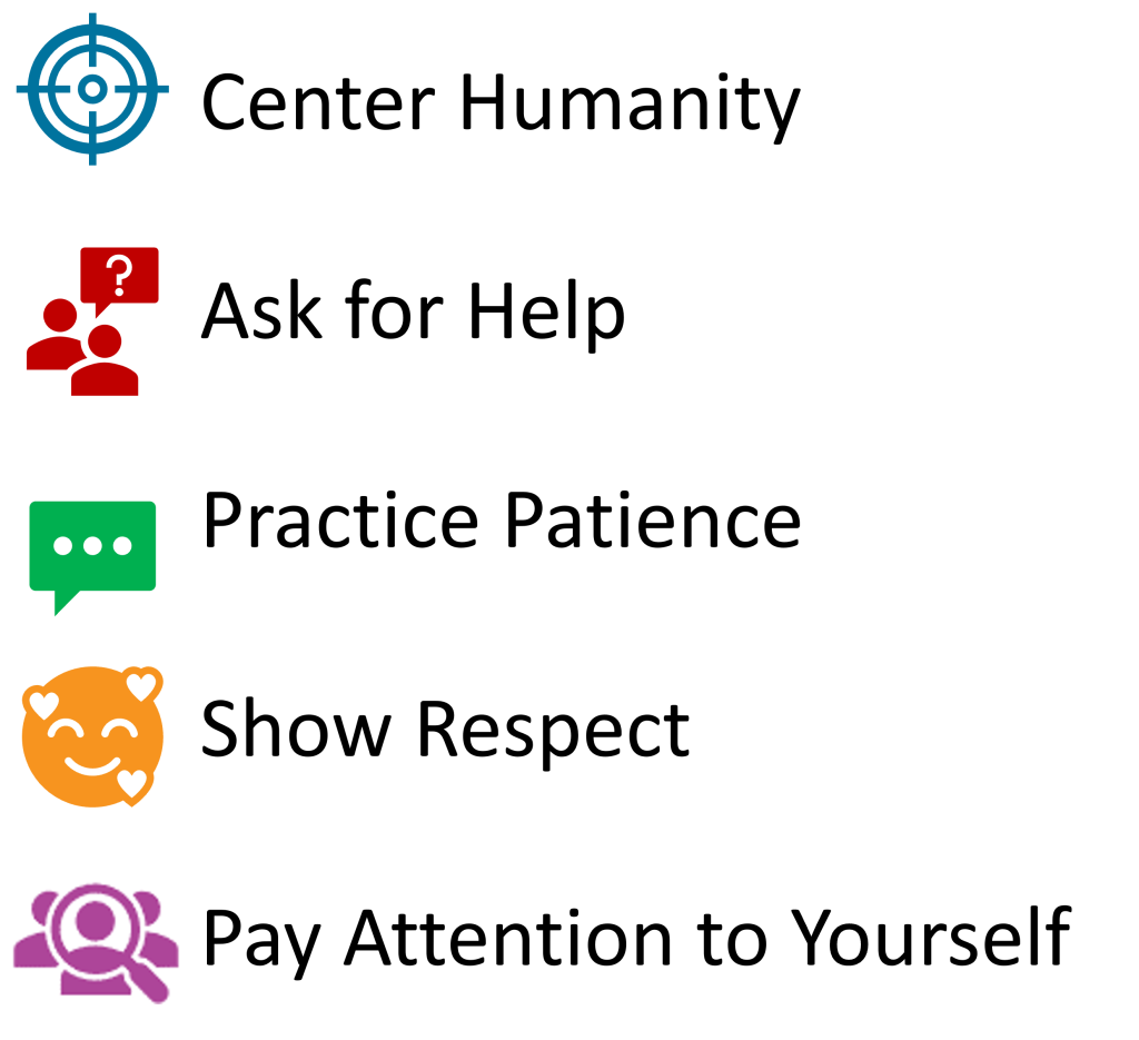
Despite my doubts, I began. Focusing on my outline, I had 5 areas I wanted to touch on. I matched icons to each and then thought about what I could construct to bring them all together. I realized that the Center Humanity portion was a target with four sections. So that is where I started.
Be Literal
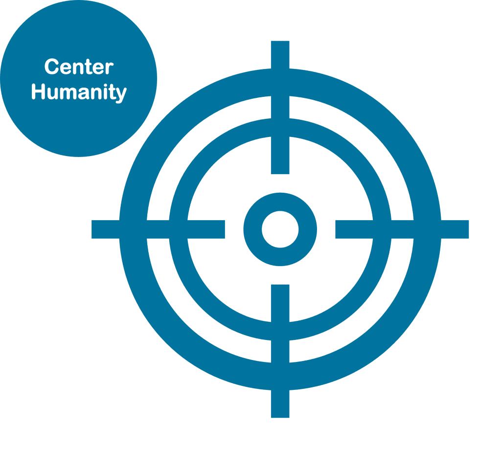
I decided to be very literal and created a circle and wrote center humanity and put it in the center of the target icon.
This was the central point I wanted people listening me to take away. That each person they interact with is another human being and we should remember that first and foremost in every customer service interaction.
Combine the Elements
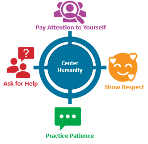
I then put one section near each of the quadrants on the target and added the wording below. I gave each its own color so that in my slide deck each would have a separate color to help tie people’s brains to that section.
At this point, I had done nothing too hard, downloaded a few icons, recolored them, and added wording. I could have stopped here and I think it would have been ok.

Pause for Reflection
But I chose to get some feedback to see if I could make it better.
At this point I paused and brought it to Office Hours for suggestions.
Shout out to all the fabulous people who shared ideas with me and helped make this visual framework more meaningful for my presentation.
Tweak for More Impact
I received lots of great ideas and my head was spinning with all the different ways I could possibly update my visual to resonate more with my audience. I decided to start by making the target look more like a target while keeping the center humanity in the center.
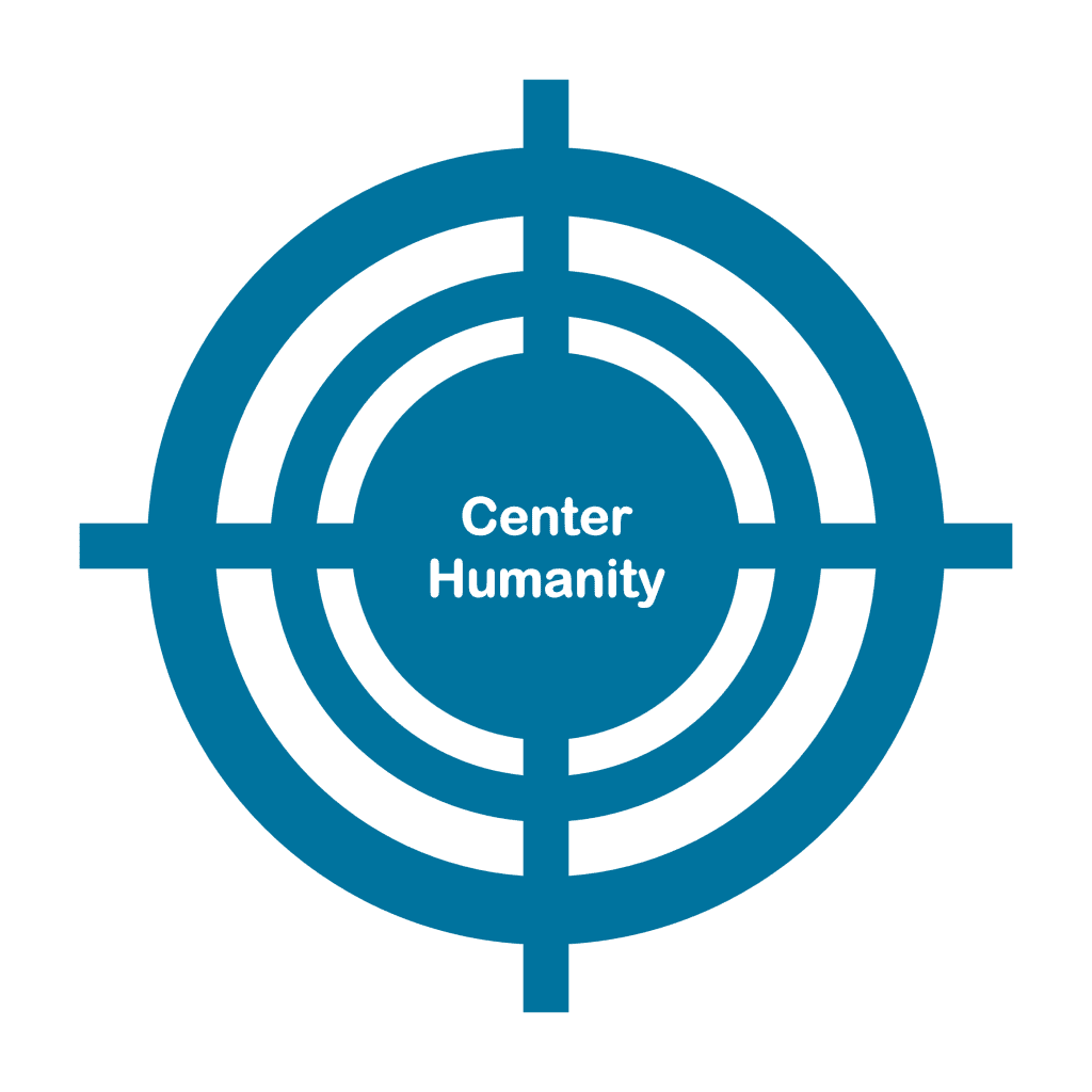
Add More Visual Cues
I wanted to make the four other sections clearer and tie things together. I took a duplicate of the target icon and recolored it and then used the crop tool to shrink it to only one quadrant.

This is what it looked like when I was finished.

Rinse & Repeat
I then did the same for Green, Red, and Purple.
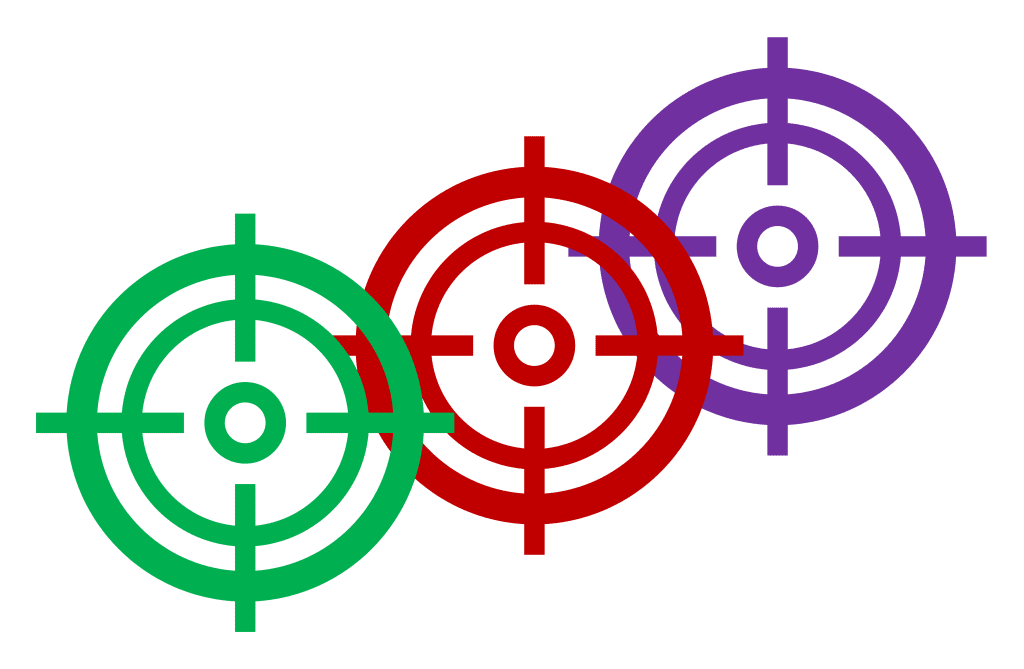
Four Quadrants
This is what it looked like when I was finished with all the quadrants.
I was liking where it was going and thought this would stick in people’s heads better than the original.

Keep Centering Humanity
I was hooked on keeping the circle and plopped it on top of all the different graphics I had just created.
This would be an easy graphic to chunk and use in my slide decks and I felt like I was on the right track.
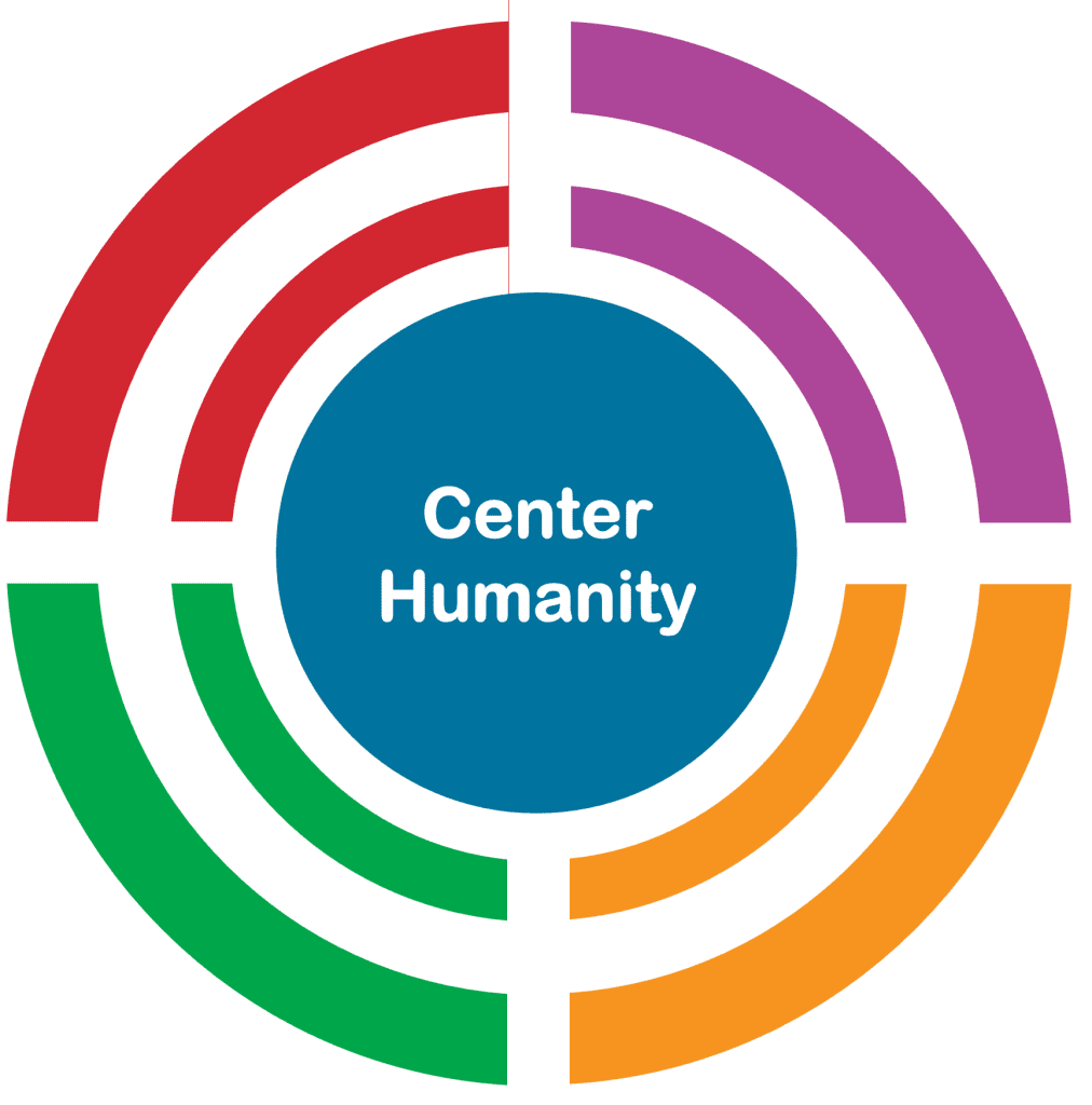
Adding Icons
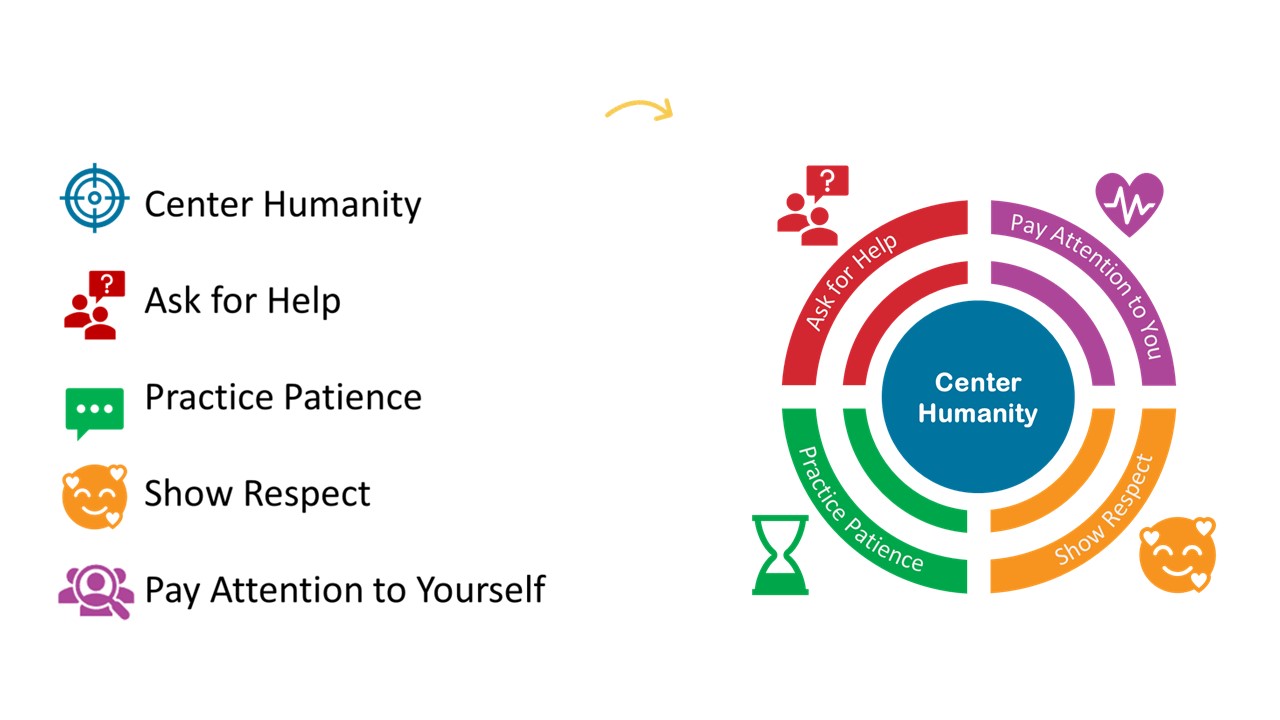
I changed some of the icons after thinking through what I was trying to convey and added them by each section.
I was getting closer, but it still didn’t feel finished to me.
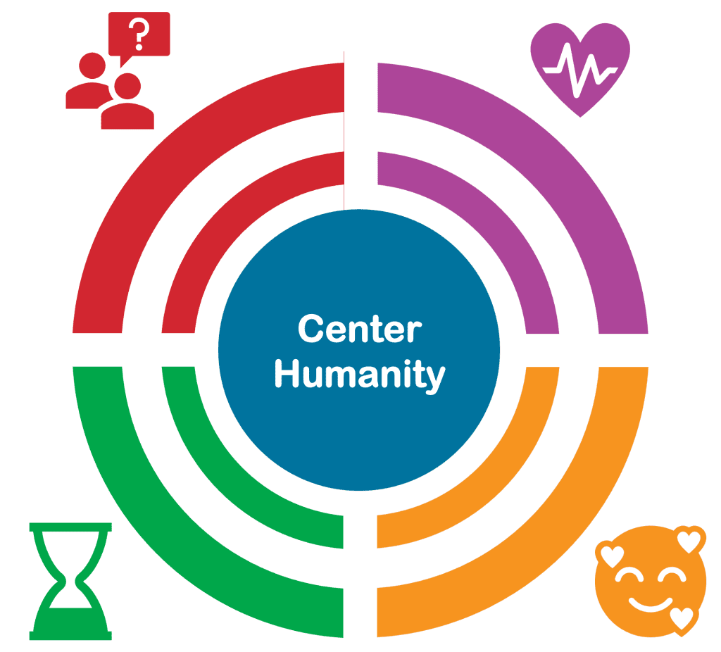
Librarians Love Words
I thought I could get away with leaving the words off and just having the icons, but it looked too bare to me. I used Word Art and after a bunch of trial and error got the words to curve at the right angle.
It now felt complete.
I used the Group tool to group all of the separate graphics together and saved it as an Image.
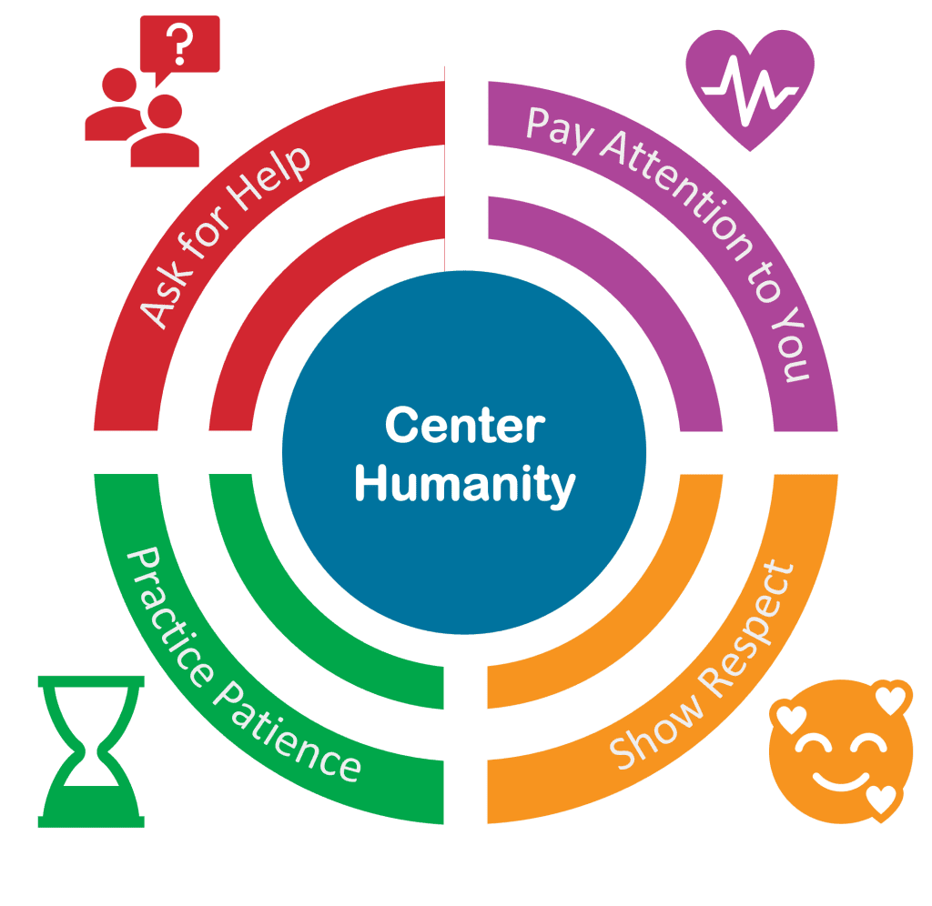
Success!
And while I thought it was pretty great, I didn’t know if it would be helpful for attendees. But it was!
In the feedback, one attendee wrote that they printed off the framework and put it on their desk as a reminder to them to follow the 5 steps.
That made my day and solidified for me why having a visual framework is so helpful. We don’t want to just give people presentations, we want what we share to stay with people and be useful.
