This is an Eval Central archive copy, find the original at depictdatastudio.com.
It’s not 1995.
Last week, I was leading a post-conference workshop with CQI professionals in California. You can learn more about their annual conferences here.
An attendee asked about best practices for adding photographs to our PowerPoint presentations.
Before
Let’s pretend that you’re giving a presentation about young children and physical fitness.
Avoid Tiny, Grainy Photos
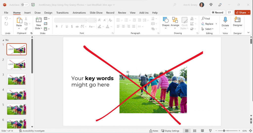
Here’s what I often see: small, low-resolution photos.
It gets The Big Red X.
I want your presentations to look professional, but this one’s giving outdated, unprofessional vibes.

Avoid Small, High-Resolution Photos
Nowadays, it’s easier than ever to find high-resolution photos.
I’ve tried dozens of photo sites, and my favorite is still Pexels.com.
All of their photos are free for both commercial and educational use.
You don’t need to create an account to download their photos (one less username and password to remember!).
You don’t need to add citations to your photos (so your slides stay uncluttered).
Over the past couple years, they’ve added more photos from international photographers, so you’ll see beautiful skin tones and hairstyles showcased among the models.
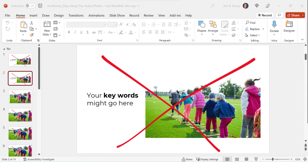
Here’s the next draft with a high-resolution photo:
Avoid Awkwardly-Enlarged Photos
We’ve solved the grainy issue.
Next, let’s solve the size issue.
I often see slides like this, where the photo is placed awkwardly on the slide.
We can’t keep those white slivers along the sides.
Avoid Stretched Photos
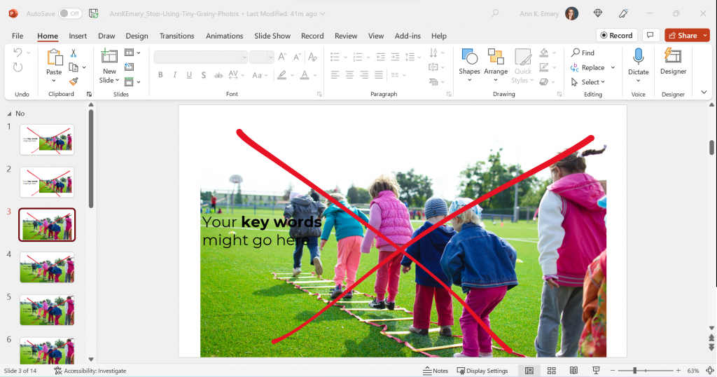
Please please please don’t stretch photos.
Yes, we want full-screen photos. But we must keep the aspect ratio (the proportions) intact.
Be careful if you’re manually dragging the sides, top, or bottom of the photo, as shown below.
The stretching is hardly recognizable on this particular photo, since it shows the backs of young children. But if you stretched a photo of someone’s face, it would be immediately noticeable (and it would look unprofessional).
Avoid Full-Screen Photos with Unreadable Text
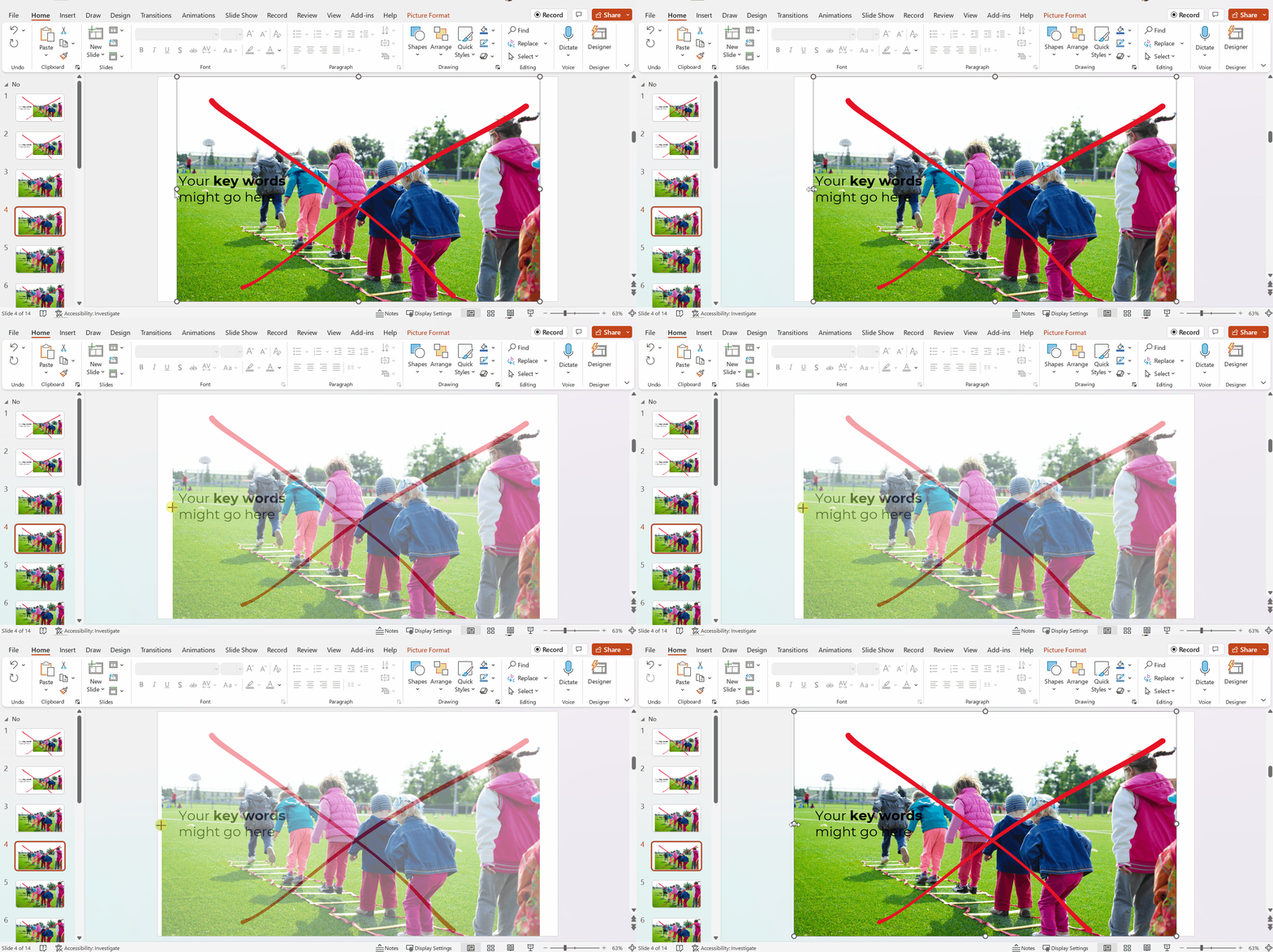
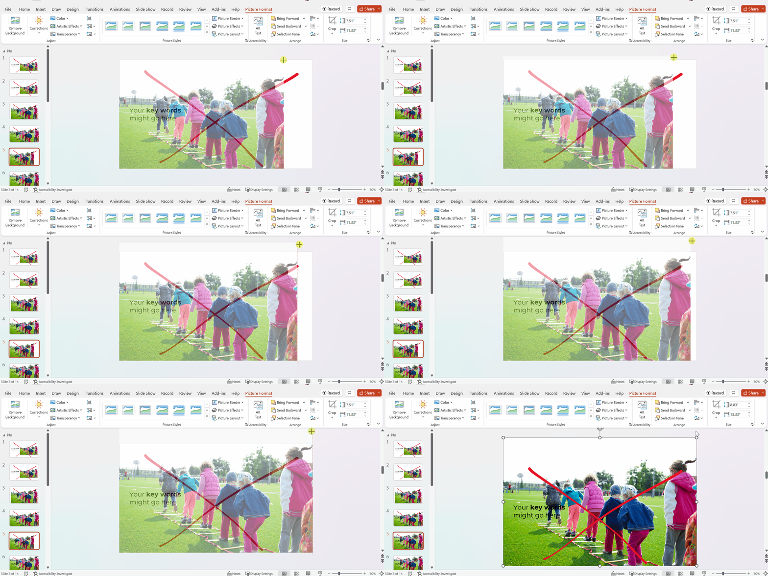
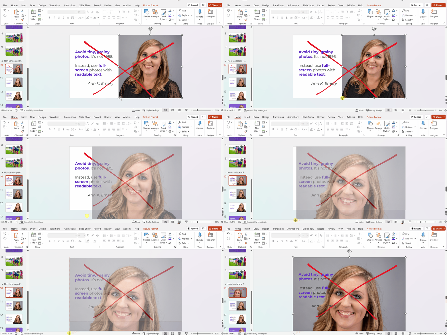
As you’re enlarging photos to fill the entire screen—so the audience feels like watching the action from the 50-yard line, not the nosebleeds—make sure you grab the corner.
Grabbing the corner will ensure that photo doesn’t get stretched awkwardly (i.e., it maintains the aspect ratio).
Full-screen photos often fall off the edges of the slide, like this. That feels weird at first! Don’t worry; the audience will only see the completed version, with the beautiful full-screen photo. They won’t know that, behind the scenes, an inch of the photo is falling off the edge of the screen.
After
We’ve got a full-screen photo, woohoo!
Next, let’s make sure the words are readable (i.e., that we have enough contrast to meet official accessibility guidelines).
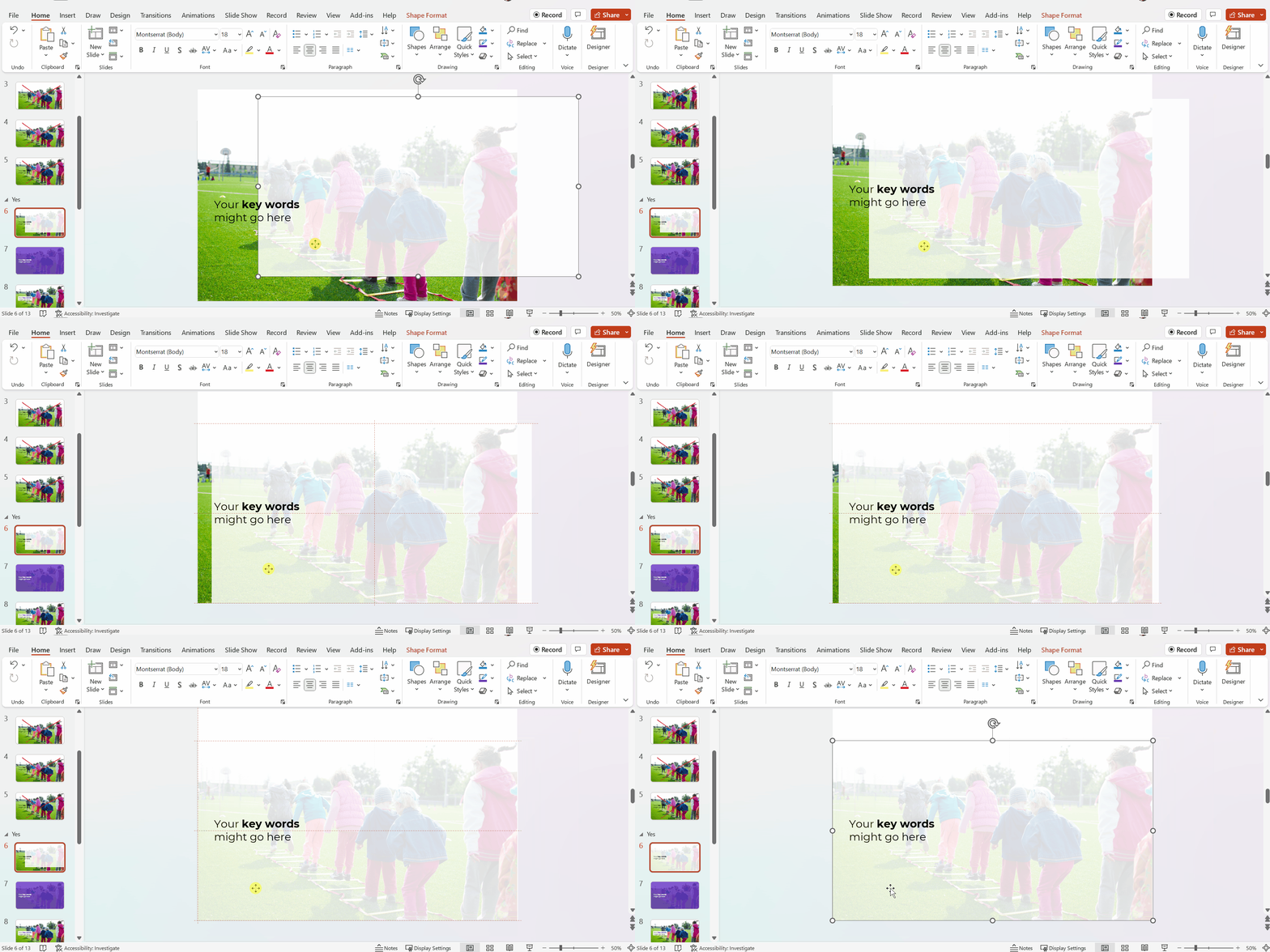
Full-Screen Photos with a White Overlay
To make sure the words are readable, try adding a white overlay.
Go to Insert –> Shape and draw a large rectangle over the entire slide. Then, adjust the transparency. This one has 15% transparency.
Your audience will easily read the large, 32-point font. And they’ll see the photo peeking out from behind, too.
In this example, the words are the star, and the photo is the sidekick.
Full-Screen Photos with a Colored Overlay
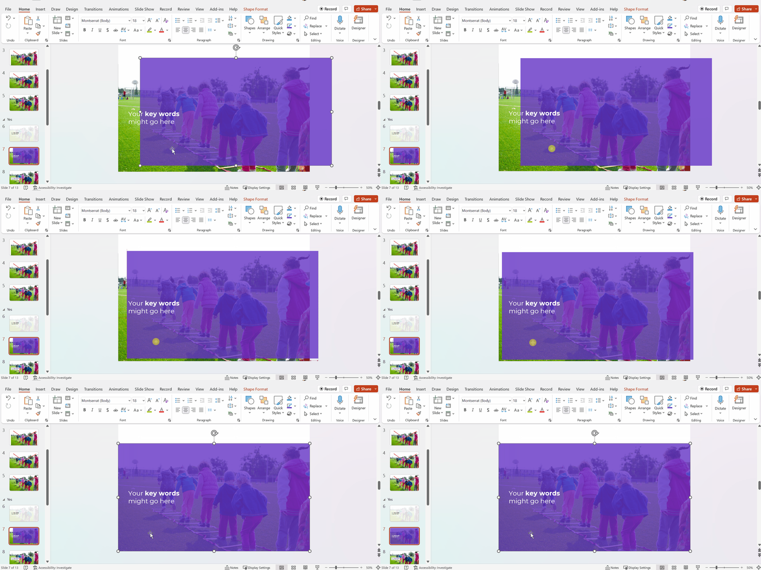
You can use brand-colored overlays, too.
The words are still the star, and the photo is still the sidekick.
Full-Screen Photos with White Text Boxes
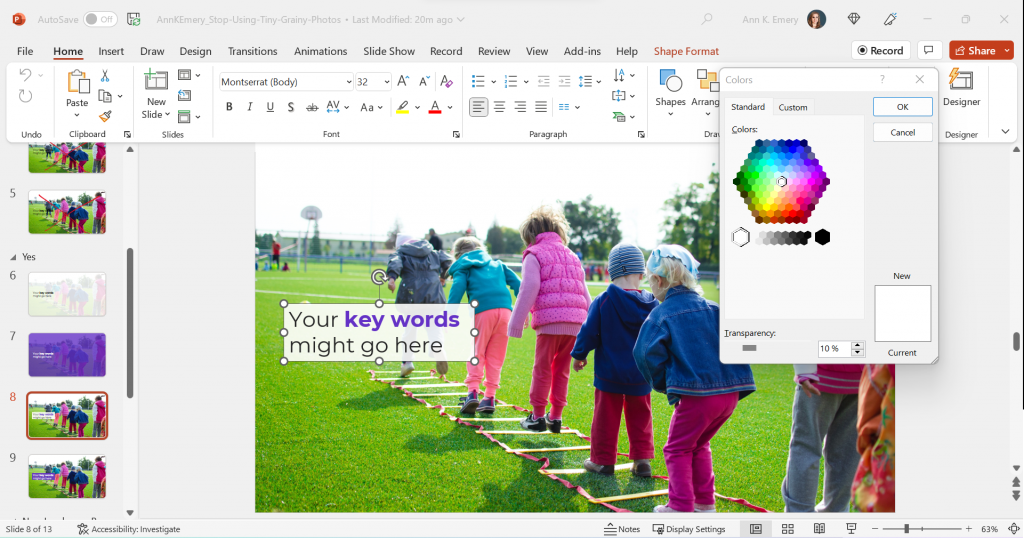
In this example, I kept the photo’s original colors.
The text box is filled with white (with a 10% transparency so you can slightly see the photo peeking through the text).
The photo is the star now, and the words are the sidekick.
Full-Screen Photos with Colored Text Boxes
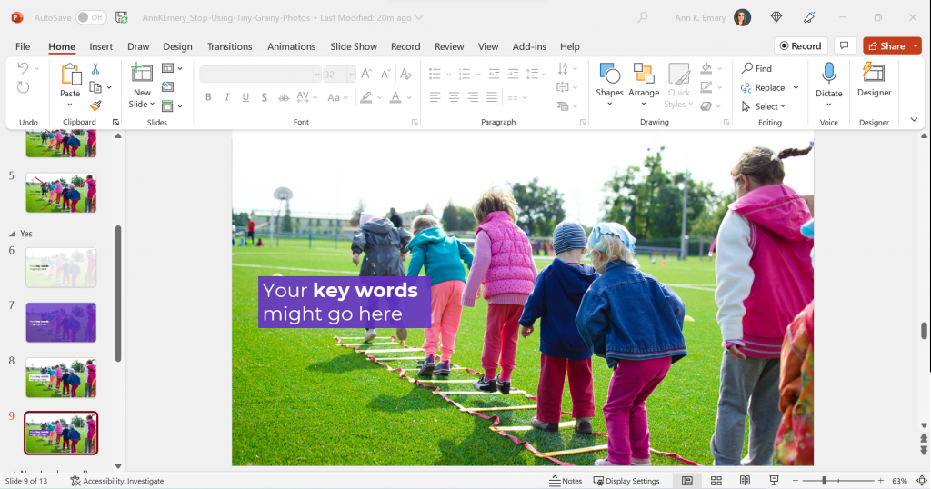
I think you get the idea by now.
You could also fill the text box with one of your brand colors, like this:
Phew! In these redesigned slides, our full-screen photos put the audience in the middle of the action, and the text is readable.
What If My Photo Isn’t Landscape?
We can’t always find landscape photos to fit our landscape slides.
Maybe the photo we want is square, circular, or portrait-oriented, like this one.
We can’t expand those pictures to fill the slide, or they might get too big.
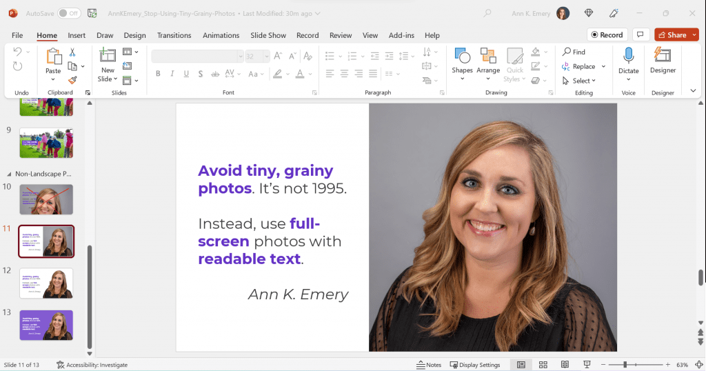
Enlarge the Photo to Fit the Height (or Width) of the Slide
I often enlarge those photos to fill the height of my slide, even if they don’t fill the width of the slide, like this:
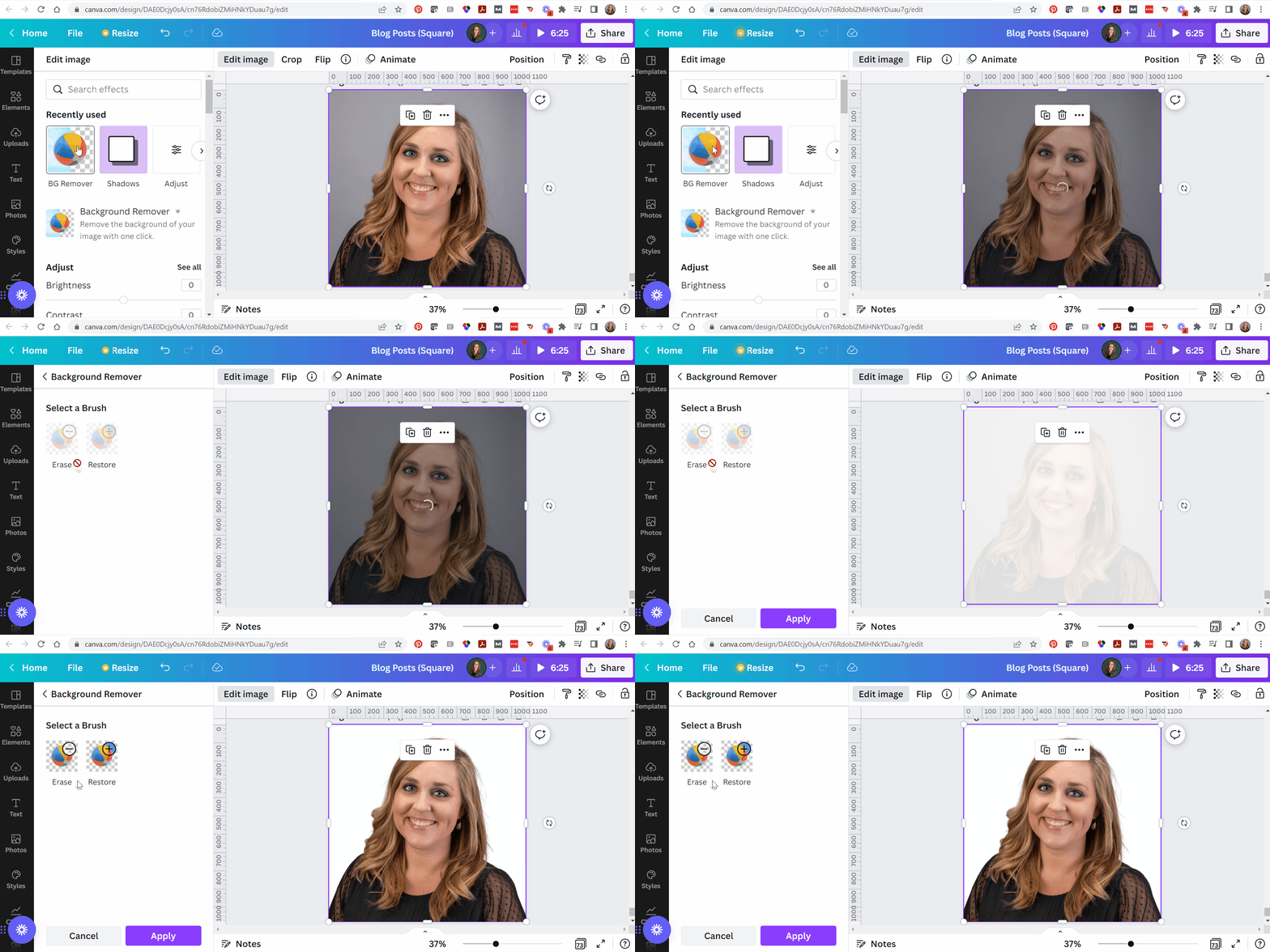
Experiment with Removing the Background
When I’m adding headshots to slides, sometimes I remove the background.
(This rarely works with non-headshot photos, like the photo of the children playing. Computers get confused, and they often mix up the background and foreground.)
PowerPoint does have a Remove Background button (!). To use it, click on the picture to activate it, then go to Picture Format à Remove Background.
But PowerPoint’s Remove Background button is meh. It’s a newish feature and Microsoft still has some fine-tuning to work out.
Instead, I upload the photos to Canva, remove the background, download the edited version, and insert that into PowerPoint.
Canva gives me the correct results 90% of the time, whereas Microsoft gives me correct results 10% of the time.
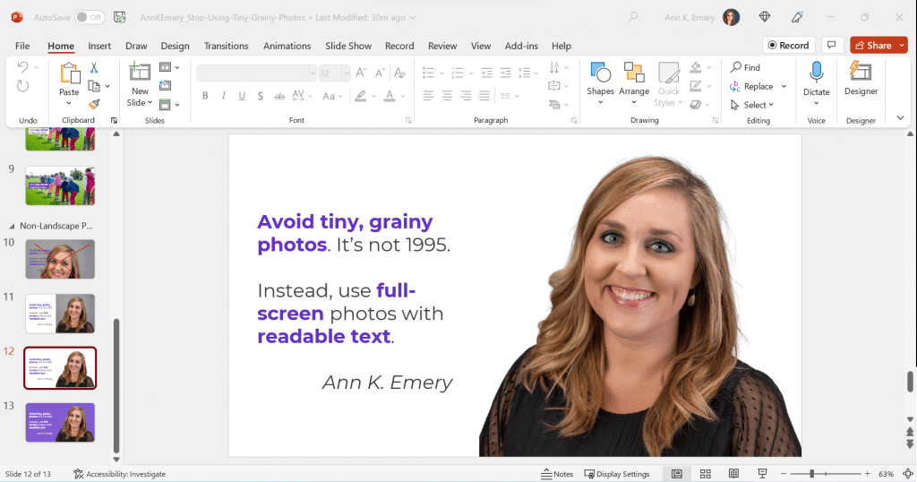
Now, the photo and the words flow better, since they’re both against a white background.
Finally, you can try colored slide backgrounds, like this. You’d use your brand colors, not mine.
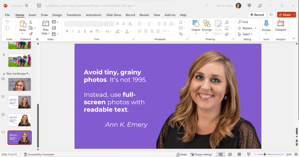
I think this final design might be my favorite of the batch.
All of these redesigns are better than the tiny, grainy original, don’t you agree?
Download My Slides
Want to explore these slides? Download them here.