This is an Eval Central archive copy, find the original at depictdatastudio.com.
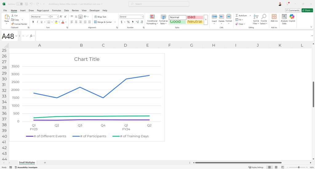
I recently saw a graph that looked like this—accidentally combining 3 different units on the same chart:

In this 8-minute lesson, you’ll learn:
(1) how small multiples layouts can help, and
(2) how to make small multiples charts in Excel.
What’s Inside
- 0:00 My goal: Convince you to use MORE GRAPHS
- 0:32 The fictional example: 3 different variables/units
- 1:44 Before: Everything together in one graph
- 2:30 After: Small multiples
- 3:21 How to make small multiples line graphs in Excel
- 4:30 Use the “Select Data” menu to graph 1 variable/unit at a time
- 5:10 Copy-paste to make the additional graphs
- 6:24 Align and group the separate graphs together
- 6:55 1 lonely line? Try an area chart
- 7:30 What it would look like in Word
- 8:09 Recap of key points
Download the Excel File
It’s here.