This is an Eval Central archive copy, find the original at depictdatastudio.com.
I’m an epidemiologist and public health researcher who studies health policies on infectious disease.
I got the opportunity to work with a public health agency which I was really exited about.
Until I had to present my research to a group of policy makers…
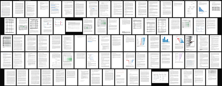
Before: The Dusty Shelf Report
Condensing two full chapters—73 pages of my thesis—into a short report for the policy making group seemed like an impossible task.

That’s when Report Redesign came to the rescue!
As this research was being conducted in an academic setting, I couldn’t entirely do away with all the technical details (or what Ann would call the Dusty Shelf Report  ).
).
But I did manage to apply the 30-3-1 principles to summarise the two chapters into:
- a shorter 23-page report (with appendices) and
- 11 slides for a 10-minute presentation to the policy making group.
Choosing the Final Outputs: A Short Report and a Slideshow
Working with the public health agency, I realised that although they were expecting the technical details on the study methods and results to be included, the overall format expected was different compared to what I had been used to in academia.
They wanted slides which were to be presented to the policy making group and an accompanying report with more details on the study in case some of the members wanted more detailed information.
I thought this would be a good opportunity to apply some of what I had learnt during the Report Redesign course.
Choosing Which Findings to Include
We had a few meetings with the research group to identify the most important findings to include in the presentation and report.
Given the audience was technical, we agreed to include:
- An overview of the study
- A sentence on what the goals/aims of the study were
- Survey respondent characteristics
- Results section that highlighted responses to main questions in the survey
- Limitations
Just focusing on these areas, I was able to whittle down the two thesis chapters into 23 pages with some additional information in the appendices.
The Shorter Report
In the original version of the write-up, I did have some tables, but they were too technical (too many decimal places; statistical terms like p-values).
I also had some graphs that used the default settings made within my software program without any editing.
For the report, I aimed to have one or more visuals on every single page (a goal covered in Report Redesign).
This included flow charts, graphs, tables, text boxes, and icon arrays. Whatever was needed to best communicate the takeaway finding from the research.
The agency was going to use their own design team for the final branding and layout, so I didn’t have to bother with that.

The Presentation Slides
I further had to whittle down the report into 11 slides for the presentation.
I decided to limit the background information and focus on the key results.
