This is an Eval Central archive copy, find the original at depictdatastudio.com.
Are your takeaway findings getting lost?
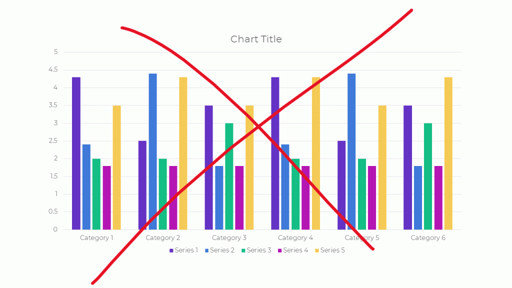
Bad graphs can slow down the viewer’s comprehension… increase cognitive load… and fail to inform decision-making processes.
Dusty Shelf Reports Aren’t Inevitable
With intentional editing, you can design visualizations that inform and inspire.
I Was Going to Wait…
I was going to wait and open registration for our dataviz course in a few more months, once things get back to “normal.”
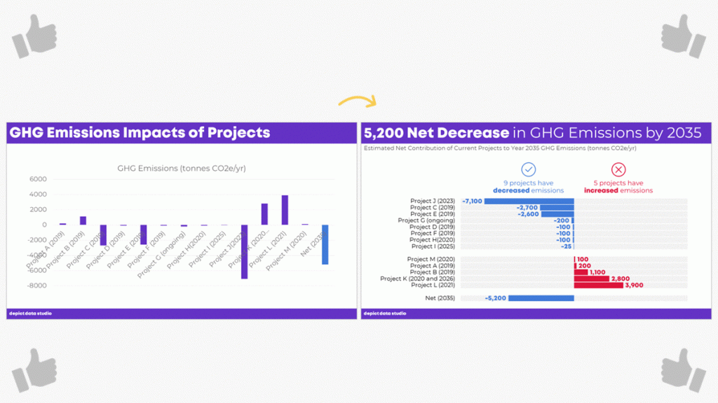
But the general public is craving clear, reliable visuals. Media outlets are reporting that their COVID-19 data visualizations are their most viewed pages. Ever.
I don’t need to tell you how badly policymakers need clear, reliable visuals to guide their decisions right now.
You may not be producing visualizations for the general public or for policymakers. Maybe you need to make one-pagers, slideshows, dashboards, or infographics for your supervisor or funder.
I don’t need to tell you that nobody has spare time right now. Before, we might’ve been hopeful that our organization’s leaders would spend time reading our graphs. But now… I can’t imagine that anyone who’s working and homeschooling has that luxury of time. Clear, concise visuals matter more than ever.
I have moments where I want to crawl under a blanket. But now’s not the time to hide. Will you step up to the plate with me?
What’s Included in Great Graphs: Design Principles
This is our flagship data visualization course.
Watch 125+ videos whenever it’s convenient for you. Pause the videos. Re-watch them as many times as you need. Practice along with me using the spreadsheets, handouts, and ebook.
Then, join live Office Hours webinars twice each month. We meet over Zoom. Get targeted feedback on your draft visualizations.
Here’s everything that’s included:
- 125+ recorded lessons to watch at the day and time of your choosing
- 12+ hours of video, the equivalent of a 2-3 day training
- Instant access to all the recorded lessons
- Live Office Hours sessions twice a month
- Downloadable resources like handouts and cheat sheets
- Software-agnostic data visualization principles
- Before/after makeovers inspired by research, evaluation, and analytics teams like yours
- Examples from a variety of industries (public health, government, education, grantmaking, international development, hospitals, universities, and more)
- License for the 200+ page ebook
- Weekly messages to encourage you and keep you on track
- The students-only Facebook community
- Lifetime access
- All future updates and additions
This is a best practices course, not a software how-to course. You won’t see videos about “First, click this button” and “Then, click this button.” That being said, you’ve got to use some software program. All the training examples have been made with everyday software you already own, like Excel, PowerPoint, Word, and other low-cost tools. You don’t have to be a computer programmer or a graphic designer to be a great communicator.
What’s New for 2020
This is the third time we’ve offered this course: 2018, 2019, and 2020.
New for 2020! Live Office Hours sessions, new modules, lifetime access, guest speakers discussing COVID-19 data, & more.
What’s Inside Each of the Modules
Data visualization isn’t supposed to feel daunting. We’ll walk through a step-by-step design process that you can apply to your own projects.
Welcome (10 min)
In this introductory module, you’ll get information about our live Orientation Session; a lesson on distinguishing between mediocre graphs from great graphs; links to download the handout and the 200-page ebook; an invitation to share your mailing address so I can send you dataviz swa in the mail; and an invitation to join the students-only Facebook community.
Module 1: Analyze Your Audience (6 lessons; 19 min)
There’s no such thing as a one-size-fits-all visualization. You’ll need to tweak, tweak, tweak to get the approach right for each of your difference audience types. You’ll learn what types of questions to ask during the planning phase of your project, like whether your viewers are technical or non-technical, what types of comparison data points could be provided, and whether your audiences are expecting a story.
Module 2: Choose the Right Dissemination Format (4 lessons; 11 min)
You’ll think about which format–a report, dashboard, infographic, one-pager, etc.–is best for each type of audience that you’re trying to reach. You’ll get downloadable worksheets like my Audience Crosswalk and Communications Plan.
Module 3: Choose the Right Chart (3 lessons; 15 min)
Chart-choosing is such an important skill, and it’s a skill that must be practiced over time (not learned overnight). In this module, you can download our 2-page Chart Chooser, which you can use as a handy reference guide.
Module 4: Pies, Donuts, Square Pies, and Waffles (9 lessons; 45 min)
It’s easy for us–and a little lazy–to say “Never use pie charts!” It’s much more challenging to know which alternatives to use instead. In this module, you’ll learn the seven criteria that must be met in order to use a pie or donut. Then, you’ll learn about my love of square pies and waffles. You’ll see three before/after pie chart transformations, and then you’ll put your skills into use with two “Your Turn” activities.
Module 5: Bar Charts (3 lessons; 25 min)
You’ll master the finer points of bar charts. Learn about scaling, shading, collapsing categories, and building diverging or small multiples charts. Then, learn alternatives like area graphs, square area graphs, and tree maps. Finally, learn how to use storyboarding during live presentations so that your dense bar charts are easier to follow.
Module 6: Choose the Right Chart, continued (8 lessons; 39 min)
Transform tables into visuals; avoid a (boring) report that’s just full of bar charts; and experiment with new-ish chart types like tile grid maps and Sankey diagrams.
Module 6: Visualizing Qualitative Data (12 lessons; 54 min)
You’ve probably heard that word clouds are outdated, but are you familiar with all the other options yet?
Module 7: Chart-Choosing Practice (6 lessons; 28 min)
By popular demand! We’ve got six examples specific to surveys. You’ll learn how to visualize yes/no questions, check-all-that-apply questions, rating scales, open-ended comments, demographic data on survey respondents, and pretest-posttest results. You can download the PowerPoint slides and Excel files that accompany these examples.
Module 8: Select a Software Program (12 lessons; 21 min)
I’ll provide an overview of my favorite software programs so you can understand the strengths and weaknesses of the major players in the market. New for 2020, we’ve got some info on getting started with Canva.
Module 9: Tell a Story (2 lessons; 14 min)
Data storytelling is a different type of storytelling than reading your kids fiction books at bedtime. In this module, you’ll learn exactly what’s meant by the term “storytelling” as it applies to preattentive attributes.
Module 10: Declutter (14 lessons; 1 hr 6 min)
Decluttering is addition through subtraction. I’ll give you permission to delete a lot of unnecessary ink! You’ll also learn about the finer points of decluttering that I never have time to cover during workshops, like decluttering visuals for scientific journals.
Module 11: Color (22 lessons; 1 hr 42 min)
You’ll get a behind-the-scenes peek into designer jargon like RGB, HEX, PMS, and CMYK codes. You’ll learn how to read your existing style guide. I’ll also cover techniques that I never have time to cover during workshops, like how to choose color palettes from scratch for your reports, slideshows, and dashboards if you don’t have a style guide. You’ll also learn about 508 compliance, like how to test your visuals for sufficient foreground/background contrast, colorblindness legibility, and grayscale legibility using accessibility checkers.
Module 12: Text (14 lessons; 35 min)
You’ll learn the basics like writing titles, subtitles, and annotations that encapsulate your key finding. You’ll also learn advanced nuances, like when to use right, left, centered, or justified text; when to use title case, sentence case, or all caps; and how to strategically place text beside graphs (rather than making viewers search through long paragraphs to find your key phrases). We’ll also measure your draft’s reading grade level and practice translating the research methods terminology we learned in grad school for the non-researchers who are using our data.
Module 13: Before/After Data Visualization Makeovers (9 lessons; 1 hr 17 min)
We’ll apply the skills you’ve learned in previous segments. You’ll see “before” graphs that are similar to graphs I’ve encountered while consulting to foundations, nonprofits, universities, and government agencies over the past decade. Then, you’ll see how I choose different chart types, declutter, and apply color and text strategically to complete overhaul each graph. Five of these examples were added for 2020.
Module 14: Partnering with a Graphic Designer (3 lessons; 33 min)
New for 2020! Whether to DIY or partner with a graphic designer is different for every organization and every project. You’ll also get tips for working with graphic designers. If you hold a few productive planning calls at the beginning of your project, then you’re so much more likely to get the end result you want.
Module 15: Collecting, Analyzing, and Visualizing COVID-19 Data (3 lessons; 30 min)
New for 2020! I interviewed Amanda Makulec about collecting, analyzing, and visualizing COVID-19 data responsibly. I’ll be adding more interviews here over the next few weeks.
Module 16: Next Steps (3 lessons; 7 min)
I’ll share my final thoughts; a list of recommended resources; and invite you to complete the course evaluation survey.
No Fancy Software Needed
This is a best practices course, not a software how-to course.
You won’t see videos about “First, click this button” and “Then, click this button.”
That being said, you’ve got to use some software program. All the training examples have been made with everyday software you already own, like Excel, PowerPoint, Word, and other low-cost tools.
You don’t have to be a computer programmer or a graphic designer to be a great communicator.
Feedback On Your Projects
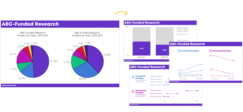
You’ll get instant access to 125+ recorded lessons that you can watch anytime and two live Office Hours sessions every month to get targeted feedback on your visualizations.
What Students Are Saying
2,500+ researchers, evaluators, and analysts have taken online courses with us.
Here’s what some recent students are saying.
“This time last year I was struggling to decide (i) whether to spend money on a course to help me improve my data visualization skills and (ii) which one. Ann’s Great Graphs course exceeded my expectations and helped me improve my Excel skills as well. The course is well paced. The extra material in the monthly webinars was a super how-to to put the tools into practical use and provided the opportunity to ask questions. Having access to the webinars allowed me to go back and catch a few nifty Excel tricks that I hadn’t noticed during the webinar, saving me tonnes of time and frustration. Ann is fast and efficient! The course is well worth the time and money. Be prepared with your ideas and set aside time to follow along. You will be amazed at how much you can learn as the year flies by. Thank you Ann!”
- Judi Ekkert, Environmental Health Officer, Interior Health
“I would often see charts, graphs, and other data visuals in journal articles, and think to myself, ‘Wow, this is horrible; I have no idea what I am supposed to learn from this!” But I had no idea how to make it better or offer constructive suggestions. After just the first few weeks of Great Graphs, I learned about how to select the best type of graph and how to make it visually appealing to the intended audience. My own publications and posters have also benefited—no more hard-to-read charts filled with clutter! The videos were easy to follow along and the detailed blog posts with Excel hacks saved me a ton of time. Thank you Ann and I cannot wait to take your next course!”
- John R. Heberger, Epidemiologist, Centers for Disease Control and Prevention
“Thanks to Great Graphs, gone are the days of each of us taking the time to adjust Microsoft’s default formats by removing vertical and horizontal bars, shrinking gap widths, increasing data label font sizes and alignment, and the list goes on and on.”
– Courtney Sims, Sharp Insight
“I am in the process of completing Great Graphs. It has been so valuable to my work. The course encompasses everything from working with data, to presenting the data in reports and making presentations… After taking this course, I have much more confidence in making decisions about design elements in my work. Like many of you, I was trained in data analysis, not presentation. I have so many more tools to choose from for working in Excel, Word, and PowerPoint to ensure I get my point across to my audience. This has reduced my stress levels, increased my confidence, and freed up my mental energy to focus on the meaning of the data.”
– Cheryl Davis, Willamette Education Service District
“We’ve been so inspired in the past two years that we’ve written several reports using PowerPoint instead of Word. To tell you the truth, I wasn’t sure how our clients would receive this new format. The first time we wrote a report in PowerPoint, I was terrified the client would hate it and ask us to create a whole new traditional, text-heavy report. Luckily, that didn’t happen. Instead, the Foundation President told us it was the best evaluation report he had seen in 17 years!”
– Ann Webb Price, Community Evaluation Solutions
FAQs
How long do I have access to the course?
Indefinitely. I used to limit access to just 12 months. I wanted to encourage you to get in here and learn with me, but instead it just stressed you out, so I’m not cutting off your access anymore.
What if I have questions about my individual dataset?
Join the live Office Hours sessions, which are held twice a month. If you can’t make the live sessions, you can submit questions in advance, and then watch the recording later to see how I addressed your question.
What if I am unhappy with the course?
We would never want you to be unhappy! If you are unsatisfied with your purchase, contact us in the first 30 days and we will give you a full refund.
I know you’re a perfectionist and always update your courses.
Yes, and you’ll be grandfathered-in to all future updates to this course.
What does an online course look like inside?
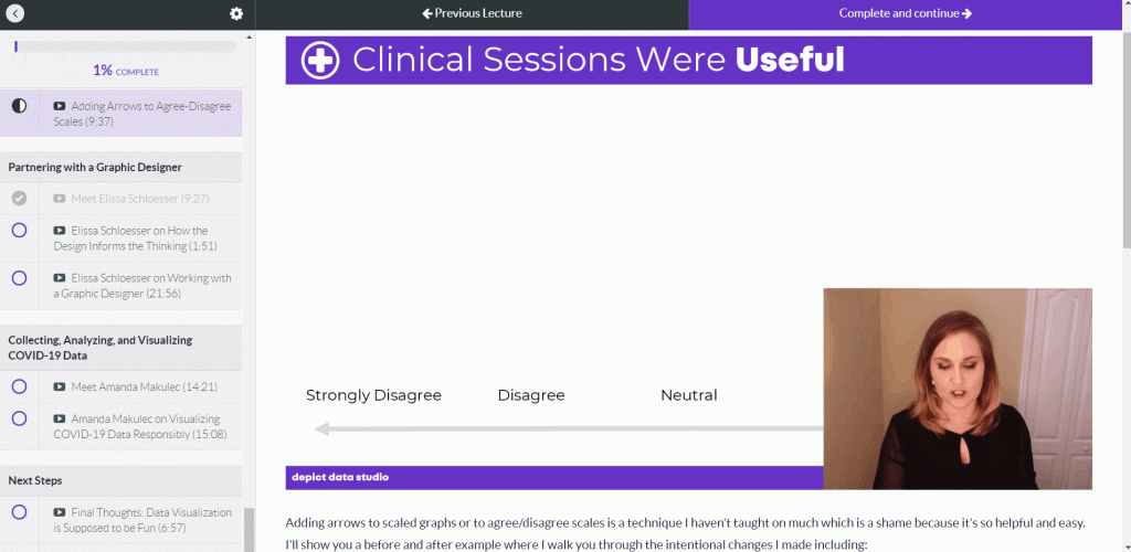
I talk with you like a real person, not a monotone robot reading off a boring script.
Register
See you in the course!
Ann
P.S. Wondering whether this course is right for you? Here’s a link to my secret calendar so you can chat directly with me: https://calendly.com/depictdatastudio/20min