This is an Eval Central archive copy, find the original at depictdatastudio.com.
Wondering how to visualize your qualitative data? Maybe you’ve got open-ended survey responses, focus group notes, or speech transcripts. Qualitative data visualization can bring our words and phrases to life.
My friend Jon Schwabish from PolicyViz asked me to partner on his One Chart at a Time project, in which we’re helping you get better-acquainted with common and not-so-common chart types.
I created a tutorial on using colored phrases to visualize qualitative data. In this tutorial, you’ll learn:
- The first time I ever used colored phrases to visualize qualitative data;
- My favorite examples of colored phrases; and
- Practical tips for using colored phrases in your project.
Watch the Tutorial
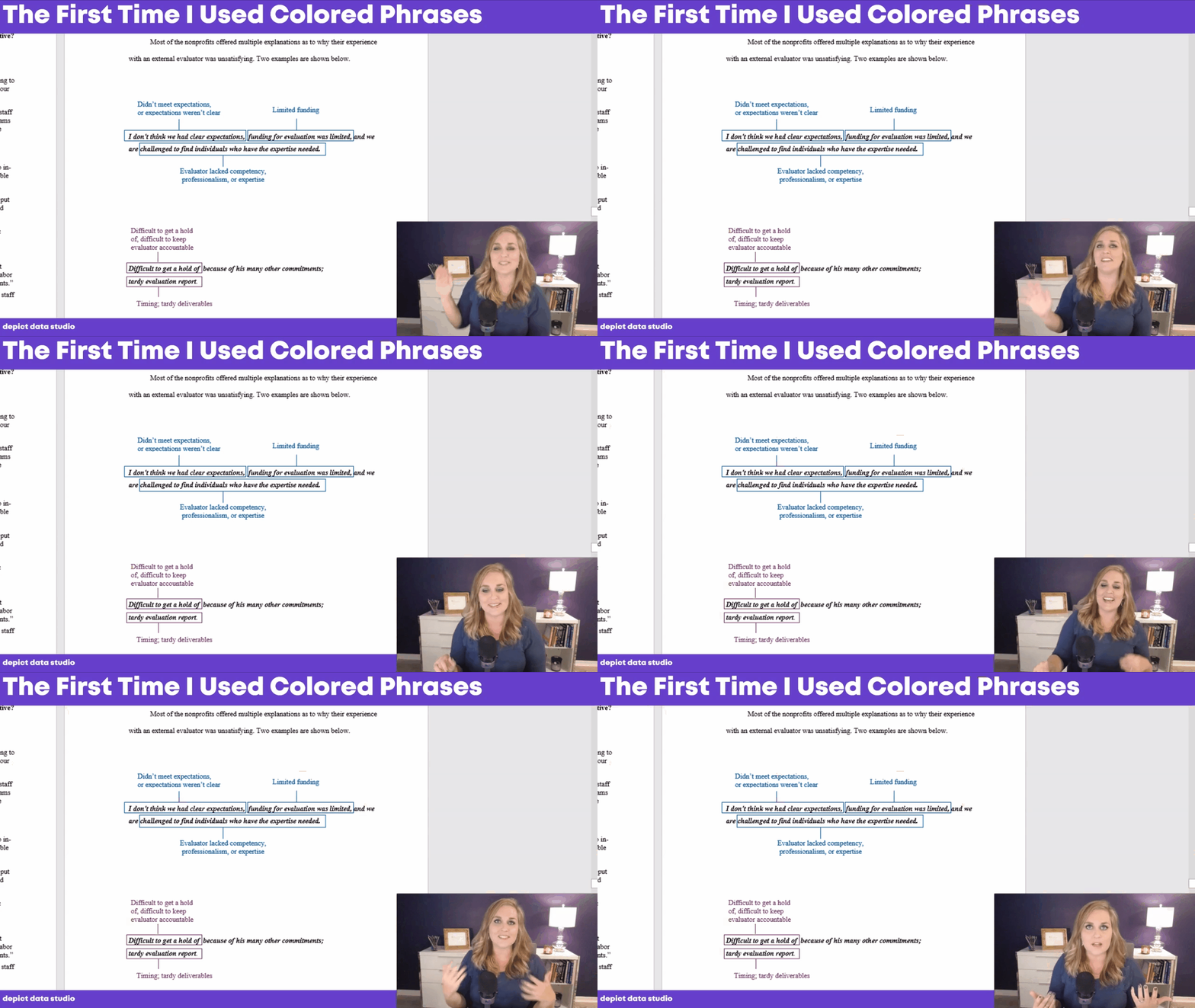
The First Time I Used Colored Phrases in Data Visualization
In the first part of the video, you’ll see the first time I used colored phrases.
I was coding open-ended survey data during my Master’s thesis, and needed to visualize different themes that I was finding in the data.
Inside good ol’ Word, I added colored rectangles around key phrases.
The outcome wasn’t perfect, but it was better than regular text.

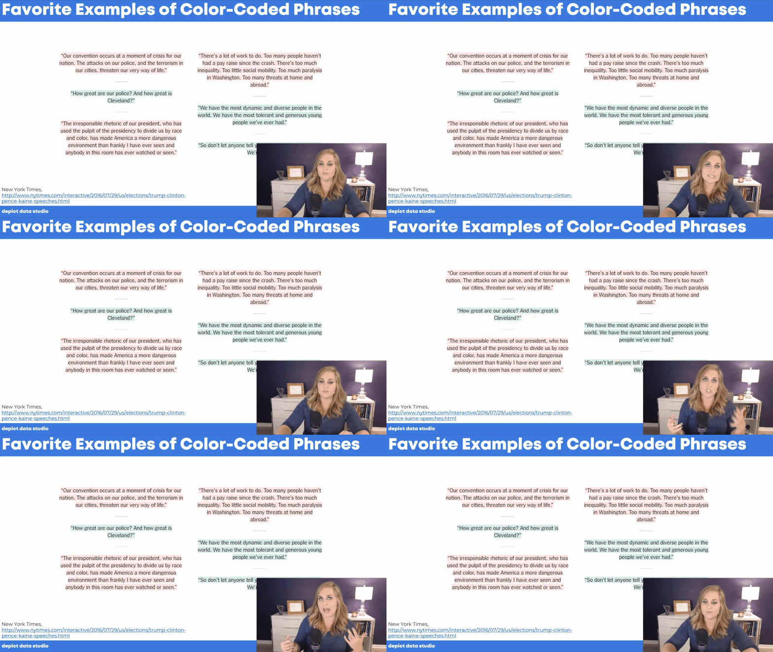
My Favorite Examples of Colored Phrases
In the second part of the video, you’ll see my favorite examples of colored phrases:
- ‘Stronger Together’ and ‘I Am Your Voice’—How the Nominees’ Convention Speeches Compare by the New York Times
- Did Michael Brown Charge? Eyewitnesses Paint a Muddled Picture by the Washington Post

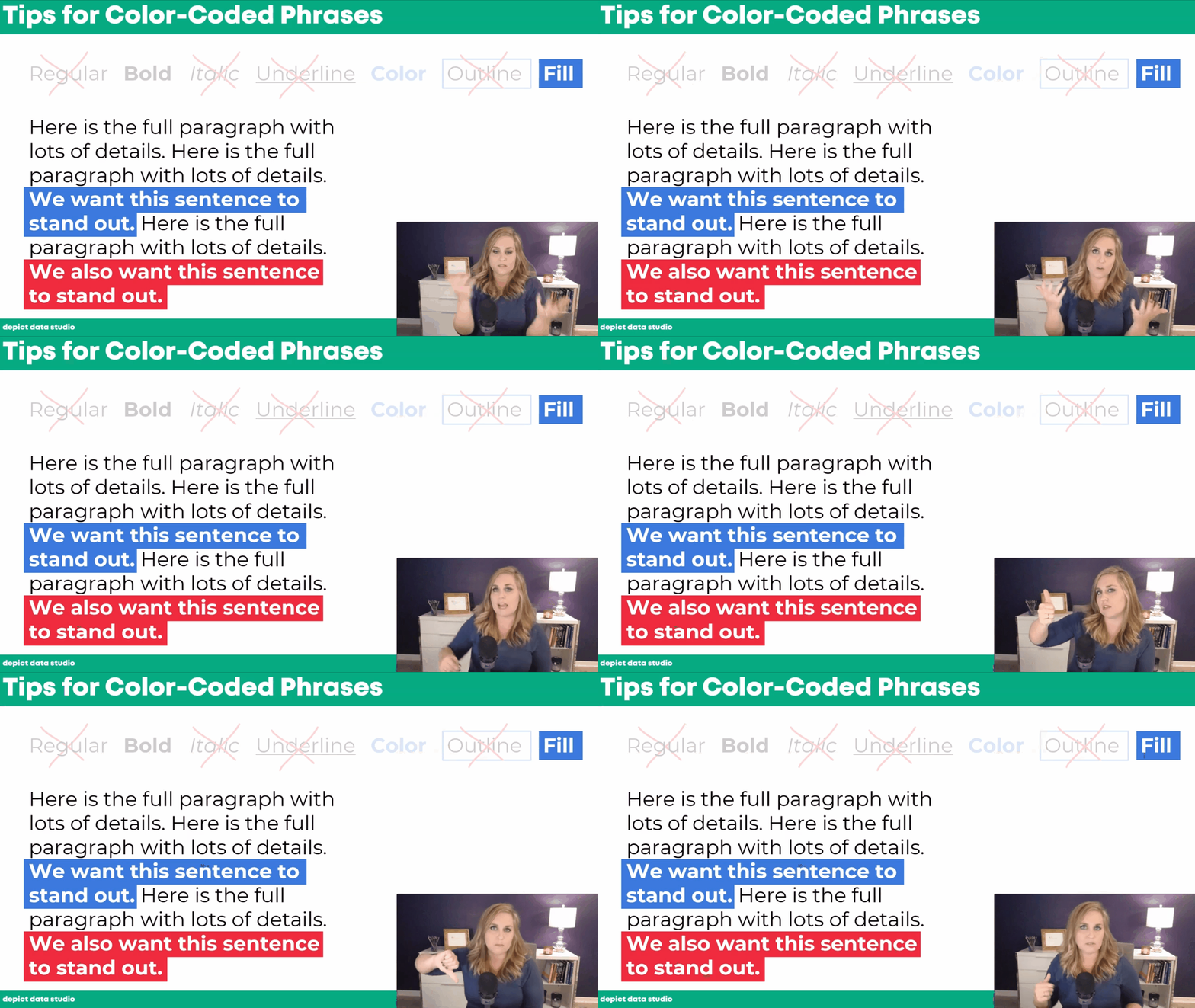
Practical Tips for Using Colored Phrases
In the final section of the video, you’ll learn practical tips for using colored phrases to visualize qualitative data.
We’ll go through seven options:
- Regular text
- Bold
- Italic
- Underline
- Color
- Outline
- Fill
You’ll learn the pros and cons of each approach, and see why I suggest using bold, colored, or filled text instead of the other options.

Your Turn
Let me know when you’ve applied colored phrases to your own project!