This is an Eval Central archive copy, find the original at depictdatastudio.com.
I was working with a state’s public health agency to visualize their data.
We’ll call them the Statelandia Public Health Department.
Before
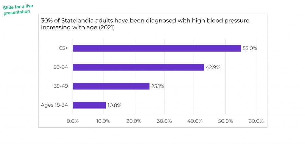
Here’s what their “before” version looked like.
The information on how many adults overall had been diagnosed with high blood pressure was tucked inside the title, while the graph focused on the breakdown by age group.
All the important details are there, hooray! But we all wanted more cohesion between the title and the graph.
Two Options for Visualizing “Overall” Data or Averages on Bar Charts
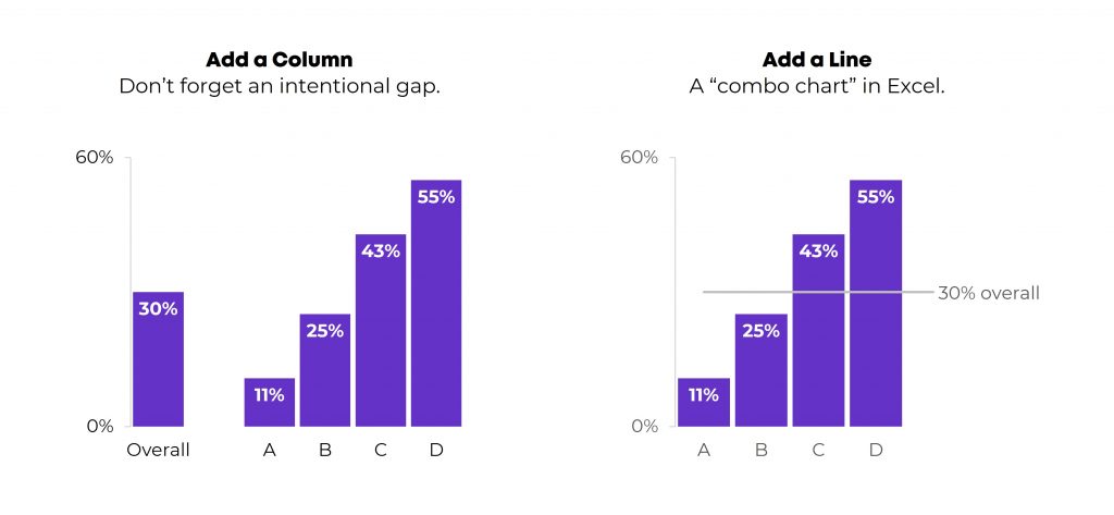
There are two primary ways to visualize our “overall” data or averages when we’re making bar or column charts.
The two options include:
- Add a column. We can add intentional gaps between the “overall” data and the subgroups. In technical terms, the space is a preattentive attribute. Preattentive attributes help our audience recognize instantly that the overall vs. subgroups are a bit different.
- Add a line. Another option is adding a line on top of the bars or columns. I’ve seen people add literal lines in Excel (Insert – Shape – Line). That works, but the fancier option is to use a Combo Chart in Excel. (If you’re not familiar with Combo Charts, you can download my template below.)
Let’s apply these two options to the blood pressure example.
Option 1: Visualize “Overall” Data by Adding a Column
I *think* this is my preferred approach. I’m still on the fence. Hmm…
A Few Quick Wins
I always start with Quick Wins. These edits can be tackled within minutes.
Quick Wins give us momentum so that we have mental energy to tackle the Not-So-Quick Wins.
Here’s what we edited:
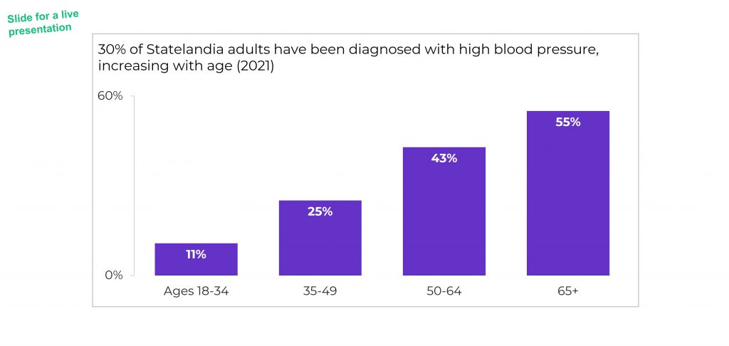
- We changed the horizontal bar chart into a vertical column chart. Age groups are ordinal, and I generally try to arrange ordinal data from left to right. You can read more about my bar vs. column logic here, and you can learn how to make this quick rotation in Excel here.
- We rounded the decimal places to the nearest whole number. You can learn more about lowering the numeracy level of our graphs here.
- We moved the percentage labels inside the columns (so they don’t accidentally make the columns look taller than they really are).
- We decluttered the graph (removing gridlines, showing fewer increments on the y-axis, tucking the labels inside the columns, etc.).
Add an “Overall” Column with an Intentional Gap
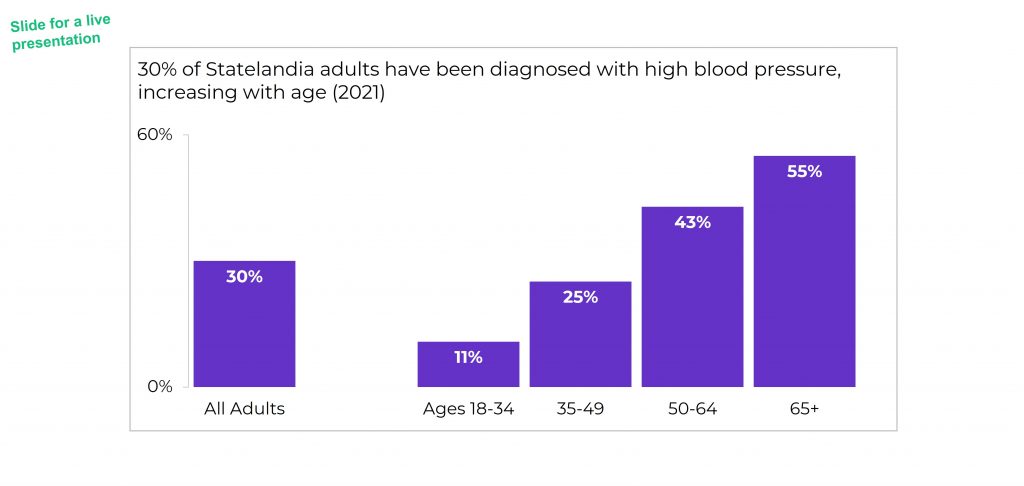
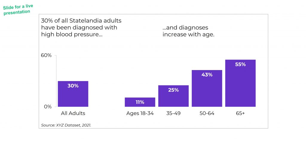
Next, we added the “overall” data to the graph as its own column.
We also spaced the overall column apart from the others. These are separate types of data (an overall number is qualitatively different from a breakout by subgroups). They need to be arranged separately on the slide.
If you’re using Excel, simply add an empty row to the table that feeds into your graph.
You can learn more about adding intentional gaps in this blog post.
Adjust the Text Placement
Next, we moved around the text boxes.
All the important text was there — but in a single full-width text box.
We simply placed “like with like” — the overall text with the overall column, and the subgroup text with the subgroup columns.
We also moved the “year” data to the source at the bottom of the slide.
Bold the Key Words & Color-Code by Category
For extra skimmability, we bolded a few key words.
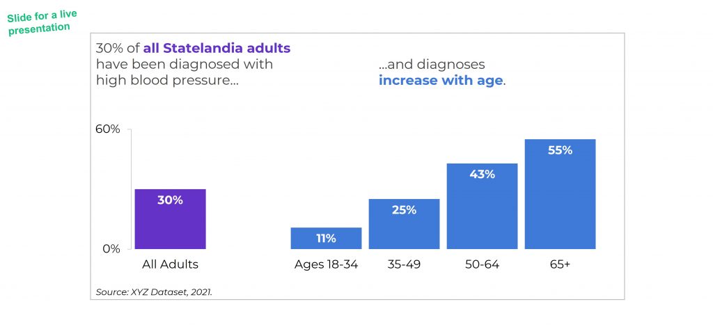
Then, we adjusted the colors. Separate colors for separate categories of information.
Color-coding by category is one of my all-time favorite dataviz techniques! You can see color-coding applied to one-pagers, recurring monthly reports, technical reports, and slideshows in these linked examples.
The final version would look like this:
Option 2: Visualizing “Overall” Data by Adding a Line
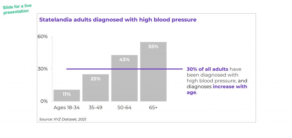
I love adding lines to visualize targets and goals.
We can add lines to visualize “overall” or “average” data, too.
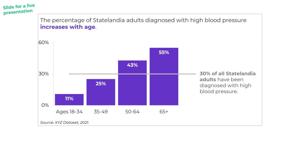
BUT make sure to gray out something. Otherwise, the line chart gets messy.
You might gray out the columns, like this:
Or, you might gray out the line, like this:
Visualizing “Overall” Data on Line Charts
It’s easy to apply these techniques to line charts.
Just add another line!
Your Turn
Which approach is your favorite?
Adding a column?
Or adding a line?
And why?
For this case study, I prefer adding a column because it was easier to arrange the takeaway text in the right places (the takeaway text is simply above the columns). For the line charts, the takeaway text didn’t feel as seamless.
Comment below and share your own insights.
Bonus: Download My Spreadsheet
Not familiar with the intentional spacing in the bar chart?
Not familiar with the combo chart design in the line chart?