This is an Eval Central archive copy, find the original at depictdatastudio.com.
Colors can make or break a chart.
Colors direct our eye movements, and therefore our brains and attention.
It’s up to you: will you help or hinder your reader’s understanding?
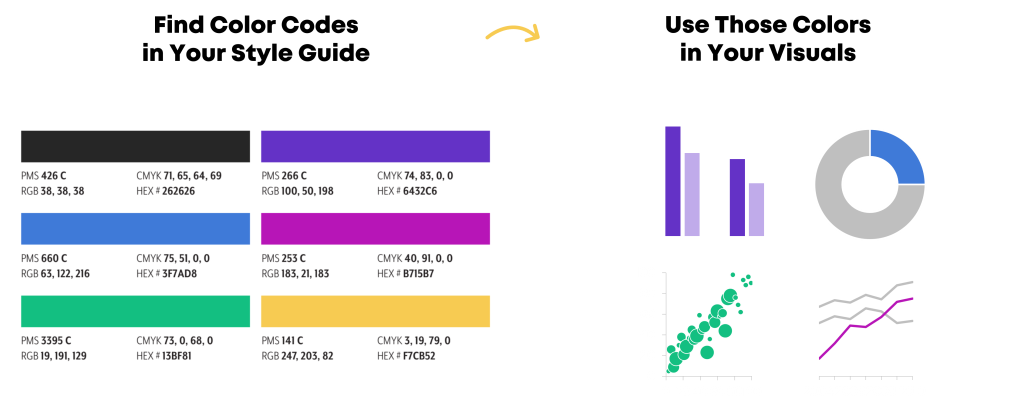
Step 1: Start with Your Brand Colors
Otherwise, your graphs, slides, and dashboards will be Frankensteined.
I’ve written about brand colors and brand presents in other posts.
Some of those resources include:
Step 2: Do Your Accessibility Testing
I’ve written about colorblindness, color contrast, grayscale printing in other posts.
Some of those resources include:
Then, your accessibility testing “results” should go inside your organization’s Dataviz Style Guide.
Step 3: Apply Those Brand Colors According to the Data & Variables
Now, it’s time to apply those branding colors to ensure that your graph is intuitive.
Look at your graph: Is your variable binary, sequential, diverging, or categorical?
Or, do you want to tell a story with a dark-light contrast?
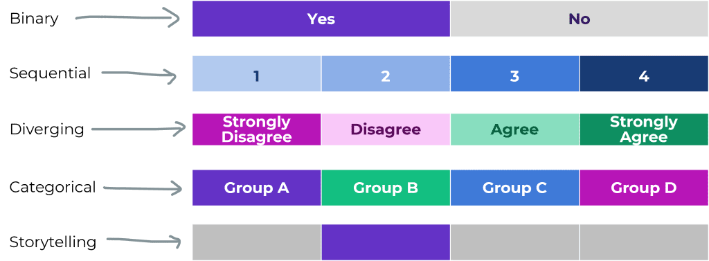
Binary Variables Get Binary Color Schemes
Binary variables include yes/no data, such as:
- yes/no survey questions
- people who speak Portuguese as their primary language vs. people who don’t
- people who own a home vs. people who don’t
- people who graduated from program on time vs. people who didn’t
- people diagnosed with an illness vs. people who don’t have it
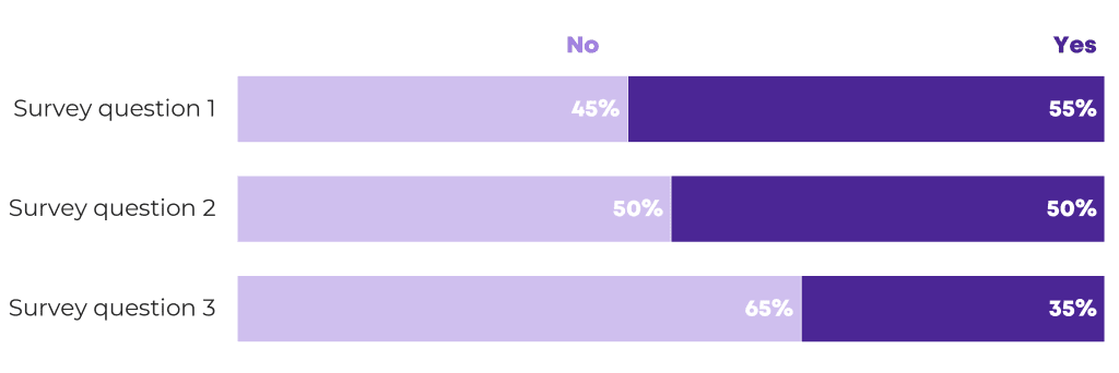
For binary variables, choose one brand color. The “presence” of the attribute gets the darker color, and the “absence” of the attribute gets the lighter color.
Here’s an example:
Sequential Variables Get Sequential Color Schemes
a.k.a. ordinal
Sequential variables have a natural order.
Examples include:
- age ranges (5-9 year olds, 10-14 year olds, and 15-19 year olds)
- income levels
- highest educational level completed (some high school, high school diploma, some college, etc.)
- years (Year 1, Year 2, and Year 3 of a project)
- semesters (fall, spring, fall, spring…)
- cohorts (first cohort of participants, second cohort, etc.)
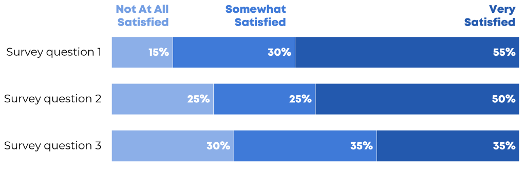
For sequential variables, choose one brand color, and use a light-dark gradation of that color.
Here’s an example:
Categorical Variables Get Categorical Color Schemes
a.k.a. nominal
Categorical variables include:
- race/ethnicity (African American, Asian, Hispanic/Latin@, White, etc.)
- gender (male, female, nonbinary, genderfluid, etc.)
- chapters of a report
- sections of a presentation
- categories of a dashboard
For categorical variables, use a different brand color for each category.
Here’s an example:

Diverging Variables Get Diverging Color Schemes
Diverging variables are opposites.
Examples include:
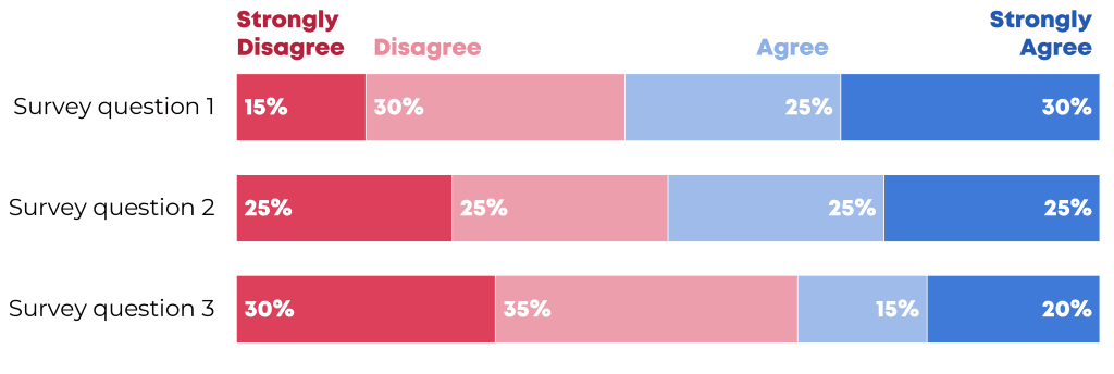
- agree/disagree scales on surveys
- changes over time (e.g., “50 percent decrease” or “70 percent increase”)
For diverging variables, choose two brand colors, and place the darkest shades on the poles.
Here’s an example:
Combining these Techniques
In most real-life projects, we need to combine these color techniques.
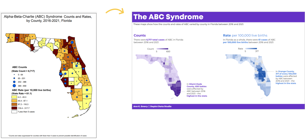
In this map makeover, for example, we needed to:
- use brand colors, not software defaults;
- use two brand colors, one for each category; and
- apply a dark-light gradation to each map, because these are ordinal variables.
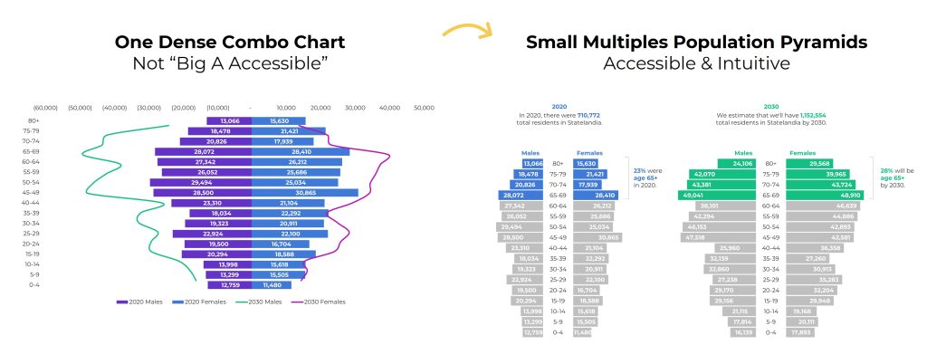
In this population pyramid makeover, we needed to:
- use two brand colors, one for each timeframe, and
- apply a dark-light storytelling emphasis to each pyramid.
Your Turn
What types of color questions do you have? Comment below..