This is an Eval Central archive copy, find the original at depictdatastudio.com.
Hello. I am Barbara Klugman, strategy and evaluation practitioner based in Cape Town, South Africa.
Under the guidance of the inestimable Ann Emery’s “Report Redesign” course, I had a go at making the contents page of a previous evaluation report meaningful.
Here are the steps I followed.
For anonymity, I have renamed the evaluand as (gender org) and the funder as (funder).
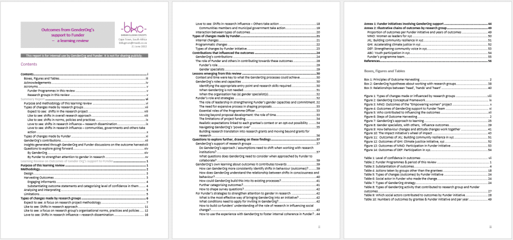
The Original
Here’s what the initial Table of Contents looked like:
Draft 1
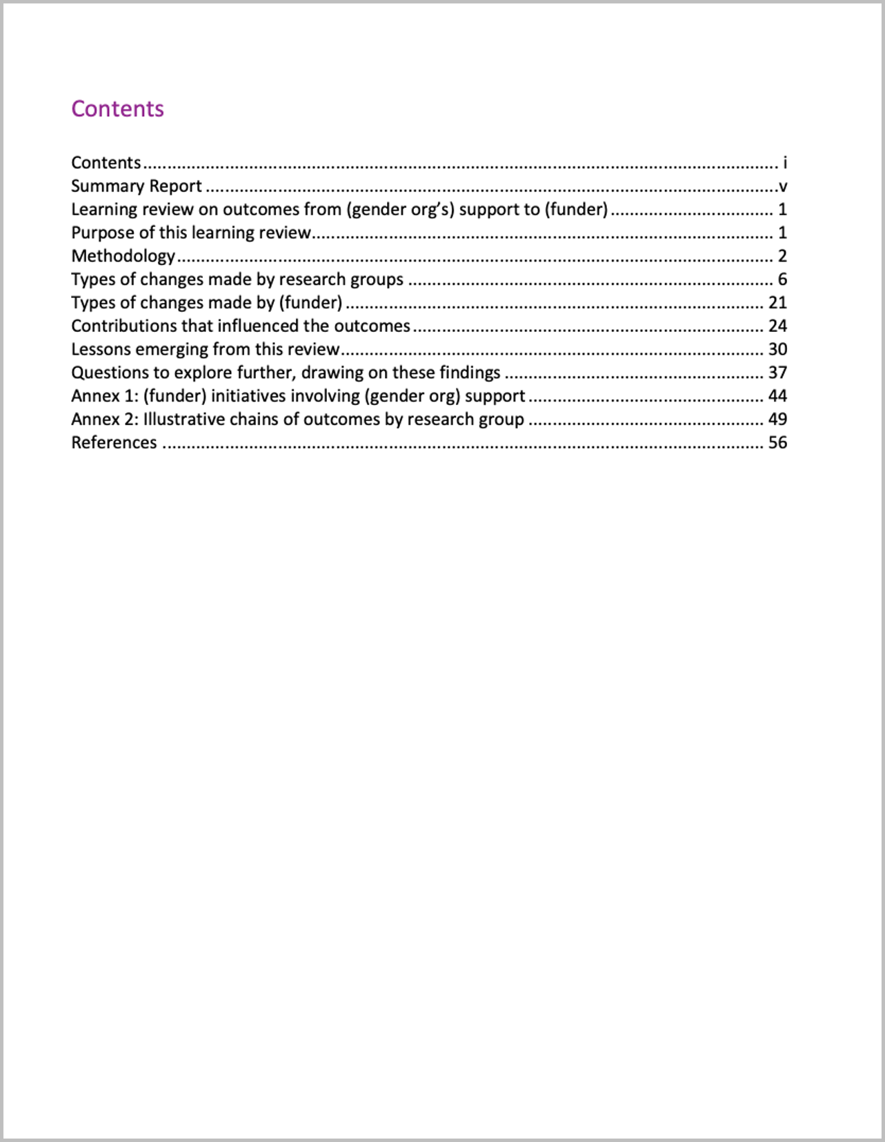
I cut my multi-page contents page from three heading levels to only Heading 1s.
Draft 2
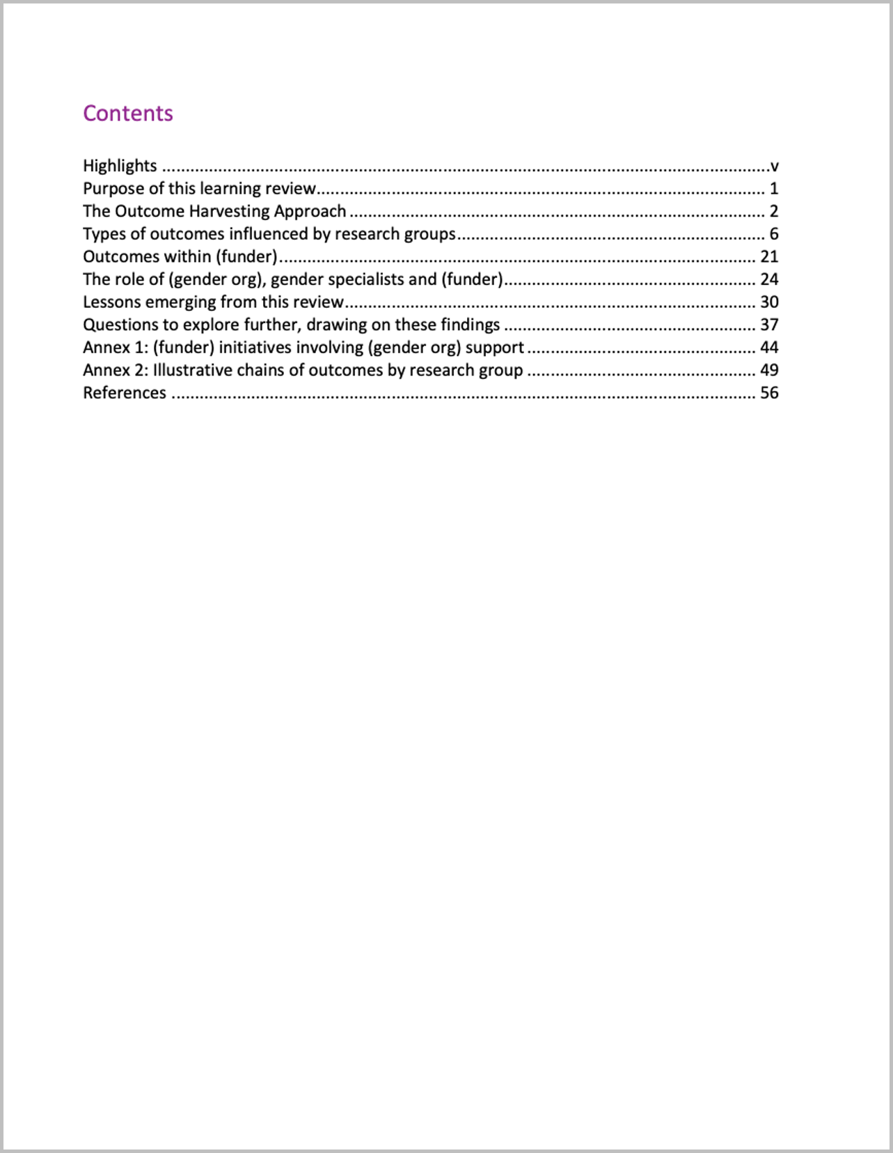
I changed some headings to be more meaningful.
For example,
- from ‘Summary Report’ to ‘Highlights’
- from ‘Methodology’ to ‘The Outcome Harvesting Approach’; and
- from ‘Contributions that influenced the outcomes’ to ‘The role of (gender org), gender specialists and (funder)’.
Draft 3
I grouped the headings, named the groups, and set it up in landscape.
I also enlarged ‘Contents,’ in response to one of Ann’s ongoing exhortations to “double the size of the headings from what you currently use.”
I moved from Word into PowerPoint.
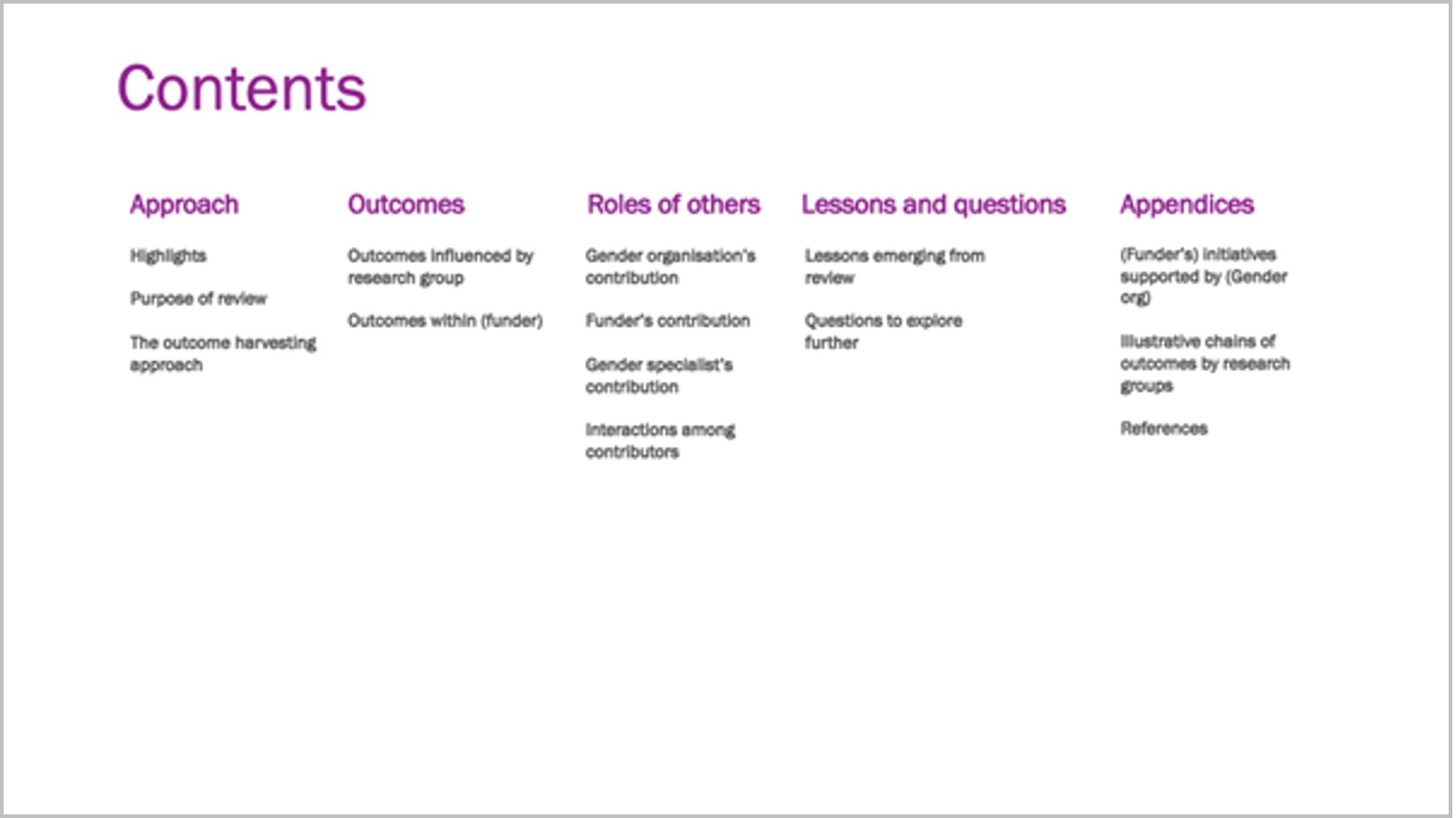
Draft 4
I created a section divider in my brand colours and added icons.
Ann proposes use of such dividers for short reports, with a different colour for each section – in long reports you’d use a whole page for each section.
I used her ’20-minute page cover’ method by layering a cylinder shape in my brand colour, somewhat transparent, over a Word Cloud, and ‘Contents’ on top.
I added an icon to each section and recoloured the sections to colours I will use for the divider page and headings of each section, taken from my brand colours.
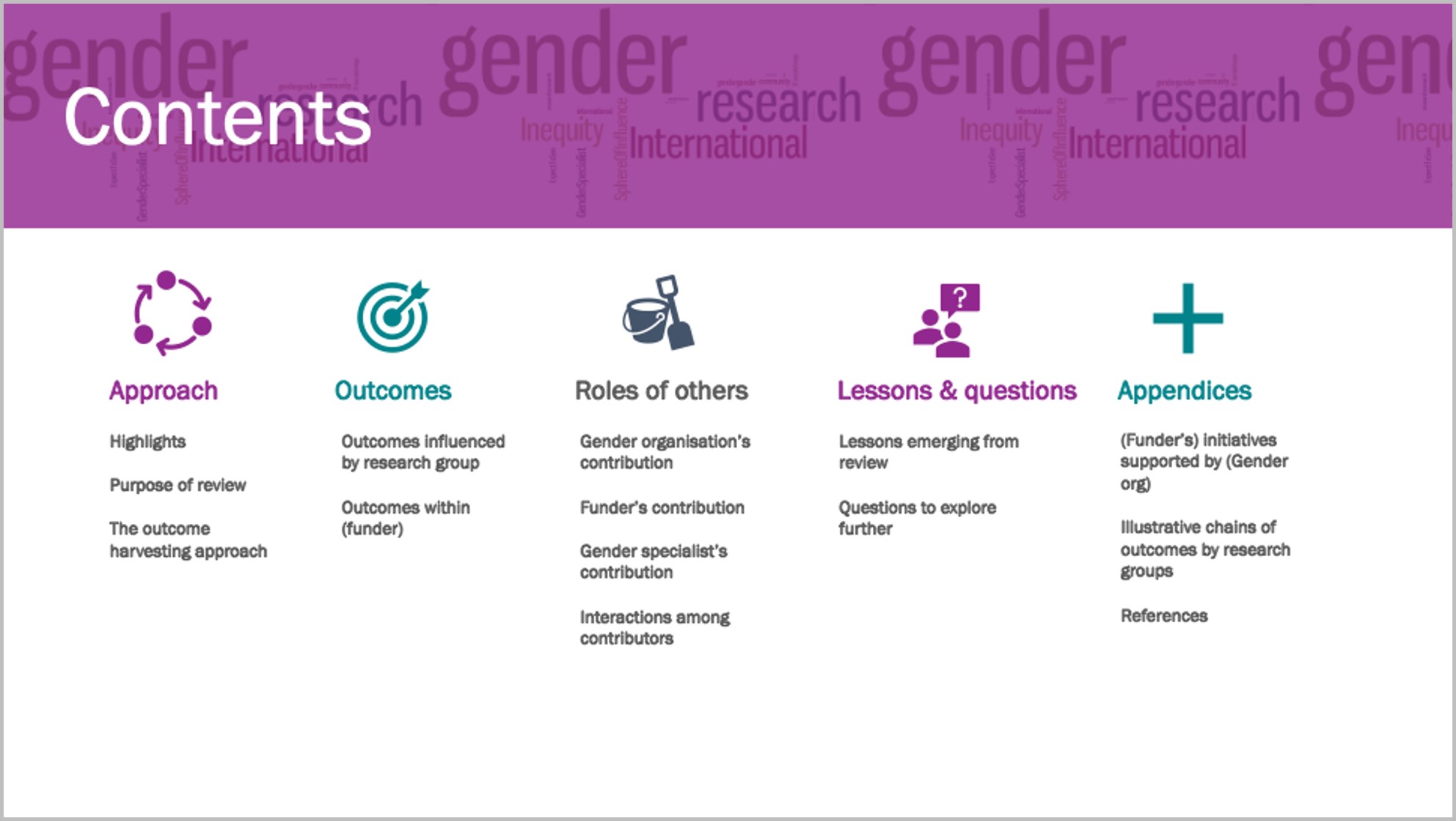
Draft 5
I re-coloured the section divider and put in page numbers.
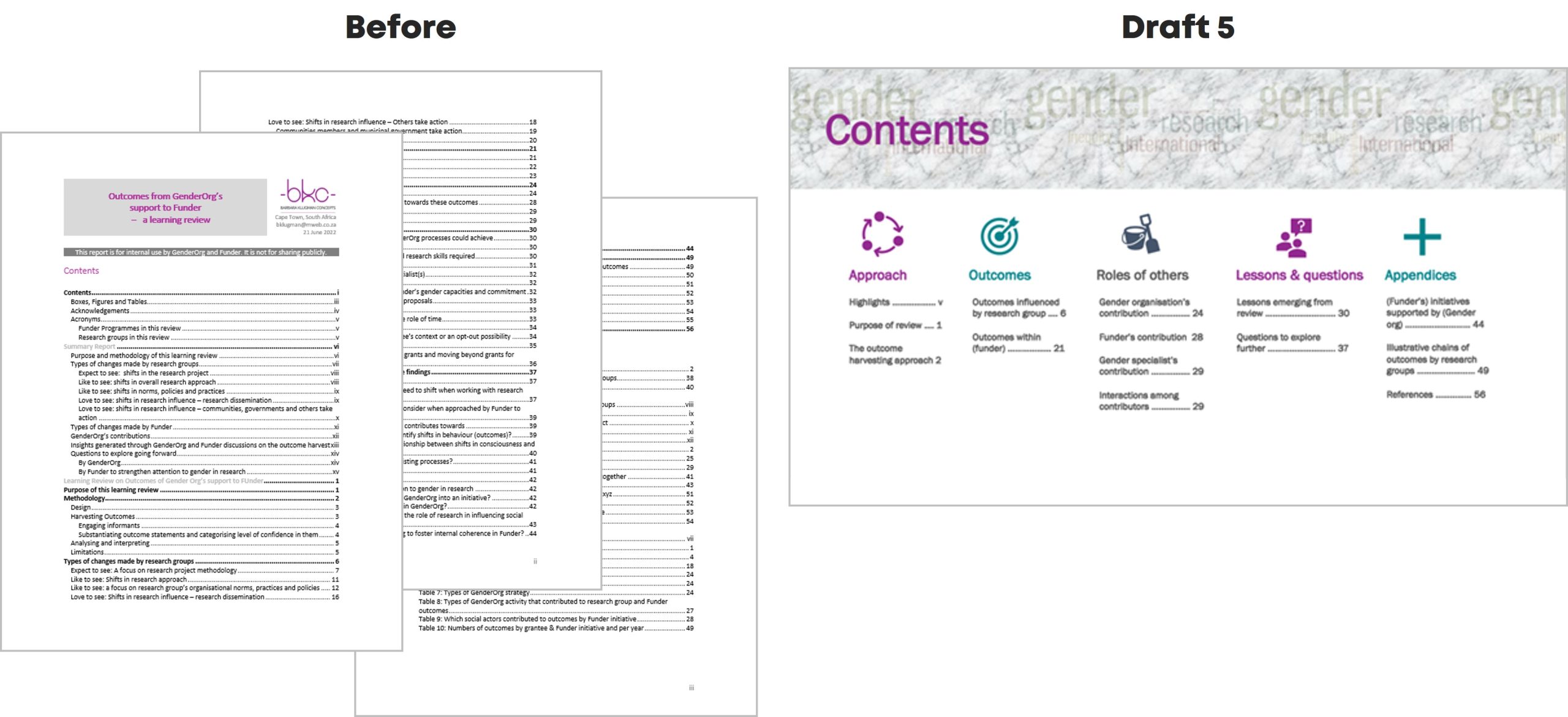
As ‘gender’ in the Word Cloud overwhelmed the heading, I used the ‘textures’ option in ‘format colours’ to create a grey textured layer over the Word Cloud, and changed the colour of ‘Contents.’
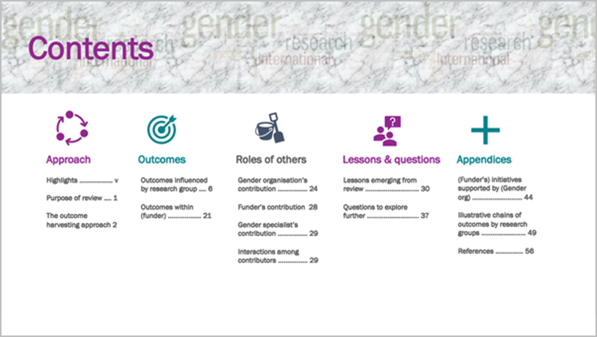
To me this shift from a pro-forma contents page to this version invites the reader to find what they’re looking for in the report.
Going forward, I would plan this out before writing the report, to help organise my own thinking about the contents and how to communicate it.
Thanks to Ann.
