This is an Eval Central archive copy, find the original at depictdatastudio.com.
Josephine Engels is an Evaluation Specialist at Mental Health America of Greater Houston. She enrolled in our Dashboard Design course and is sharing how she uses her new skills in real life. Thanks for sharing, Josephine! –Ann
—
Are you tired of text heavy reports to summarize grant findings?
Do you want to update the look and feel of your reporting templates?
Save time and energy by using static Excel dashboards to design your grant deliverables.
Your program data will come to life before your eyes and your readers will thank you.
Read on to learn more about my journey implementing static dashboards in a non-profit context.
Dashboard Design Course Comes to the Rescue
New to dashboard design, I enrolled in Ann K. Emery’s Dashboard Design course to help tackle an upcoming grant report with many moving parts.
Mental Health America of Greater Houston’s (MHAGH) Center for School Behavioral Health (CSBH) received a two-year grant from the Rebuild Texas Fund in 2018 to help 9 school districts in the Greater Houston Area address emerging behavioral health needs from Hurricane Harvey and improve their ability to respond to future disasters.
My Challenge: 9 School Districts x 21 Recommendations
To assess school district capacity for addressing student behavioral health needs, CSBH uses a rubric with 21 recommendations for addressing the prevention, early intervention, and treatment of behavioral health issues in students.
My challenge was to show the progress each of the 9 Rebuild Texas school districts made implementing the 21 recommendations from start to finish of the grant.
Using Static Dashboards to Track Progress Over Time
Cue the entrance of a tool that saved me time and created a great looking end-product: static Excel dashboards.
Here’s how I created two different styles of dashboards: A project overview, and individual report cards for each district.
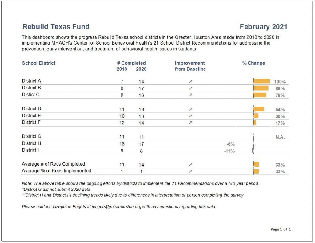
Dashboard Showing the General Overview
To create a general overview tracking school district progress, I did the following:
- Clustered school districts in groups of 3 and added grey lines for easier reading.
- Used the start and end years to list how many recommendations were completed.
- Inserted trend arrows to show which districts had improved. I decided to remove the arrows for neutral or declining trends to simplify takeaways and make the report less “busy” for the reader.
- Inserted deviation bars to show percentage of change from start to end.
- Ordered results from largest to smallest amount of change.
Individual District Report Cards
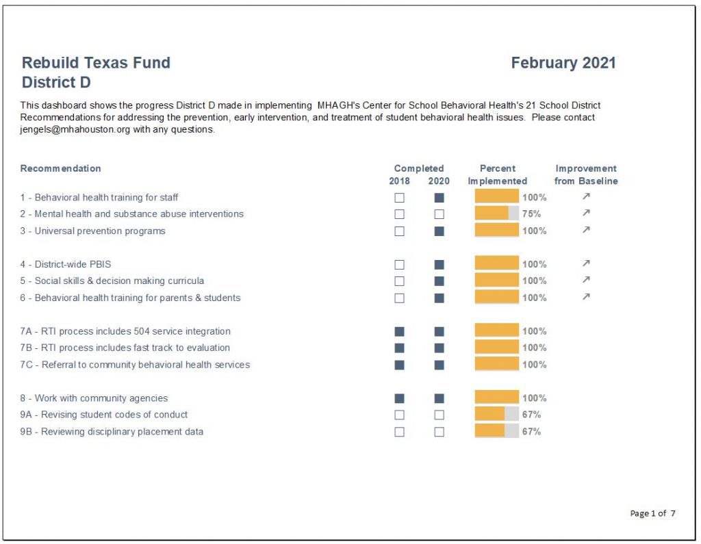
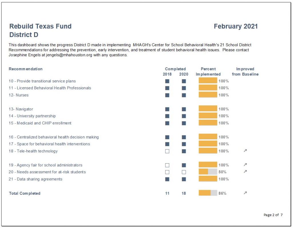
I then created individual district report cards by:
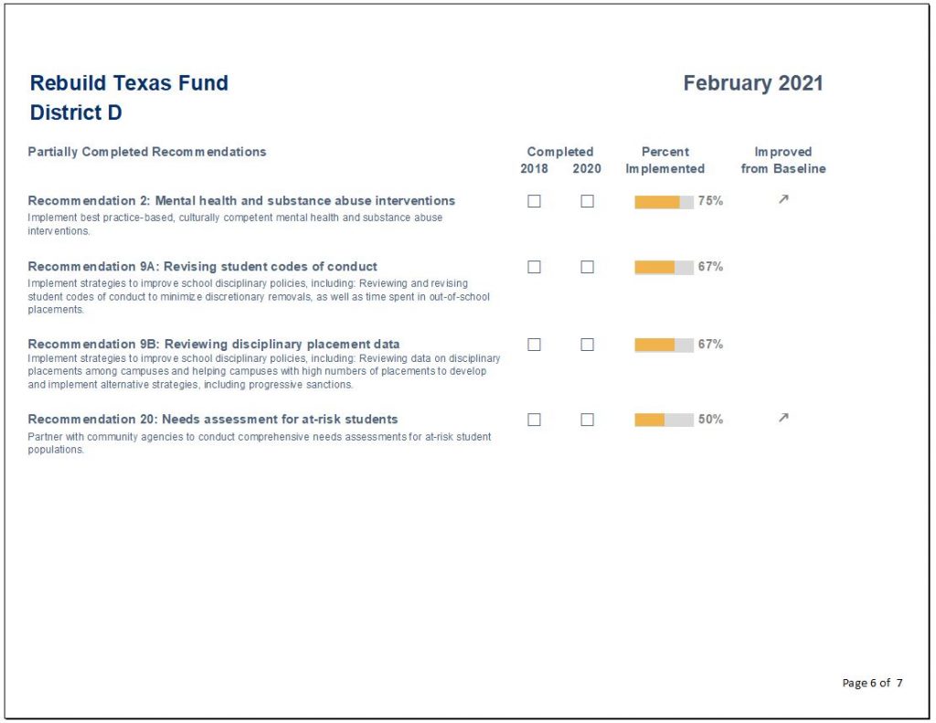
- Inserting checkboxes to indicate recommendation completion.
- Replacing deviation bars with progress bars to show the depth of implementation of each recommendation.
- Including grey shading in the background of the progress bars to indicate progress remaining.
- Inserting trend arrows to further indicate improvement since there might have been progress in implementation even though the recommendation was incomplete.
Recommendation-by-Recommendation Summary
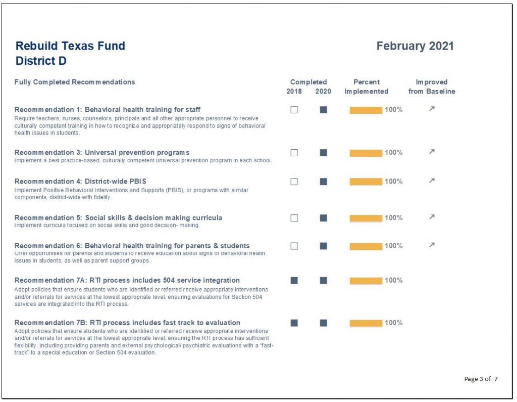
I also included a recommendation-by-recommendation summary, which was categorized by fully and partially completed recommendations.
Conclusions Section
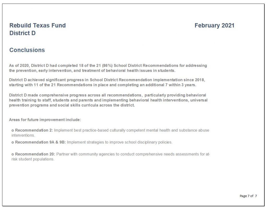
Finally, I created a section for conclusions to inform the reader of the progress made as well as areas for future improvement.
Lessons Learned
Here are three lessons learned.
Excel is so Versatile
Excel is much more versatile than I thought.
There are so many functions in Excel that I was underutilizing, so many hidden treasures.
The amount of visualization that can be done with the conditional formatting command alone was eye opening.
Why pay more for expensive software when Excel can do the work?
Save Time Using Only One Software
Transferring work from Excel into other products can be overkill when you can just do it all in Excel.
Save time by designing single or multi-page reports in Excel. A cinch after taking the Dashboard Design course.
Formatting Matters
This course helped me break bad habits and reconsider my assumptions.
Here are some formatting takeaways:
- There is such a thing as using too much bold text.
- Consider using landscape view when designing reports. It’s easier on your reader not to have so many items crammed into a narrow portrait view.
- Use more white space, less is more.
- Webdings and Wingdings font, who knew?
Colleague Reception
While I enrolled in the Dashboard Design course to help me with a very specific project in mind, I have since designed static dashboards for all of my organization’s program areas and am only getting started!
My colleagues have given very positive feedback, as the dashboards have made it easier to analyze their program data more comprehensively.
They especially appreciate one-pagers that can be shared with different stakeholders, including board members and program collaborators.
Upcoming Goals
Next on my list is using automation to create a series of matching goal tracking dashboards that let programs see their progress toward grant metrics by funder. I am embracing automation in 2022!
I’ll also be visualizing accounting data to help programs get a better understanding of their funding use. The areas for application within our organization are endless.
I hope other non-profit professionals working with data will be able to take advantage of this wonderful opportunity.
Connect with Josephine Engels
LinkedIn: https://www.linkedin.com/in/josephine-engels-mhagh/