This is an Eval Central archive copy, find the original at depictdatastudio.com.
Bob Coulter is the director of the Litzsinger Road Ecology Center, a 38-acre field site in suburban St. Louis. He’s also a Depict Data Studio student and when he shared his work in our graduation ceremony, I knew it needed to be showcased. Keep up the great work Bob! – Ann
__________________________
For the past few months, I’ve been developing dashboards to support students’ understanding of local ecology and equip them to use that local understanding as a baseline to explore the rest of the world.
Imagine, for example, being a 10-year-old in St. Louis.
Your neighborhood has plenty of trees since you’re at the western edge of the forests typical of the eastern US. This can only happen because the temperature is warm enough and there is enough precipitation to support tree growth.
Heading west from here the ecology shifts pretty quickly to grasslands, with the grass getting shorter as you approach the Rocky Mountains. A quick look at the data shows decreasing levels of precipitation as you head west.
For a more extreme contrast, Yuma, Arizona is much hotter, but the area gets about 10% of the precipitation St. Louis does. How is this heat and lack of precipitation reflected in the plants and animals in southern Arizona?
All of this learning is wrapped under the heading “What’s It Like Where You Live?” – a program I used as a 4th grade teacher 25 years ago, developed by the Missouri Botanical Garden and now undergoing a major reworking.
As we flesh out the curriculum, we’ll be supporting kids’ local field work with dashboards synthesizing climate data and images of plants and animals typically found in different ecoregions.
First Forays
At a basic level, students can compare temperature and precipitation data for their local community with data for other cities around the world. Is it warmer or cooler, wetter or drier?
A simple table or a scatter plot serves the purpose quite well. The limit in this approach is the image students often develop when data from one city represents “the desert” or “the rainforest.”

Resolving this conundrum has opened the door to some exploratory work crafting dashboards which encompass both similarities and variation within an ecoregion. (Mostly I’ve just been geeking out with the data, but “exploratory research and development” sounds so much better!)
Refinements
Taking the data visualizations further has pushed me to walk a fine line between interesting visualizations and the developmental capacities pre-teen students bring to the task.
Most kids have limited experience with data tables and graphs, and what work they have done is pretty specific (such as graphing pizza preferences among class members).
Graphs showing means (or even means of means) risks becoming too abstract without the right supports.
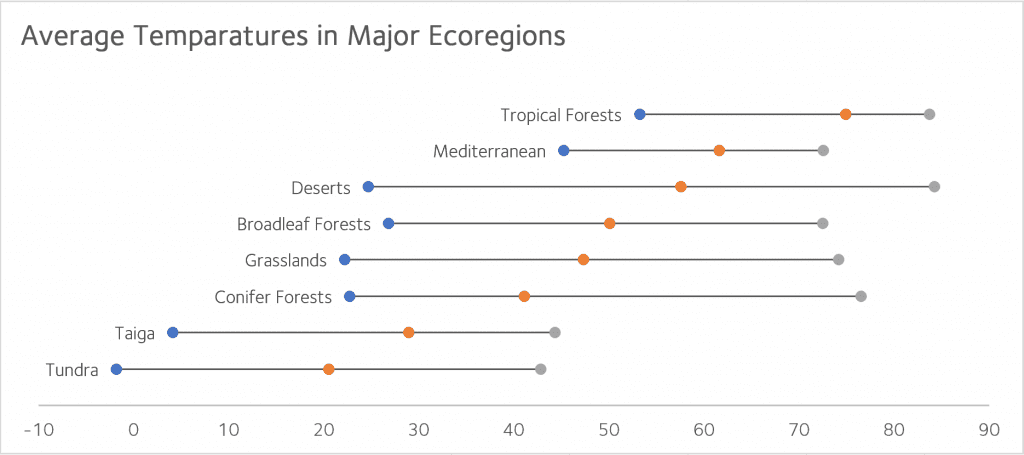
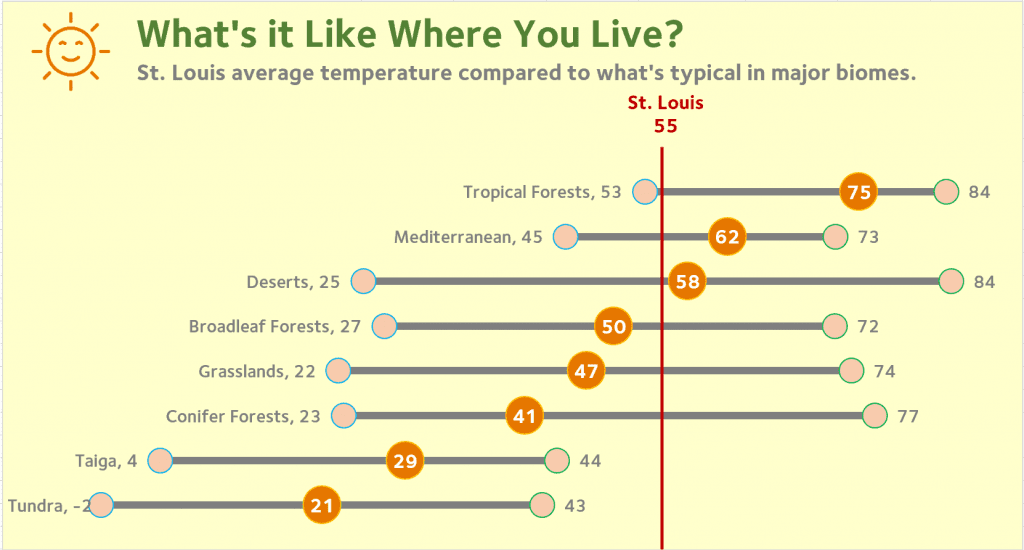
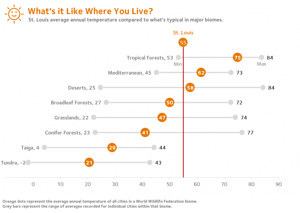
After exploring a few options, I settled on a representation which captured both the spread of data typical of cities in a given ecoregion and the mean value of these cities.

Major thanks are due here to Ann Emery for streamlining the look and feel of this version. Her focused, uncluttered design aesthetic is a perfect match for this work.

I’ve tested this out with a few kids with good results, but COVID restrictions have kept me from seeing how a broader pool of students make sense of this display. I’m hopeful that restrictions will be lifted in the new school year so we can move forward with some pilot testing.
Going Further
To be sure students remain connected to their local base, I needed an anchor which is ideally movable so that students in other areas can use the materials. For this, I’m indebted to Jon Schwabish of the Urban Institute and PolicyViz.
While participating in a workshop he led, a couple of techniques we were using came together. By combining a single point scatter plot and error bars, a reference line can be inserted to mark local conditions.
If this strategy proves useful in our pilot testing, I expect that we will be able to support localization so that students anywhere could enter their own data and have VLOOKUP or a similar procedure to change my St. Louis reference line to one appropriate for any student’s home city.
The work so far has been an enjoyable way to explore data and apply the many things I’ve learned in Ann’s workshops and elsewhere. I’m looking forward to seeing how students use the data when we begin pilot testing.