This is an Eval Central archive copy, find the original at depictdatastudio.com.
Our organizations collect all this data—through surveys, assessments, interviews, and so on—and then what?
The default: The data just sits there inside a Dusty Shelf Report.
But what if your data could actually inform real-life decisions?
I recently sat down with Vivian Jefferson from Loudoun County Public Schools, a growing district in the Washington, D.C. metro area.
Vivian and I are both members of the same Facebook group (a community for everyone taking data visualization training with me).
A couple weeks ago, Vivian mentioned that her graphs had been featured on the news (!!!).
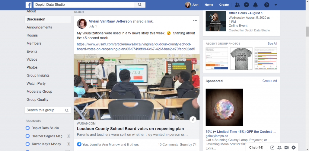
The topic was school reopening plans for the 2020-2021 academic year. Vivian and her colleagues had collected surveys from parents and teachers to gauge their opinions.
Watch the Conversation Below
Vivian and I talked about the 52,000 surveys that her office designed, administered, cleaned, and visualized within a two-week timeframe.
She’ll teach you how they visualized the data, making sure to have detailed reports for technical audiences and a storytelling slideshow for a school board meeting with hundreds of attendees.
And, she’ll tell you how her graphs ended up being featured inside a news story for an even broader audience.
About Vivian Jefferson
Vivian works in the research office of Loudoun County Public Schools in Virginia. The district is one of the largest in the state, with 83,000 students and 94 school facilities (and counting–they open a new school almost every year!). They average about 2,500 new students each year.
The research office is a four-person team consisting of a program analyst, data analyst, office supervisor, and Vivian, who manages surveys.
How Vivian’s Role Has Shifted Due to COVID-19
Vivian noted that the data requests have been more urgent and bigger in size as the leadership tries to make decisions quickly. Loudoun County Public Schools closed in early March but was able to implement some online learning using existing tools.
“The leadership wanted to monitor how that was going: Are students logging in, are they engaged? What we found was that the tools that we had couldn’t necessarily collect all of that data. We could tell how many students were logging in, but not if that were completing the activities or for how long they were logged in,” said Vivian.
Vivian and her colleagues have been doing more surveys to try and find where people stand and what their concerns are.
Vivian also said that the biggest impact she feels has been on what they haven’t been able to do.
In the spring, they usually conduct assessments to see how students have progressed. They haven’t been able to do that, so they don’t know if the interventions they had in place worked. They also don’t know what the student needs and strengths are going into the next school year.
“We won’t have the whole last quarter of data to be able to compare with previous years. Anytime we see trend data for 2020, it’s going to have an asterisk that it’s showing only three-quarters of the data. And I think that’s probably happening all over with school districts across the country,” Vivian said.
Designing the School Reopening Surveys
Let’s dive into the survey that was featured on the news.
School leaders requested a “survey of families and staff to see where their comfort level is with these three models that we’ve developed, what they’re concerned about and their needs are.” The school system was considering three models: 100% in-person, 100% virtual, or a hybrid.
Vivian’s office designed and administered two surveys: one for parents and one for all school-based staff, such as administrators, office staff, and other professionals in addition to teachers.
They reviewed similar surveys from other school districts, and then added questions specific to their own county.
Parents were asked about their spring 2020 online learning experience; which of the three reopening models they preferred; whether they had computer access for distance learning; and more.
Staff were asked whether they received the support and resources they needed in spring 2020; whether they would be comfortable being inside a classroom with physical distancing measures in place; and whether they were comfortable taking their temperatures and wearing face coverings.
Then, the surveys were translated into Spanish, and links were emailed to parents and staff, and further promoted on social media.
Collecting the Survey Responses
Vivian said, “We knew we were going to get a lot interest in it because it’s such a hot topic. We do a school climate survey every spring for staff and parents. The parent survey usually gets 11,000 to 12,000 responses. This survey had 46,000 parents respond. And then about 6,000 staff responded (usually only a couple thousand respond). It was huge.”
Vivian’s office designed the surveys, collected 52,000 responses, and compiled the data into reports and a slideshow within just two weeks.
Visualizing the Data
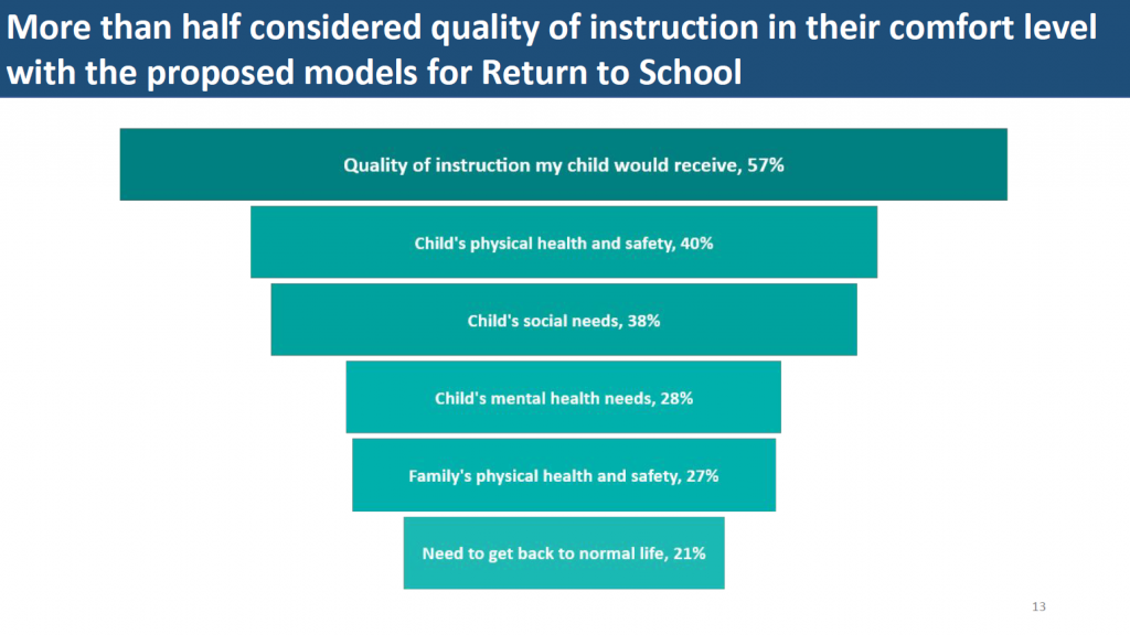
Vivian color-coded the data to make the categories easier to navigate. For example, they consistently used teal for elementary schools, orange for middle schools, gold for high schools, and blue for the county.
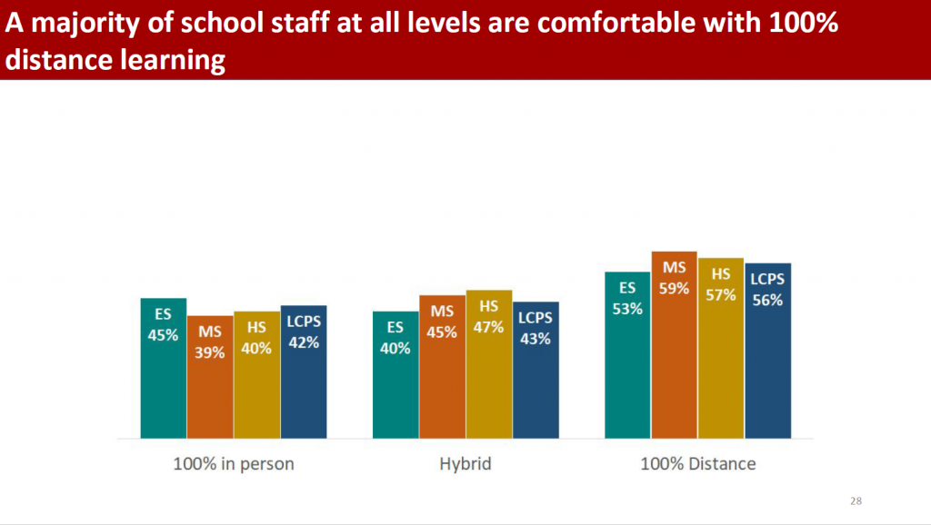
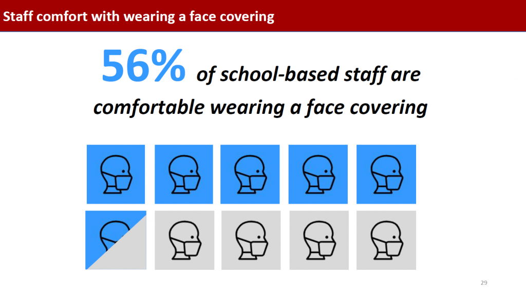
Vivian also drew attention to key findings by making pieces of the visuals darker or lighter:
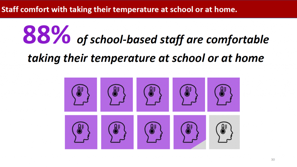
Vivian also said that, “On the titles of the slides, I tried to pull out what the main finding was, to highlight what they should be looking for.”
The Reporting Model
I personally love the reporting model that Vivian’s office followed.
They developed two detailed reports plus a slideshow with key findings. And, the news story provided a high-level overview. There’s something available for every type of audience.
Vivian and her colleagues have evolved their communications strategy. “When I first started there 14 years ago, we were doing the full Dusty Shelf Reports. Over the past few years, we’ve realized that our decision makers need data to make policy and decisions within a few weeks. They don’t have time to wait for a year long, in-depth program evaluation. We’ve been kind of gearing up for a fast response model of reporting anyway, but this was really fast.”
Two 13-Page Technical Reports
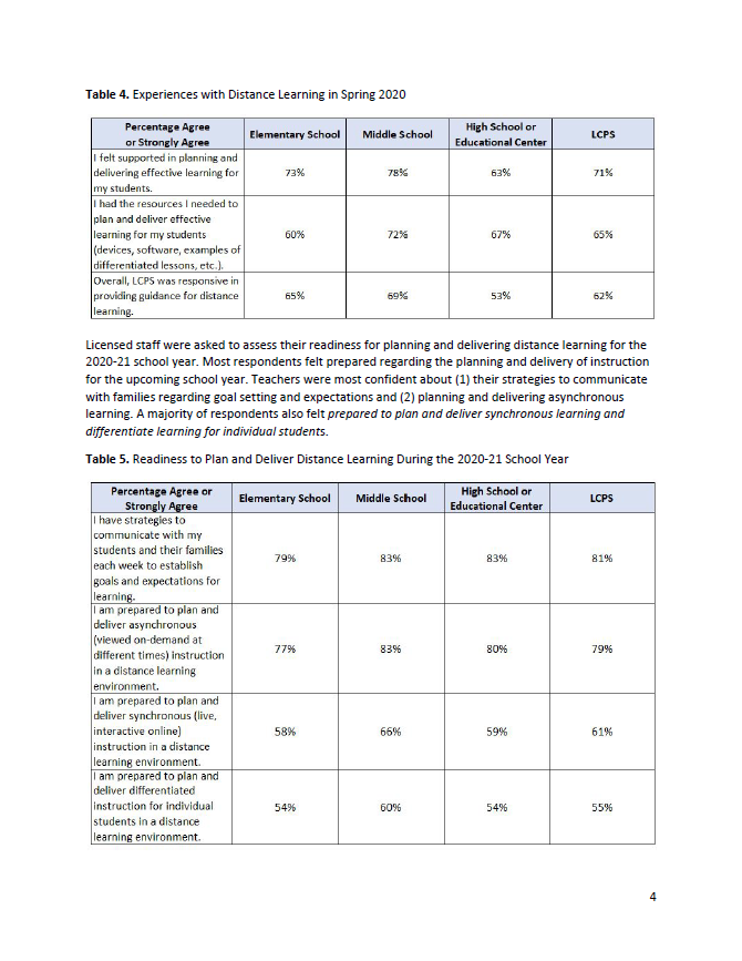
Vivian’s office shared detailed results within two 13-page reports, one for the parent survey and one for the staff survey.
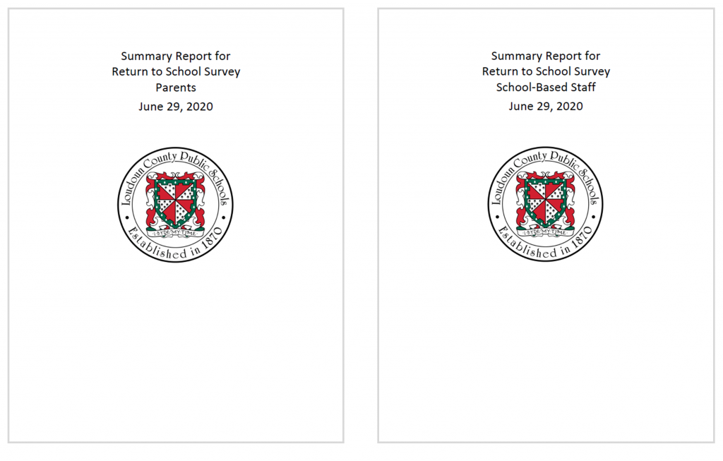
These reports contained tables of both quantitative and qualitative survey results.
The Slideshow
Vivian and her colleagues also developed a slideshow, which would be presented at a school board meeting. The slideshow was viewed by school board members, administrators, staff, and parents.
The News Story
Finally, the news article and 90-second video provided a high-level overview of the survey results.
Vivian said she was very surprised to see that someone on a Facebook group she’s a member of linked to the new story and said, “LCPS was on the news today!”
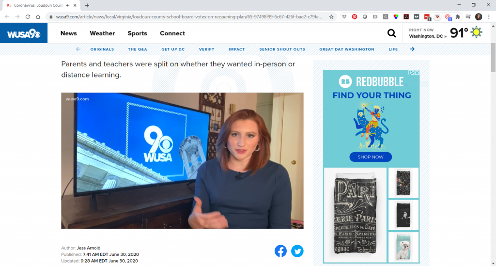
“I thought, ‘I wonder what they said?’ And I clicked on it, and watched it, and I almost fell out of my chair, literally. They had used the graphs from my presentation!” she said.
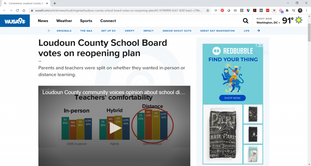
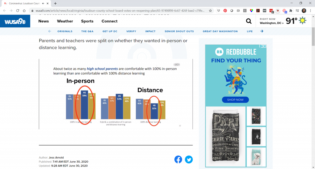
The news station used several of Vivian’s graphs, even enhancing one by circling one set of columns that they wanted to draw attention to.
The news story combined the survey’s quantitative data with audio clips from the public comment portion of the school meeting:
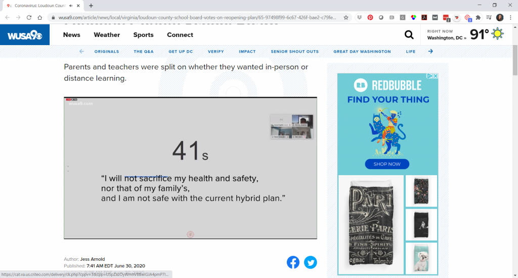
“I knew that people would be looking at the report, but I thought mainly like the school board, people who tuned in to watch the school board meeting,” Vivian mentioned. “But I didn’t realize that people would take anything from it and use it in a different way.”
Reactions from the School Board and Parents
And, a couple days after the school board meeting, Vivian was out shopping in a store and overheard a couple parents discussing statistics from the report.
The school board also gave Vivian’s office good feedback on the data.
Loudoun County Public Schools had considered three models for the 2020-2021 academic year:
- 100% in-person
- 100% virtual
- A hybrid model
The school system opted for the hybrid model, in which half the students would be in school at a time. Parents will also have the option to opt-out and follow 100% virtual learning.
Note: Vivian reached out to let us know that “as typical of the times we are in, this week the school board and superintendent changed the reopening plan to be all distance learning at first, with a phased approach to the hybrid model. You can see their revised plan here: Revised Plan for 2020-21.
Learn More about Vivian’s Survey
The survey results were shared publicly on the school board’s site.
- The slides that were presented at the school board meeting in June 2020.
- The tables from the parent survey.
- The tables from the staff survey.
Connect with Vivian Jefferson on LinkedIn.
Your Turn
Comment below. Let us know which part of the conversation resonated with you the most.