This is an Eval Central archive copy, find the original at depictdatastudio.com.
Are your takeaway findings getting lost?
Bad graphs can slow down the viewer’s comprehension… increase cognitive load… and fail to inform decision-making processes.
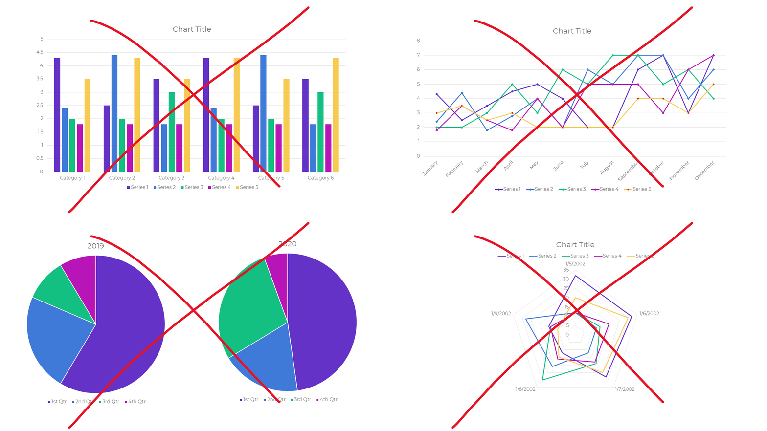
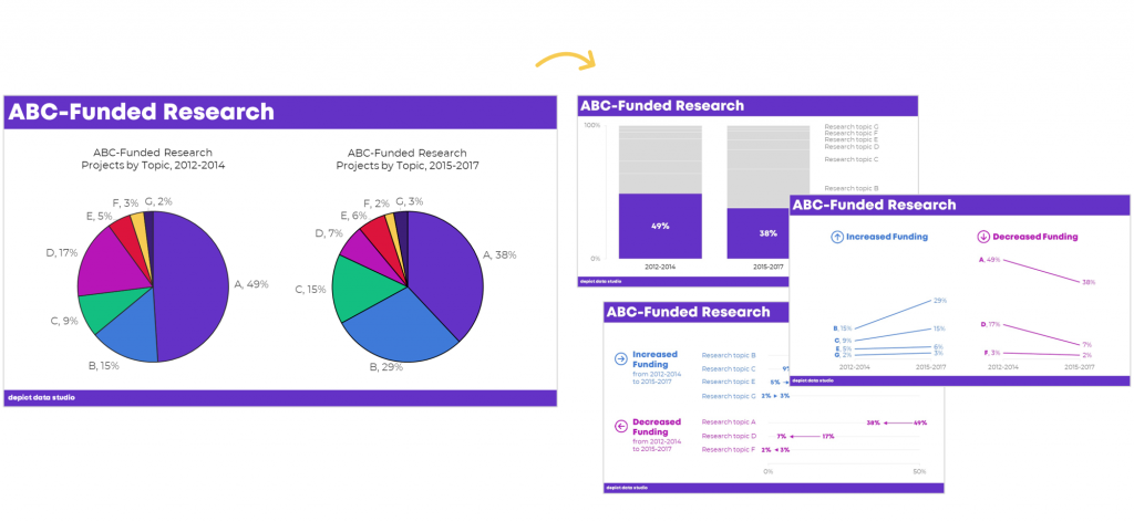
Dusty Shelf Reports aren’t inevitable.
With intentional editing, you can design visualizations that inform and inspire–right inside of Excel, PowerPoint, and Word.
You don’t have to be a computer programmer or a graphic designer to be a great communicator.
I started building this course three years ago.
We added to it, and added to it, and added to it.
We quadrupled the videos and templates. We added Office Hours so you can pick my brain about your individual projects. We added Discussion Boards and a Facebook group to build community. We added Guest Experts so you can learn about programs beyond Excel. We added Lifetime Access.
This Excel dataviz training is the best it’s ever been.
Great Graphs: Excel How To’s is open for registration this week only.
What’s Included in Great Graphs: Excel How-To’s
- 142+ video lessons that you can watch anytime
- Step-by-step instructions for making beginner, intermediate, and advanced graphs in Excel
- 18+ templates to download and follow along
- Discussion boards to interact with fellow dataviz enthusiasts
- 2 Office Hours sessions every month to talk about your projects and hear from guest speakers
- Private Facebook community of fellow participants
- Weekly emails to cheer you on
- Lifetime access so you don’t feel rushed
- Examples from a variety of industries (public health, juvenile justice, museums, and more)
- Behind-the-scenes Excel magic tricks guaranteed to make your jaw drop
This is a software how-to course. You will see videos about “First, click this button” and “Then, click this button.” I’ll share my insider tips so you know which common mistakes to avoid.
Research-based data visualization best practices are baked into the entire course. I’ll teach you how to format the graphs so they’re accessible, intuitive, and backed by research.
We believe that anyone can design amazing visualizations using everyday software you already own, like Excel, PowerPoint, and Word. You don’t have to be a computer programmer or a graphic designer to be a great communicator.
Who This Training is For
This training IS for those of us who make graphs ourselves. This course is NOT for supervisors who delegate all their graph production to someone else. (Supervisors, enroll your staff. Ask me about group rates.)
This training IS for people using everyday software like Excel, Word, and PowerPoint. This course is NOT for graphic designers who exclusively use Adobe Illustrator or Acrobat.
This training IS for people who love learning Excel magic tricks. This training is NOT for computer programmers who exclusively write code in programs like R or Python.
This training IS for people who are ready to dive deeper. This training is NOT for people just hearing about data visualization for the first time. (Not sure why a 3D pie chart with 50 slices is impossible to read? Let me train you on best practices first; then, come back and enroll in this course next year.)
This training IS for people whose time is precious. I’ve got two kids and I run a business. I’m well past the phase in life where I can afford to learn the long, hard way. This training is a one-stop-shop and a shortcut.
142+ Video Lessons
You’ll get instant access to 142+ step-by-step video lessons–the equivalent of a two-day training. You can watch these lessons anytime around your own schedule.
- Symbol fonts (4 lessons; 40 minutes)
- Spark lines (8 lessons; 34 min)
- Data bars (7 lessons; 39 min)
- Heat tables (8 lessons; 42 min)
- Bar charts (11 lessons; 57 min)
- Waffle charts (7 lessons; 33 min)
- Dot plots (18 lessons; 1 hr)
- Small multiples bar charts (14 lessons; 55 min)
- Population pyramids (12 lessons; 45 min)
- Line charts (12 lessons; 54 min)
- Slope charts (13 lessons; 40 min)
- Small multiples line charts (8 lessons; 36 min)
- Tile grid trendline maps (4 lessons; 31 min)
- Geographic heat maps (4 lessons; 34 min)
Step-by-Step Instructions
You’ll learn exactly how to create symbol fonts, spark lines, data bars, heat tables, bar charts, waffle charts, dot plots, small multiples bar charts, population pyramids, line charts, slope charts, small multiples line charts, tile grid trendline maps, and geographic heat maps.
Variety of Graph Types
You’ll create familiar charts like bar charts and line charts, but I’m most excited about teaching you about Excel’s lesser-known secrets.
18+ Templates to Download and Follow Along
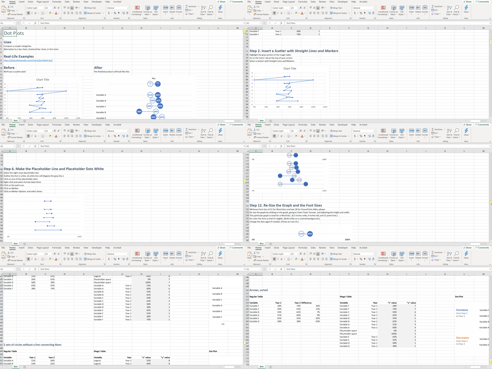
You can download and keep all 18+ Excel spreadsheets that accompany the video lessons.
Discussion Boards to Ask Questions
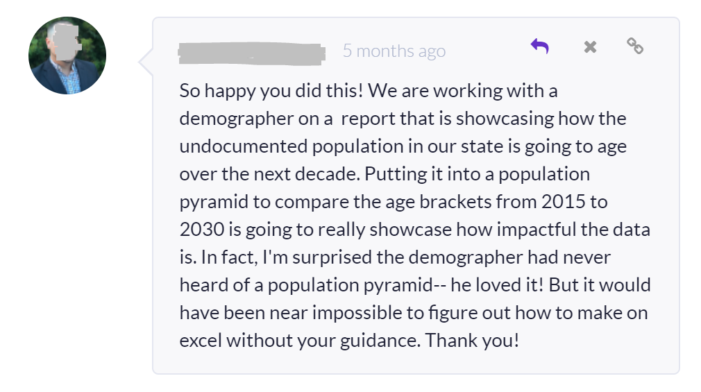
Every module includes discussion boards where you can ask questions, comment on the lessons, and share your own tips with the community.
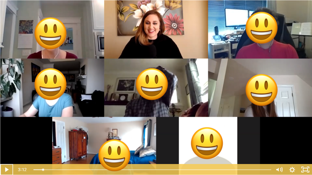
Live Office Hours Twice a Month
We’ll share screens and work through your drafts together.
Guest Speakers in Office Hours
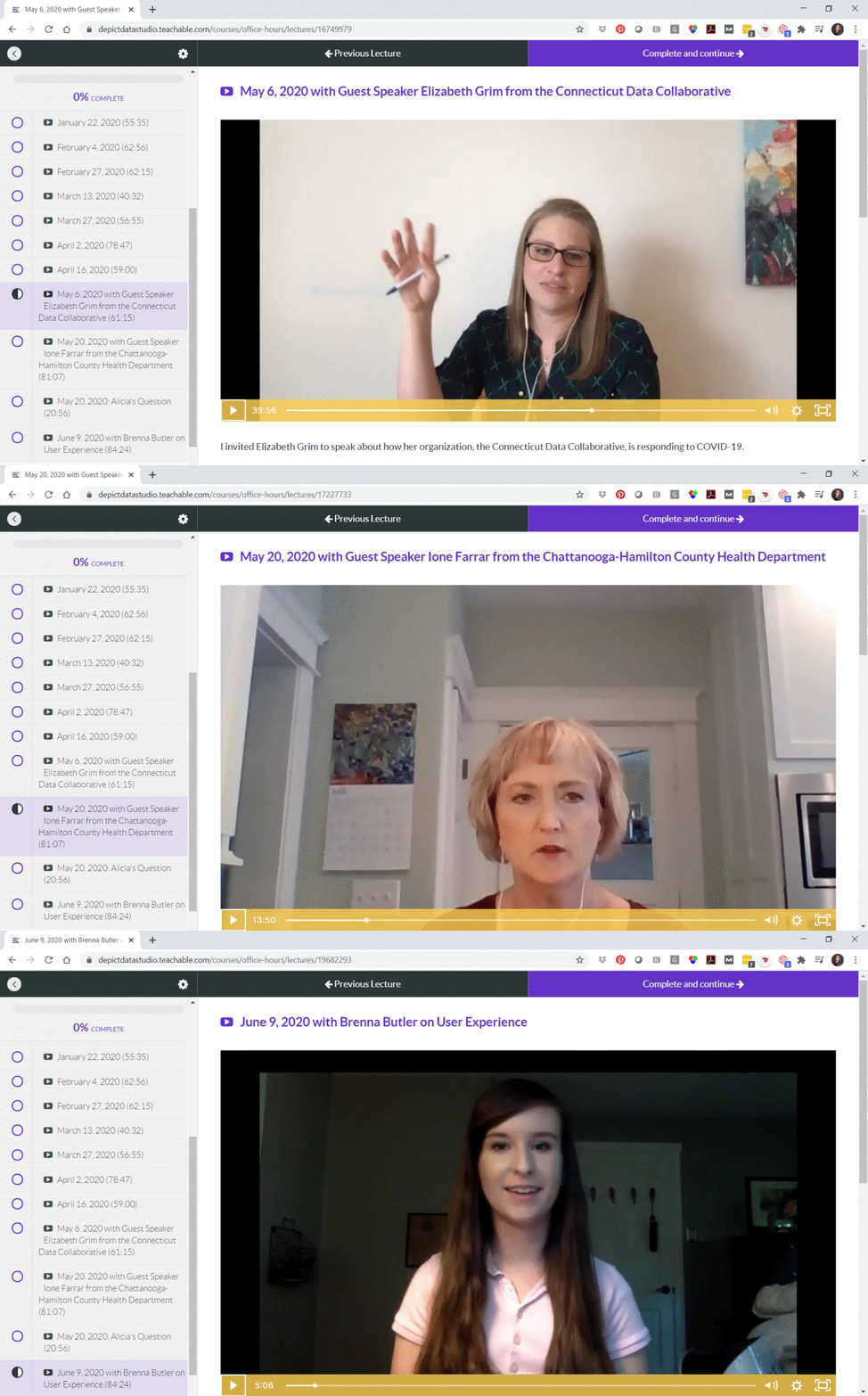
Sometimes we invite guest experts to speak with us during Office Hours. You’ll be able to access recordings from our sessions with Elizabeth Grim (about Connecticut’s COVID-19 response), Ione Farrar (about Tennessee’s COVID-19 response), and Brenna Butler (about user experience). You’ll also be invited to upcoming sessions with Jane Zhang, Chris Lysy, Sara Vaca, Esther Nolton, and Jason Melchi.
By Popular Demand! 6 Live Trainings
Office Hours are open to everyone who’s taking online courses with me. By popular demand, we’ll also hold six additional Live Trainings just for the participants in this course.
- Monday, June 29, 2020 from 4 – 5 pm EST
- Monday, July 27, 2020 from 4 – 5 pm EST
- Monday, August 31, 2020 from 4 – 5 pm EST
- Monday, September 28, 2020 from 4 – 5 pm EST
- Monday, October 26, 2020 from 4 – 5 pm EST
- Monday, November 30, 2020 from 4 – 5 pm EST
The sessions will be recorded in case you can’t make it live.
Private Facebook Community of Fellow Participants
You’ll be invited to join our private Facebook community, where I offer additional Facebook lives. You can also post your own questions and get feedback from me.
Weekly Emails to Cheer You On
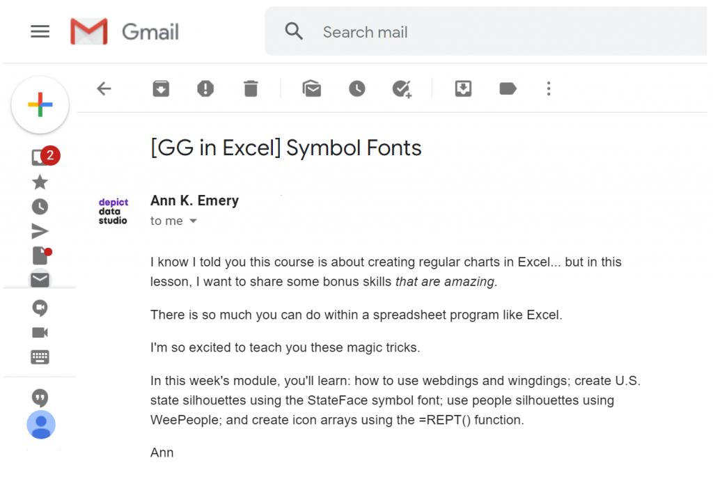
I know you’re going to skip straight to the juicy dataviz magic tricks, but I’m going to email you on Mondays around 11 am EST and pretend like we’re working through the course one module at a time.
Once-a-Year Registration
Mark your calendars! This course only opens once a year for registration. The 2020 enrollment window is Monday, June 22nd through Friday, June 26th. When it’s open, it’s open. When it’s closed, it’s closed.
We’ve also got special Early Bird Bonuses for the earliest registrants.
First 25 People
The first 25 people to register will receive a Swag Bag with a dataviz shirt, stickers, buttons, and magnets.
First 10 People
The first 10 people to register will ALSO receive verbal feedback on their graph, report, dashboard, or infographic. The feedback will be recorded and posted as a case study inside the course.
First 5 People
The first 5 people to register will ALSO receive an Excel makeover. You’ll send me your spreadsheet, report, or slide. Then, I’ll work on it directly during one of the Live Trainings with the 2020 cohort. This is a great opportunity to have me consult on your project.
What Participants Are Saying
3,390+ researchers, evaluators, scientists, and analysts have taken online courses with us.
Here’s what recent participants are saying.
“Having attended Ann’s keynote address at the 2017 Southeastern Library Assessment conference, I learned a few quick tricks to transform a stock Excel graph to something better. Once I moved into an assessment role full-time, I knew I would be writing more reports and wanted to up my game with Excel graphs and charts so I knew just where to go for help. Ann’s course in Great Graphs offered that and so much more. When I had to write a summary of a laptop loan program survey, I transformed the plain, ordinary graphs to uncluttered, with clearly understandable graphs of the survey results. Ann takes you beyond the basic Excel charts and graphs to learn how to make super cool waffle charts and icon arrays and adding spark lines and bars to a spreadsheet for quick visual analysis. Two of my favorite tips were learning how to create new theme colors to input the color brand from my organization and using bold colors to highlight your point with the remaining graph in gray or lighter tones. I found this course to be very practical with beneficial tips to use immediately in my work and would recommend it to anyone desiring to up their game with charts and graphs for data visualization.”
– Lee Ann Lannom, Assessment Librarian, Jean & Alexander Heard Libraries, Vanderbilt University
“The Great Graphs tutorials are exactly what I was looking for in learning data design techniques in Excel, especially using examples that makes sense in a nonprofit and philanthropic setting. I like the short snippet format where I can quickly learn about a technique and then instantly apply it. For instance, I was working on multiple data tables showing the number of services delivered and number of clients accessing housing services by quarter across multiple homeless services programs. Program leadership wanted a quick scan of the numbers by quarter for the entire fiscal year. They were used to looking at numbers this way. I decided to add sparklines to the data tables so that program leadership can also quickly visualize the trend over time. I quickly reviewed the Great Graphs tutorial on sparklines and added trends to the data tables. I also learned other tips to create sparklines quicker and add other visual features such as high and low points in the data. A data analyst I was working with on this project was amazed that this could be done in Excel. He was used to doing all his analysis in python or R, and wasn’t too familiar with data design techniques in Excel. Thank you, Ann, for creating these quick tutorials that anyone can follow, especially those in the nonprofit sector.”
– Rocele Estanislao, Assessment & Evaluation Analyst, Kaiser Permanenete Bernard J. Tyson School of Medicine
Frequently Asked Questions
How long do I have access to the course?
Indefinitely. I used to limit access to just 12 months. I wanted to encourage you to get in here and learn with me, but instead it just stressed you out, so I’m not cutting off your access anymore.
I know you’re a perfectionist and always update your courses.
Yes, and you’ll be grandfathered-in to all future updates to this course.
What if I am unhappy with the course?
We would never want you to be unhappy! If you are unsatisfied with your purchase, contact us in the first 30 days and we will give you a full refund.
Register
See you in the training program!
Ann
P.S. Wondering whether this course is right for you? Here’s a link to my secret calendar so you can chat directly with me: https://calendly.com/depictdatastudio/20min