This is an Eval Central archive copy, find the original at depictdatastudio.com.
Sure, you can add anything and everything to your dashboard. (Here’s a running list of all the great graphs you can make in Excel.)
In this article, you’ll learn about 20 stress-free charts that we can make inside spreadsheet software like Microsoft Excel.
These visuals can be added to static or interactive dashboards.
They’re fast for us to make… which means a quick turnaround time for your audiences. No need to wait weeks or months until a dashboard is ready! These visuals are made within minutes, so your dashboard is ready same-day.
This is a preview of everything that’s included inside Dashboard Design. This hybrid course includes 9 modules of self-paced lessons along with live Office Hours.
Module 1 is all about planning, deciding what to include, and iterating.
Module 2 involves hands-on practice to create these 20 stress-free charts.
Visualizing 1 Point in Time
In the first lesson of Dashboard Design, you’ll make stress-free charts for visualizing 1 point in time inside spreadsheet software like Excel.
You’ll create:
- (1) Tallies
- (2) Circles
- (3) Filled Squares
- (4) Outlined Squares
- (5) Bars
- (6) Stacked Bars
- (7) Heat Tables
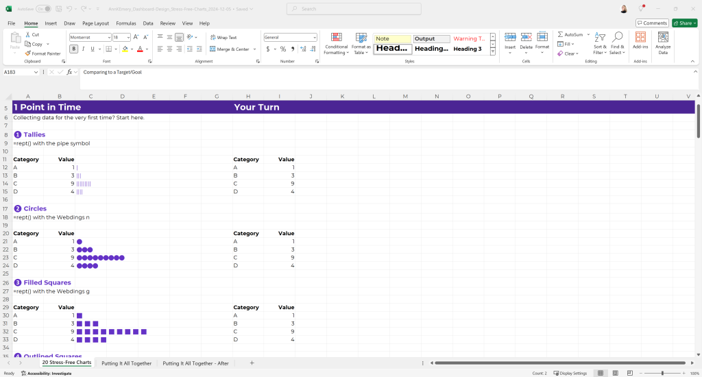
In the Dashboard Design course, you’ll download the file, practice along with me, and pause and re-watch segments as needed.
You’ll see my Answer Key with the formulas on the left, and you’ll practice in the Your Turn section on the right.
You’ll learn which techniques are best for small n’s vs. big n’s.
You’ll see case studies of these techniques being used in real dashboards, slides, reports and even as appendices to technical reports.
You’ll hear me talking about “Big A” Accessibility (508/ADA guidelines) as we go, ensuring that your stress-free charts match your existing branding while also being colorblind-friendly and grayscale-printing friendly.
This is a 26-minute lesson; there are timestamps below the video so you can easily rewind or fast-forward. The timestamps making re-watching segments easier for Future You.
Every video has captions that can be turned on/off. Every video has a full transcript, too (so you can skim the transcript and see which lessons will be most helpful to you). Dashboard Design includes ~20 case studies in Modules 8 and 9, and nobody needs to watch them all. You can skip around and see which case studies from fellow participants are most applicable to your own industry and workplace.
Visualizing Exactly 2 Points in Time
In the next lesson of Dashboard Design, you’ll create stress-free charts for visualizing exactly 2 points in time.
These are the charts you’ll need for before/after, pre/post, baseline/endline, etc. dashboards.
You’ll create:
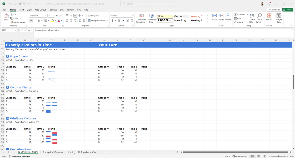
- (8) Slope charts
- (9) Column charts
- (10) Win/loss columns
- (11) Deviation bars
- (12) Checkboxes
- (13) Sort-of checkboxes with squares
- (14) Sort-of checkboxes with circles
3+ Points in Time
Do you collect and share data every week, month, quarter, or year?
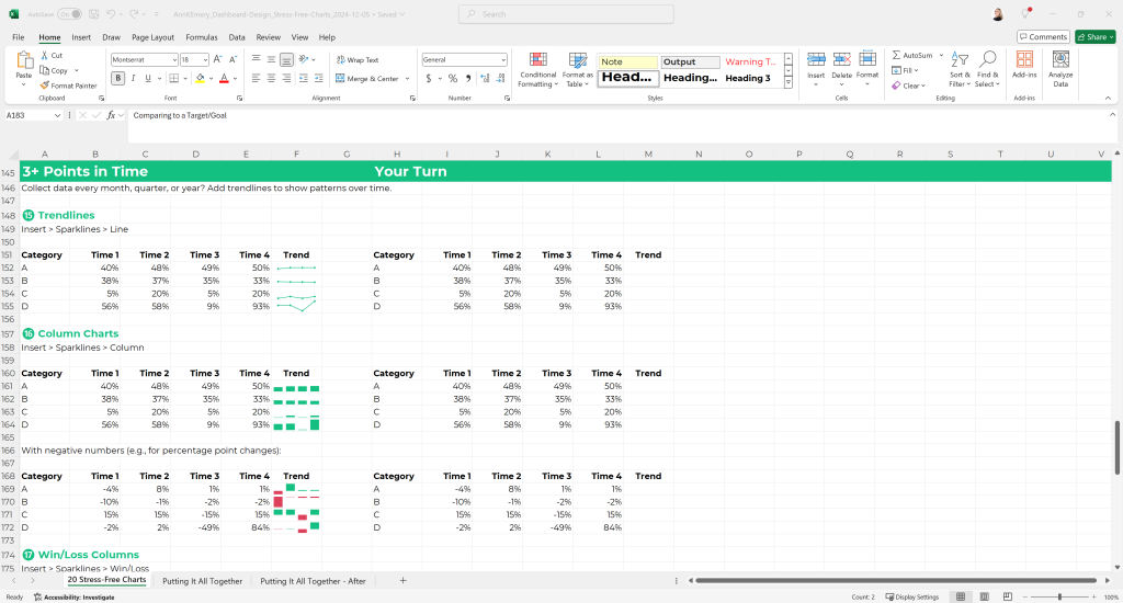
These are the stress-free charts that can showcase your time series patterns.
Inside Dashboard Design, you’ll create:
- (15) Trendlines
- (16) Column charts
- (17) Win/loss columns
Progress Towards a Goal
Then, you’ll create:
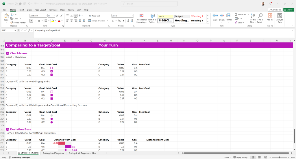
- (18) Checkboxes
- (19) Deviation bars
- (20) Spillover bars
Putting It All Together
In the final lesson of this module of Dashboard Design, you’ll practice applying all the skills you just learned.
You’ll take this boring, black and white table…
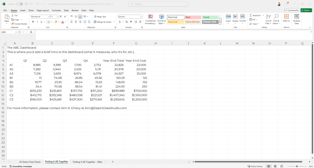
and transform it into a professional, skimmable dashboard.
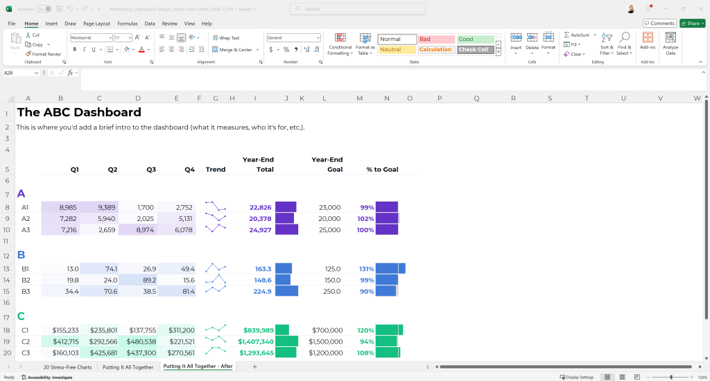
This is the first of many before/after transformations you’ll make alongside me.
Later in the Dashboard Design course, in Module 3, you’ll practice making more of these static dashboards from start to finish. Static dashboards are great for busy, technical audiences who just need a 1-pager of key findings.
In Modules 4, 5, 6, and 7, you’ll make interactive dashboards in Excel.
Your Turn
Comment here: Which of these stress-free charts are you already familiar with? Which ones are new?