This is an Eval Central archive copy, find the original at evalacademy.com.
So you’ve administered a survey using one of the many online survey platforms that claim to help you create a survey, analyze the results, and export your results so you can make data-driven decisions. With tools like these, who needs an evaluator! Right?
Don’t get us wrong, surveys are useful tools and we’re a fan of any survey platform that makes it easier to use the results. But what about when you want to scratch beneath the surface or present a legible graph that will convince the program director or funder that action needs to be taken? This is where the canned survey tools start to falter.
Just like the default settings in Microsoft Excel or Word, the default report settings in most survey platforms give you some quick and dirty results, good for getting an overall sense of what’s going on. But sometimes you’ll need to present your data in a different way.
In this two-part series, we’ll take you through the steps to export and format your data so that it’s useable, then we’ll teach you some of our favourite data cleaning and analysis tips!
First, let’s review why you might want to look beyond the survey platform’s pre-made graphs and analysis for your answers.
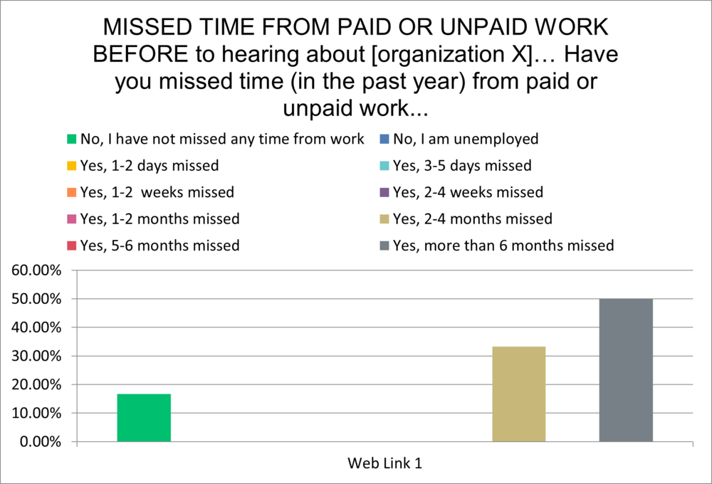
Here’s an example graph from a survey platform; there was a total of 6 responses for this question:

In this graph alone:
-
The graphs default to %, which over-inflates results when you have small numbers of respondents (usually we say less than 10 respondents).
-
Colours are often random and don’t highlight key findings.
-
While the response categories make sense for gathering the data, they get confusing when you are visualizing the data.
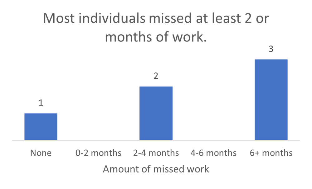
A quick makeover shows something a little different:

Other issues with the default graphs can include:
-
Inability to compare answers across questions— did people who answered one question one way answer another question in the same way?
-
Inability to combine results across surveys. Say you have a survey after each event you host and want to look at the results of all of the surveys together.
So now what? You go to download your survey results and are faced with a variety of options- do you download responses by question? By respondent? PDF? CSV? Excel? Have no fear, we’ll guide you through this process.
Step One:
Download the most granular responses available. Select responses by respondent so that you are able to trace responses by participant and link a participant’s response to one question (e.g. demographics, like age or gender) to their response for another question.
Step Two:
Download the responses in an editable format. We prefer Excel, but CSV works as well since you can save a CSV file to Excel. Please, please, please, don’t download the PDF version.
Step Three:
Go forth and analyze with a few tips from us:
1. Label the Questions Clearly
Sometimes the survey platform exports information in a way that makes it hard to tell what the survey question was; either by importing a very long question or cutting out parts of the question stem. Save yourself the hassle of flipping between your survey and your data by clearly labelling the questions so you understand what questions are linked with the answers.
Here’s an example of how column headers show up on exported data from one survey platform:

Here’s how we suggest formatting it with some simple tweaks:

2. Leave a bread crumb trail
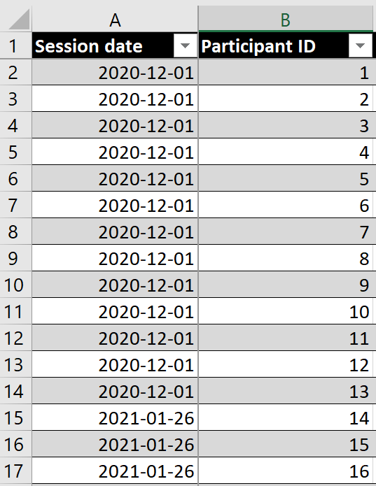
Want to analyze the same survey delivered a few times, like multiple post-event surveys? We suggest merging them into a single file. However, it’s important to track where the surveys came from. Make one of your columns a description of where the data came from (e.g. March 31 session, Group A session). This allows you to go back to the original data if necessary and allows you to analyze the survey answers by source.

Notice how in this example, the session date in column A tells you which post-event survey the data is linked to.
3. Keep your data organized
Create a separate “analysis” tab, or even multiple analysis tabs (e.g. demographic analysis, skill analysis) to organize your data. Label your tables and charts in the analysis tab by survey question so you can quickly scroll to find what you are looking for. The goal is to be able to find what you are looking for quickly, with minimal scrolling or clicking between tabs.
Here’s an example of what a survey analysis spreadsheet might look like. All data are in one tab in this example, with separate visualization/analysis tabs for each section of the survey (demographics, resources, mentoring, knowledge).

4. Let Excel do the math
Level up your Excel skills with a few formulas and tricks using tips from the next article in our series.
Now that you’ve got a handle on exporting and organizing the data so that it’s more useful, check out our favourite tips and tricks for cleaning and analyzing data (article to come May 2021) and this article on dialing down your data so that people understand what to look at.
To learn more about applying evaluation in practice, check out more of our articles, or connect with us over on Twitter (@EvalAcadmey) or LinkedIn.
Sign up for our newsletter
We’ll let you know about our new content, and curate the best new evaluation resources from around the web!
We respect your privacy.
Thank you!