This is an Eval Central archive copy, find the original at freshspectrum.com.
So let’s not overthink this one.
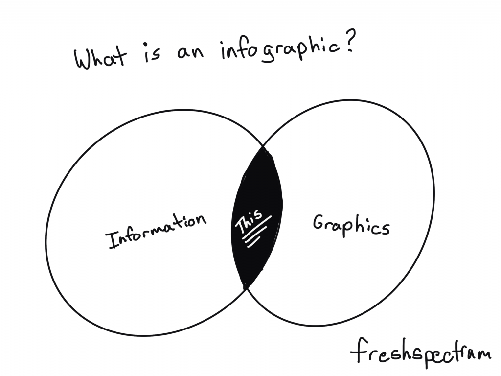
Infographics are the result of asking graphic designers to illustrate data and other information. We can find examples across history of people mixing pictures and text to convey information. There is no singular style and an all encompassing definition is probably not all that useful.
For me, infographics are just a way to adapt a body of work (say a report or a paper) to meet the needs of a particular audience.
We live in a visual world. And visual reports are slowly becoming the norm, not an exception.
But for a lot of organizations, those fearful of stepping too far away from their normal practices, going all in on visual reporting is a lot to ask. Infographics offer a kind of stepping stone.
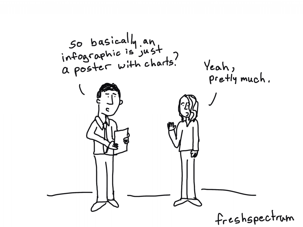
Infographic design as poster design.
The easiest way to think about an infographic is to look at it like a poster.
Posters are purposeful visual communication tools. Posters outside a movie theatre show you what’s playing. Posters outside a music venue tell you what artists are going to be appearing soon, and where else they are playing. Posters in the airport security line tell you how to prep for your turn through the metal detectors.
Yes, you can communicate some useful information. But rarely ever does a poster offer anything comprehensive. Comprehensive is just not the point. Speaking directly and efficiently to an audience is the point.
What tools should I use?
I would suggest using design tools for your infographics. Tools like Adobe XD, Adobe Illustrator, Adobe Photoshop, Sketch, Canva, or even Power Point can be used to make nice infographics.
I would avoid trying to create infographics using analysis tools or dashboard tools (like Tableau, R, or Excel). Same with word processing tools like Word. You can create infographics using anything, but that doesn’t mean you should.
Examples of Infographic Styles
Just because there isn’t one way to create an infographic doesn’t mean we have to start from scratch. There are all sorts of styles and examples on the web. The type you choose really depends on your information and your specific audience needs.
I’ll share some links where you can find good examples at the end of the post, but before that, here are some basic styles.
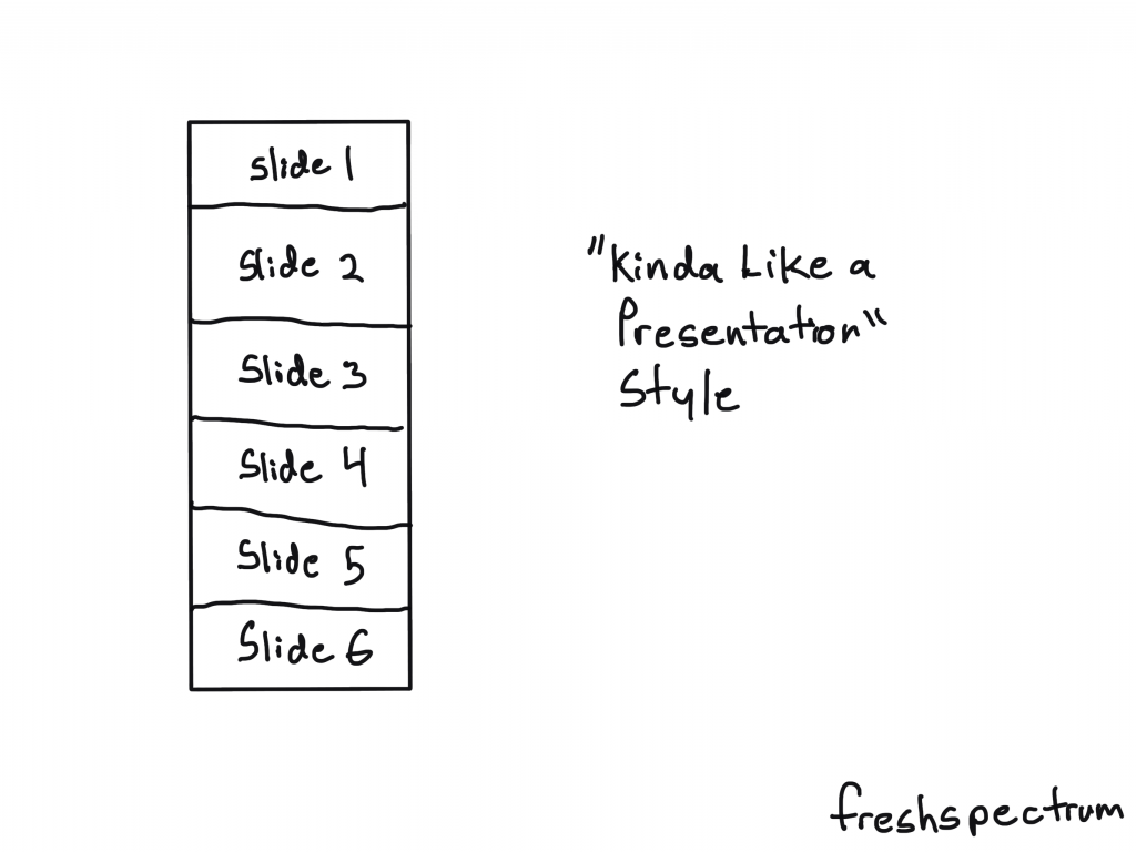
The “Kinda Like a Presentation” Infographic
These infographics used to be all the rage a decade ago. Basically you create your infographic like it’s a power point slide deck (or slide doc). Then you sequence the panels (slides) like you would with a presentation.
Just remember that you won’t be standing in front of the slides when you share it. So you want to make sure people can read it from top to bottom.
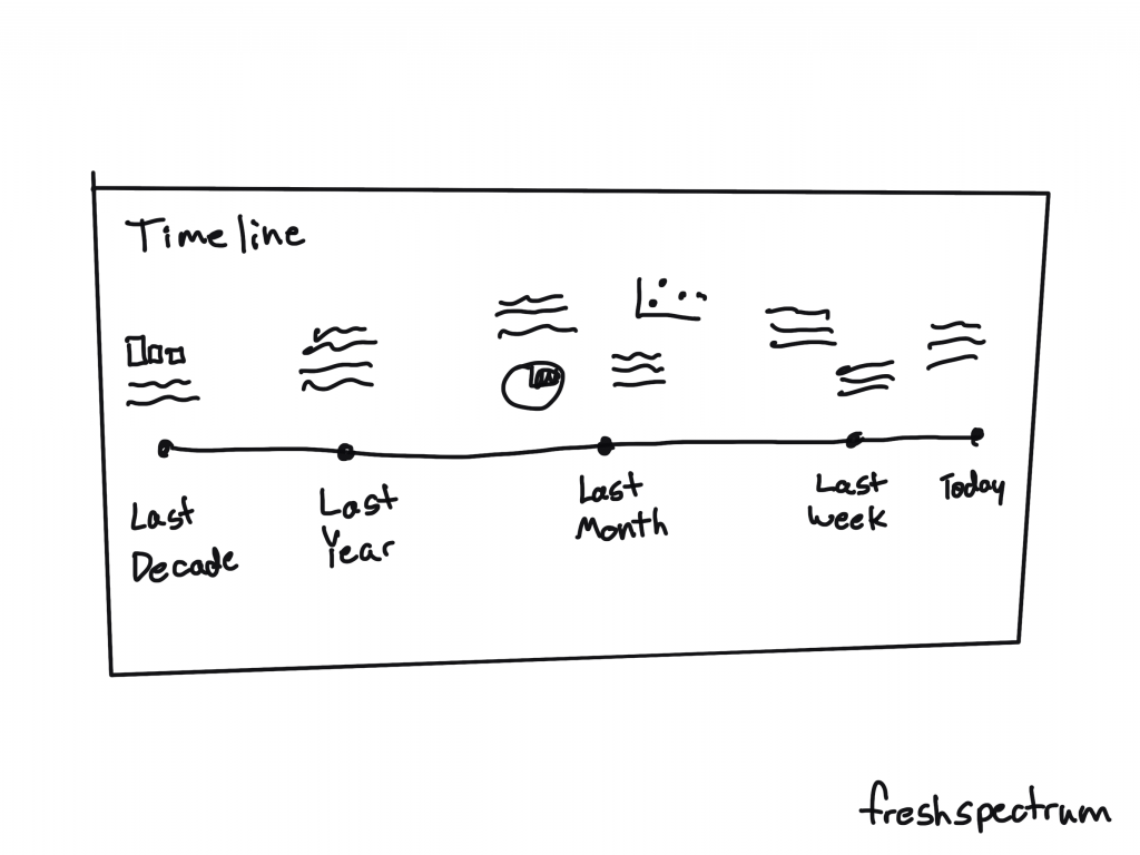
The Timeline Infographic
It’s a timeline. You annotate it with words, dates, pictures, and charts. The timeline itself provides the narrative underpinning.
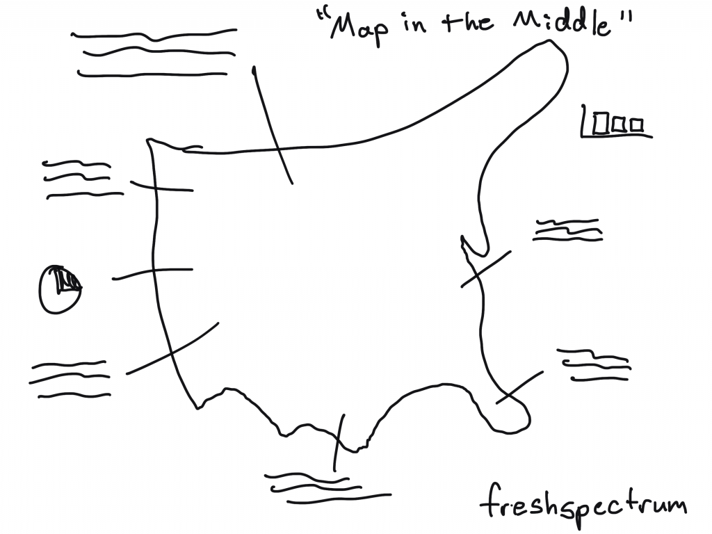
The “Map in the Middle” Infographic
It’s a map. You annotate it with words, pictures, and charts.
People like maps.
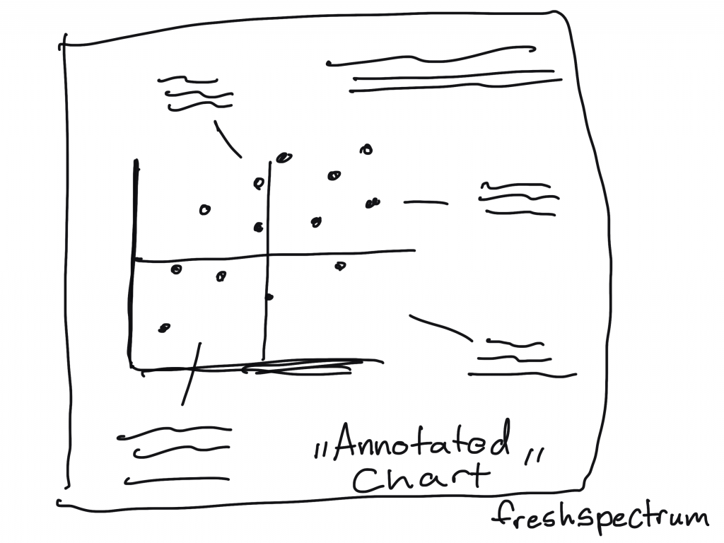
The Annotated Chart Infographic
You start with an interesting chart. Then you annotate it with words, pictures, and other charts.
This is a nice infographic if you have some kind of marquee chart to feature.
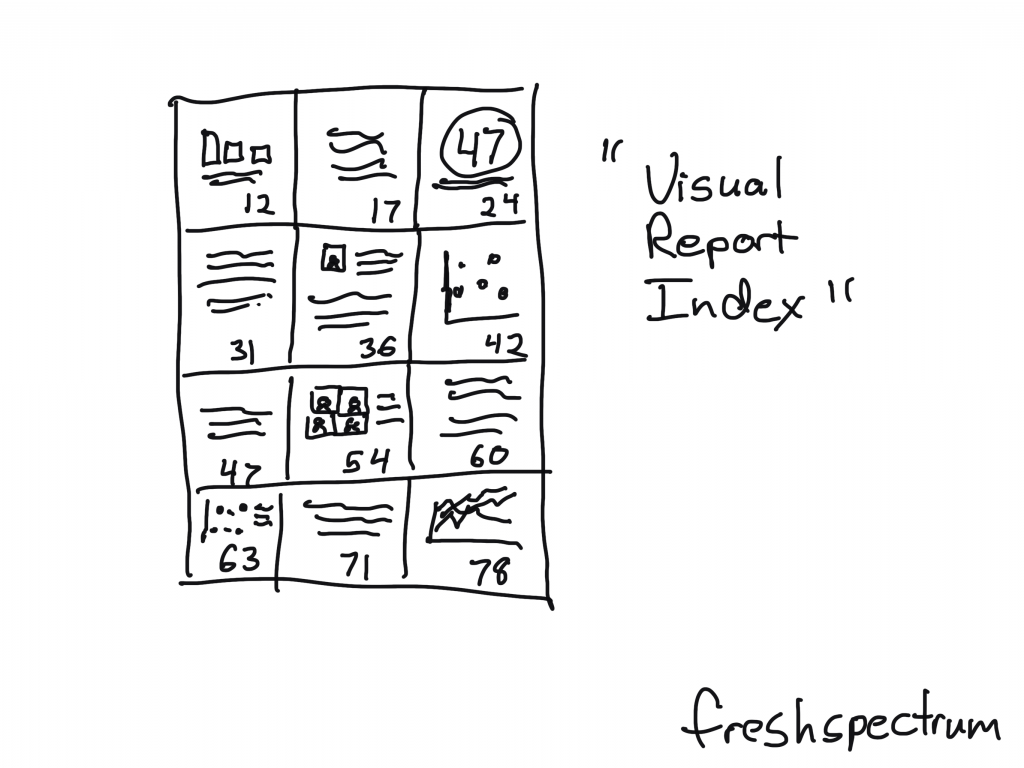
The “Visual Report Index” Infographic
This is an infographic that pairs really well with a longer report.
You just take out quotes, graphics, and charts and put them with their page number. The person reading the infographic will know exactly where to go in the report if they want to dive deeper beyond the single fragment.
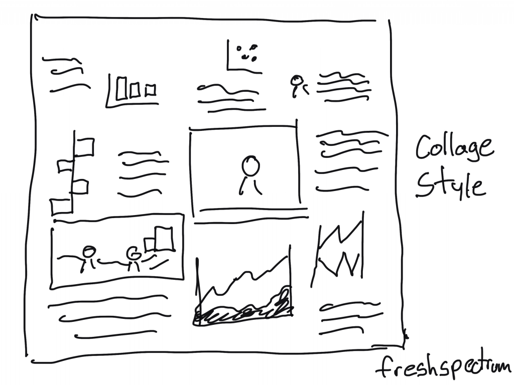
“Collage Style” Infographic
For the people really good at creating scrapbooks. You can pull together a bunch of information in the style of a collage.
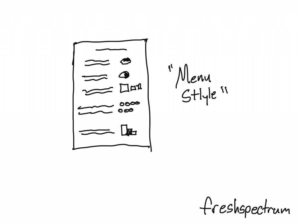
The “Menu Style” Infographic.
With this style you basically just mimic a restaurant menu. But instead of pictures and descriptions of the food, you have charts and annotations.
You could also add page numbers to make index style.
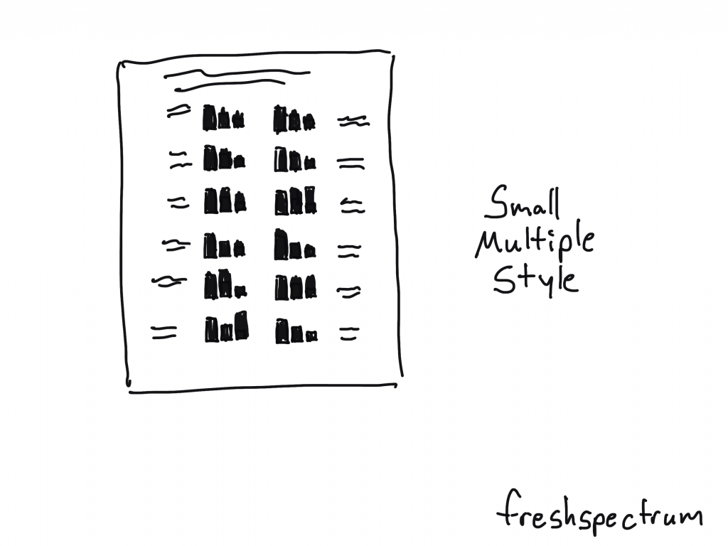
Small Multiple Style Infographic
Small multiples make really solid infographics. You just start with one chart then repeat it over and over again. For example, if you have a program with 20 sites, you create the same chart for all 20 sites then put them together on the same page.
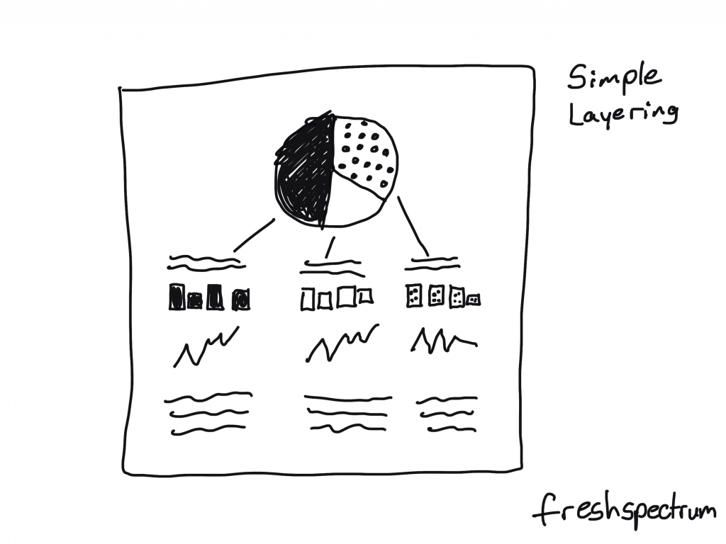
Simple Layering Infographic
Start with one chart.
Then for each of the categories shown in that first chart, you’ll create subsequent charts or share other specific information. This is similar to how you might create an interactive dashboard, showing multiple levels of data, but with an infographic you’ll just do that on one page without the required clicks.
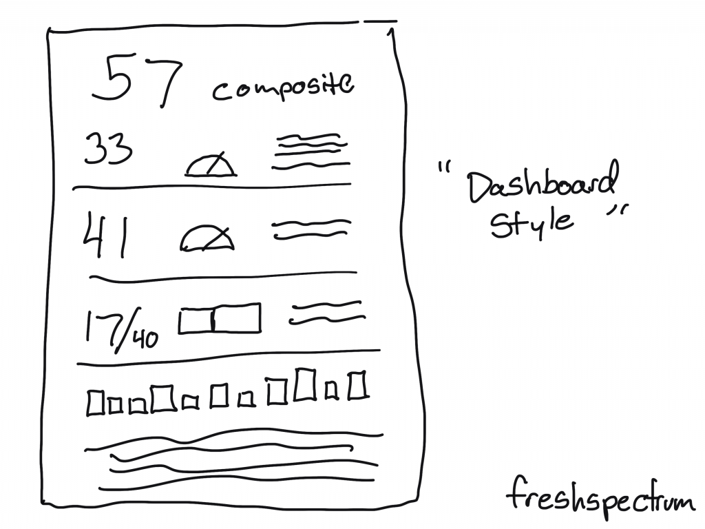
“Dashboard Style” Infographic
This is usually what I suggest when a client wants a dashboard but the data doesn’t continuously update. You create a dashboard look, but then you can release once a month (or once a year).
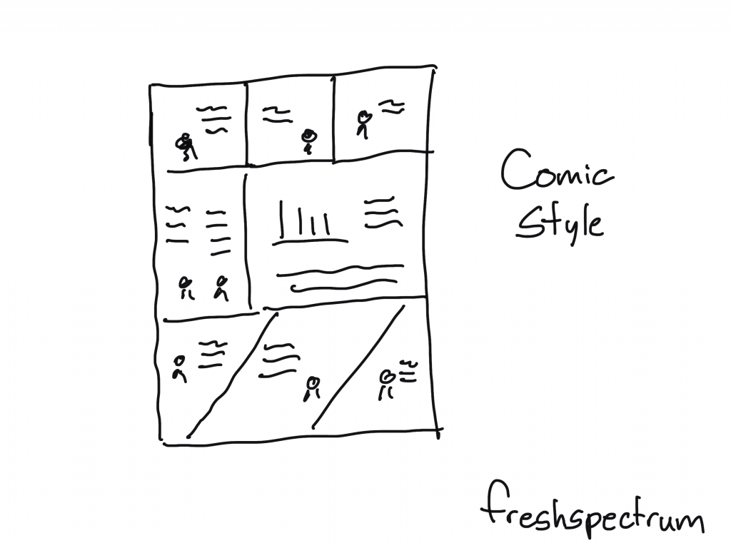
Comic Style Infographic
So for this one you create your infographic like it’s a comic or a graphic novel. I really like this approach, and not just because I draw cartoons.
Some Example Infographics
I shared a bunch of styles, but there are tons more out there. Seriously, I could have kept going on and on (diagrams, pathways, flow charts, etc.).
But instead of that, at this point you’re probably just hoping to find some links with good examples. So here you go: