This is an Eval Central archive copy, find the original at freshspectrum.com.
Today’s post is a reflection on contemporary reporting, and how for many organizations, it looks almost identical to the approaches we used in the late 90s.
In today’s post:
- Why I think it’s time to kill the “let’s just stick a pdf on a resource page” information sharing paradigm.
- What has changed in the digital world since 1999.
- The rise of social media and the attention competition.
- Smartphones, tablets, big monitors, and the need for responsive design.
- The evolution of UX/UI design and a new set of software tools.
- Big data and easy access analytics.
- The big takeaway.

Time to kill the “let’s just stick a pdf on a resource page” information sharing paradigm.
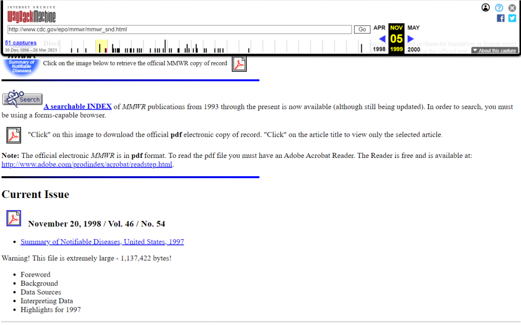
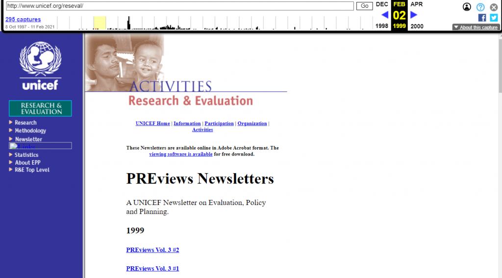
So back in 1999, if you wanted to share a report, you would either create an html version of the report or (increasingly at the time) share a downloadable PDF.
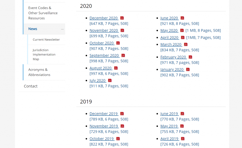
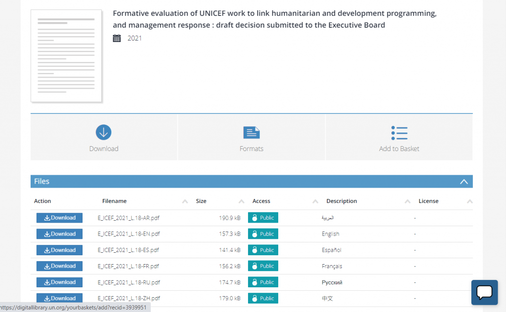
Flash forward to 2021. Now if you wanted to share a report, most organizations simply share a downloadable PDF (or occasionally put together an html version).
This is what I call the “let’s just stick a pdf on a resource page” information sharing paradigm. It’s how countless organizations share their research and evaluation reports. And I think it’s time to evolve.


What has changed since 1999?
- Social Media. For instance, Twitter and Facebook didn’t exist until the 2000s. In 1999, Mark Zuckerberg was still in high school.
- Smart Phones and Flat Screen Monitors. The range of screen sizes you have in your home is incredibly wide compared to 1999.
- UX Design as a Web Design Paradigm. User experience design predates 1999, but it did not have anywhere near the reputation it has now-a-days.
- Big Data and Easy Access Analytics. Google Analytics didn’t launch until 2005, lots of websites still had hit counters in 1999.
1. The rise of social media and the attention competition.
Social media didn’t look nearly the same back in 1999. Blogger was launched that year and WordPress was a few years away. The now defunct GeoCities was the 3rd largest site one the web. As for peer to peer, it was pretty much email, old school internet forums, and AOL instant messenger.
It’s kind of amazing to think about how much social media has grown over the past two decades. There are so many ways for people and organizations to share their thoughts with the world today that just didn’t exist back then.
People are not losing their attention spans, they are just experiencing an overwhelming amount of new information. And the people who have monetized attention are playing hard, and not always fair. It means, if you really care about sharing, you need to up your own game.

2. Smartphones, tablets, big monitors, and the need for responsive design.
The iPhone wasn’t released until 2007. We had cell phones, but definitely not smart phones. As for the monitors on our desks, they were boxy picture tubes that could only get so big. Which was okay, because our computers could only power so much and nobody had the internet bandwidth we have now.
Today I often bounce back and forth between an iPad, a large PC laptop, an old MacBook, and my iPhone. The screens are wildly different, and so is the experience.
PDF technology really helped our field get their print reports onto the web. You didn’t have to learn web design to share a report. It looked like it did on paper and that worked more or less okay on old school computers. Not so much in our now multi-responsive world.

3. The evolution of UX/UI design and a new set of software tools.
When I think back to the late 90s I remember a lot of ugly websites. And as time went on, they started to get prettier but also more confusing.
In 1993 Don Norman coined the term “user experience” for his group at Apple Computer. (Watch Don explain the history of “UX” and what he thinks of how people use his word now.) But the field is older than the term.
A 100-Year View of User Experience – Nielsen Norman Group
In today’s software and web design worlds it is hard to miss the influence of user experience design. At the most basic level, it’s not so much a methodology as it’s a shift in perspective.
The original question, “what do we intend with this site and how does it perform?,” has been replaced with “what does the user experience and how can we improve that experience?”
It might not seem like much, but the simple shift in perspective changes so much in how we design. And the product is so much more relevant and useful.

4. Big data and easy access analytics.
In the early days of the web you would track web traffic based on how many times your server delivered data to a user. With these numbers you could pickup on things like, “how many times was a page visited?” or “how often was this pdf downloaded?”
Over time, analytics became more sophisticated. With web cookie based analytics programs like Google Analytics you can track just about every keystroke. You also get access to more information, sophisticated algorithms, and clean reports. There are also other external analytics data sources we can tap into.
All of this data provides us with a greater ability to influence strategy. But that assumes we have a strategy beyond, “let’s just stick our pdf on our report page.”
The big takeaway: It’s time for a change in strategy.
So to recap.
- Audience attention is finite, and there is more competition than ever.
- Our information viewing context has changed dramatically.
- We have new sets of methods we can use to understand audience needs and experience.
- We have sources of analytics that can directly guide our reporting strategy.
I am not against PDFs. Even super big PDFs that few people will ever read have their place in a larger strategy. But I think we can do better with how we share our research, evaluation, and other data than to default to same style of reporting we’ve been doing for the past 20+ years.
Instead, I advocate for strategic, thoughtful, and systematic approaches to information design. In a future post I’ll share my approach, a strategy that I call the splash model.