This is an Eval Central archive copy, find the original at freshspectrum.com.
So your organization gave you a Tableau license. Or perhaps you attended a half-day PowerBI workshop. Now you’re ready to use your new tools and make some of your data interactive.
But should you?
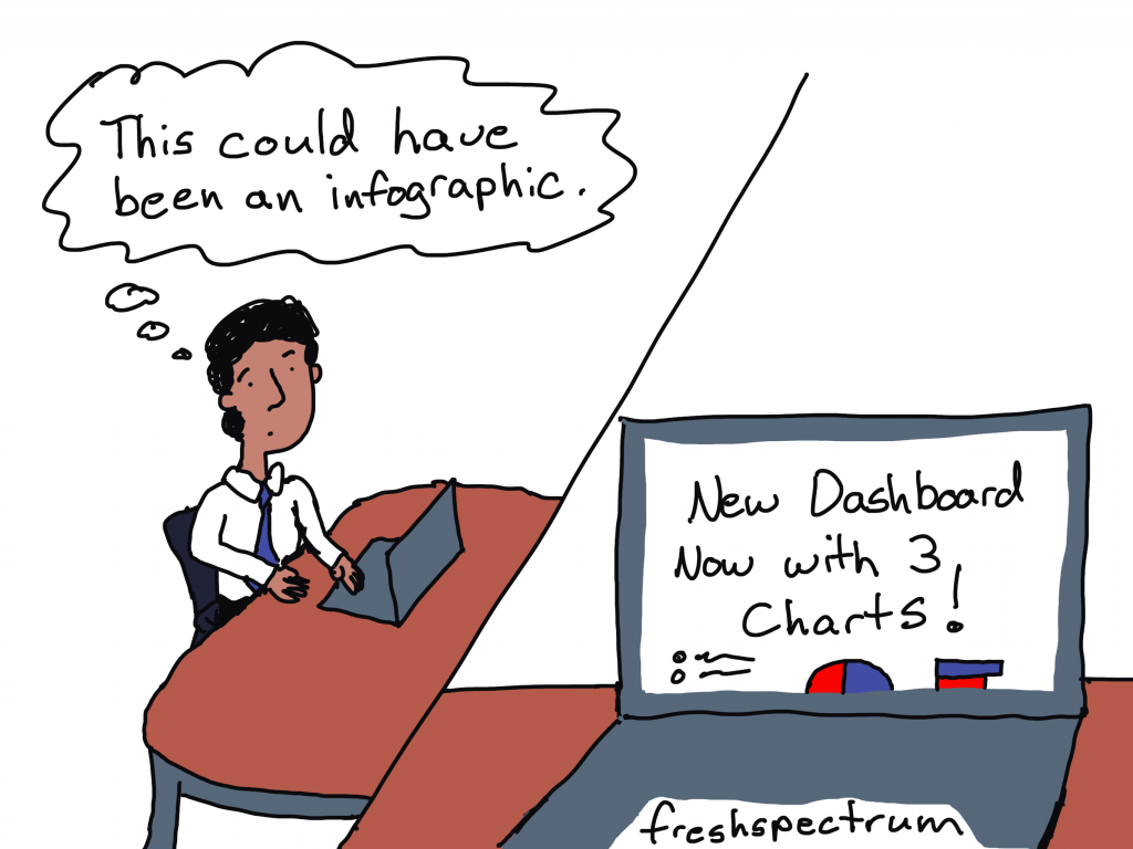
Not everything should be interactive!
Tools like Tableau and PowerBI give you the ability to pack a lot of data into a small space. This can be incredibly useful when you have a lot of data that you want to open up for exploration.
Good interactive visualization can reduce the overwhelm felt by the data user. It does this by layering the data and presenting just little bits at a time. Because when you have thousands upon thousands of rows of data you need to simplify the experience.
But when you only have a little bit of data, creating an interactive dashboard does more harm than good. Instead of opening up a large dataset, you end up hiding data from your dashboard user. In order to find all the data that could easily fit on a single page, they need to click, and click, and click.
Example: The National Health and Nutrition Examination Survey (NHANES) Interactive Visualizations
NHANES is a big multi-year multi-million dollar CDC study that has collected lots of data over the years. And according to their website, they have some new interactive visualizations.
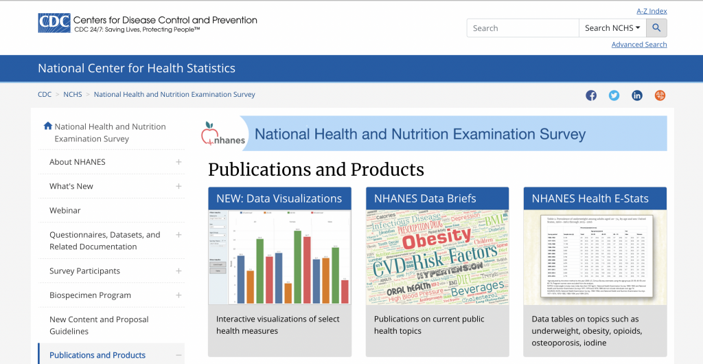
Their visualizations are some basic Tableau dashboards showing the prevalence of high total cholesterol, hypertension, and obesity in the US across ten points in time. The data is also filterable by Sex, Age Group, and Race and Hispanic Origin.
The initial visual we are given is a line graph showing high total cholesterol representing all adults 20 and over.
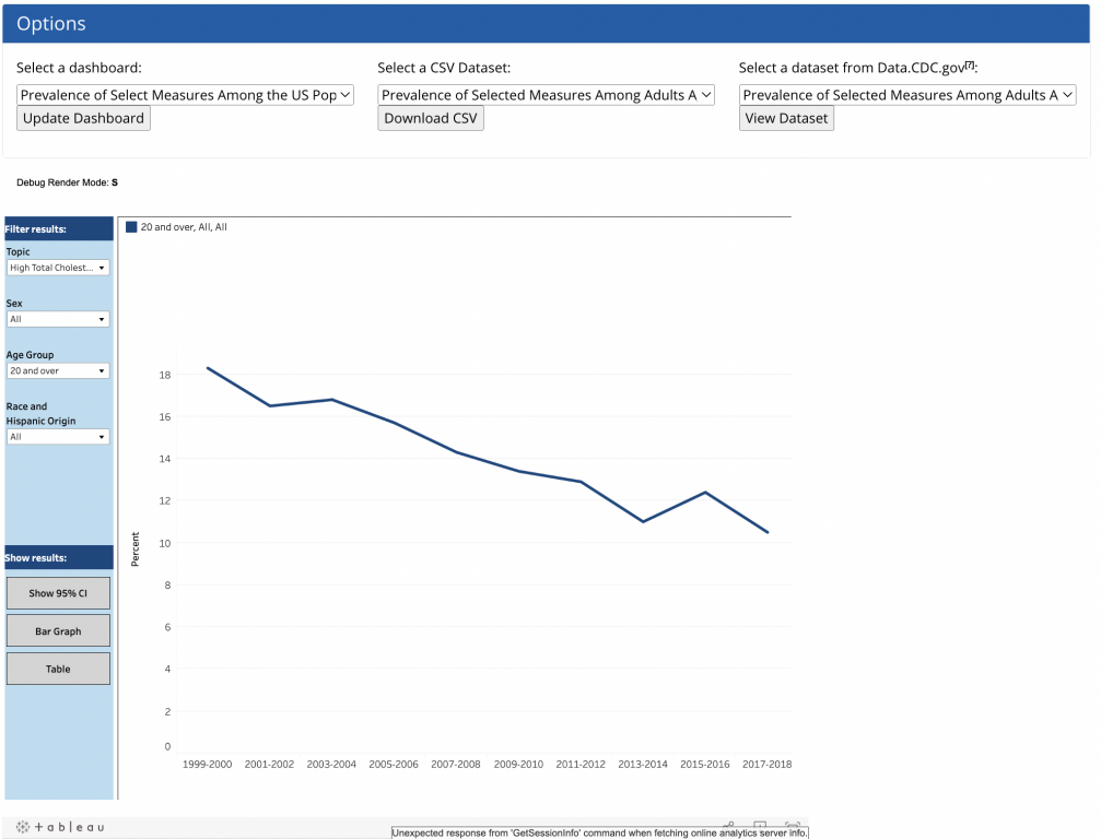
For all its options and buttons, this is a small set of data for a dashboard. You find that out quickly if you download the CSV file.
The data for all three topics, sex, and age groups fits within 6 columns and 360 rows of data.
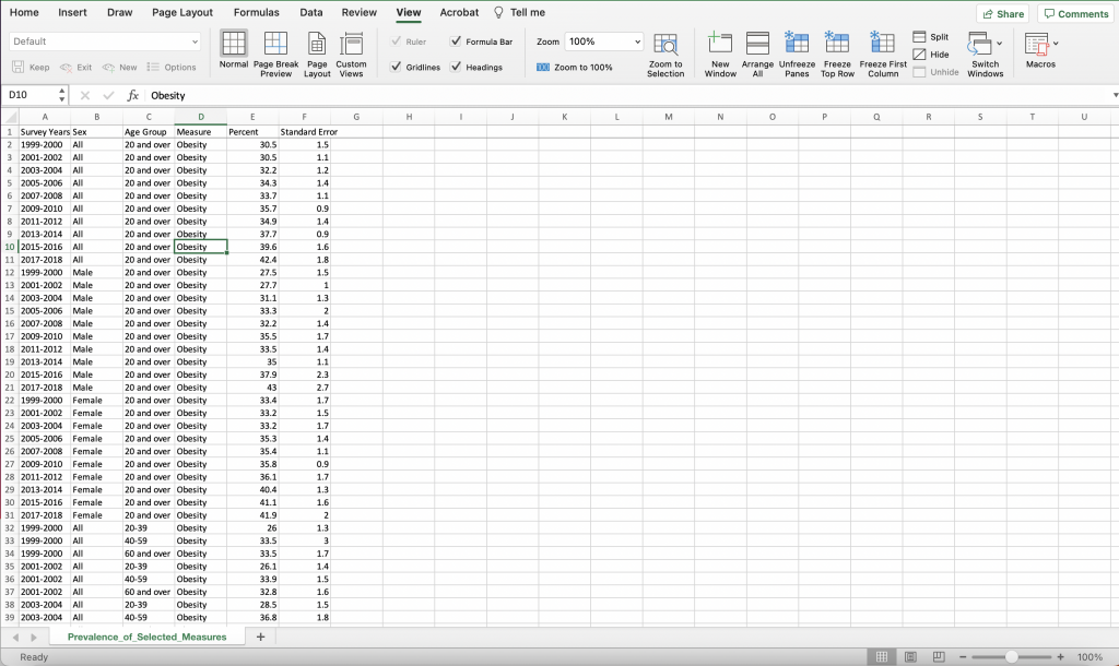
The race and hispanic origin data was not found inside the CSV, but it really doesn’t add a ton of data to the overall dashboard. Especially since the data is not broken down for every age group and there are some missing values due to low sample sizes for those groups.
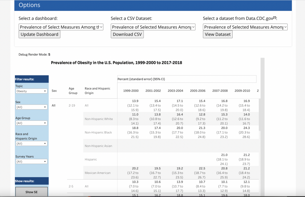
All in all, the data represents hundreds of rows not thousands.
An alternative: create a series of charts.
The alternative I would pitch would be pretty simple. Instead of creating an interactive dashboard this data could be presented in a simple series of charts. Then you add narrative around each giving additional explanation and context.
For instance here are the charts for all adults 20 and over for each of the three topics (high cholesterol, hypertension, and obesity).
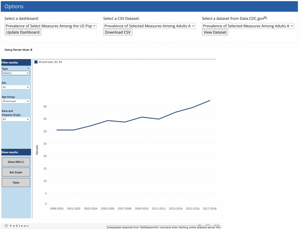
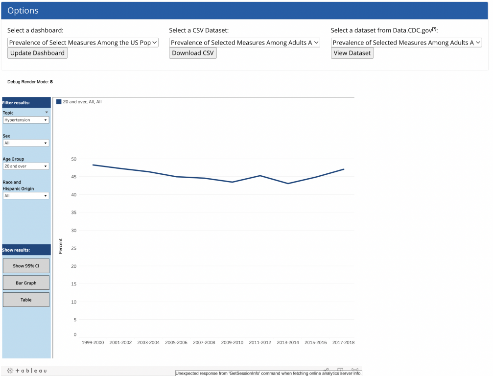

These same three charts could easily be visualized in a single chart. We can even use some subtle interactivity through a tool like Flourish. Here is an example of the same data represented in the above three dashboard views but in a single chart.
One chart will not replace the full dashboard.
That would just be the initial chart.
I would then split up the three topics. And for each topic, I would show the data split by sex, age, and race.
In total, it would be ten charts with supporting narrative. None of the data would be hidden, and you wouldn’t need an explanation about how to explore the data. The page would feel more like reading a news article.
The Takeaway.
If your interactive dashboard would need 100s of charts to show the same amount of data, then a dashboard is the right call. But if your interactive visualization could be replaced using a handful of charts, you should just use the handful of charts.