This is an Eval Central archive copy, find the original at freshspectrum.com.
For Christmas dinner this year I made my family spinach and pasta rotolo. It’s a baked pasta dish that involved making fresh pasta, rolling it flat, filling it with a spinach/ricotta mixture, and rolling it up like a jelly roll. Then it gets cut into small little scroll like pieces and baked upright with a homemade creamy parmesan rosé sauce until the top ends of the pasta crisp up.
And while it ended up a bit of a mess and not quite picture perfect, it was delicious.
Years ago, pre-covid and before we were vegetarians, my in-laws would take us out to a fancy restaurant for Christmas eve dinner. It was a long multi-course meal that usually included the kind of fancy dishes you would never make at home.
Both of these examples are the kinds of things you don’t do often. They either require too much work or too much money to be a regular thing for most people.
That’s certainly true for us. The rest of the year our pasta comes from a little cardboard box with sauce that comes from a can. And the only time we have a multi-course meal is when one of us opens up a bag of chips to snack on before dinner.
Sometimes you want special. But most of the time, you just need to eat.

DataViz is not just for special occasions.
Visuals are important.
And when there is too much information for people to process, visuals are even more important.
Without pictures the web would just be overwhelming blocks of text. It’s why most social media platforms look like living comic books. Visuals allow us to scan before we decide to dive in and read. In essence, the pictures are critically important navigation tools.
I joke sometimes that data visualization is really just academically acceptable illustration. In settings where you have to defend the inclusion of any image, such as an academic journal, a chart gives you a simple way to include pictures. But most of the time, even including those kinds of pictures was not requirement.
Now-a-days that’s changing. DataViz and good design are no longer just for special occasions.

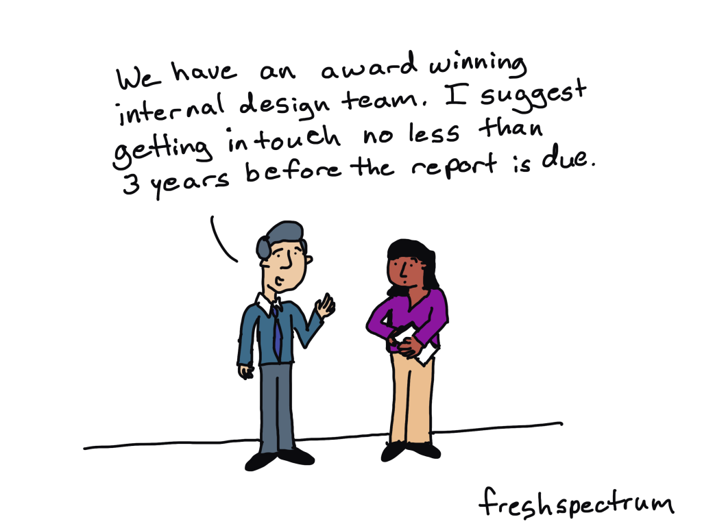
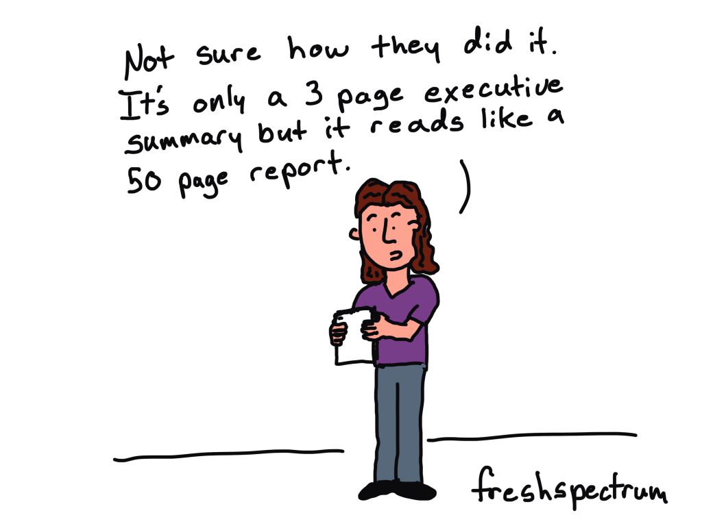
DataViz home cooks wanted.
Some of the coolest innovations over the last decade are not tools that allow us to do things that have not been done before. Instead they are things that bring better dataviz and design to the masses.
- You don’t need a deep dive into Adobe creative cloud to create high quality infographics. You can start with Canva.
- You don’t need a deep dive into javascript, R, or python to creative interactive web reports or apps. You can start with a WordPress website builder.
- You don’t need a deep dive into Tableau or PowerBI to create automated interactive charts. You can start with Flourish or Datawrapper.
With these new tools, and the right process, you can create high quality DataViz and designs easier and faster. And most people won’t know the difference (including your boss or clients).

So, should DataViz be easy?
Yes.
YES!!!
I would love it if more organizations put more time and money into DataViz and design. But until that happens, I think the best thing we can do as a data field is to learn how to use the tools we have to make the process easier and faster.
I and I hope with this blog, along with the workshops and courses I’m developing, I can continue to help make that process easier in the new year.