This is an Eval Central archive copy, find the original at freshspectrum.com.
In this series of blog posts I will share examples of professionally designed modern reports. For each report I’ll also write out a list of things to notice. My goal is not to critique but to show you real life examples of design concepts to help you become a better report designer.
Today let’s take a look at Feeding America’s Map the Meal Gap 2023.
This report is a good example of a modern layered approach. Meaning it’s more of a report bundle than a stand alone document. For this study let’s view the report holistically and not to spend too much time focusing on any one specific element.
To get the most out of this post I suggest opening the report in another browser tab so you can bounce and forth as your read this post.
1. The report is anchored by a dashboard style interactive map.
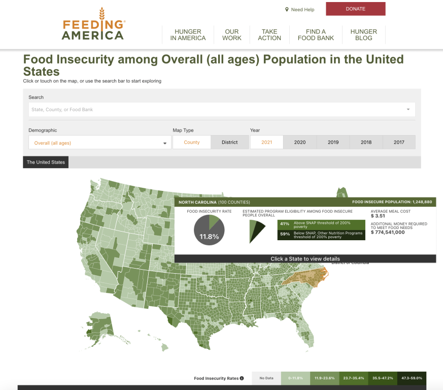
The interactive map is “deep” not “wide.” Meaning there are only a handful of variables (food insecurity rate, SNAP eligibility, average meal cost, population, money required to meet food needs) but you can filter the map to show different localities, demographic groups, and across different years. The presentation style won’t change, only the data. But there is a ton to explore.
2. Check out the four tab Q&A below the map.
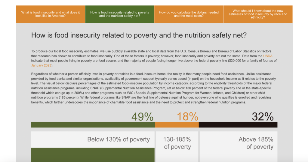
“Everyone is Overwhelmed.” I say this a lot when teaching workshops and writing on this blog, but it’s true. As a report designer you need to find ways to layer information so it doesn’t overwhelm the reader. The initial landing page for this report doesn’t look too intimidating, outside of the interactive map there is only so much content showing and just a few links. But in order to pack in more information they used a simple tabbed box at the bottom of the page that features answers to four essential questions.
3. What else is included in the reporting bundle?
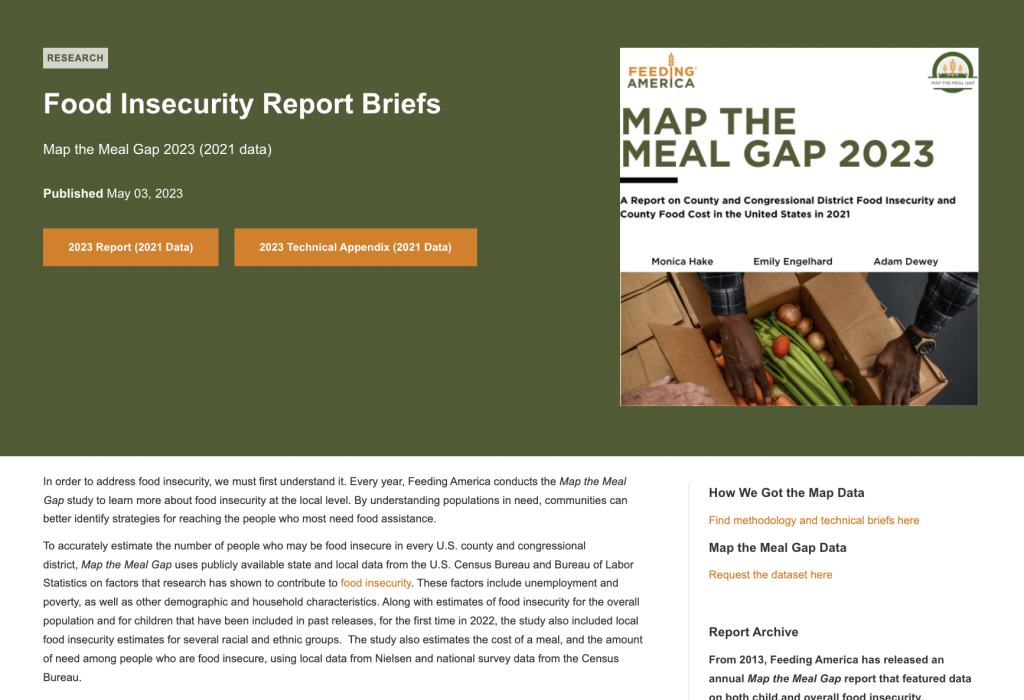
Let’s list out all of the elements that were created when sharing this report. Elements that then become part of the reporting process and contain additional information for interested readers.
- The Interactive Map
- The “Map the Meal Gap 2023” visual PDF report.
- The “Map the Meal Gap 2023” PDF technical brief.
- The landing page where the Interactive Map is shared.
- The landing page you end up on when you click the “report” link. Where you will find the “Food Insecurity Report Briefs.”
- The landing page you end up on when you click the “methodology” link.
- The landing page you end up on when you click the “data” link.
This list just includes the primary pieces of content that make up the report. It does not include any associated social media, email communications, presentations, or featured images (which likely also exist but were not noticeably linked on these pages).
4. The main downloadable PDF report is visual and easy to read.
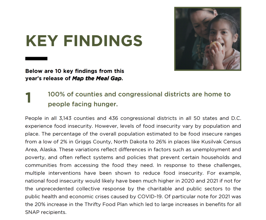
This report was clearly designed to reach a broad audience of stakeholders and politicians. Even the decisions to map the data by both county and congressional district hints at how this report was designed to have a policy influence. The pages are not overloaded and it reads more like a magazine or brochure than it does a technical report.
5. The technical brief is text heavy and only includes a few visuals.
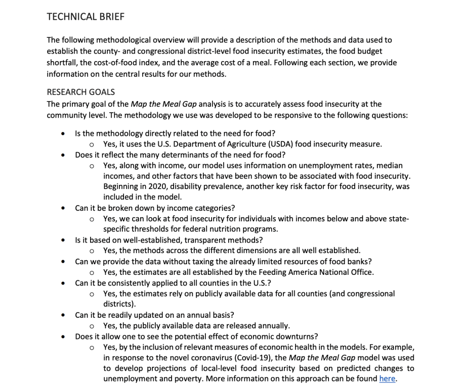
The technical brief is not a work of art. It uses a smaller font and includes far fewer visuals. But it serves its purpose.
Not all reports need to be pretty. Spending extra time, effort, or money making a technical report designed for a very small technical audience is wasteful. Simple formatting and basic fonts are really all that is required.
What are your takeaways?
Did you check out the report? Anything interesting catch your eye? If yes, leave a comment and let me know what you noticed.