This is an Eval Central archive copy, find the original at freshspectrum.com.
In this series of blog posts I will share examples of professionally designed modern reports. For each report I’ll also write out a list of things to notice. My goal is not to critique but to show you real life examples of design concepts to help you become a better report designer.
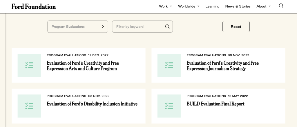
This week I want to look at content that you might not consider to be “reports” but are totally reports. It’s the Program Evaluation Landing Pages in the Ford Foundation’s Learning Library.
To get the most out of this post I suggest opening the report in another browser tab so you can bounce and forth as your read this post.
1. How do you define the word, “report?”
So for this week I want you to explore just the landing pages for several different Ford Foundation evaluation reports. Don’t download the PDFs (unless you really want to) as they are not my focus this week.
For me, a report is just a type of communication vehicle. It could be a PDF but it could also be a person delivering a presentation through a webinar. In this case, I want you to notice how the landing page acts as its own report.
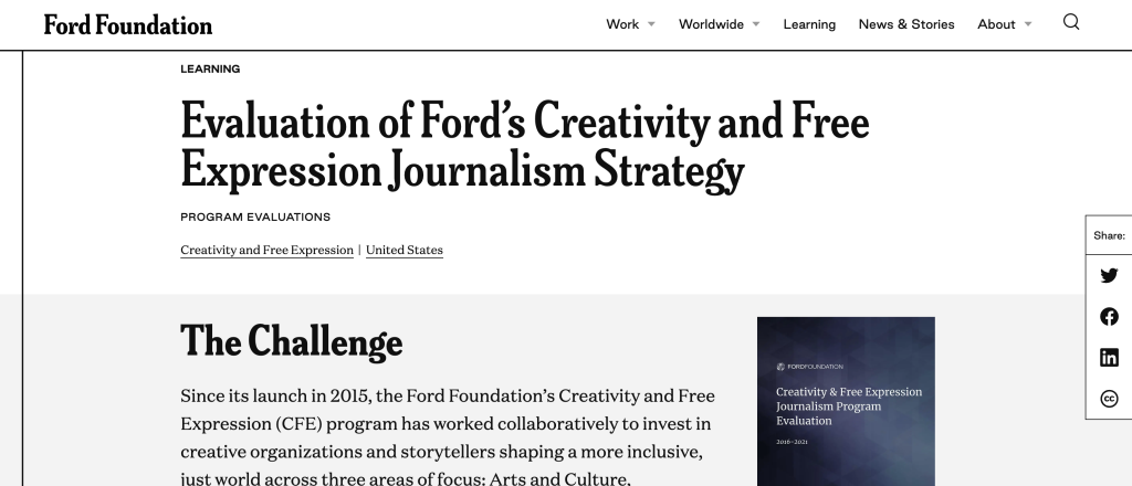
2. What is a landing page?
The landing page is the web link people go to when they download your report. You might also refer to this as the download page.
I find that for most evaluators the report they refer to is just the document at the end. Which I think misses a huge amount of opportunity. Instead, think about every point in a reporting process as a kind of audience touch point.
In that way, a social media post would be an audience touch point. Same goes for the descriptive blurb that might go into an organization’s newsletter. The landing page would also be an audience touch point. And all of these things come before anyone ever gets to the document at the end.
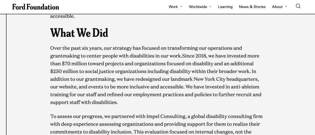
3. Notice how the structure of each landing page is standardized?
There are three sections.
- The Challenge
- What We Did
- What We Learned
It can be really hard to standardize reporting inside large organizations. They work with so many different individual projects and consultants. Yes, you can introduce design standards, but is it always worth the effort?
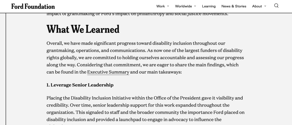
4. It’s like a blog post!
I really like how the “What We Learned” section is built like a listicle blog post. This isn’t an infographic, there really are no graphics here. The landing pages are just like a blog series introducing each individual report.
That said, if you wanted to make an infographic out of these it would be super simple. I mean they are already 75% of the way to a final product.
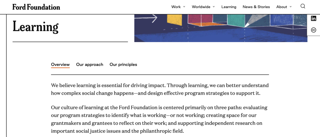
5. Bonus, check out the overview, approach, and principles at the top of the Learning page.
I think it’s cool how the Learning “search” page leads in with an overview.
Since this information is universal across all the reports, it makes sense to include it on the page you visit to search through all the reports.
How are your report landing pages formatted?
Are you using this space for more than just a simple abstract? If not, why not? Let me know in the comments.