This is an Eval Central archive copy, find the original at evalacademy.com.
Six Hacks for Renovating Your Evaluation Report
Part 3
This series of posts walks you through how to reno your evaluation reports using six of Canva’s design lessons. Part 1 focused on how to take your audience on a journey using storytelling techniques. Part 2 focused on how to format your report with a consistent, cohesive look using colour and font. Part 3 in this six-part series focuses on formatting your report by grouping and spacing elements in your report to enhance readability.
In this blog series we have talked a bit already about how our brains like to consume information. In a nutshell, human brains crave visual cues – they are constantly searching for patterns to make learning easier. Let’s dig a bit deeper into human perception and explore how simply arranging elements on a page can make all the difference when it comes to engaging your audience in your report.
Gestalt Principles
Does this image look familiar?

The image above is called Rubin’s Vase; it can either be seen as a vase-like object or as two faces. The Rubin Vase was made famous by Gestalt psychologists. Gestalt psychologists are known for their research that attempts to understand perception and how the human eye perceives visual elements. In fact, they have come up with a number of principles that describe how the human eye perceives visual elements. Gestalt principles explain how our eyes perceive shapes as a single, unified form rather than separate elements. Rubin’s Vase is an example of that – our brains tricking our eyes into perceiving interesting wholes out of seemingly meaningless individual elements. The figure below illustrates the Gestalt principles. The principle we are going to focus on in this article to create more accessible, readable reports is, you guessed it, proximity!
The Principle of Proximity
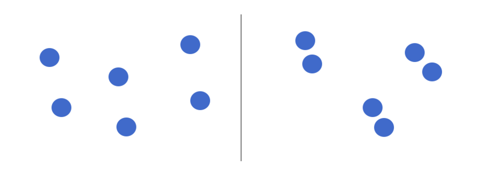
The principle of proximity states that objects that are close together are perceived as a group. The shapes of the left appear to have no relation, but when we organize them together, they are no longer viewed as separate objects but groupings. We can easily leverage this principle in our reporting by 1) grouping like things together, and 2) embracing white space. Let’s take a look at how we reno’d a recent report using proximity principles.
Grouping Like Things
Reports are often comprised of text. Grouping text is best done through sensible paragraph use – one topic with one objective to prove. Below are two images from a recent report we drafted.
The image on the left shows the initial draft of a recent report where we dumped a bunch of text onto the page as part of our writing process. When we went to format the draft, we took that text and used the proximity principle to separate the text into three topic areas. As discussed in the last article, headings help with readability; however, even without the headings you can see the grouped text in separate paragraphs helps our reader understand that the information grouped together is similar but different from the other paragraphs.
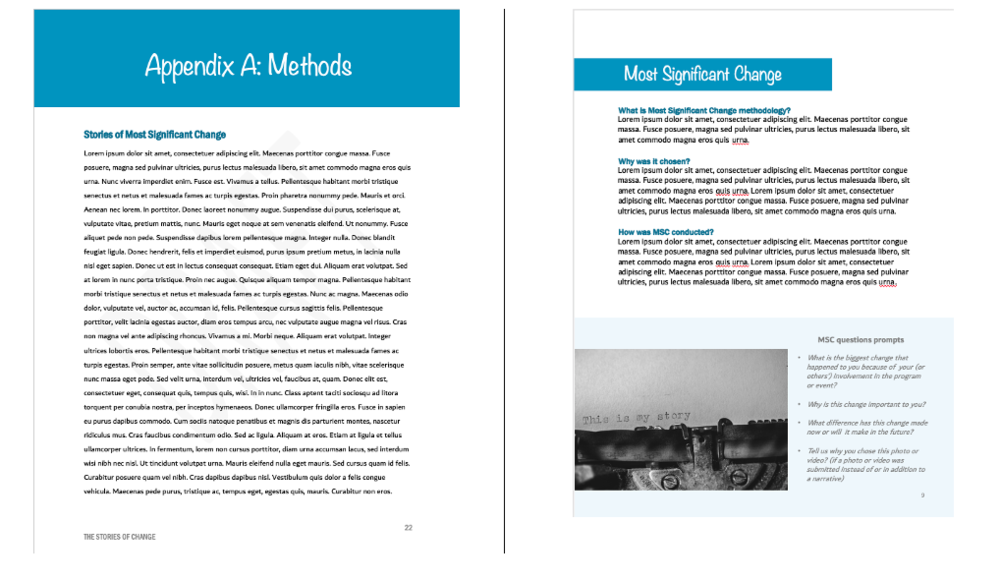
The image on the right also illustrates how call out boxes can be used to delineate information by grouping it to one area of a page. We wanted our readers to know the questions we asked participants and so we grouped the questions in a call-out box and then grouped each question together in a bullet within the call-out box. By grouping the questions together into a bulleted list, readers can easily identify each question as opposed to including them in a paragraph above.
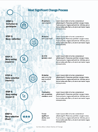
In addition to describing the most significant change (MSC) methodology we wanted to show how we implemented it. The image below illustrates our MSC process. You can see that we didn’t use borders around the steps or lines connecting the descriptions to the steps. We didn’t need to clutter up the illustration with those elements because we used the proximity principle. Our eyes can look at the groupings of text on the right and see that they are separate steps because they are separated by space.
Embracing White Space
The second way to practice proximity is to embrace white space. We want to practice proximity, but not to the point where we group too many things together and end up with a busy report. White space is your counterbalance to report busyness; it is the areas between the elements on a page. When I open a report and there are pages and pages cramped with text, graphs and other items, I want to close it as quickly as I opened it. I get the same feeling when I enter a room full of furniture, pictures and other clutter – overwhelmed and wanting to leave. White space creates the visual breathing room your audience needs to capture and hold your audience’s attention.
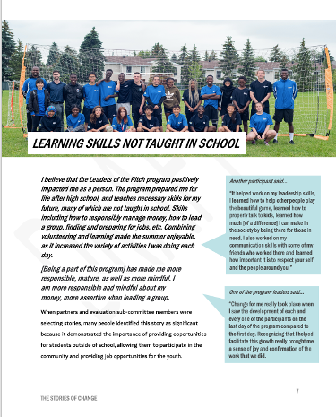
Creating white space is perhaps one of the easiest but most effective ways I use to format a report. The following images show the same report described above. The image on the left shows the original page from a draft of the report. You can see there was a lot going on.
The two pages below illustrate how we infused some white space to simplify how the same information was communicated. It can sometimes add length but since it helps to engage my audience I make that trade-off every time.
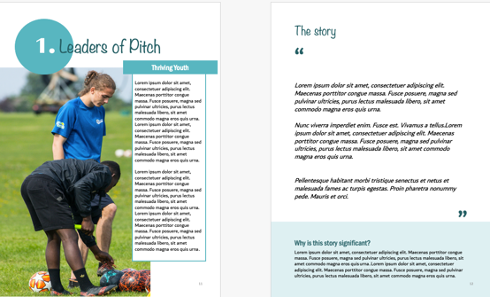
Take a look at some of the reports you are creating. Are there opportunities to practice proximity? Try it out and make sure to stay tuned for the fourth article in our six-part series, “Make it pop” where I show you how to highlight the most important takeaways in your report by playing up differences.
Article thumbnail image source: Canva
Sign up for our newsletter
We’ll let you know about our new content, and curate the best new evaluation resources from around the web!
We respect your privacy.
Thank you!