This is an Eval Central archive copy, find the original at freshspectrum.com.
Do you know how to design a good one page report? Do you know how many words fit nicely on a single page? Do you want to know how to find good one pager templates? This post is for you!

How many words fit nicely on a single one page report?
So this one depends a lot on your font choice and size. It also depends on the overall design composition. But let’s test out a few options.
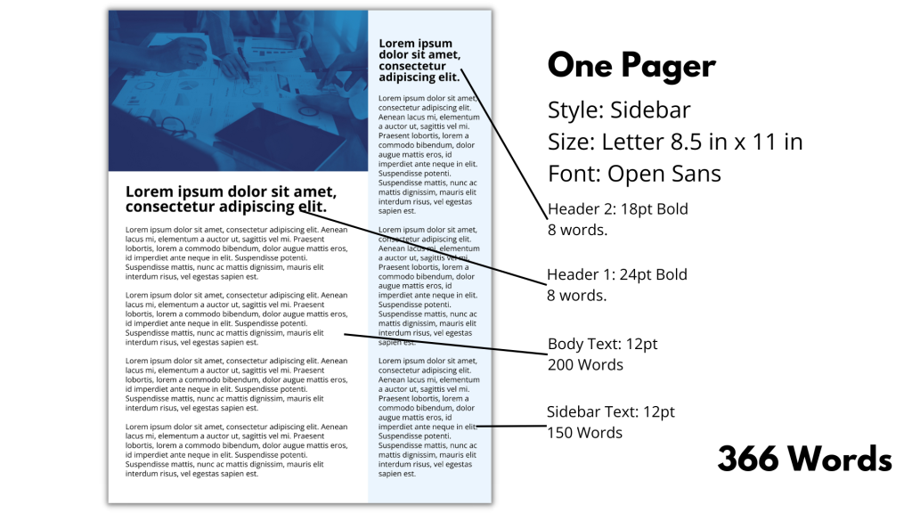
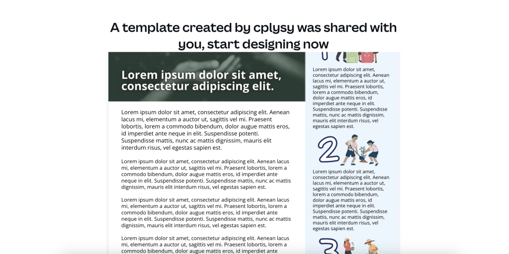
Here is a simple two column design (main column + sidebar). I used Open Sans for the font and left space for an image in the top left. Each of the main Lorem Ipsum paragraphs is 50 words, and the headers are each 8 words.
With a 12pt main body font, 24pt header 1, and 18pt header 2, we get a total of 366 words. This is what it looks like.
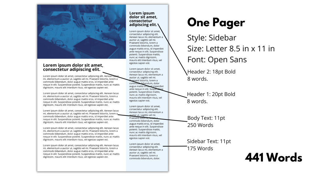
If we drop the font sizes to 11pt body, 20pt header 1, and 18pt header 2, we get a total of 441 words. So an increase of about 25%.
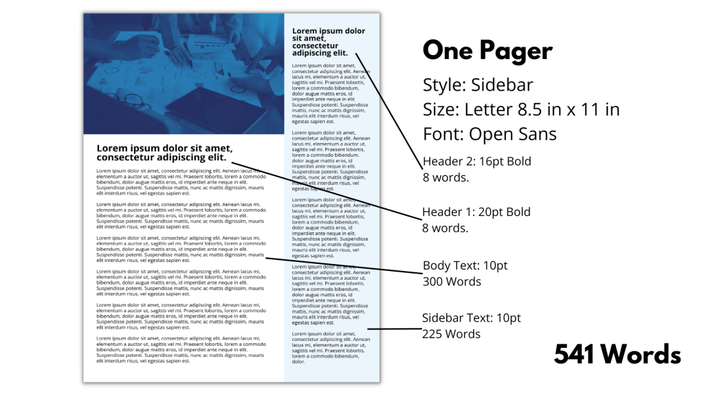
If we drop the font sizes to 10pt body, 20pt header 1, and 16pt header 2, we get a total of 541 words. Yes, the words fit, but this one pager feels so much heavier than the 12pt one pager.
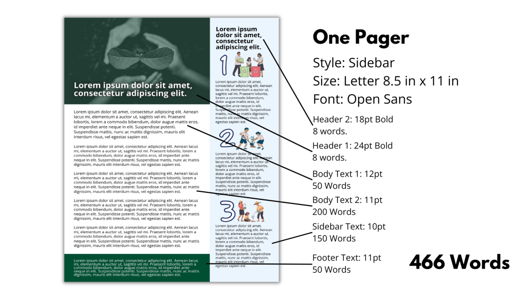
Chances are, you’ll want to mix and match just a little. In this one pager I shifted the header 1 over the image, using the same 24pt font as the first example. I used 18pt for the header 2. For the narrative I mixed font size, with the first paragraph of the body text at 12pt and the remaining 4 at 11 pt. I also added a footer block at 11pt.
Now for the sidebar, I dropped the text size down to 10pt and added some images to split the blocks. The change means being more intentional in the writing, but it also increases the word count compared to just dropping the font size.
So it wasn’t really my intention originally, but if you like any of these examples, here is the Canva template link. Just make sure to sign into, or register for, Canva before clicking the template link. It’s free.
How do I design a good one-pager in Canva?
Designing for a one pager introduces constraints on your process. Which can actually be a good thing for a designer. Here are two tips that can make designing a one pager a bit easier.
Tip 1. Use Templates.
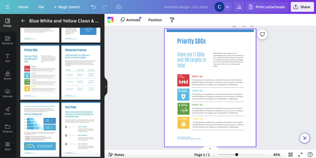
Canva has a bunch of report templates. The trick is to understand that a report template will show up as just the title page, but there are a bunch that have internal pages designed as well. These internal pages can make for really nice easy to use one pager templates. Like check out the inside spreads for this SDG Progress Report template.
Also, don’t limit yourself to looking at only ‘Report Templates.’
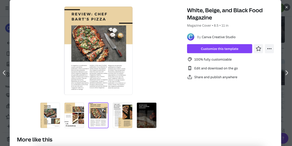
For example, the inner pages of many Magazine templates could also make for really nice one pagers.
Tip 2. Use Grids.
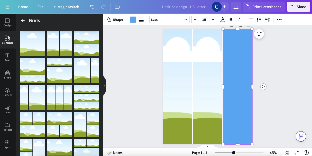
Grids in Canva elements are actually photo grids. But you can also just them as measurement guides, which is what I do often. I put in a grid, overlay a text box over one of the columns and poof, then delete away the text box.
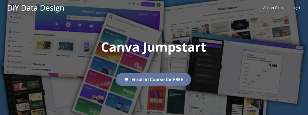
This is something I talk more about in my FREE Canva Jumpstart course.
My boss likes using Word for track changes and will not use Canva or PowerPoint.
Here is another piece of advice.
It’s okay to design in one platform and write in another. Actually, it’s often better to write in one platform and design in another.
Design or choose a template with generic text (ex. you could use simple lorem ipsum). Use Canva, or PowerPoint if you prefer. Then use the dummy text to understand how many words will fit inside your one pager.
Now you get to act like a Newspaper editor. You know your target word count. If someone wants to go over that word count (including yourself), make it known that the decision will break the template.
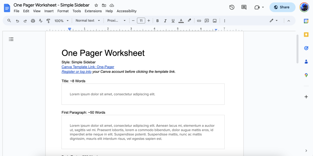
You know the one pager template I shared above. Here is a Google doc worksheet I developed to pair with that template. Feel free to copy this worksheet and use it along with the Canva template. You can also download the worksheet as a Word Docx if that’s a preferred writing tool.
Want to improve your own graphic design skills?
Here are some nice free graphic design guides.
A lot of my interest in grid based design started when I found the work of the late Massimo Vignelli. There are a couple of his works available on the web for free download, and they are well worth the read.
The Vignelli Canon

The famous Italian designer Massimo Vignelli allows us a glimpse of his understanding of good design in this book, its rules and criteria. He uses numerous examples to convey applications in practice – from product design via signaletics and graphic design to Corporate Design. By doing this he is making an important manual available to young designers that in its clarity both in terms of subject matter and visually is entirely committed to Vignelli’s modern design.
Designed by Massimo Vignelli, 2009, 96 pages.
Graphic Design for Non-Profit Organizations
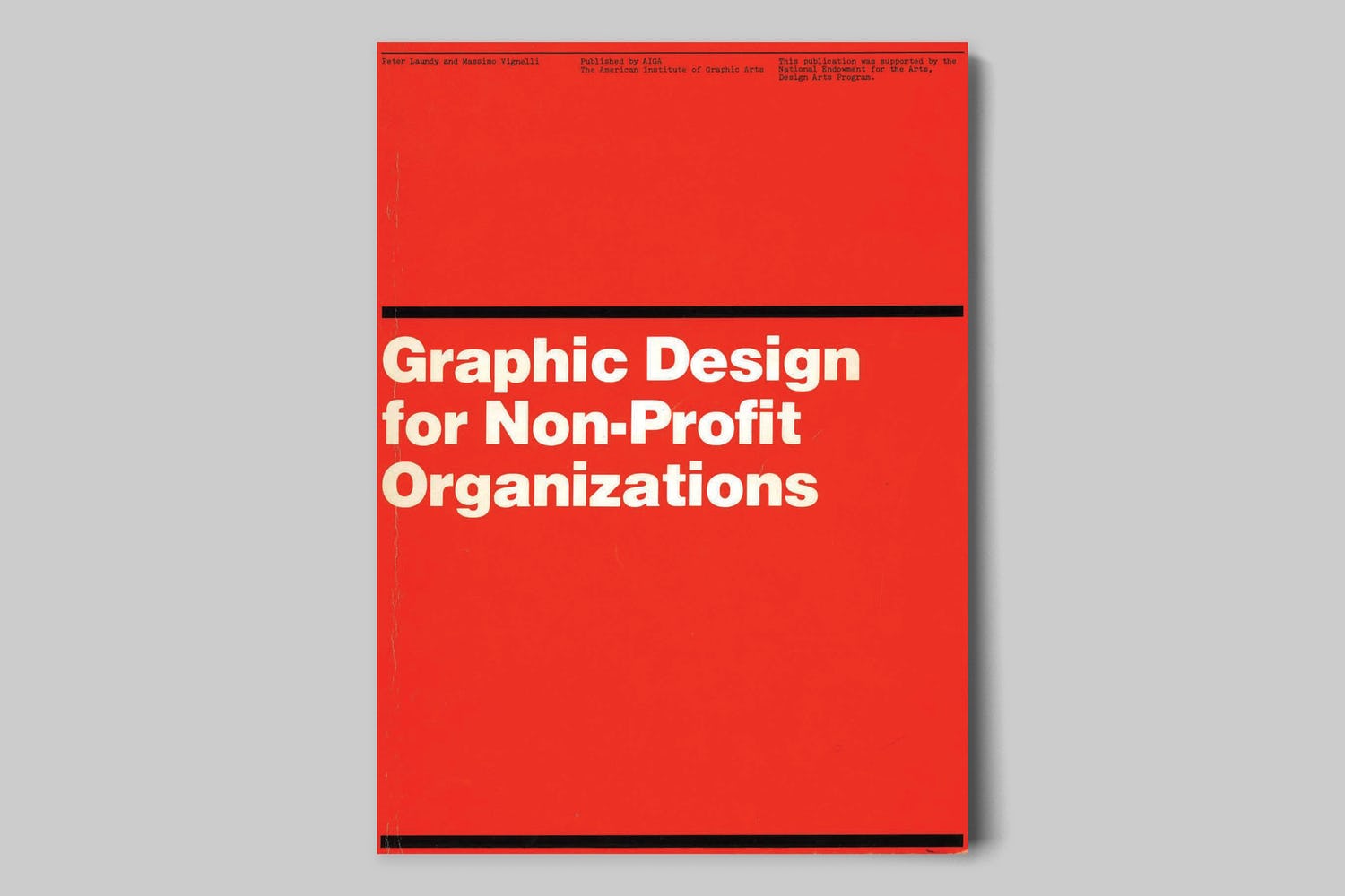
The document presented here focuses on improving structural design and general best practices for Non-Profit Organizations. However, the scope of the teachings apply to achieving good design across any industry. These works are the property of their respective owners and should be used for non-commercial research and education purposes only.
Designed by Massimo Vignelli & Peter Laundy in partnership with AIGA, 1980, 52 pages.