This is an Eval Central archive copy, find the original at freshspectrum.com.
I’m trying out a new style of course, and for the moment, it’s free.
Even the best designed full reports are only read by so many people. It might be the marquee deliverable you pass on to your client. The thing that addresses everything you learned and documents everything you did. But ultimately long reports have limited audience.
But then there is that one really nice illustration or chart. You know the one, it’s the visual you end up using in all your presentation slide decks. It’s the only image that gets shared in the email newsletter. It’s the image that goes along with all your social media posts.
That one little graphic will get seen by way more people than your full report.
That is, at least, if you have that one little graphic.

Our biggest reporting problem.
Our biggest reporting problem is not:
- long boring reports,
- bad charts,
- or a lack of audience interest.
Our biggest reporting problem is that our reports are under illustrated.
We do not create enough quality visuals to satisfy the functional needs of our modern image-hungry digital society.

What are Micrographics?
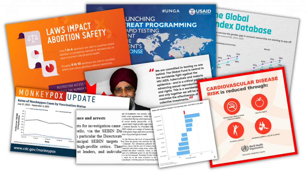
I use the term to describe a bunch of different types of visuals.
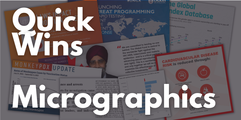
But in a nutshell, micrographics are visuals that can exist and even thrive in their own right outside of a report. They have a wide range of uses…
- as power point slides,
- as blog post featured images,
- as report illustrations,
- as social media images,
- as centerpieces in longer infographics,
- as marquee visuals in executive summaries,
- as newsletter illustrations,
- and more!
Communications’ teams have been picking up the slack.
Since most of our reports are under illustrated and lack the kinds of images that can be stood up on their own, social media teams have had to pick up the slack. This means taking our work and adapting it into a visual format.
We see this the most with large organizations that have their own dedicated comms teams. Their social media accounts share tons of visuals, most of which have been adapted from reports, newsletters, and fact sheets that contain few, if any.
But not all of us work in large organizations. And even if you do, there is no guarantee the social media team is going to pay special attention to your work. Not unless you make it easy for them to do so.

My email course on Micrographics.
The course is made up of 10 emails sent over 10 days.
With the exception of the introduction and the wrap-up, the emails are all structured using the same pattern.
- First we will look at an example of a micrographic shared by a large NGO, non-profit, or government organization on Twitter.
- Second we will look behind the tweet and find the information source behind the graphic.
- Third we will break down the micrographic into its component parts.
- And lastly we will recreate the image using free online tools (mostly Canva but also Flourish and DataWrapper). I have done this for each one of the 8 examples and shared my version as a Canva template. It’s up to you to follow my lead (but you can look to my example if you get stuck).
The goal isn’t to teach you how to copy the work of others, but to give you a better perspective on the process of data illustration.
My hope is that by showing you how other large organizations go about creating visuals for social, you’ll be able to apply that same process to your own work. You’ll also get some experience using a few new tools.

Want to binge the course instead?
The course binge option is only available to Designing with Chris – All Access participants. But you are more than welcome to join us anytime!
Ready to start the email course?
Just click the link, put in your email address, and click to get started. Your first email should come pretty quickly! Then you can expect an email everyday for the next 9 days.
