This is an Eval Central archive copy, find the original at freshspectrum.com.
Seriously, and I don’t mean after you’ve written several drafts. I really mean before you write.
In today’s post.
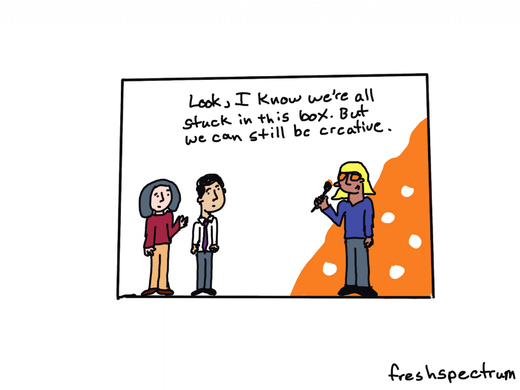
- Most creativity happens inside the box.
- Why waiting till the end to design your report is a bad idea.
- Why designing first is a better idea.
- This is something I call reverse design.
- Introducing my FREE Course – 1. 2. 3. Report!

Most creativity happens inside the box.
There is this notion out there that to be creative you need to think “outside the box.” Or that you need to draw “outside the lines.”
But I think that’s BS.
Because not only can creativity happen inside the box, the box can help us be creative. Because even though the box limits freedom, it also takes away a bunch of decisions that just get in the way. That clears space to let you focus on the decision points that are most important.
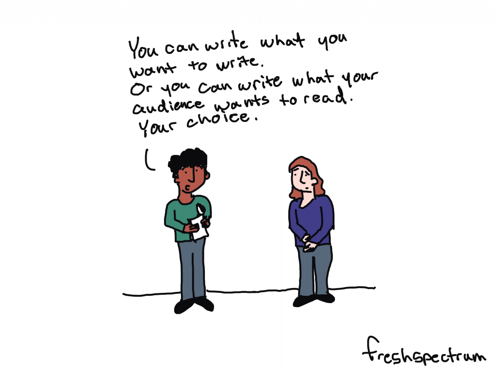
This is why a simple writing prompt is more useful for creative writing than a blank page. It’s why a set of canned WordPress templates can help you create a fresh looking, but functional, web page. It’s why the simple format of a slogan or elevator pitch can help an entrepreneur communicate their business idea.

Why waiting till the end to design your report is a bad idea.
I have been on a bunch of evaluation teams where the thought of report design is something that you don’t even entertain until you’ve already written several drafts.
It’s very possible that by the time the designer gets a hold of the report, the wording is completely set in stone. So the designer is stuck with what is written, even if the way something is written makes the report design that much harder.
Here is the deal. A well-designed report, with lots of white space, charts, photos, illustration, and icons, is usually going to have far less space for text than you have written in your Word document. Your 25 pages of Word document narrative might translate better to a 40 page modern report, not a 25 page report.
A good designer can usually still make it look okay. But it’s going to feel heavy. Or it’s going to go way over your desired page count.

Why designing first is a better idea.
This is why I like to design the report template first. Even before writing your report you usually know:
- The target report page length.
- The must have report sections.
- Your branding and style guidance.
With that information you can pull together a basic template using dummy text (i.e. lorem ipsum or something a little more narrative like). There is a saying within my wife’s family that I think makes sense here, “start the way you mean to finish.”
By creating a template in the beginning, that has the right overall look and feel, you get to create specific word count goals. You’ll know around how many words you have for every section of your report to keep it clean.
And you’ll also know when you are breaking that style by going over word counts.
This is something I call reverse design.
It’s about starting a report from your ideal final product and working backwards. I talk about it, along with my 3 audience approach in my new free course on simplifying and modernizing your reporting approach.
It’s called 1. 2. 3. Report! and it’s open for enrollment right now.

My FREE Course – 1. 2. 3. Report!
The full free course is just over 30 minutes and includes:
- 9 total videos
- 4 lessons on my simple modern report design approach.
- 4 reporting activities you can complete using Canva.
This includes activities on creating a 25 page pdf report, 3 page pdf executive summary, 1 page pdf report, and a listicle infographic.
You’ll also get access to a discount code for when my full workshop opens back up for registration on March 1st.