This is an Eval Central archive copy, find the original at freshspectrum.com.
There is this fantastic book on usability written by Steve Krug called, Don’t Make Me Think. It’s not new, first released out all the way back in 2000. But if you have never read it, you should. Even if you have never really considered yourself a web designer.
“Don’t Make Me Think!”
Krug’s First Law of Usability
Following the “Don’t Make Me Think” law is a fantastic way to make an easy-to-use website, mobile app, or data dashboard. Because most of the time in those situations, making people think is unnecessary.
Let’s say you need to change your home’s air filters, and you go online to your home improvement store of choice. You should be able to easily find your air filter, buy it, and then have it delivered to your home. Thinking should not be required.

Most data dashboards also don’t require thinking. Picture a COVID-19 tracking dashboard. When you visit one, chances are you are not up for an in-depth study. You just want to know the numbers.
A site like Amazon is really good at not making us think. But that clunky resource website filled with too many words, acronyms, oddly named sections, and poorly designed content, not so much.
When thinking is necessary.
Our data work sometimes requires making people think. Occasionally we need to challenge someone’s world view because the evidence we’ve collected warrants a challenge. Challenging a reader in the right way at the right time can help them to learn something new.

Where thinking is useful.
- When trying to understand a new concept.
- When questioning a commonly held view.
- When calling a reader to take action beyond just a button click.
- When a point is so important you want to slow the reader down.
Where thinking is NOT useful.
- When trying to figure out the button to click next.
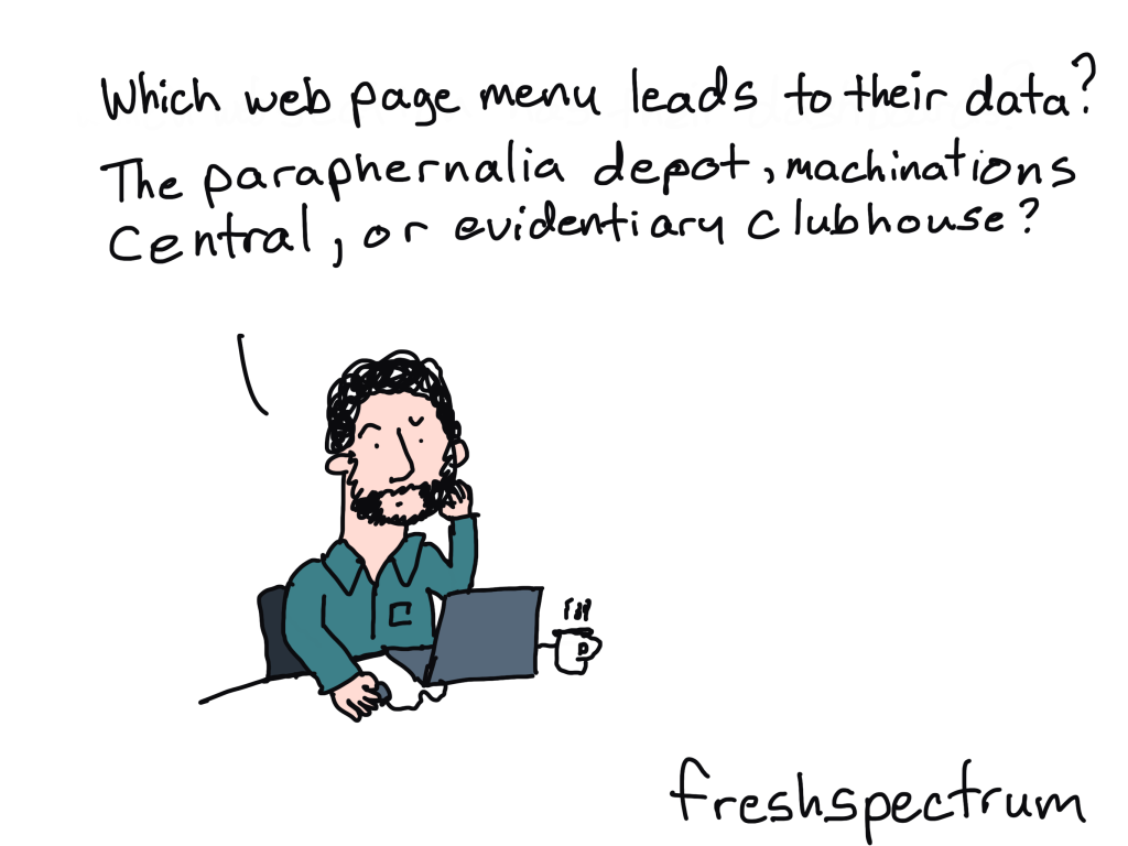
- When deciphering menu items.
- When pulling data for well-known indicators.
- When searching for answers to easy questions.
There isn’t a hard and fast rule on what thinking is useful and what is not useful. But you should be able to defend your decision to make people think. Forced thinking can be a barrier, use it wisely.
Flip Card Game Concept
Working with a colleague I created a little concept game based on a published report.
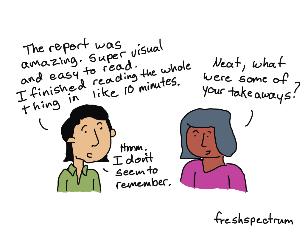
The following paragraph included a meaningful finding from the study. In paragraph form it’s really easy for a reader to just skim right through the data. Does it deliver the data? Yes. Is it efficient? Yes.
However, these assets are not equally distributed across neighborhoods. SOMA (23%), Richmond (21%), and Sunset (19%) neighborhoods have the highest number of food assets; while some of the most disadvantaged neighborhoods, such as Japantown (4%), Bayview (3%), Excelsior (2%), and Visitacion Valley (1%), have much fewer assets. Among all food assets in these API priority areas, only approximately 1 in 5 (19%) accept SNAP or WIC.
Food Justice in Turbulent Times – Needs & Opportunities in San Francisco’s API Communities
But what if we wanted to slow down the reader instead?
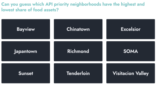
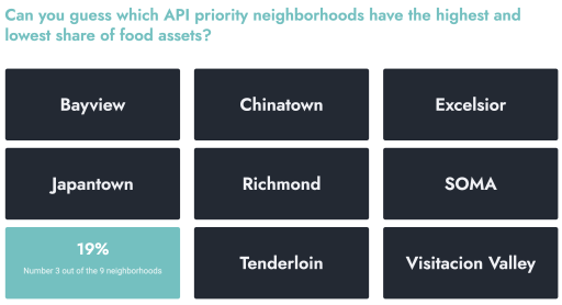
Perhaps we can simply make them guess their way to the answers. Clicking on the image below will take you to a demo version of the simple game I created in WordPress.

By simply moving your mouse over each neighborhood, the card will flip. And from the flipped card you’ll see the percentage share of food assets along with the neighborhood’s ranking (out of 9).

Why I design reports in WordPress.
Something like this is super simple to do in WordPress. But you won’t find a game in a PDF.
Speaking of reporting using web design tools…did you know?
I now offer The Modern Reporting Solution: an all-in-one design, technology, and copywriting service using WordPress to create cutting edge interactive reports and data dashboards. The result, accessible online reports your audiences will love.
Curious about this? Set a free consultation with me at freshspectrum.com/consulting