This is an Eval Central archive copy, find the original at freshspectrum.com.
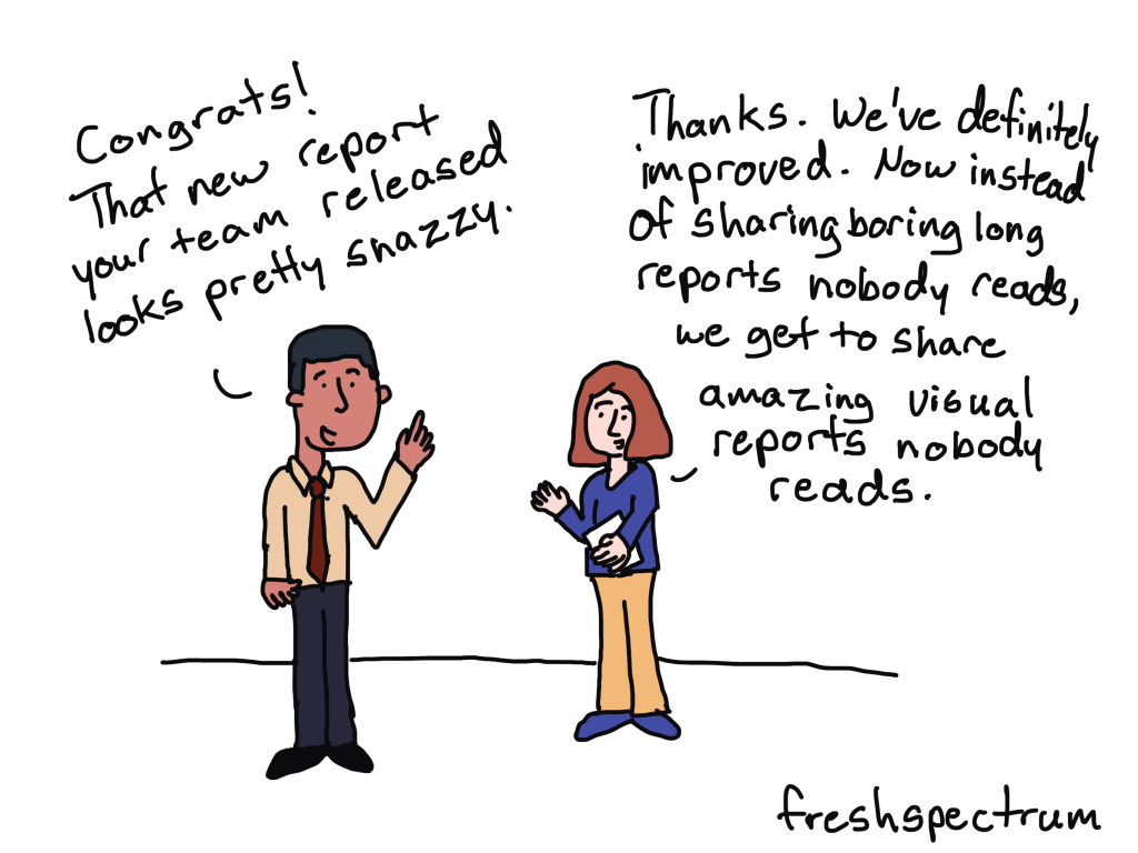
Long, boring, dusty-shelf reports might be a problem, but it’s rarely the biggest problem most data teams face.
When teams decide to start tackling their report design problems, that’s where they start. They think that if they can turn their long, boring, dusty-shelf report into something that’s not as long, not as boring, and more enticing to read, everything will be better.
So they commit most of their reporting resources towards that goal. Which just leads to shorter, more interesting, dusty-shelf reports.

Report deficiency should be the first problem you tackle.
The easiest shortcut to better serving modern audiences is to create more reports. Reports of different lengths, in different formats, and with audience tailored content.
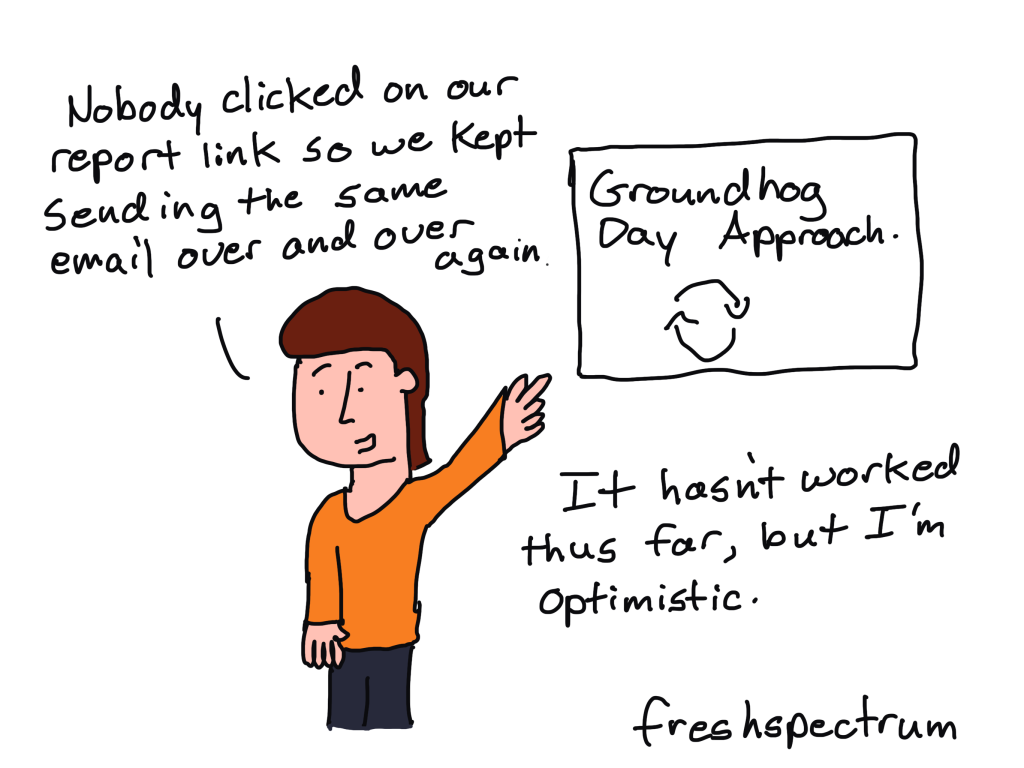
The half-life of any piece of content shared today is remarkably short. So an org with only one really good report has two options, to share it once and move on or spam share it over and over again.
Nobody likes being spammed by an organization trying to push their one big report. But by altering formats, lengths, and content you create additional sharing opportunities that don’t feel forced. You also make it easier for those reports to be shared with different audiences.

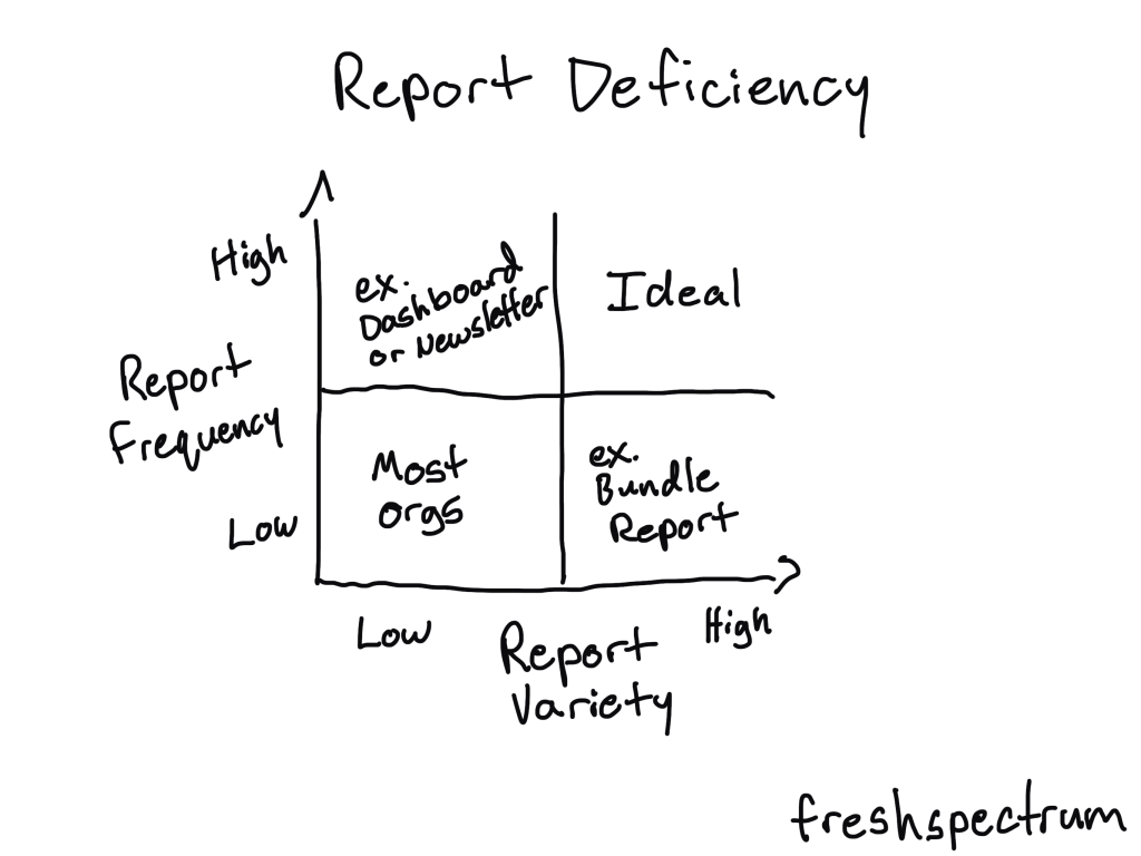
The two basic ways to treat report deficiency
The first is to increase frequency.
Higher frequency lets you develop an audience. If you only share a single report once every year you don’t have much of an opportunity to grow and cultivate a report audience.
Blogs and email newsletters are likely the easiest ways to increase frequency. But you can also just create shorter visual reports more often, establishing a cadence that can help you grow that audience.
The second is to increase variety.
Don’t just share one big annual report. Or, if you do, adapt that long report into a collection of different formats (ex. short visual reports, infographics, videos, webinars, presentations, courses, slidedocs, etc.).
These different formats create more opportunities to share your work that feel natural and organic, not spammy. They also give your collaborators (colleagues, program teams, executives, academics, politicians, etc.) choices in how they share your work with broader audiences.

Want to learn some easy ways to create effective everyday visual reports?
I’ll be teaching a live public half-day virtual workshop on designing everyday visual reports.
In this highly practical live course you’ll learn:
- How to design effective short visual reports for use as fact sheets, executive summaries, case studies, method briefs, and more.
- How to apply fundamental graphic design principles to give your reports that modern professional feel.
- A process you can use that will benefit both the writing and design of your report.
Registration in this course includes:
- Two live 90 minute sessions (on February 20 & 22 at 10 AM Eastern).
- Forever access to the recordings.
- Optional-to-attend after session Q&As (I’ll hang around for questions up to 30 minutes after each session).
- One year of office hours with Chris Lysy (a $250 value).
