This is an Eval Central archive copy, find the original at freshspectrum.com.
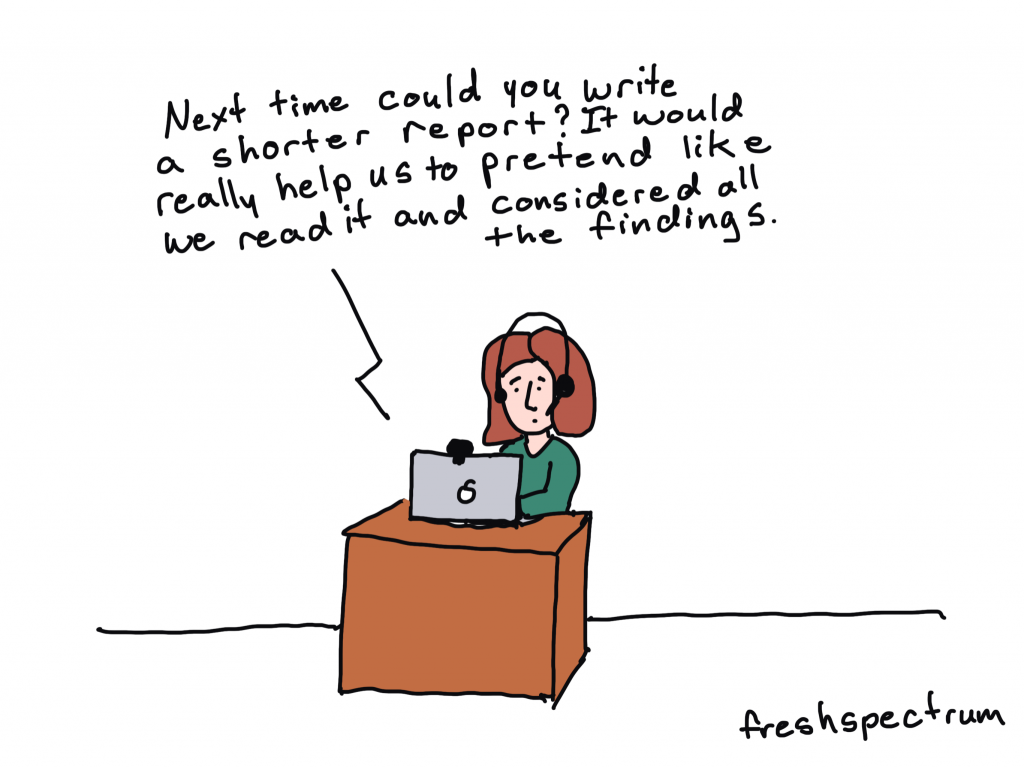
Have you been told your report is too wordy?
Or maybe you received input that your report was “too long” or “not reader friendly.”
And then perhaps you were given the advice, “make it shorter.”
STOP!
Don’t follow that advice.
In this post I’ll tell you why making your report shorter is often bad advice, and what you should do instead.

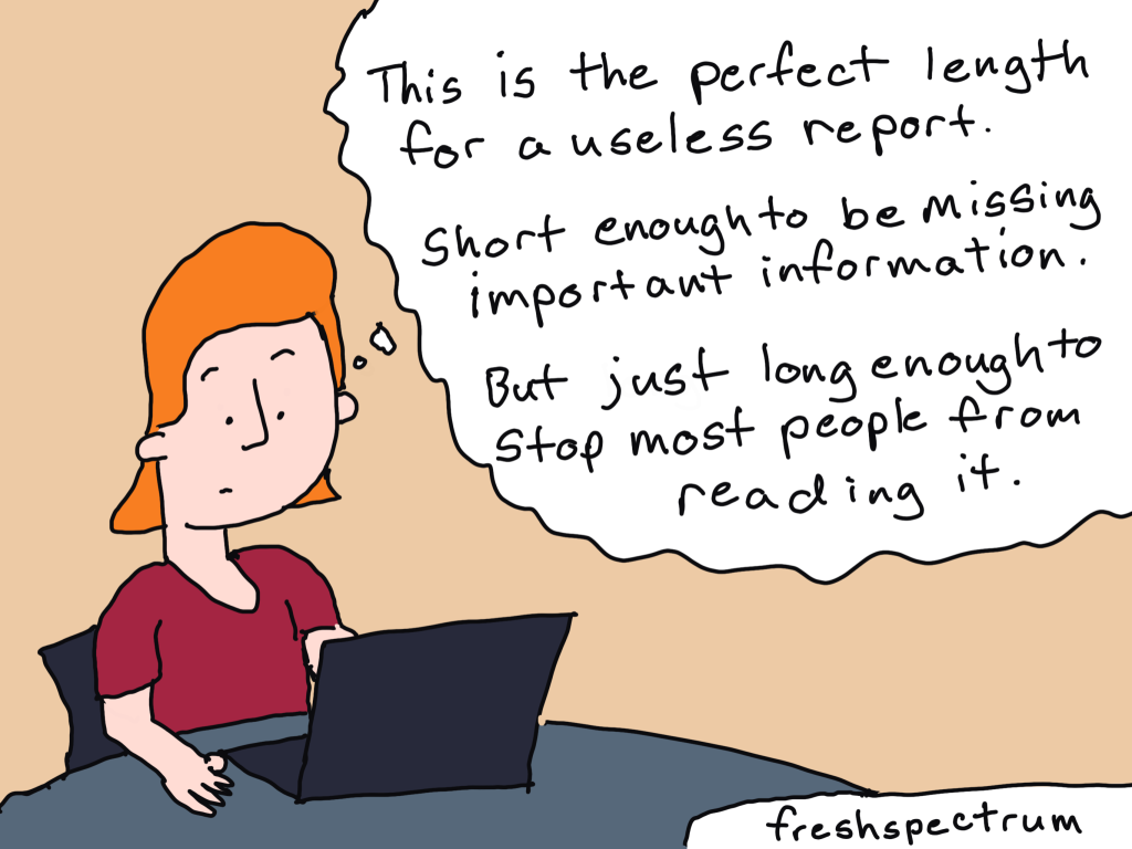
Shorter is not the same as easier to read.
When I was a kid my mom always had a few magazine subscriptions. We were not a Newsweek, Atlantic, or National Geographic family, more of a Southern Living and Better Homes and Gardens. These magazines would then accumulate over time and you would find them all around the house, from end tables to bathrooms.
Magazines were always the kind of thing that you could just pick up and read an article or two then set down. But even though they were really easy to pick up and read, it’s not like they were necessarily that short.
Most magazines are around 100 pages, but do you hear people complaining that a People magazine is too long? A lot of reports that people complain about are around the same page length, and sometimes much shorter. You could even get a comment that a 5 page executive summary is too wordy.
And maybe it is. Because here’s the secret.
People only complain about length or wordiness, when something is hard to read. But length (and even wordiness) isn’t the thing that makes our work hard to read.
So if it’s not a length or wordiness issue, what is it?
In short, poor organization and the wrong format.
A lot of reports are written like novels. There is an expectation that the reader is going to start from the beginning and work their way to the end.
Most people don’t read reports from start to finish. They don’t want a novel. They just want to skim. Then when they find something they want to read more about, they read more about it.
And if your report isn’t designed in a way that could be easily skimmed, people are going to complain that it’s too wordy.

Here are a few approaches for improving your report design (some are counterintuitive).
Try these things before you start summarizing your analyses and cutting out chunks of your rich data.
1. Turn your headings into a story.
Think about it. If people are just going to flip through your report, they are going to start by reading all of your headings. If your headings just say, Executive Summary, Introduction, Methods, Findings, Recommendations, your reader is not going to get anything out of their skim.
If you change each heading into a short narrative sentence, and do this systematically throughout the whole report, the headings themselves will tell the reader a story. Even if they only skim.
2. Add more pages.
If people are complaining that your 10 page report is too long, try making it 20 pages. Just don’t add any new words. With the added space create blocks of white space and make room for illustration. In our digital world readability is more important than physical space. It’s very possible you can make something easier to read just by giving it more space.
3. Reduce font size.
Not everywhere. But if you have long sections, layer your text by staggering font size. Make the first intro paragraph a larger font and the rest of the section smaller. This creates a path for your skim readers to go from header to first paragraph to next header, and on and on.
4. Spotlight important things.
If you have important findings, interesting quotes, or just stuff you really want the person reading to know, format the information so it won’t be skipped. This could be as simple as using a colored block and position to highlight a couple sentences or using an icon. The goal is to intentionally break your reader’s skim through the use of formatting.
5. Systematically illustrate.
Most evaluators and researchers have this academic bad habit of only using visuals if they can fully justify their existence. But in our visual first digital world, visuals are no longer optional. Images have become visual cues that certain information is important, or that a section has changed.
If the visuals don’t exist, everything just lumps together into a big block of text.
Want to learn how to illustrate your report?
My compelling qualitative data visualization course will be live on October 15 & 17.
Reports filled with rich qualitative data are much more likely to feel too wordy. But the answer to improving those reports is NOT to just summarize the data. I have an approach to qualitative data visualization that enhances your work and increases readability without destroying the richness that makes qualitative data so valuable.
You can learn more about the course on my workshop page at diydatadesign.com.
