This is an Eval Central archive copy, find the original at freshspectrum.com.
Are you the kind of person who likes to nitpick other people’s charts?
I’m really not.
I wasn’t there when they decided to use that chart. I don’t know what factored into their decision. As far as their intended audience, I don’t know if anybody actually cares what chart gets chosen. So when a conversation among data folk about a chart pops up on social media, I usually stay out of it (unless it’s funny, or intentionally misleading, or I’m super bored).
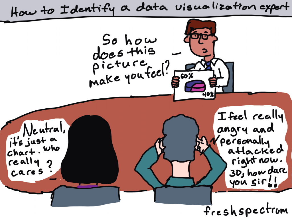
But last week, right around the time I was posting my blog post on tailoring your reports based on interest level, there was one of those conversations about a chart published by the NY Times.
This week I want to talk about that chart and a few others, not to nitpick, but because they are good examples to highlight the differences between Engage style data visualizations and Inform style data visualizations.
Quick Recap: Inform, Engage, Inspire

Your audiences’ interest levels in the data that you are sharing vary WIDELY (unless nobody cares, in which case they don’t vary at all).
Some audiences care a lot about the data you are trying to share. For those people, your goal should be to INFORM. When someone is already super engaged and looking for specific answers, they just need the data. Your job is to give them the data and get out of their way.
Some audiences care enough about the topic to be mildly interested in what you have to say. But you have to pique their curiosity to get them to stay with you. In these times your goal should be to ENGAGE.
Finally, some audiences are not even mildly interested. If we have any shot at getting them interested, we need to INSPIRE.
The Spiral Graph
So last week, at the top of a New York Times guest essay there was a spiral graph.
This was an out of the ordinary way to report time series data.
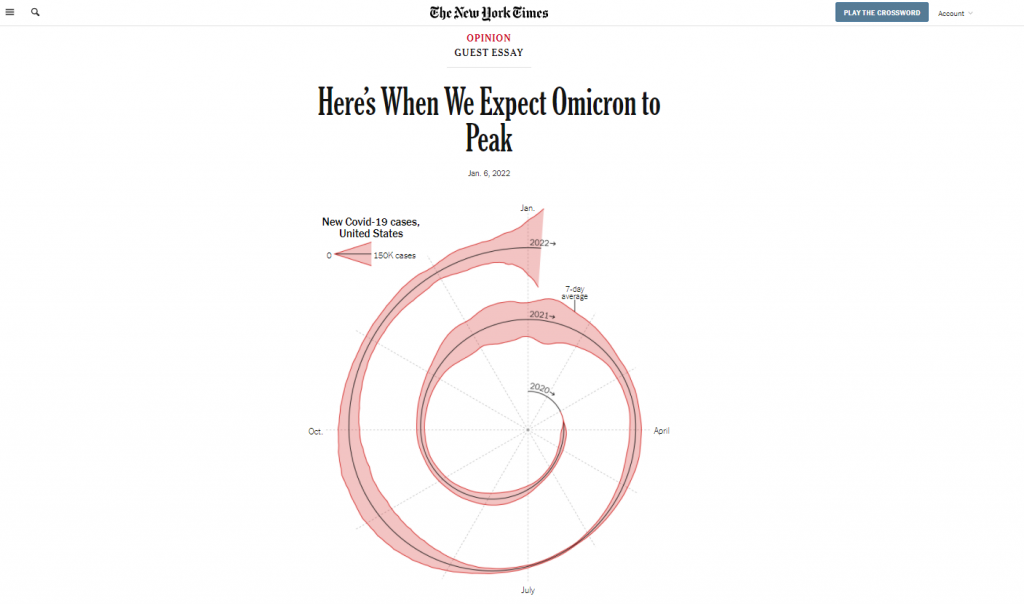
And when something is different in a major publication known for its high quality visualizations, data people talk. Right after it was published I started to see multiple social media conversations and a string of blog posts discussing the merits of this particular chart.
The Spiral Graph is an ENGAGE Chart
If we’re just talking straight up minimalist well designed data communication, the spiral graph is not it.
But let’s talk about context:
- This chart is just a lead-in illustration to an Opinion piece.
- It’s not even the only chart in the essay, there is another that plays more of an inform role.
- The NY Times has created and shared MANY other Coronavirus visualizations over the last couple of years.
What the spiral graph does well is attempt to change the way we look at data we have come to know all too well.
In just about every usual chart we see in the modern digital world, the width of the chart is dependent on the device we are using to read the article. That width stays fixed, as days go and more data gets added, the chart stays the same width.
By spiraling the chart, you get to show something about the length of the pandemic that you wouldn’t be able to show in the standard line graph. You get to make the chart longer, without forcing a scroll by the reader. And ultimately, it’s strange enough to pique curiosity.
For an INFORM graph check out the NY Times Case Count page.
If you want an INFORM style graph head over to the NY Times case count page. This data presentation is phenomenal as a dashboard style information sharing device.
The goal with this kind of graphic is to give the data and get out of the way. I can’t tell you how many times in the last couple of years I have turned to the NY Times to get informed about the current state of the Coronavirus, but it’s been a lot.
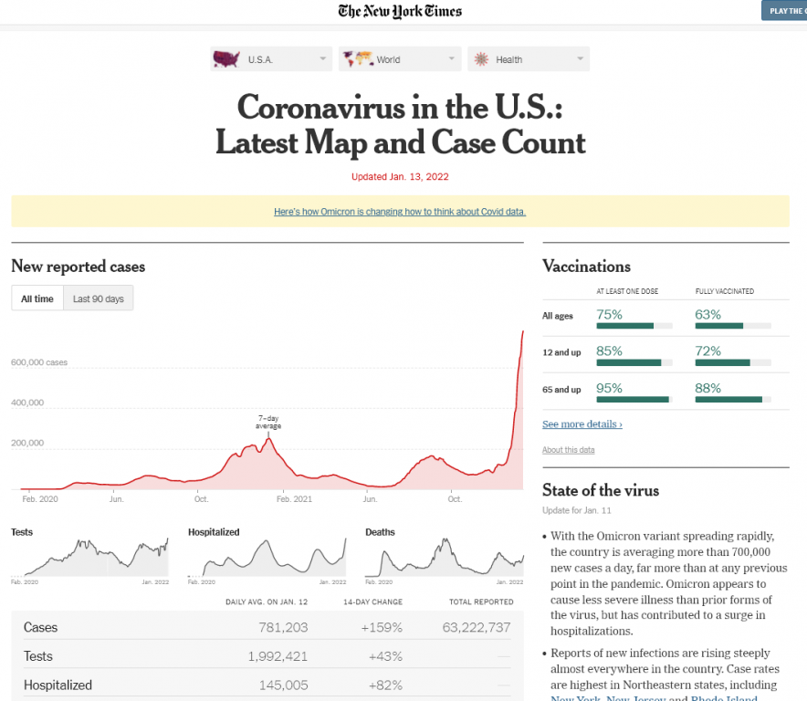
The simple line graph delivers the information on case waves almost effortlessly. Add in that it is interactive, provides analysis, and is followed up by collections of supporting graphs that provide other key metrics and break the data down by important categories like age and state.
But no matter how amazing the delivery, if you keep repeating the same graphic it gets stale. And considering this page lives in parallel to the far more short lived opinion essay, you can’t just use the same charts if your goal is entice readers to read on.
Another example of a NY Times ENGAGE graph.
Okay, so there are certainly ways to make an inform style graph a little more engaging without making it really odd.
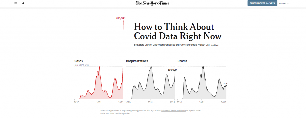
Check out the leading graph in this piece that was put out on Friday January, 7. The Omicron case wave is so big in the US that it jumps out of the normal bounds of the graphic into the header space.
In a usual NY Times article, the article title would be centered and the chart would not start until after the by line. But in this case, they let the chart extend to the top of the page. And they actually shifted the whole title off to the right of center so that the line could fit.
Why could they do that? Well the Covid wave peaked so much that the chart was naturally unbalanced. So instead of just shifting everything down as normal, they let the wild peak break their formatting structure.
Okay, what about an INSPIRE graph?
So we’ll stick with the NY Times because I found a good one.
To INSPIRE with data visualization, we usually have to tell some kind of story. And it needs to be a big story, a major idea or moment in time.
The following is a snapshot from an interactive visualization put out by the NY Times in May of 2020, just as the US reached a COVID death toll of 100,000. For this moment in time the Times was trying to connect the big number to the thing it represented…Human Lives.
So instead of a chart, we have lots of little people silhouettes, some annotated with names and little obituaries. The The page is a scroller, and it takes time to go through. As you scroll down the date changes and the number of deaths increase. Little bits of story also find their way into the visualization.
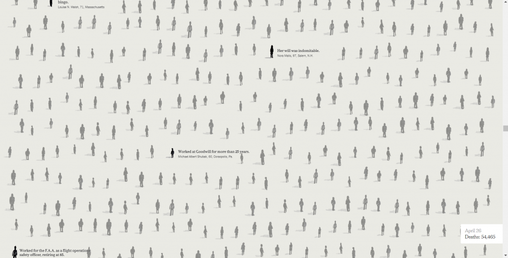
This isn’t the way you simply inform a data hungry audience of the numbers. It’s also not just a simple engaging graphic designed to pique interest that will lead a reader forward.
This is the kind of data visualization that tries to connect with human emotion. To convey a big idea and leave a lasting impression.
So what do you think?
Have you ever created a graph or other visualization just to pique interest?
See any examples from within your own domains of expertise that could fall in any of these three buckets?
If so, would love to hear about them. Write me a comment, I most certainly read the comments and try to respond to every single one.