This is an Eval Central archive copy, find the original at rka-learnwithus.com.
By: Rachel Nicholson
Having drafted new labels, we want to ensure our approach is actually meaningful to our audiences at the Nelson-Atkins before putting them on the walls. We’re currently in the process of evaluating our new labels to better understand their impact on visitors.
Our approach for label evaluations is usually to do random visitor interception. While the museum is open, Covid-19 makes this challenging because of socially distancing and wanting to ensure visitors feel safe and comfortable. We also wanted to focus on speaking to people from groups that may have experienced harm or could potentially experience harm in our galleries. This meant a more targeted approach to visitor evaluation.
Drawing from the strong partnerships that our Community and Public Programs and School and Educator Programs teams have developed, we reached out to community partners who have been involved with the museum in various ways including teachers involved with Race Project KC and artists involved with creating the Black Lives Matters murals throughout Kansas City. Each person we spoke to was a visitor to the Nelson-Atkins, meaning they had visited in the last year, and was over eighteen.
Alyssa Carr, our Evaluator on the team, and Jocelyn Edens developed the protocol for label evaluation. With the help of the museum’s graphic design department, they created new versions of the labels and placed them over the old labels, asking people to read and then reflect on the new version in the gallery. Questions included “What did the label make you think about? What are your reactions to the label? This can be about the objects or the gallery as a whole.” We began with the new label because we were most interested in people’s reactions to the stories shared and language used, apart from whether or not the new just felt like an improvement over the old. Of course, this comparison was important for us to understand if our approach was working to reduce harm and so after discussing the new label, Alyssa and Jocelyn removed the new version to reveal the old one. Here, questions were a bit more specific including “Did any specific words stand out to you in the labels? Do your feelings about the object change from reading one label versus the other?”
What are we learning so far?
For this first round of evaluation, we focused on six objects across the collection areas. Overwhelmingly, visitors reported that they preferred the newer labels (phew!).
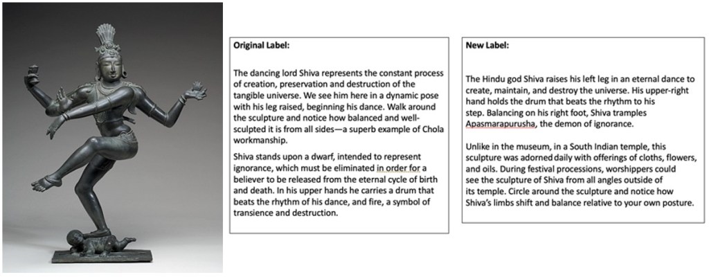
In our last post Ariana Chaivaranon shared how she and curatorial colleagues reimagined the label for Shiva Nataraja, The Lord of Dance. Below are the old and new versions:

After reading the new version, visitors said the label drew them in to examine the object in new ways and that they paid close attention to the sculpture’s posture. The prompt to circle the object and the challenge to think about the object in its original context, in contrast to its display in the museum, both contributed to this reaction. After reading the old label, the majority of visitors also called out the use of the term “dwarf” and mentioned that they appreciated that the new label did not include this term.

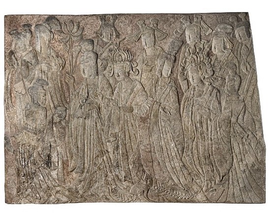
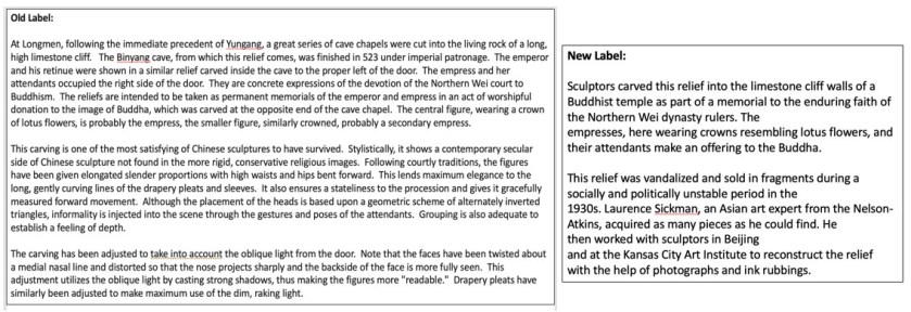
In the case of the Offering Procession of the Empress as Donor with Her Court, from our Chinese Art collection, Jocelyn Edens shared that she and curatorial colleagues wanted to not only shorten the label from over 300 words to 70-90 words but also be transparent about how the work was reconstructed from many fragments, a very different focus than the original label that instead focuses on style and composition.

Once again, all those interviewed preferred the new version to the old, sharing that the old one contained a lot of information that was difficult to take in. One of our motivations with evaluating this particular label was to understand if the new approach would affect how people explored the other objects in the gallery. This, however, did not happen. Instead, people remarked on how the new label made them think about the Buddha as well as the connection to Kansas City Art Institute. While this particular label did not seem to have an effect on the interviewees’ overall experience with other objects, we’d like to continue exploring this question of how individual labels may influence visitors’ understanding of other objects.
One last example was new interpretation for an object in our European Art collection, Cassone, or Chest, from 1500s Italy, which depicts the myth of Apollo and Daphne. Apollo chases Daphne romantically and, in an effort to help Daphne escape from Apollo’s unwanted pursuits, Daphne’s father, Peneus, turns her into a tree. Much like in the case of Europa and the Bull (a label we are working on but have not yet evaluated), in the original label this myth was described as a romantic story. In the rewrite (both versions below), we explicitly called out the violent nature of this myth as a story of attempted rape.

When presented with the new label, interviewees noticed this explicit language of rape as well as how it asked them to think about attitudes towards relationships and gender dynamics both historically and today. When presented with the old label, interviewees also shared that they were unfamiliar with phrases like “high relief” and “sculpted ornamentation”, reinforcing that we need to avoid art historical jargon. Everyone interviewed preferred the shift away from a traditional art historical approach to the new label that was more explicitly tied to a 21st century understanding of the myth and gendered power dynamics. This one was particularly interesting (and exciting) for me, as it proves that people appreciate, and may actually want, culturally relevant discussions and transparent language in interpretation.
Where do we go from here?
Obviously, we still have a lot of work to do both in replacing current labels and in applying our agreed upon principles to all interpretive text. While this process started with the goal of harm reduction, it has pushed us to reimagine the content of all of our interpretation including the stories we do (and do not) tell and the language we use. Right now, the Interpretation and Curatorial departments are beginning to dig into specific parameters for inclusive language. Here, we are indebted to A Progressive’s Style Guide as a starting point for many conversations. We are gathering resources and sharing as much as possible, all in an effort to build a shared understanding and a common language.
Reflecting on the process, there are a few pieces I would say have been effective. First, this goal of developing a common understanding of harm/shared learning around what creates harm has made the work incredibly collaborative and fruitful. Rather than Interpretation dictating what we say and how we say it, this process has allowed us to build from the bottom up and create principles and values with our curatorial colleagues.
Second, throughout the process we have maintained that we are aiming for progress, not perfection. Those of us working in Interpretation know that once you start asking questions about labels, more questions appear. It’s easy to go down a rabbit hole or get so overwhelmed by the amount of work (don’t even get me started on credit lines and tombstone information!) that these projects die before they get off the ground. Committing to the principle that this is an ongoing process that will likely never be finished has helped us take it one step at a time. At the least, we’ve rewritten some outdated, harmful labels. At the most, we’ve developed new principles and values that will guide our work moving forward. While we still have a lot of work to do, we’ve made progress and tried to not let our perfectionist tendencies get in the way.
While this process has been effective in certain ways, there are, of course, still areas for improvement. I wonder, for instance, if starting with labels was the right place. In each conversation throughout this process, concerns and questions about other forms of interpretation have been raised, not to mention the need for small- and large-scale gallery reinstallations to reframe how we tell stories about objects. This is natural because labels support visitor experience and, as we all know, do not exist in a vacuum. While focusing on labels has enabled us to address some problematic interpretation and start amazing conversations with colleagues, I also worry it has overly focused us too much on one interpretive element. The question now becomes how do we open up the conversation to larger organizing principles that go beyond label text and get to the very root of planning and ideas in our projects. I don’t know the answer, but I think we’re on our way and I’d welcome any thoughts.
Thank you all for reading this series. It has been a pleasure to share our work and I hope it has been inspiring in a small way.
About the Author
Rachel Nicholson is the Director, Interpretation, Evaluation & Visitor Research at the Nelson-Atkins Museum of Art. You can reach her at [email protected]. Every two weeks throughout April and May 2021, Rachel has shared her team’s efforts to rewrite the Nelson-Atkins’ permanent collection gallery labels through a harm reduction lens. Read her first three posts here.
Don’t want to miss a post? Subscribe to our mailing list (just fill out the form at the right)!
The post Improving Our Museum Labels Through A Harm Reduction Lens: Part 4 appeared first on RK&A.