This is an Eval Central archive copy, find the original at freshspectrum.com.
Icons can be a really easy and effective way to illustrate reports and visualize qualitative data.
In this post I’ll share some examples, give you some icon use tips, and talk about some specific ways you can develop and use your own icons using Canva.
In a previous blog post I talked about qualitative data visualization and my O.S.E.E. approach. I’ll use that same framework in this post to talk about icon usage.
How to use icons to organize your report.
Icons can be useful for giving a pretty dull looking report just a little bit of life. But they can also act to help organize information. In this way icons become a lot like feature images on web pages, helping the reader navigate a report.
Take this example from IDEO’s Field Guide to Human Centered Design [PDF] & DesignKit website. Icons are used throughout the pdf copy with every single method having an associated icon. These icons are also then used on the designkit website as clickable menu items.
How to use icons to spotlight important information.
Pictures can be an important tool for spotlighting important messages and takeaways. In this way appropriate icons can be used to illustrate quotes, blurbs, and factoids. Icons can also be used to illustrate menu items on a page to help guide the reader to where they would like to go next.
How to use icons to engage your report reader.
Icon arrays are one of my favorite ways to visualize small sets of data. But they can also be really helpful in illustrating stories to increase engagement. You might be used to icon arrays as simple pictures with “bathroom people icons” but icon arrays are really only limited by your imagination.
I like the use of icon arrays in this NY Times story about about COVID outbreaks in prisons from 2021. The watercolor feel to the arrays is much more intriguing than a bar chart.
How to use icons to enhance your qualitative data.
Icons can provide really subtle enhancements to your data presentations. This especially true for any qualitative information that can be coded.
Take for instance the UN Sustainable Development Goals. There is a discrete set of 17 goals, each with its own related icon. In this publication archive the related goals for each report were highlighted on the publications page as small simplified number icons.
You can also create little icon matrices. Especially when you plan to revisit a topic over and over again. Take this political people profile icon array from the NYTimes. Rather than saying 17 out of 20, you can show the 17 people. Then do it again for another question with the same base set of 20 in the same matrix order.
This kind of setup is really easy to do using a tool like Canva. Just create the matrix, duplicate the page for each question, and the gray out the ones that don’t apply for each use.
A few icon use tips and considerations.
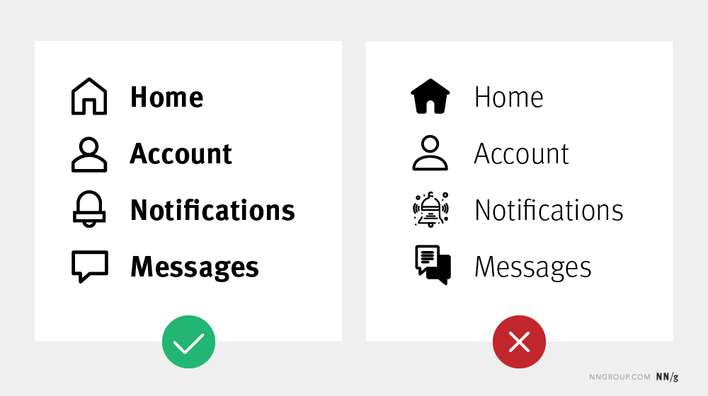
- Your icon sets should feel cohesive, as if they belong together. If you use a hodgepodge of different styles and colors your whole report will feel like an unorganized mess.
- Try to use SVG icons when possible. SVG is a scalable format, meaning it will look clean and clear when tiny or huge. This keeps it from being pixelated and from taking up more digital space than necessary.
- Icons are often used in user interface design to organize information. You can find a lot of tips and tricks from that world.
How to find and select the right icons in Canva.
Here are some tips for working with icons in Canva.
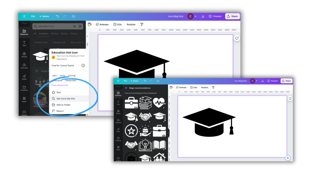
Tip 1. If you find an icon you like, or is close but not perfect, click on the icon for more information.
There you might find a see more like this option that will give you a set of what Canva believes are related icons.
Tip 2. Some Canva icons are part of collections.
This can be super helpful in finding a set of matching icons.
Tip 3. If you like an icon check out other icons by that same creator.
Icon creators often have sets of icons with similar styles, even if not necessarily shared as a collection.
Tip 4. A lot of the icons you can find in Canva have color options (but not all).
This can be a really good way to integrate brand colors or match somewhat unrelated icon sets.
Tip 5. Here is a trick for standardizing the size and shape of icons.
A lot of icons you might want to use will come in different shapes and sizes. Using them as is might feel like a bit of a mess.
The easiest way to standardize is to place a shape in the background. Squares, circles, and other shapes can be perfect backdrops. This can quickly standardize a set.
You can also add text to the images, as it’s good practice not to assume people will understand exactly what the icon signifies.
My workshop on Qualitative Data Visualization.
If you’re interested in more tips like this, I’ll be covering a good bit in my upcoming course on qualitative data visualization. It’s still in development but I’ll more information about it soon.