This is an Eval Central archive copy, find the original at freshspectrum.com.
Mood boards can be really useful design tools, especially early in the design process. In today’s post I will give you guidance on how to create your own mood boards using Canva’s whiteboard feature.
I have actually written a guide on creating report mood boards in a past blog post. As much as I think the approach I laid out for the report mood board can be useful, I think it misses a bit of the point in creating mood boards in the first place.
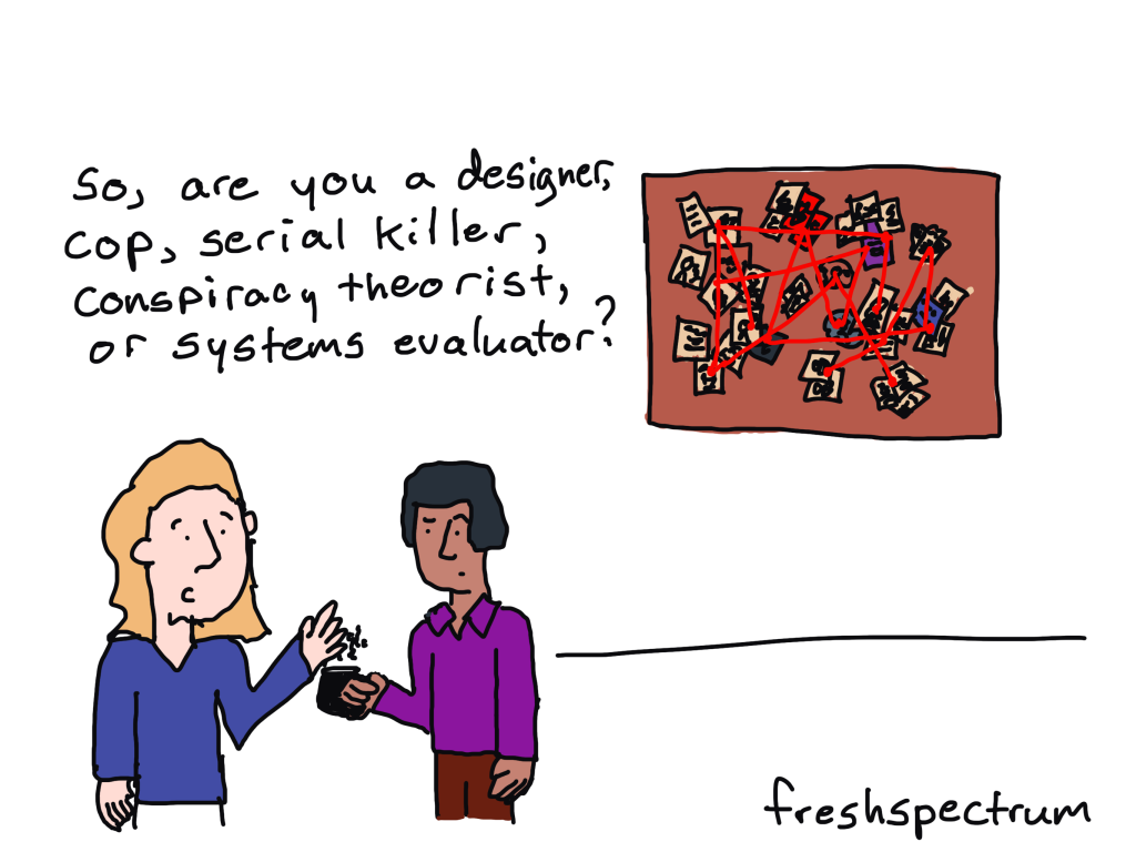
What is a mood board?
Wikipedia gives us a nice definition.
A mood board is a type of visual presentation or ‘collage’ consisting of images, text, and samples of objects in a composition. It can be based on a set topic or can be any material chosen at random. A mood board can be used to convey a general idea or feeling about a particular topic. They may be physical or digital, and can be effective presentation tools.
When to use a mood board?
There is a time in every design process where you’re trying to get a sense for what exactly you are creating. It’s usually after you’ve come up with a design challenge and scope but before you’ve narrowed down potential design solutions.
Often during this time you’ll have a bunch of ideas floating around in your head, but nothing substantial to share with colleagues. This is the perfect opportunity to dump all your ideas into a mood board so you can start communicating the general feel behind the potential design.
Showing your work early and often (even before you have a concept) can help get your team on board with whatever crazy/not-so-crazy ideas you have floating around your head.
How to make a mood board with Canva.
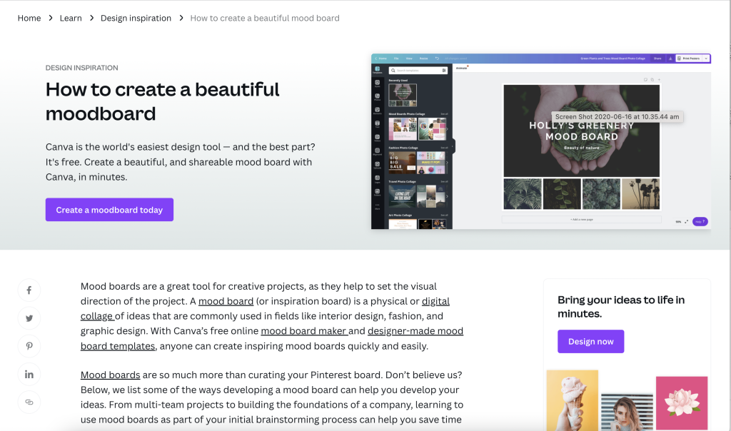
So before we jump in, just know that Canva has a huge post on creating mood boards.
My problem with Canva’s post is that their mood boards are too polished. It’s the same problem I had with my own report mood board guide.
Polished mood boards have their uses.
But let’s get messy.
Start with a Canva Whiteboard
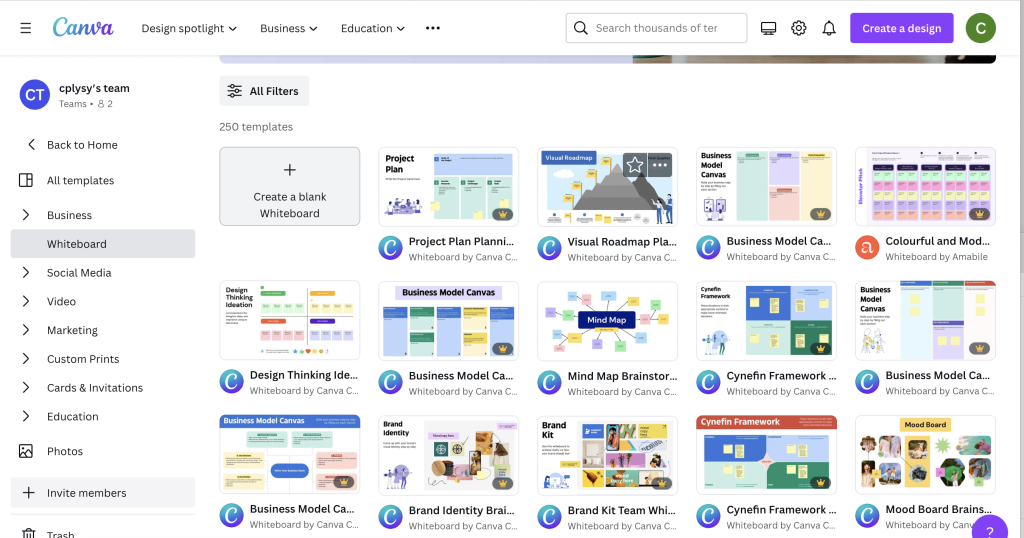
Before Canva introduced whiteboards you had to pick specific dimensions before you could start a project. But with the whiteboard feature you don’t have those limits.
I suggest starting with a Blank Whiteboard. While there technically are Moodboard templates, they pin you down too much to be useful for this kind of free form design.
Drop stuff on the board.
Now here comes the fun part.
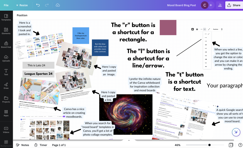
For a good board you just want to drop in a bunch of sample images, photographs, fonts, colors, quotes, etc. The goal is to create a feel for what you’re trying to create.
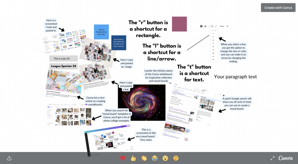
The example I show here is really just a mood board I created prior to creating this mood board blog post. So it’s a mood board for a mood board post.
Drop in screenshots and html links.
Here is the cool thing about this being digital.
If you find something you want to drop on your mood board, just take a screenshot on your computer. Then paste it right into Canva from your clipboard.
Have a link to an article you want to include for inspiration. If you paste the link onto the whiteboard Canva will even pull the featured image and descriptive text. Not only that, it’s still a live link, so you can use it to actually remember other sites you might want to return to for further inspiration.
Colors, Fonts, and Text Blocks
For colors, fonts, and text blocks, use short cuts.
Inside of Canva, with the whiteboard feature open, clicking the “r” button on your keyboard will create a rectangle on the page. I use these single color solid rectangles to share color ideas.
Clicking the “t” button will drop in a line of text…”your paragraph text”. If you’ve copied text from a page, you can also just paste it right into the page (as long as you don’t have anything specific selected).
When placing in fonts I like to just use the font name for the text and the font size so it’s easier to get a sense of scale.
Clicking the “l” button will drop in a line. Select the line and you can change the weight, color, and end points. One of the end points you can select makes it an arrow.
Want to take a closer look at my mood board example?
Now go get “messy.”
When creating a mood board, it’s tempting to try and be very specific about things you like or want. Being specific can stifle the exploration of an idea or concept and limit the designer you are working with. Try to keep things loose when creating your mood board and aim for a general style or feeling as opposed to trying to define specific aspects of a design in your mood board.
Okay, so ironically, my mood board mood board isn’t really a good example of a mood board. But my goal was to give you a sense of how to make one. You’ll find tons of examples on the web of mood board styles you might want to emulate.
Now go create something.