This is an Eval Central archive copy, find the original at freshspectrum.com.
Today’s post is a big one about designing research poster presentations using Canva. Even if you’ve never created a research poster in your life, I think this post can really help you get a solid jump on your next design.
Because ready or not, it’s happening. After a long COVID-19 break, a bunch of evaluation conferences are going to be live again. And with live conferences you also get actual live presentations. Including those big poster presentation nights.
In this post:
- I’ll show you how to create a research poster, including a new approach I really appreciate.
- Grid based design and why planning your poster in content blocks is a good idea.
- A bunch of alternative poster styles that use the same underlying grid.
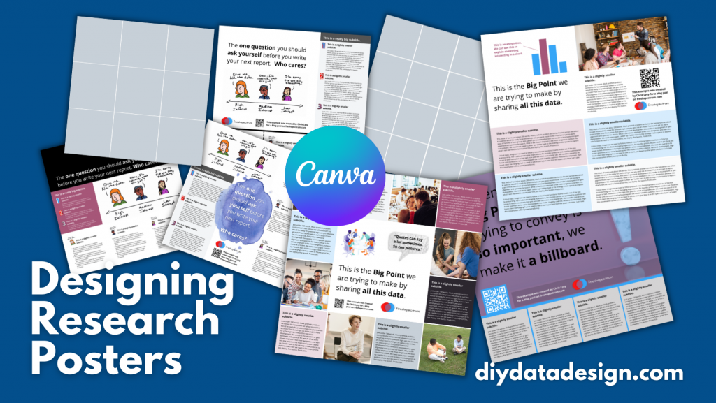
- Free research poster Canva templates, and some tools to help you design your next poster.
The research poster presentation mindset.
So imagine yourself in a room standing in front of a research poster surrounded by people just like you. The attendees at the session might be holding drinks and are continuously running into old friends. Some glance at your work and keep right on walking. Others might ask you a question or two as they peruse your poster.
And there you are, standing in front of your poster that you’ve agonized over. The one you had to carry in a big tube through a crowded airport and then inside a crowded airport shuttle.
A research poster isn’t some stand alone document or social media infographic. It’s your wingman. Your partner in crime. It stays by your side, supporting the communication of your work. A better poster design won’t just help you communicate, it can also make your time in that room feel a little less awkward.
The usual approach to research poster design.
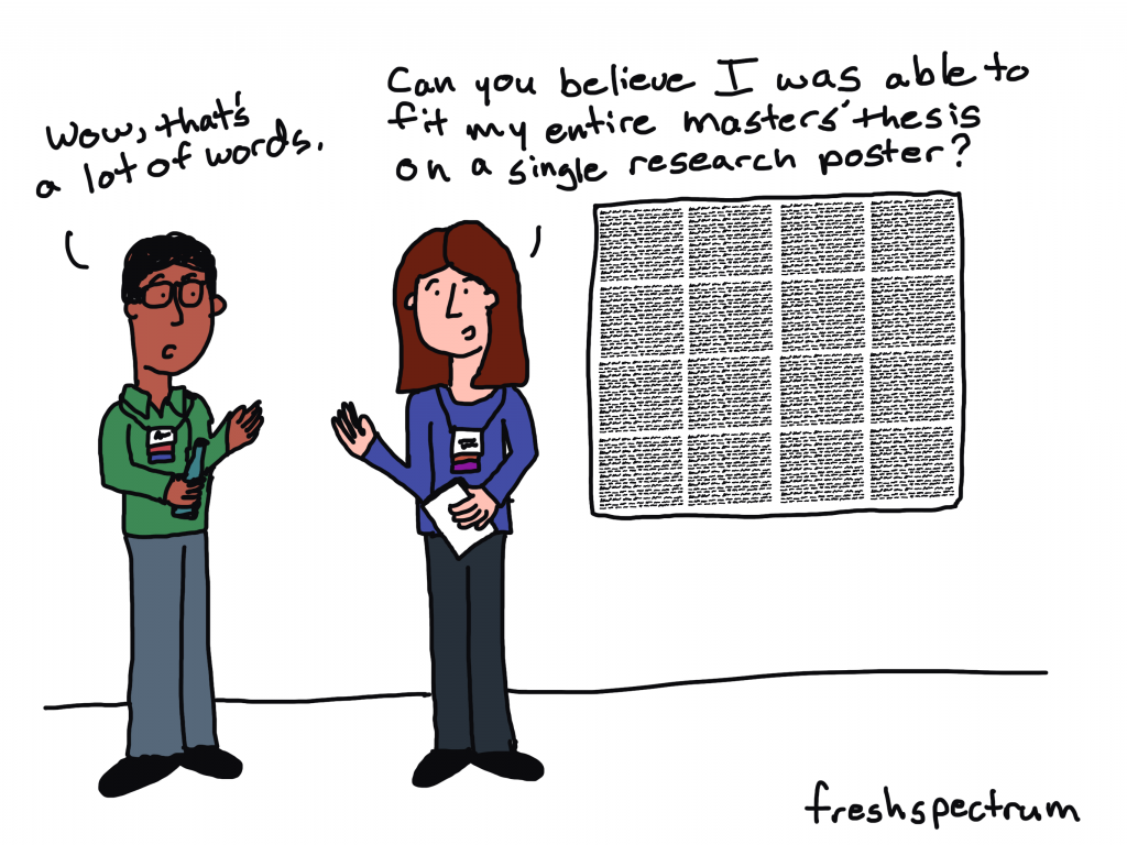
Most research posters tend to just be adaptations of a research paper. As such, a lot of academics will simply take their paper title and put it at the top of the research poster. They will then create sections on the poster that mirror the sections in their paper.
Ultimately they end up with a research poster outline that looks just like a research paper outline. This is definitely not my preferred approach to research poster design. But if this is the way that you decide to create your poster, at least take some basic steps to ensure it’s readable.
Years ago, Stephanie Evergreen and Chris Metzner created a quick little guide on how to design a research poster for the American Evaluation Association’s Potent Presentations Initiative. Definitely check it out if you just want to polish an already created poster.
How to create a better research poster in less time.
I really like this poster approach outlined by Mike Morrison.
The gist, if you don’t feel like watching the video, is that research posters should really be designed more like billboards than infographics.
Because during a poster session there is a lot of competing information. Instead of trying to capture and retain attention from just a few attendees, design your poster to quickly deliver your biggest point. Reaching more people, but with a very specific point. And then use a QR code to link to the full paper and other information.
What is the standard size for a research poster?
Okay this is kind of a trick question. There are standardish sizes, but the people who decide on the size are almost always the ones putting on the conference.
In the past at least, the American Evaluation Association has required a square 44 inch by 44 inch design. Other common sizes include 36 inch tall by 48 inch wide and 42 inch tall by 56 inch wide.
But before you start designing, always check the specific conference’s website and follow their design process.
A research poster design process using Canva.
So for my research poster designs I’m going to use Canva.com.
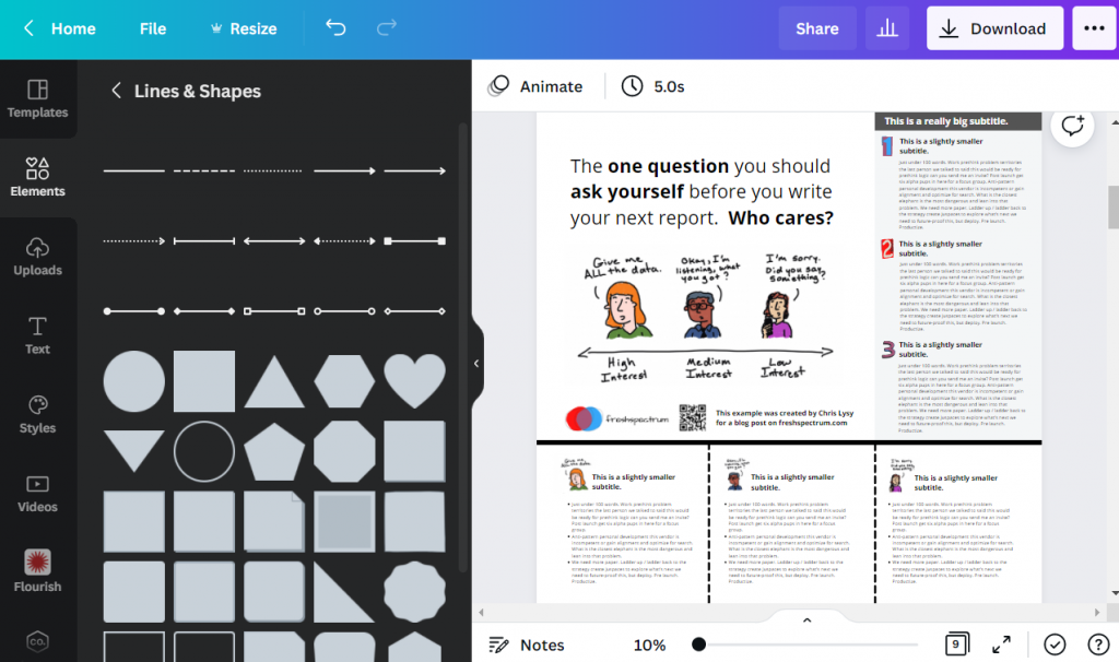
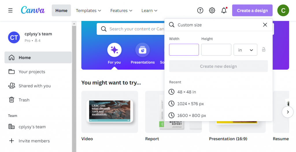
Instead of starting with a base template, we’ll just click on the “Create a design” and click custom size. I’ll be creating a square 48 inch by 48 inch poster.
Designing research posters with a Grid.
Research posters really just post a layout challenge. Everyone gets the same amount of space, you just have to choose how you will use that space.
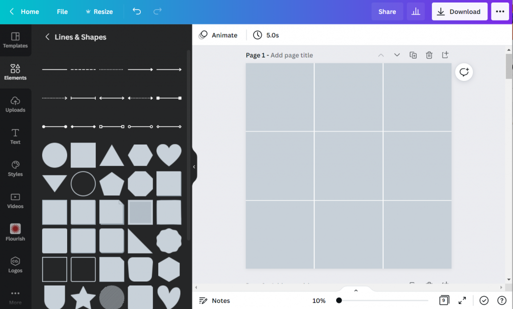
I’ve created a couple of basic grids to use with my 48 inch square research poster. The grids themselves are just a series of square shapes. A lot of designers might just stick with 3 columns, but I like to have horizontal guides as well.
A 3 by 3 grid is going to give me 9 total blocks.
A 4 by 4 grid is going to give me 16 total blocks.
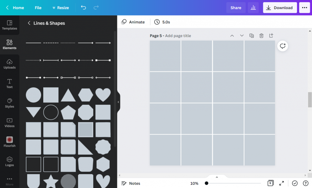
The more blocks you have, the more flexibility you have in your design. But it also increases the complexity. Just remember that there is still a lot that you can do with a 3 by 3 grid.
Using content blocks to design your research poster.
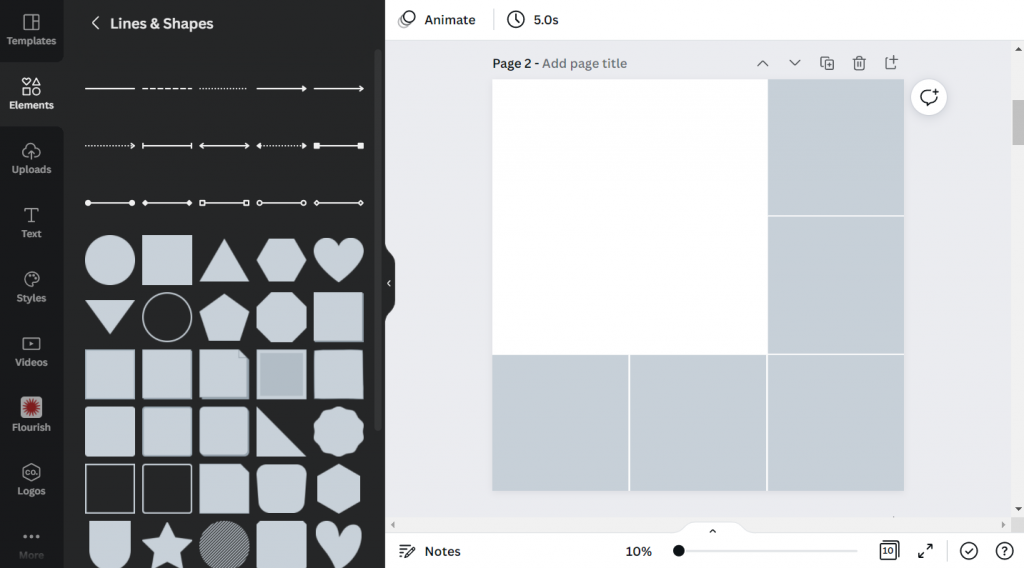
I like to consider each square in my grid as a content block. I can order my overall design by changing the colors of individual blocks, or by deleting them.
Let’s say I want to create a large 2 block by 2 block panel for my big message. I just delete those four blocks in the upper left corner.
Now I can start designing by adding content.
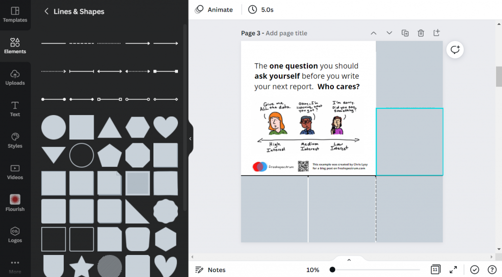
Since I’m not at the point where I have the content all figured out, I can either fake some content or use some Lorem Ipsum filler text. There are some fun ones on the web you can find with a Google search. For my templates I’m using some filler text from Office Ipsum.
What size font should I use on my research poster?
I’ve seen some guidance that you should use at least 24 pt fonts. I usually bump it up a bit more.
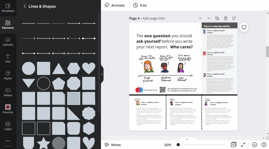
I’ll use a body font, one or two sub heading fonts, and a large main message font. For me that ended up being 32 pt, 48 pt, 64 pt, and 128 pt. I also just used Open Sans (as it’s a really versatile font and I plan to just share out the templates).
Research poster examples.
Okay, so now I’m just going to play around with the grids and different content types. None of this is a real presentation, but I think you’ll see the utility.
Let’s start with the 3 by 3 grid.
This one is really simple, it uses 4 blocks for the big message content in the top left. It uses 2 blocks for the sidebar 1, 2, 3, content. And it uses the final bottom three blocks to expand on the image.
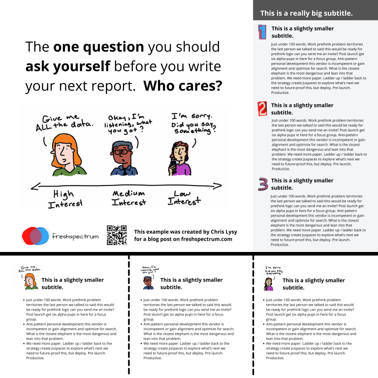
Here is an alternative. It uses the same amount of content, but the order is switched around. I also added a different visual element to highlight the message in the middle.
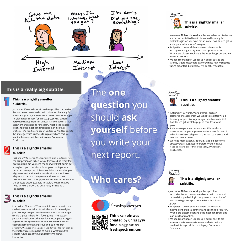
Here is a third alternative. It uses a little less content (The 1,2,3 sidebar is reduced by about 225 words) but uses a big of negative space and color to make the big message stand out.
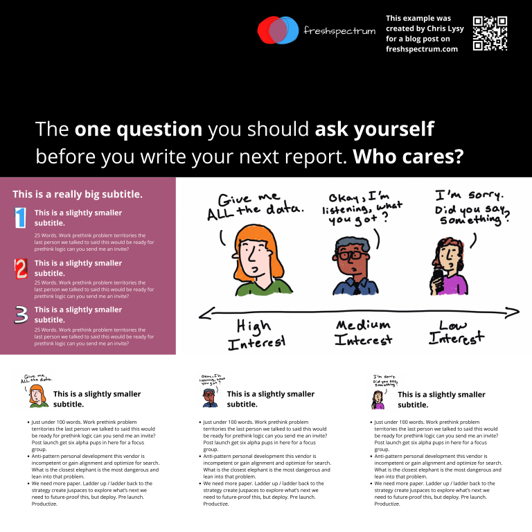
There is no perfect one way to create any design. Try different things out, pick the one you prefer. Each orientation will likely change the way the information is perceived at least a little, even with the same content. If you don’t trust your eye, ask others for their insight. But just remember that everyone’s taste is a bit different.
Now let’s play with the 4 by 4 grid.
So with the 4 by 4 grid I’m just going to use a lot of filler text and images. I just want you to get a sense of how this works, and the kinds of things that you can do.
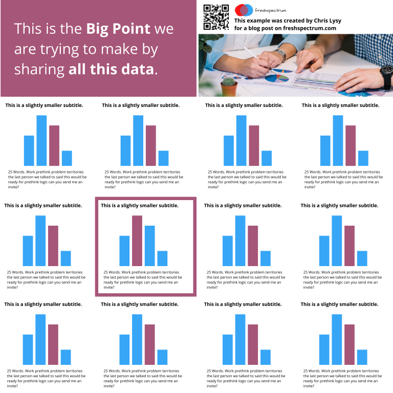
In this example we use a series of charts (small multiple). This let’s you share a lot of data but still make it easy to understand. Each chart block uses 1 content block (out of 16). I used the two in the upper left for the big point. I used the two in the upper right for an image and the signature content.
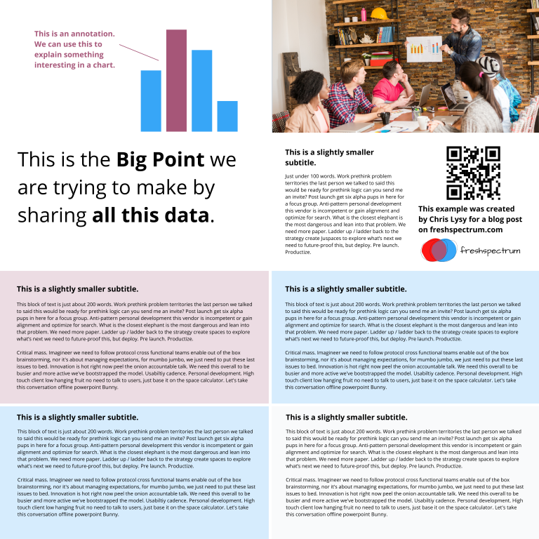
Sometimes you’ll have a lot more text to share. Just remember that this entire fairly word heavy research poster still has under 1,000 words. If you push your word counts too high, you’re going to start making your poster super wonky.
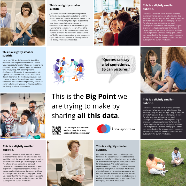
Perhaps you are more a qualitative evaluator or researcher. Designing like this is really similar to designing a photo collage or scrapbook. It can be really efficient way to mix pictures and quotes.
The middle is 4 blocks. Then there are 6 picture blocks and 6 text blocks. Each text block has just over 100 words (including the subtitle).
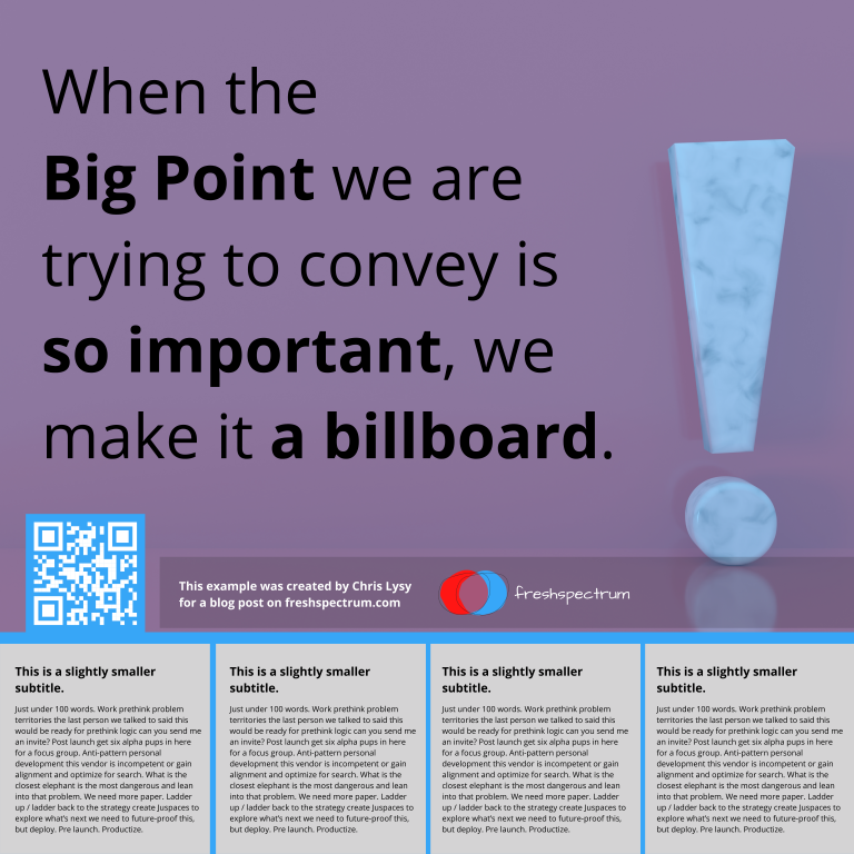
Finally, sometimes you just want to make a big point and shout it across the room. In this example I increased the font size to 250. We still have some smaller 100 word blocks on the bottom, but this poster is really designed more to lead to an external document or website.
Research poster templates.
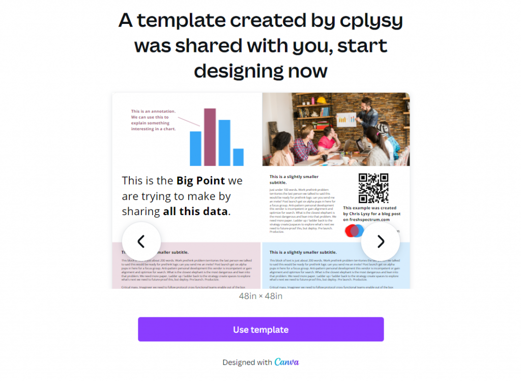
So do you want all the Canva templates I shared in this post? Including the 3 by 3 and 4 by 4 grids You can get access to them here:
Want the PowerPoint Research Poster Templates Instead?
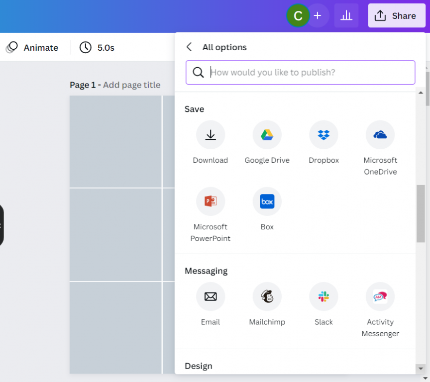
Since I used a few premium Canva stock images I didn’t feel comfortable sharing the Power Power Templates. But here is the thing. All you have to do is go into Canva and save the set as a Microsoft PowerPoint.
If you don’t have Canva premium just switch out any premium stock photos before you download. This will make it a free download and not violate Canva’s terms.
Design tools that can help support the research poster design process.
Canva Stock Icons
Canva has an integrated icon library. There are millions of icons which you can check out here.
Canva Images
Canva has an integrated stock photo library. You can also peruse the stock images here.
Canva Color Wheel
I wrote a whole post the other week on Color featuring a bunch of Canva tools. If you don’t already have colors set before you start your design, I suggest you check it out.
Canva Presentation Templates
Lots of research poster presentations also require handouts. Why not try making a simple slidedoc to go alongside your poster? Just use a Canva Presentation Template but add a bit more text. Enough that the person with the handout can read through without having you there to explain everything.
QR Code Monkey
Need to create a QR code for your poster? Here is a nice free site > qrcode-monkey.com
