This is an Eval Central archive copy, find the original at freshspectrum.com.
In the research and evaluation worlds where I tend to do most of my work, Microsoft Office reigns supreme.
I have nothing against Word, PowerPoint, or Excel. But I just find some other tools are just easier to use for certain tasks (such as creating infographics). And while that’s fine when working independent, so much of my design work is built around collaboration with a broader team.
This usually gives me two options. I can try to teach that team a new tool while we collaborate (not always as easy as it sounds). Or we stick with what they know and create in Office. Luckily with Canva I can get the best of both worlds.
Here is how I would go about creating an infographic template in canva to use in PowerPoint.
Before you comment, yes, you can create infographics directly in PowerPoint from scratch.
But I just find it easier to work off of Canva templates, even if my ultimate destination will be PowerPoint. The workflow is smoother in Canva, the templates are easier to search, and shape elements are easier to add.
Pick an Infographic Size
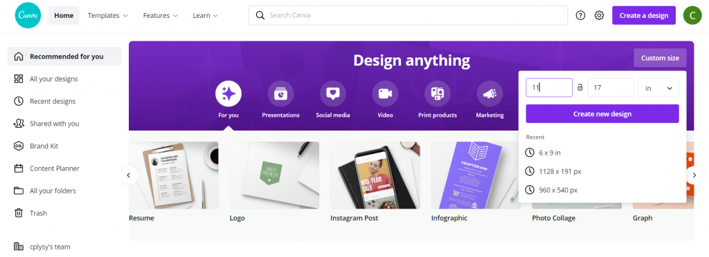
Infographics can be any size. But if you start with an “infographic” template in Canva it starts you with a long thin canvas. So I prefer to start with the size of infographic I want. I’ll still be able to search through all the Canva templates later.
If you are designing something for both print and web, I suggest going with something you can print using your office printer. Lots of U.S. organizations have printers that can print 11 x 17. Added benefit, if you fold it in half the dimensions are 8.5 by 11 (the perfect size to fit into a standard folder with other handouts).
Find a Canva Template
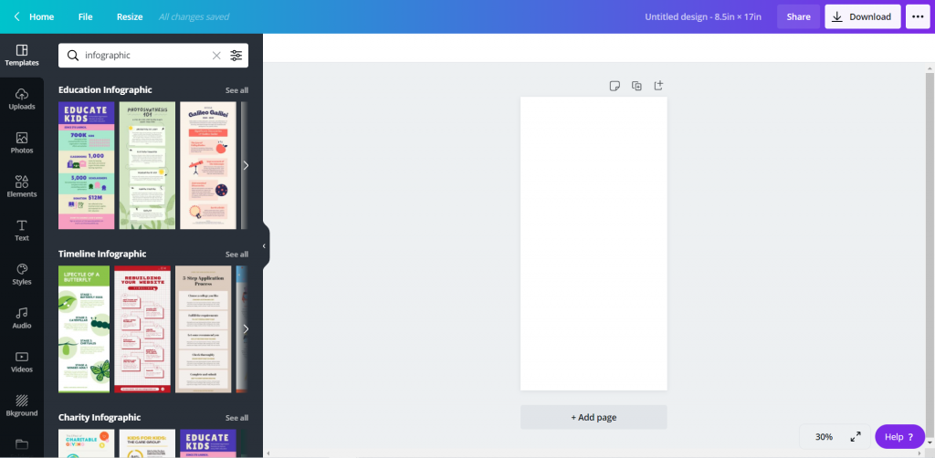
Whatever size you choose to start with, search “infographic” using the Templates menu. You’ll be given a whole bunch of options to choose from.
Adapt the Canva Template
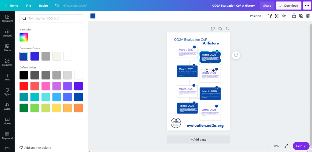
Once you choose a template, you can start adapting the template to meet your brand colors/fonts. You can also get rid of anything you don’t want to be a part of the base template.
If I were designing solely in Canva, I would enter in all my text and icon illustrate. But since I plan to rewrite in PowerPoint, I’ll just leave the template defaults.
Add Additional Pictures or Graphics
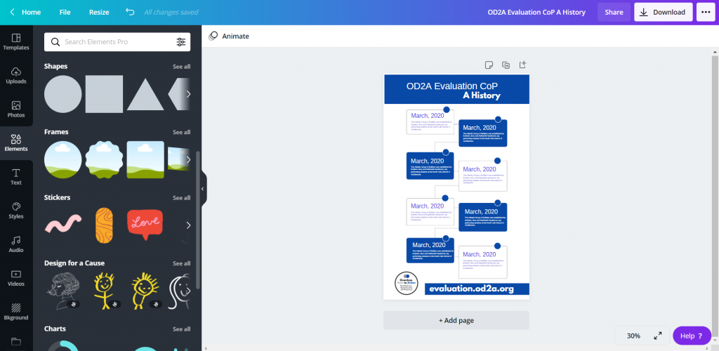
Just because you start with a template doesn’t mean you can’t add a little bit of your own style to infographic. You’ll find lots of options in elements and photos.
Download as Microsoft Power Point
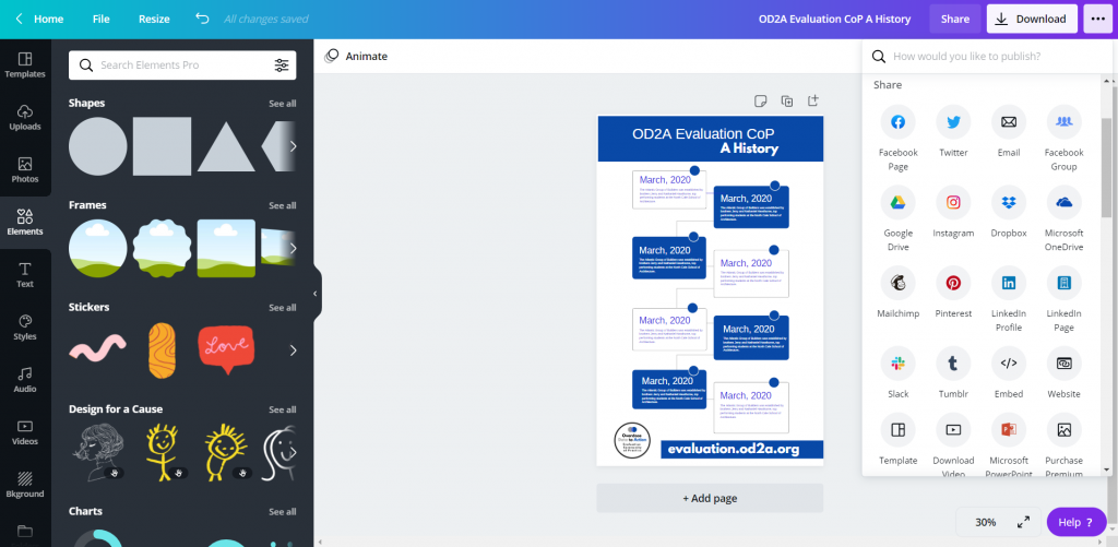
Once you’re done pulling together your base template, download it into PowerPoint. Use the little menu button in the upper right hand side of the page (you won’t find the option in the Download menu). The download to PowerPoint will be in the “Share” portion of the menu, although you might have to click a “See All” button to find it.
Open and Tweak in Power Point
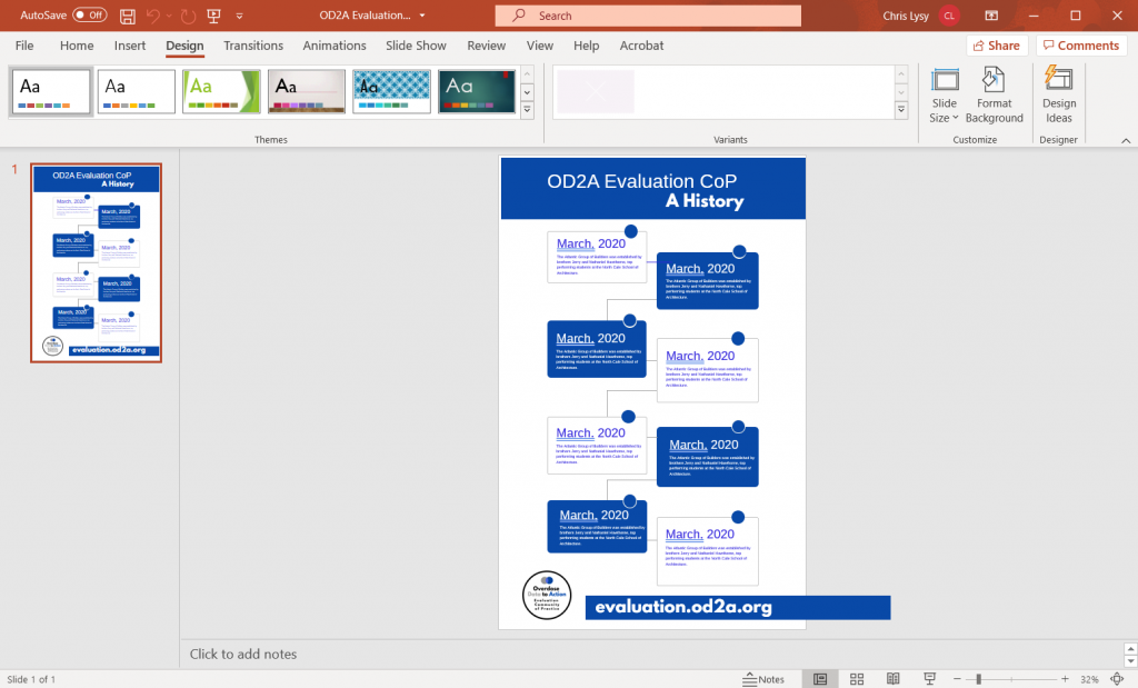
After you download it into PowerPoint, and before you share it with your team, I would suggest cleaning it up a bit. The save as PowerPoint works pretty well in Canva, but some of the shapes/elements might get wonky or fall out of the page boundaries. I like to quickly fix them and send out a clean template.
Share with Your Team for Editing
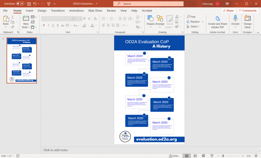
Alright, now you’re ready to share your PowerPoint with the other members of the team. Since so many people know how to use PowerPoint, they don’t have to come to you every time to edit and revise their work.
Icon Illustrating in PowerPoint
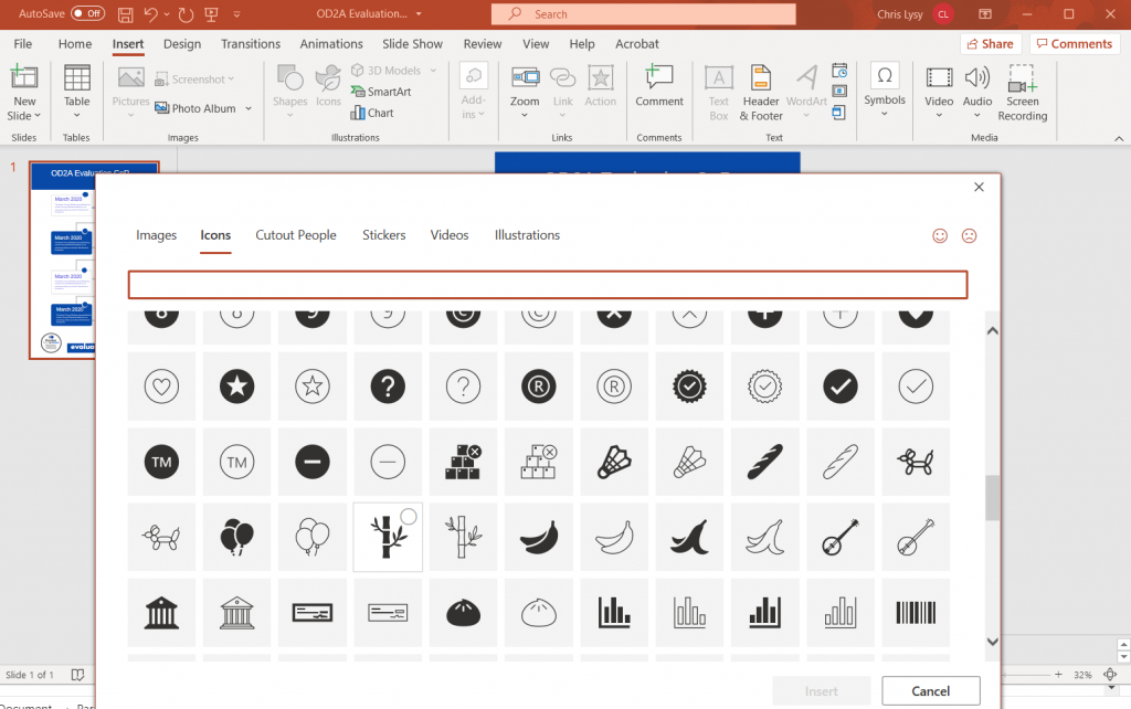
You might have noticed that I cleared out all the icons before downloading to PowerPoint. Icons are tricky to have in templates because they might be too specific for all the times the template might be used.
Luckily PowerPoint has it’s own icon library. After the text goes in I often do an icon illustration pass, illustrating the different blocks with icons based on the text.
Save as your desired format.
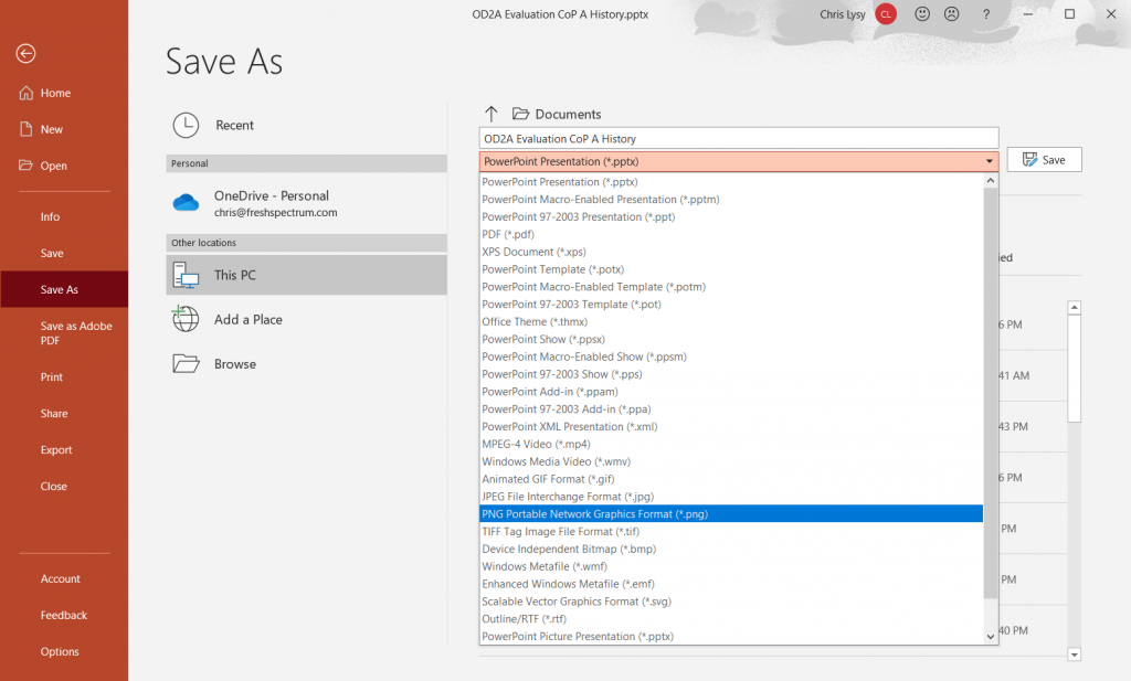
Finally, just because it’s in PowerPoint, doesn’t mean it has to stay in PowerPoint. Depending on your uses, you can always save it as an image file (like a png or jpg) or a PDF.