This is an Eval Central archive copy, find the original at freshspectrum.com.
Today’s post was written by Anne Heberger Marino who is the founder of Lean-To Collaborations. You can learn more about Anne’s work by visiting her website or by following her on Twitter (@LeanToCollabs).
When Chris shared his Canva redesigns of a logic model and theory of change, it didn’t take much for me to agree it would be interesting (and possibly instructive) to recreate them in MURAL.
I am a BIG fan of MURAL. A crazy amount of my world and work winds up in MURAL. MURAL has become the place where I think, plan, dream, and run collaborative workshops for my business.
Though I don’t work on many evaluation projects these days, evaluation is still my professional home.
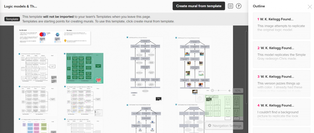
In today’s guest post, I’ll walk you through how I re-created Chris’s Canva redesigns of a Logic Model and Theory of Change in MURAL. If this is a new tool for you, don’t worry. I’m assuming zero familiarity with MURAL. The plan is to look at:
Creating and adapting a standard logic model in MURAL
- Creating and adopting a theory of change in MURAL
- A few MURAL-specific features to try in your logic models & TOCs
- Additional ideas for how evaluators might use MURAL in your practice.
You can think of MURAL as an online version of the whiteboard in your office or classroom. You can use MURAL alone or with hundreds of collaborators. If you’ve used Jamboard, Miro, or Zoom’s whiteboard feature, you’ll be familiar with some of the features and use cases for MURAL.
Recreating the Logic Model using MURAL – Version 1
Looking at a standard logic model through the MURAL lens, it’s made of up 3 x5 sticky notes, 3 x3 sticky notes, and arrows. The process I was to make all the sticky notes, line them up, connect the arrows, and add labels.
It only takes seconds to create a sticky note formatted with a box around it.
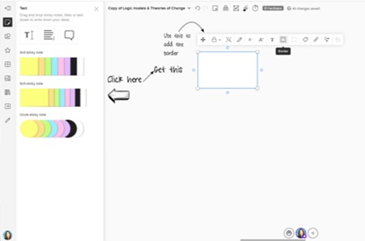
Now that the sticky note looks the way I want it, single-clicking on that sticky lets me add text. MURAL will automatically shrink the text to make it fit in the sticky note so don’t go overboard. Double-clicking near the sticky note I just made creates another sticky with the same formatting. Great time-saver! The align tool gets all the boxes looking orderly.
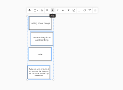
The arrows and connecting lines are a bit fiddly to get juuust right, but I expect that when adding lines and arrows to things. The align tool is helpful here, as are the guidelines that show up automatically.
In less than 15 minutes I was able to recreate the W.K. Kellogg logic model. In the lower right I added stickies with links to the original model and Chris’s freshspectrum post.
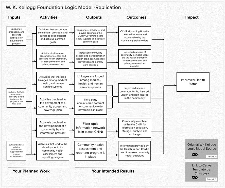
If you look closely at the template version, you’ll see a light gray line around this model. That’s because the model is within what MURAL calls an “area”. The individual pieces of the model are part of one area, so I can copy the whole thing to create Version 2.
Almost magic, right?
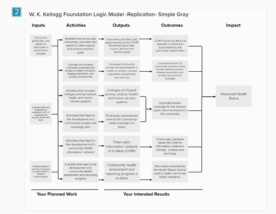
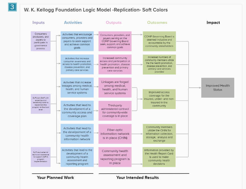
Logic Model Versions 2 and 3: Gray boxes, Pastel Boxes
Here’s the process for Version 2:
- Duplicate Version 1
- Align the new model with the first
- Select all the sticky note boxes
- Change the formatting on the boxes
For Version 3, follow steps 1-4 and then change the color of the headers to match the boxes.
It took less than 2 minutes to go from Version 1 to Version 2 and Version 2 to Version 3.
Version 3 uses default colors already part of the MURAL color palette. Using an eyedropper tool would have made it easy to precisely color match Chris’s design or a client’s branding.
Version 4: Adding Images to the Logic Model
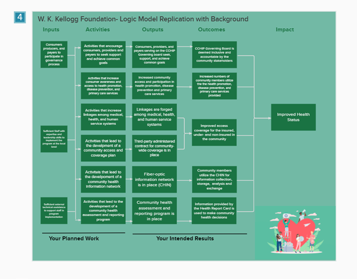
I couldn’t perfectly replicate Chris’s results using a photo background for the logic model.
MURAL comes with an extensive album of photos that you can crop, turn, and adjust to whatever size you need. Every image I tried felt like it was competing with the model rather than adding value. This is how I feel about most photo backgrounds in MURAL. It’s a personal preference.
You can upload your own photos to MURAL. And I’ve done that when I want to brand a workshop for a client. In this case, I decided to stick with “out of the box” content from MURAL. It would have felt like cheating to use one of my own photos or design one that fit my needs.
Eventually, I found an image that fit with the content of the logic model. I used an eyedropper tool to match the background to the “hospital scrub green” in the image. Part of why I chose this picture was the pure horribleness of the color. Consider this a reminder to make your color and design choices carefully.
Version 5: Experimenting with Tags
In this screenshot, you can see that I started off replicating the labels Chis used in his model using MURAL tags. It would have been possible to recreate those labels, but I wanted a way to demonstrate the power of tags.
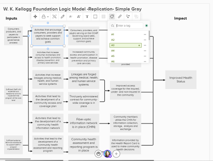
The tag feature allows you to add words and an icon to a sticky note. They allow you to convey more information on a sticky note without taking up much space or diverting too much attention to the main text. I’m curious what Chris thinks about this feature from a design standpoint.
[Note from Chris: I like it. One of the biggest issues evaluators run into when creating models is the desire to add way more text to a box than can actually fit. Tags give you another way to incorporate additional context without adding a lot more text.]
What might that offer to an evaluation logic model? We could indicate partners that are involved in the program’s activities. We could use icons corresponding to different data collection methods and when those will occur. You might use tags to indicate the status or progress connected with an outcome.
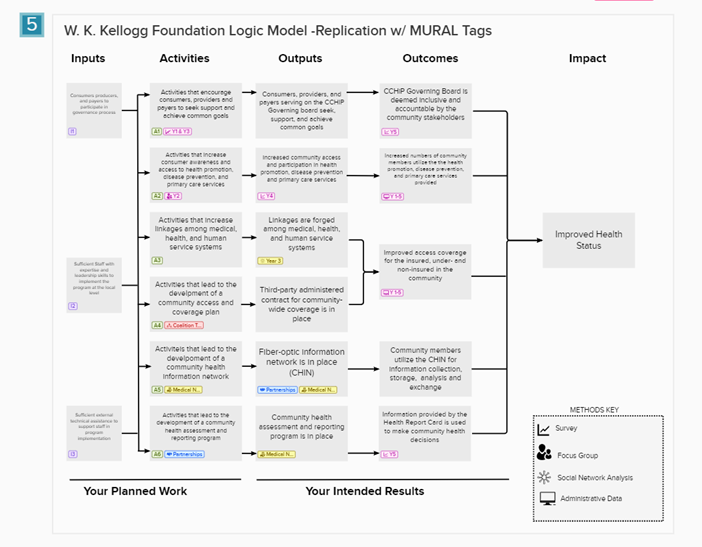
- I imagined an evaluator adding methods and timing to the logic model.
- Under A1, there is a tag and icon showing indicating there will be a survey in Year 1 and Year 3 to assess this activity (see legend at the lower right).
- There are also tags for who might be involved in these activities. You’ll see tags for the Coalition Team, Medical Network, and Partnerships.
- Each tag can be given a label, color, and icon.
- We could communicate what’s been done (and what’s left to do) by greying out the tag color as work progresses
- Tags can only be added to sticky notes. They won’t work on shapes like the ones used in Models 7-10.
There may be no end to the creative ways evaluators could find to use tags in MURAL. What would you use them for?
Model 6 & Model 10
These are blank versions of the models.
Recreating the Theory of Change using MURAL- (Image 7)
Looking at the theory of change I can see it is best recreated by using shapes in MURAL. We need several of the same size rectangle, several ovals, one long and skinny rectangle, and some arrows.
To create shapes with text, follow these steps:
- Create and format the shape you need.
- Add text. (You can change the font)
- Adjust the elements so that the shape surrounds the text, and the text is readable.
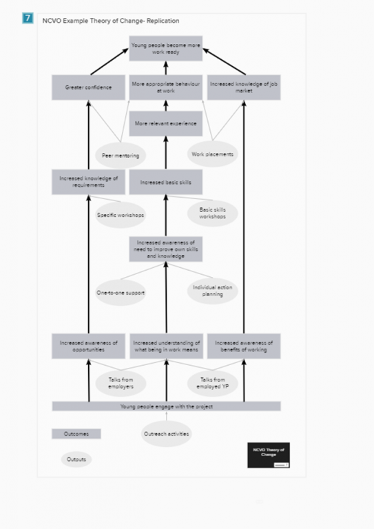
You may need to experiment to find a shape/text combination that will accommodate all the pieces of the model. It may help to create the wordiest element first. If your shape/text combo looks good for that element, it will work for the others.
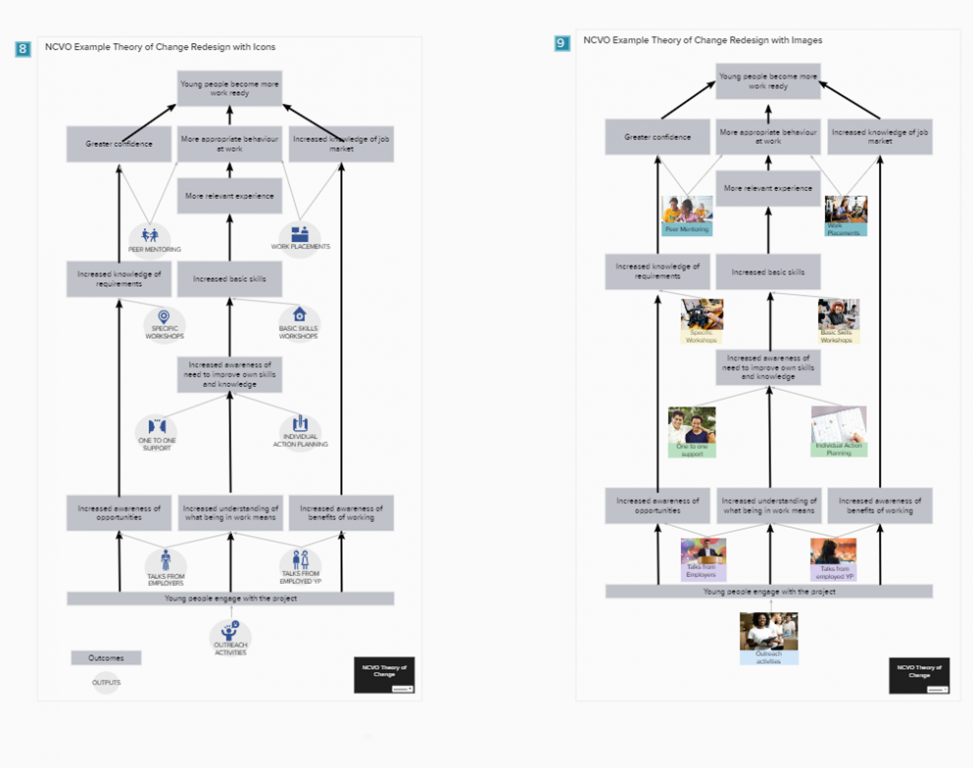
Adding Icons & Images to the Theory of Change (Models 8 & 9)
For Model 8, I used MURAL’s icon library to find simple images corresponding to the program’s outputs. I kept all the icons the same color for a simple look. Model 9 uses the image library and a bit of cropping to put “real people” in the model. Since the photos all had distinct color profiles, I used pastel text boxes to unify each level of the model.
Ways to Share your Models
There are several ways you can share models made in MURAL.
- Invite people to the mural itself. If you’re using this option, be sure to “lock” areas unless you want people to be able to move things around. Viewers can leave comments for you in the mural.
- Download and share. You can download an entire mural board or sections of one as a PDF or png image. It’s also possible to download HTML and data in a zip file.
- Share your mural as a template. When you publish a mural as a template, others can use and adapt your designs to suit their needs and your original mural remains unchanged. (That’s what I did with this set of models.)
Other ways to use MURAL for evaluation
- MURAL is a very flexible tool, making it well suited for diverse evaluation contexts. Here are a few other ways you might use MURAL in your evaluation work. I’m sure you have others.
- Use an existing logic model as the background for an entire mural board, giving you a large workspace for a stakeholder engagement workshop.
- Put the building blocks of your evaluation (inputs, activities, outputs, intended users, evaluation questions, methods, and outcomes) into a mural and invite stakeholders to build a representation of your evaluation plan.
- Create different versions of the same theory of change (linear, circular, etc.) and host a “gallery walk” to get feedback on the designs.
- Make a “home base” for evaluation in MURAL. Store links to your models, reports, explainer videos, meeting notes, and cartoons so everyone can access the information they need when they need it.
- Take the identifiable information out of your logic model or theory of change and share it as a template with the MURAL community.
Want to play with these designs in MURAL?
You can get a copy of the template of all the models here if you already MURAL account or want to register for one. (It’s free, there’s no catch, and this is NOT an affiliate link.)
And if you end up creating something using these templates, please do share it with me in the comments! I’m happy to answer your questions about MURAL too.