This is an Eval Central archive copy, find the original at freshspectrum.com.
In this video I’ll show you step by step how to use a tool called Flourish to create beeswarms, dot plots, and violin plots. While you can create dot plots in Excel, this is definitely my preferred approach. In this short video, you’ll learn why.
This is part of the DiY Data Design recipes series.
Full Transcript
Hey data designer!
Today I’m going to show you how to create a beeswarm, violin plot, or dot plot using a tool
called Flourish.
But first, if you’re wondering, you can create perfectly fine dot plots in Excel. You have to
trick it a little, but it’s do-able.
If you’re interested in that approach I suggest checking out this blog post by Stephanie
Evergreen. stephanieevergreen.com/easy-dot-plots-in-excel/
But for me, I prefer to create a lot of my charts using a tool called Flourish. A couple of years ago Flourish was bought by Canva, and while it is compatible with Canva, it’s also a stand alone chart design tool. One that’s really designed to serve the needs of data journalists, but also works really well for most data designers.
You’ll find the site at Flourish.studio where you can register for a free account.
After that, just go ahead and click new visualization.
Flourish is template based. So instead of asking you for data at the start, it gives you a choice of chart templates.
For the one we’re doing today, we’ll scroll down the page and choose “beeswarm” from the Scatter options.
As a template tool, Flourish preloads a chart with data. This makes it really easy to use because we don’t have to guess how to structure our data in order to get our desired chart design.
You’ll notice a ton of options on the right hand side of the page. I find the Flourish menu to be fairly intuitive with lots of little help menus. But since there are a lot of options, you can get a little lost sometimes when trying change things to meet your preferences.
Anytime I start with a template, one of the first things I do is look at the data. You do this by clicking the Data tab at the top of the page. Not only will you see the data, but you’ll also see how the columns are selected for use in the visualization. So if you want to visualize with your own data, the easiest thing to do is just match the format of your spreadsheet with the data format in the template.
Beeswarms, violin plots, and dot plots are just variations on the same type of chart. On the preview side, if you expand the menu for box, violin, and beeswarm plots, you’ll be able to switch between these different variations. Like here where I changed Auto to No in the beeswarm option. Now my beeswarm is a basic dot plot.
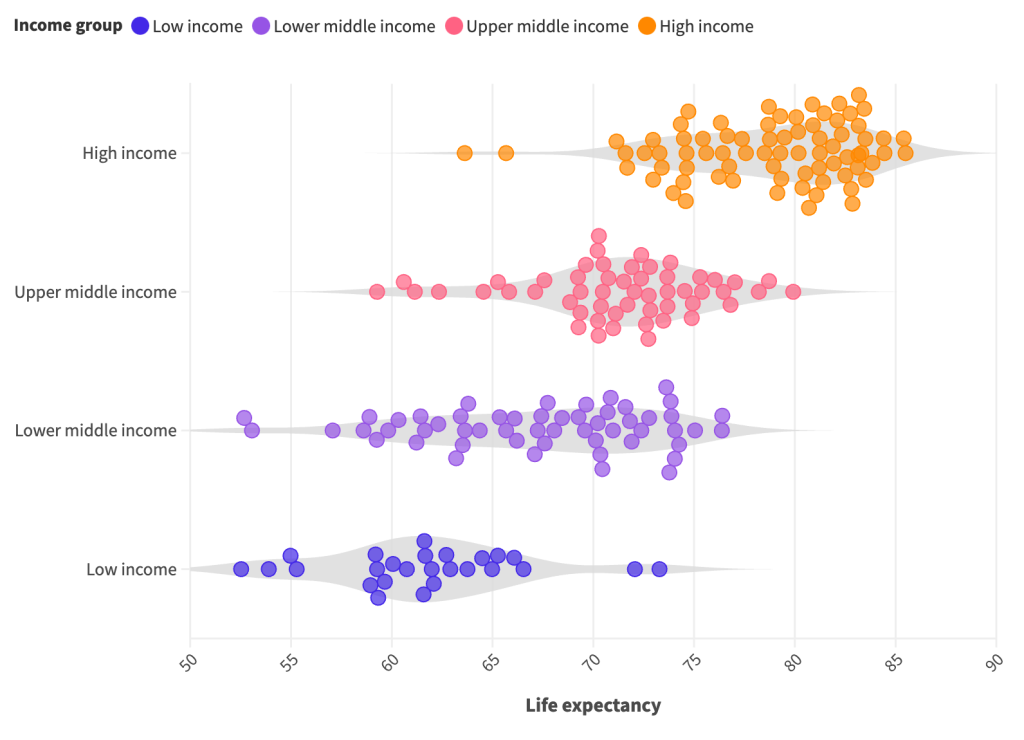
Turning the dot plot into a violin plot is as simple as checking the violin plot box. Or, we can get fancy and make a beeswarm violin plot.
Now that we have our visual, we can download it by going to the export & publish menu. You do NOT have to publish your visual to download your visual. You can simply click the download image button.
With every download you have choices of format between PNG, JPG, and SVG.
You can change the size by changing the number of pixels, if you tweak the width or height you’ll see a preview of the change in the snapshot image. Or if you just want to double the size of your PNG (to make it a bit higher resolution) there is an easy check box for that on the page without requiring you to do the pixel math.
And that’s it. Here is our final visual.

I wanted this video to be as simple as possible, so I just stuck with the default and starter
data from Flourish. But I definitely encourage you to play around with all the different
options.
If you enjoyed this video, please go ahead and like, subscribe, and leave a comment. It
means a lot and I will always read every comment. And if you’re interested in free resources like eBooks and courses, visit my resource library at freshspectrum.com/library
Now…Get out of your head and go create some stuff.