This is an Eval Central archive copy, find the original at freshspectrum.com.
The scatterplot is one of my favorite chart types. So how do you create one in Canva?
In today’s post I’ll show you how you can create a scatterplot directly in Canva, even though you probably shouldn’t. Then I’ll walk through creating a scatterplot using Flourish. Finally I’ll talk a little about when you might want to use a scatterplot, along with an example of how you can make the chart easier to discuss by adding quadrants.
Can you create a scatterplot directly in Canva?
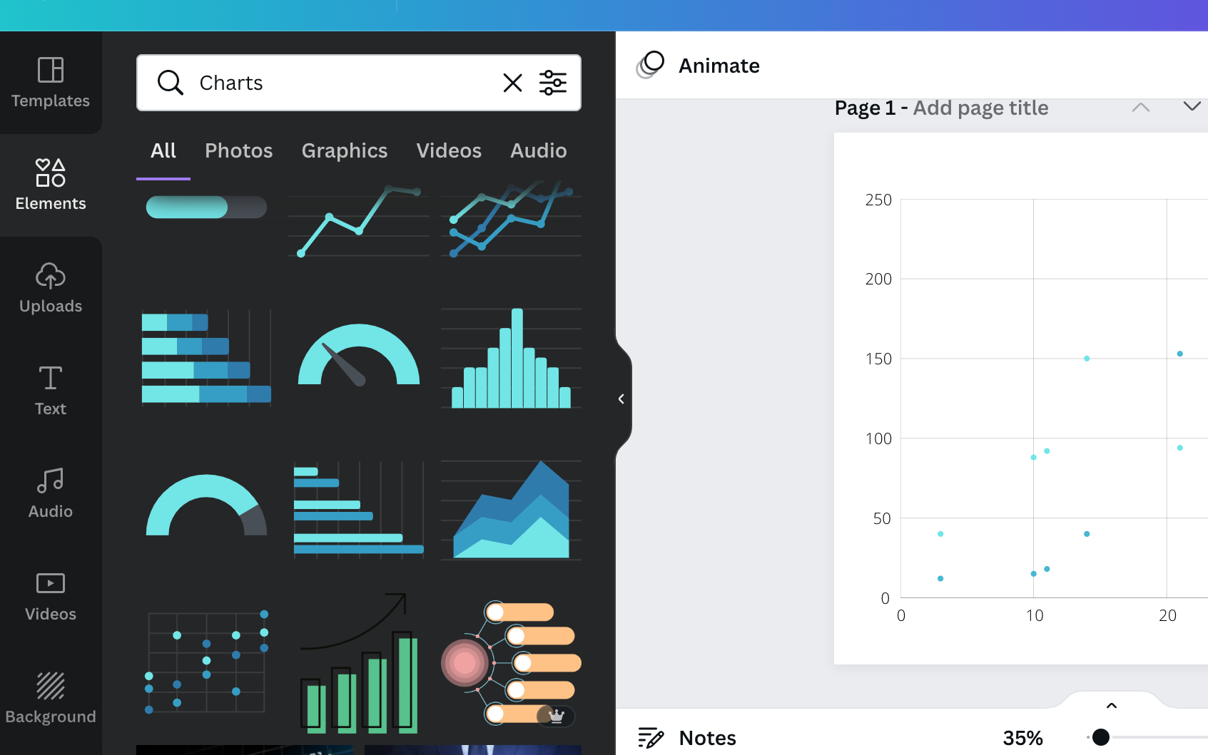
Yes, you can certainly create a scatterplot directly in Canva.
Inside any Canva design just open up the elements menu and search for “Charts”. Then look for the scatterplot.
After you select the element, you’ll get a new Scatterplot dropped onto your page already filled with fake data.
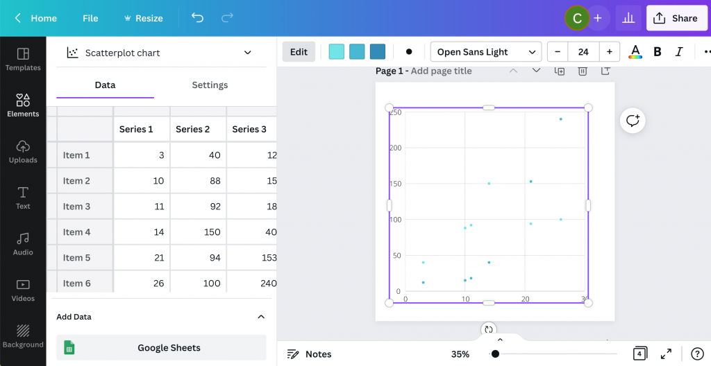
From here you can simply replace the data on the page with your own. Or you an connect directly to a Google sheet where your data lives.
Then you can tweak the style a bit with some of the options Canva makes available.
Where you might get annoyed.
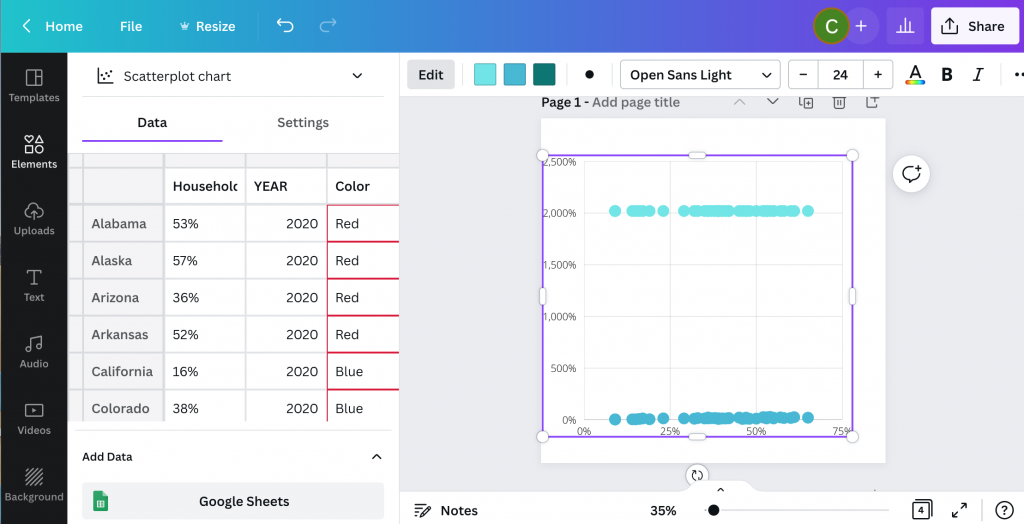
I personally find the Canva data interface super annoying (the thing on the side that looks like a spreadsheet).
It looks like a spreadsheet, but it really doesn’t act like one. You can paste over the dummy data with your own data, but it’s not easy to move things around. You can’t even select multiple cells at once, which is usually required to move columns around.
Then ultimately, you’ll only have access to a few options you can use to tailor your graph.
Why go with Flourish instead?
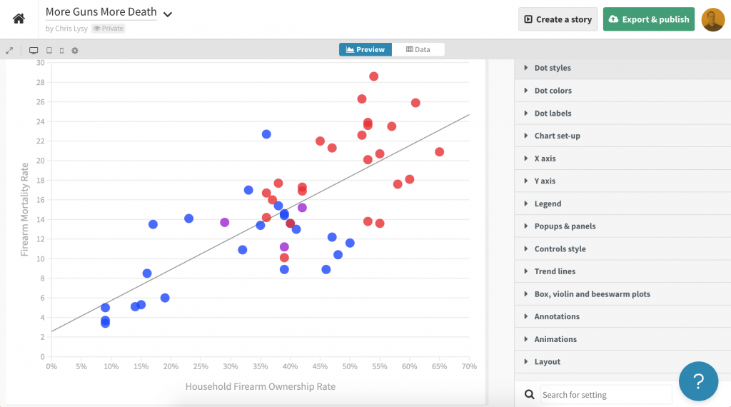
Flourish, a free product that easily integrates directly with any Canva design, is my recommended go to for just about any chart or graph you want to create in Canva.
First off, you get tons of customization options. It can be a little overwhelming at first, but it doesn’t take too long to start figuring out how to tailor your design.
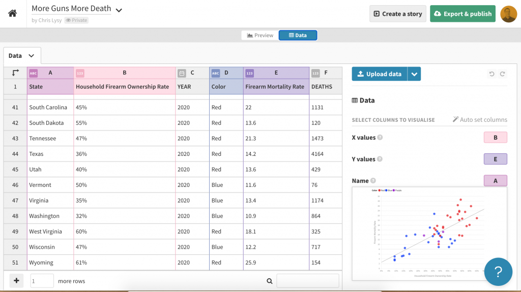
Next, the data entry part of this works really well. I also think the controls are intuitive and love how easy it is to choose columns, colors, names, and other aspects.
Creating a basic scatterplot using Flourish
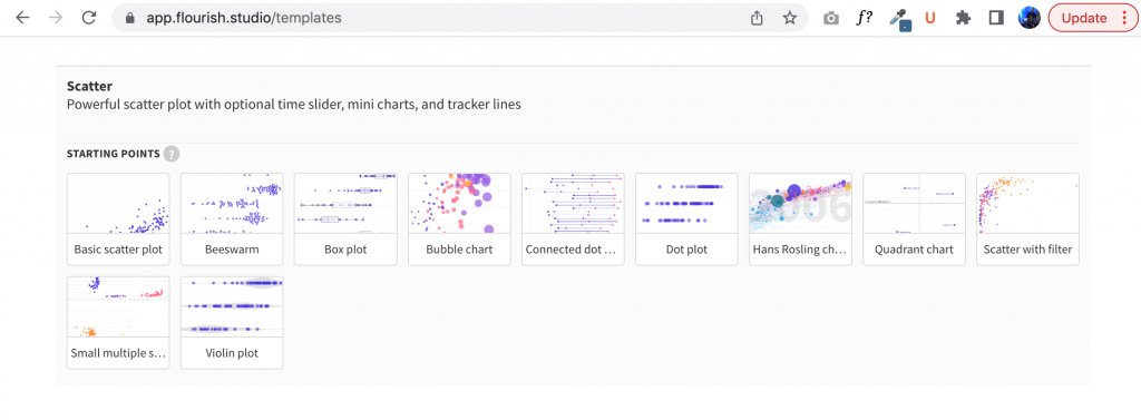
To create a scatter plot in Flourish, just click “New Visualization” and select one of the Scatter Plot starting points.
Just like Canva, Flourish will start you out with a chart using Dummy data.
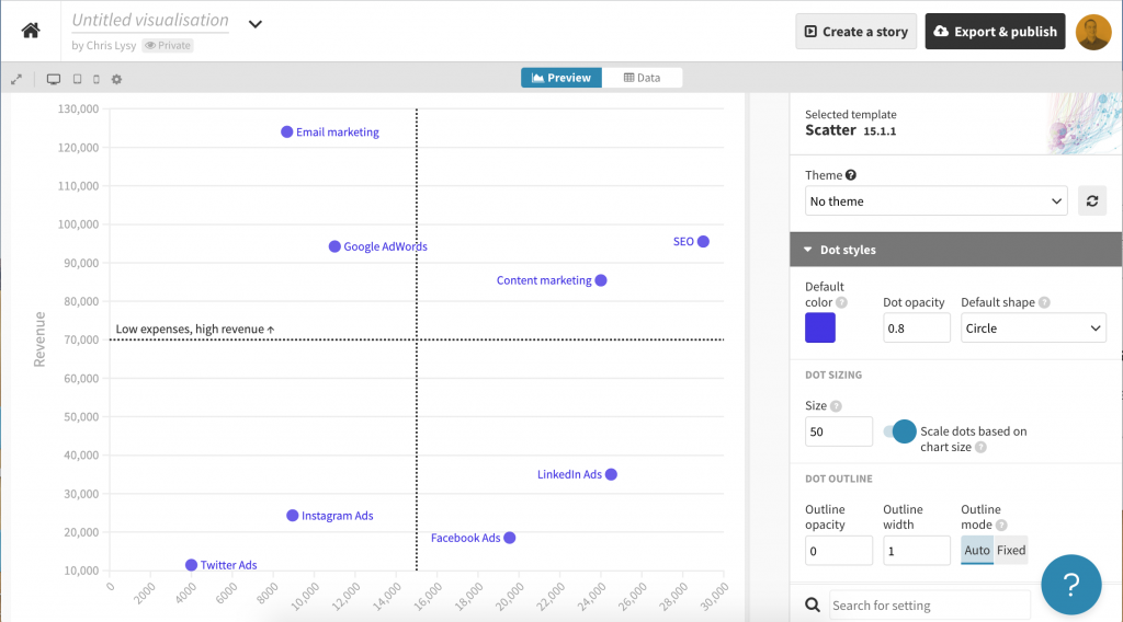
Then you just paste in or upload your data into the data tab.
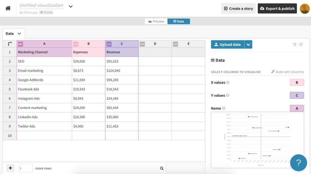
If you need to change the selected columns, just put the letters in the appropriate spots for X values, Y values, and Name.
If you want to add in other variables (such as through color) you can do that here as well.
Scatterplot basics, where continuous data meets continuous data.
Scatterplots are visualizations of two continuous variables.
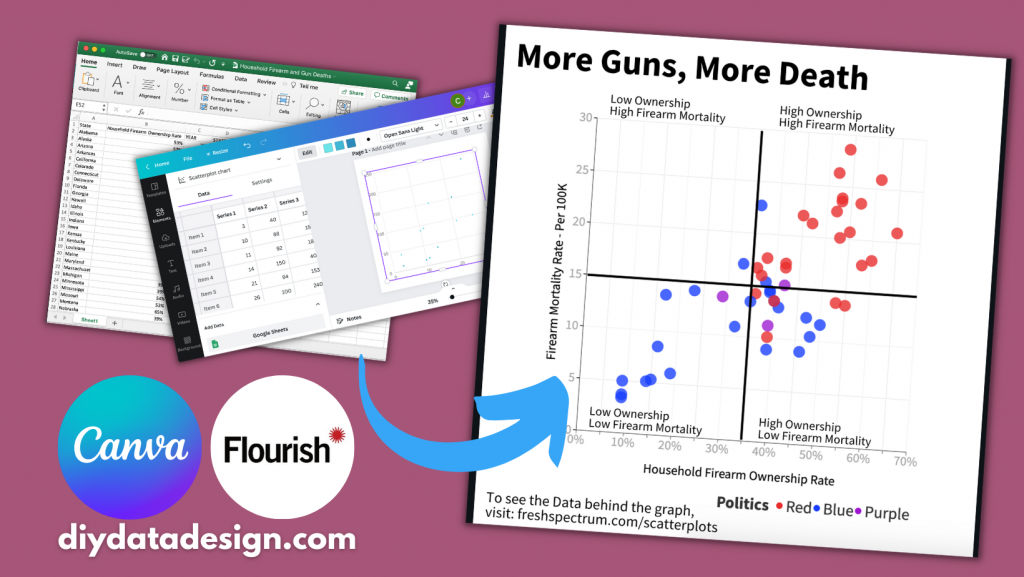
They are really good at showing correlations. Take for example the following scatterplot I created by matching the Firearm Mortality Rate with a Household Firearm Ownership Rate.
Believe it or not there is a pretty solid correlation between the percentage of households with guns and the total number of gun deaths. Also the highest firearm mortality rates are in mostly red states (shocking I know).
Turn your scatterplot into a “perceptual map style” 4 by 4 quadrant.
One of the downsides of a scatterplot is that it can be a bit tough to discuss.
Unlike a bar graph, where you have very specific tangible values, scatterplots are more about pattern recognition than individual data points. And while you can highlight and annotate individual points, sometimes you want to discuss the graph a little more broadly.
In these kinds of situations I like adding a 4 by 4 quadrant grid.
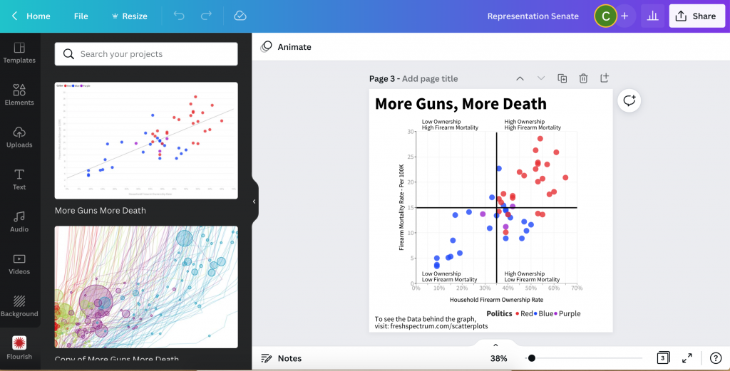
- To do this I start by connecting to my Flourish account from within Canva.
- Next I drop the chart into a design.
- After that I just add lines to make it a two by two.
- Then I label each of the four quadrants.
Now this chart is really simple to discuss. Here are a couple thoughts I had when looking at the final version.
- I thought there would be a red state/blue state divide, but this is pretty extreme.
- The High Ownership/Low Mortality quadrant is interesting. It also includes most of the high gun ownership blue states (like Vermont and New Hampshire). I’m curious as to why they don’t see the same kind of high mortality numbers as some of the red states with similar ownership rates.
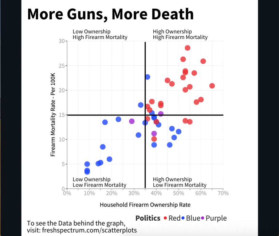
Mixing Two Data Sources (CDC’s Firearm Mortality by State & RAND’s State-Level Estimates of Household Firearm Ownership)