This is an Eval Central archive copy, find the original at freshspectrum.com.
You want to know the secret to improving the quality of your charts, graphs, and illustrations?
It’s simple. Create more than one chart, graph, or illustration. Then pick the best one.
Or, in other words, formstorm it.
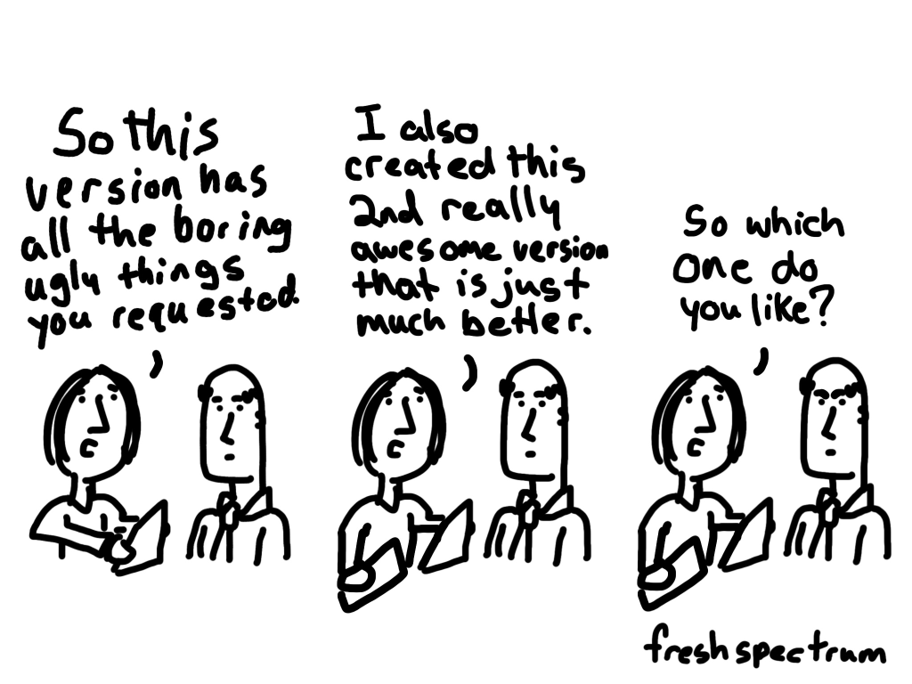
Stop taking the easy way out.
The following comes from a presentation given by John Cleese on Creativity In Management, which you can watch in full on YouTube.
I was always intrigued that one of my Monty Python colleagues who seem to be to me more talented than I was did never produce scripts as original as mine. And I watched for some time and then I began to see why.
If he was faced with a problem and fairly soon saw a solution, he was inclined to take it. Even though I think he knew the solution was not very original. Whereas if I was in the same situation, although I was sorely tempted to take the easy way out and finish, I just couldn’t. I’d sit there with the problem for another hour and a quarter and by sticking at it would, in the end, almost always come up with something more original.
It was that simple. My work was more creative than his simply because I was prepared to stick with the problem longer. So imagine my excitement when I found that this was exactly what MacKinnon found in his research. He discovered that the most creative professionals always played with the problem for much longer before they tried to resolve it. Because they were prepared to tolerate that slight discomfort and an anxiety that we all experience when we haven’t solved a problem.
Most everyday chart designers move forward too fast on a single chart design or icon choice.
- “Categorical data, I’ll create a bar chart.“
- “Time series data, I’ll create a line graph.”
And most of the time that’s fine. But if the data is important, don’t just stop with the quick default chart choice. Because every chart you create, and variation, can tell a different story.
And instead of checklists or chart choosers, my suggestion is to create a bunch of possible charts before picking the one you want to use in your report or presentation.
What is formstorming?
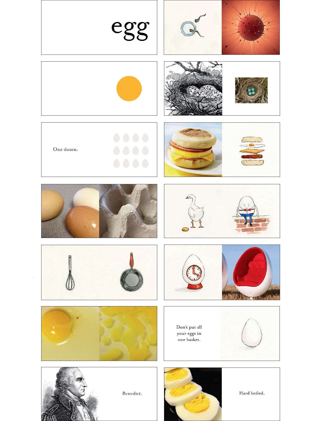
Formstorming is a process I read about in the second edition of Graphic Design The New Basics by Ellen Lupton and Jennifer Cole Phillips.
Formstorming is an act of visual thinking — a tool for designers to unlock and deepen solutions to basic design problems.
Generating multiple iterations of one subject is a means of digging deeper.
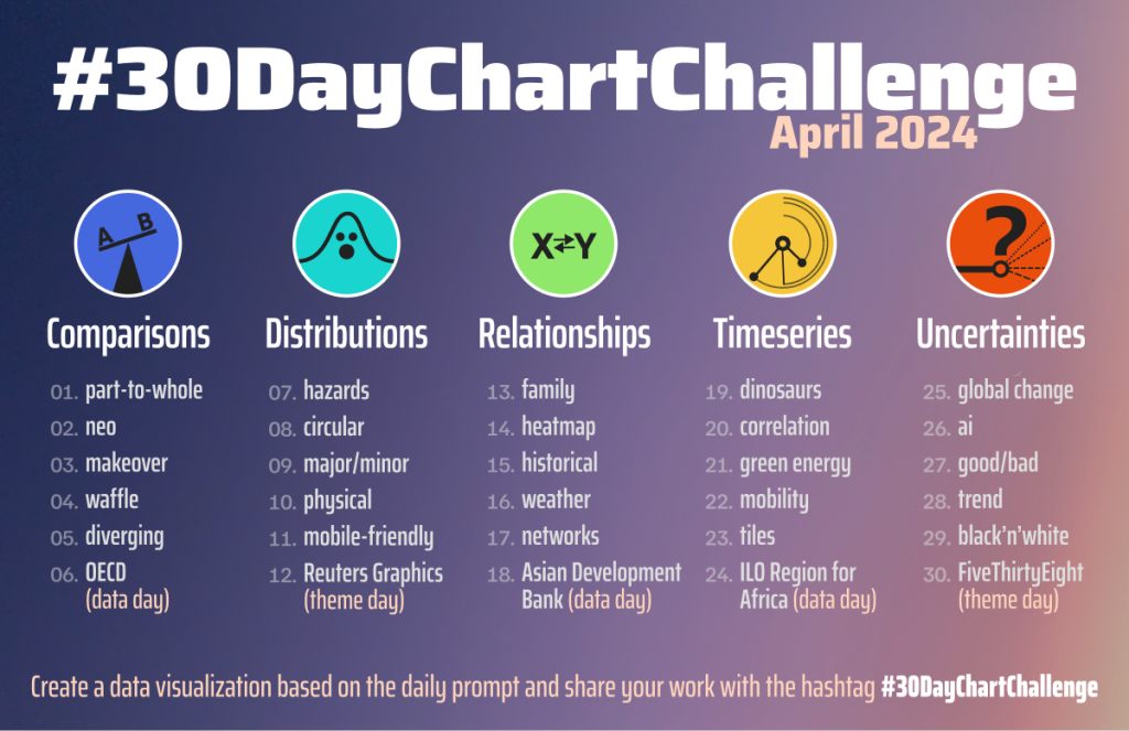
You might be familiar with some of the daily challenges you’ll see ln Social Media. Things like daily drawing challenges or the 30 day chart challenge. These kinds of challenges can be really great for creative practice.
But it can also be really useful to take on that mindset when just doing your regular data visualization work.
More iterations, more creative solutions.
So how many chart or illustration iterations should you consider?
When I get a new potential design client, before we settle on a budget, I always ask how important the project is to that client. Because the process involved in any creative project is not usually dependent on the amount of time it takes to “do the work.” But the importance of that work.
If you are creating a logo for a side project, you probably won’t sink that much time into it. But if you are creating a logo for a city, one that will be on signs, documents, vehicles, and more, you probably want to spend more time than a lunch break.
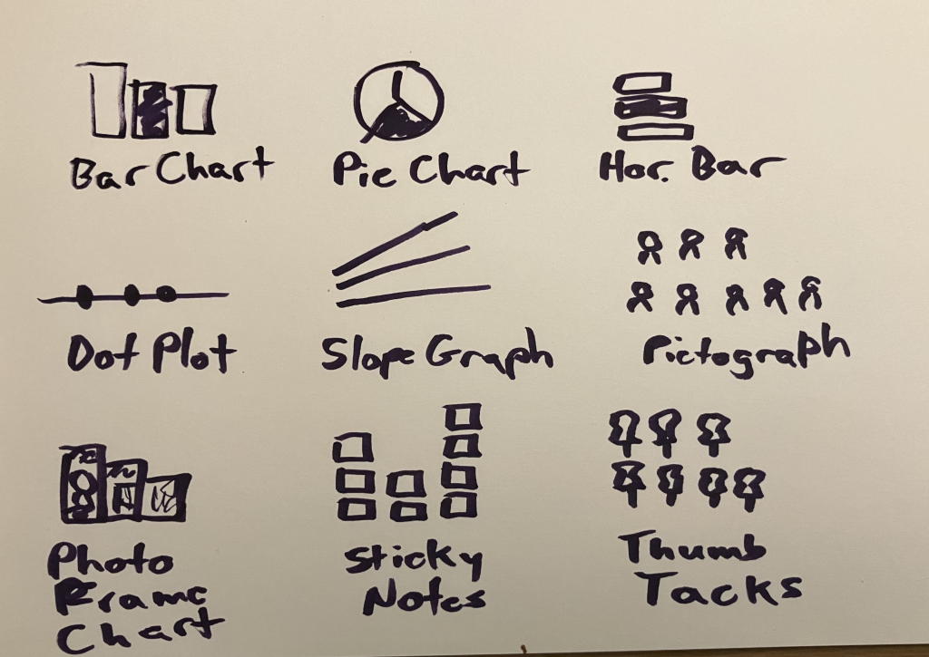
The same thing goes with chart iterations. If sharing the data is important, spend more time creating more iterations. If it’s not that important, just stick with a few. If you currently just create one chart option, try creating 3. If you already create a few, and the project is important or the message is critical, try to create far more (say 15).
But if you just want to stretch your creative limits, I would suggest approaching the visual with a nice 3 by 3 (9 iterations).
Want some more tips on practical creativity?
There is still time to register for my Compelling Qualitative Data Visualization course, which will be held on October 15 & 17.
I’ve been reading a LOT of qualitative data sections inside of reports, and trust me, there are a lot of people who could use some support. It’s just not something anybody is taught in their social science programs in grad school.
You can learn more about the course on my workshop page at diydatadesign.com.
