This is an Eval Central archive copy, find the original at freshspectrum.com.
Ever get annoyed with formatting after you create a chart in Excel?
It’s pretty easy to create a chart in Excel. A couple of button clicks and poof, there you go, chart created. But if you want to create a chart that actually looks good, you often have to do a bit more work. For example…line graphs…scatter plots.
But sometimes, formatting in Excel just makes you want to…uh, how do I put this?
Throw your computer out the window.
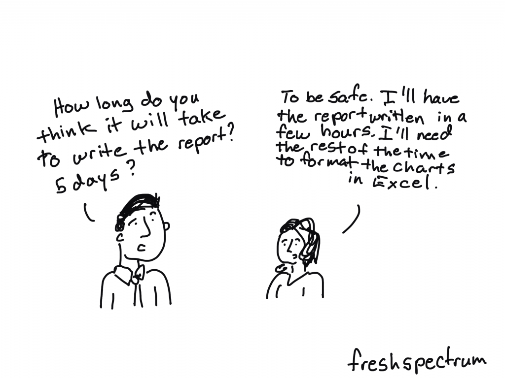
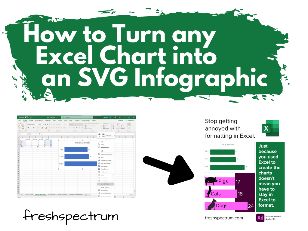
Lucky for us though, just because we created our chart in Excel, doesn’t mean we have to stay there to format the thing.
Believe it or not, Excel is a vector design tool. And even though it’s hard to take advantage of that while using Excel (stupid textboxes won’t go where I want them to go!!!!!) we can take control by sending our chart outside of Microsoft.
Start with a Chart in Excel
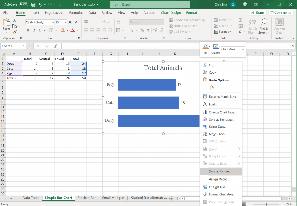
So let’s start with a chart in Excel.
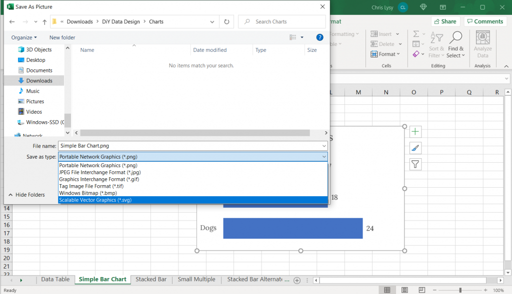
Just right click on the chart you want to format and click on “Save as Picture…”
Export as Scalable Vector Graphics (A.K.A. an SVG)
Now when we save it we want to save it as a vector format (or else this won’t work). With my PC Office 365 version of Excel I’m given 6 options.
Of the 6, five are pixel based (aka raster)…PNG, JPG, GIF, TIF, BMP.
But number 6 is the trusty Scalable Vector Graphics format…SVG. This is our vector file format.
Open your SVG in a graphics program.
Now that we’ve saved our SVG somewhere on our computer (or somewhere else) we need a program that works with SVGs.
Luckily there are bunch that fit the bill. Here are three big ones.
- Adobe Illustrator (ye olde graphic design industry standard that requires a pro creative cloud account)
- Figma (new fangled UI design tool that is both a pro tool and FREE to use)
- Adobe XD (also a new fangled UI design tool that is both a pro tool and FREE to use by the same people who brought you ye olde graphic design industry standard Adobe Illustrator)
Any of these three will let you pick apart and redesign this chart. If you are not an Adobe CC person already, I would suggest starting with either Figma or Adobe XD.
Here is what the Excel Chart looks like in Adobe Illustrator
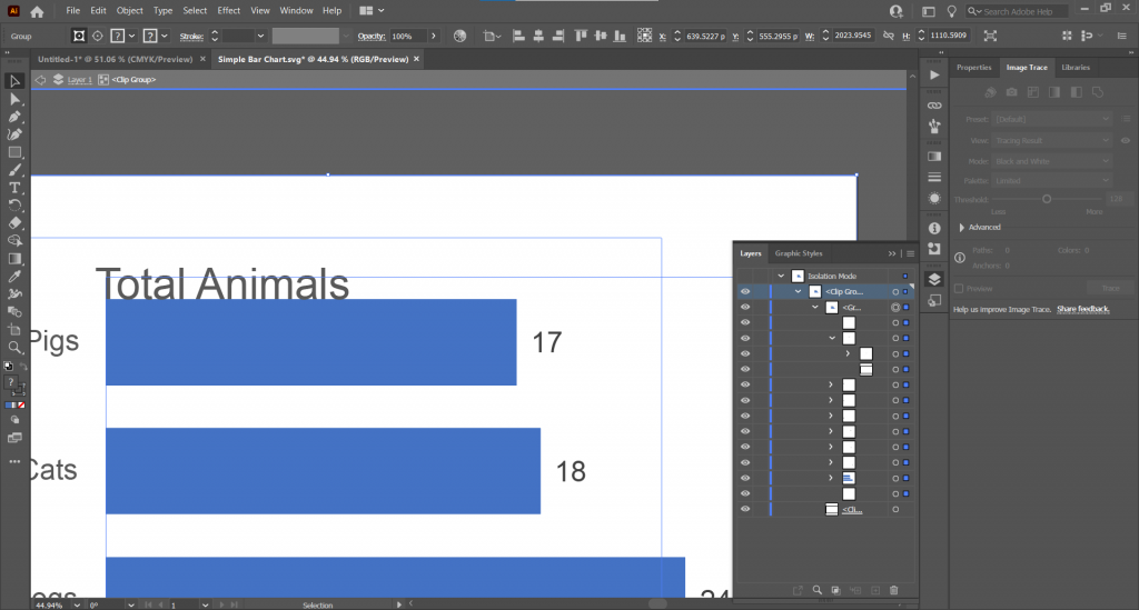
See that over there on the right side? That’s a layers panel.
Every single element in an Excel chart can be isolated and changed through the SVG. You’re also going to find a bunch of empty rectangles that can be deleted away if they get in your way.
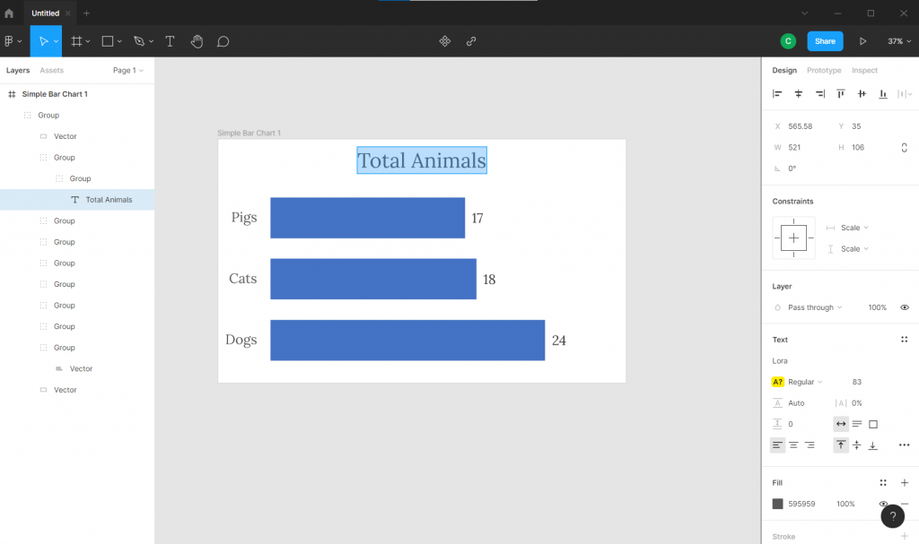
Here is what the Excel Chart looks like in Figma
Here we are in Figma with the layers on the left.
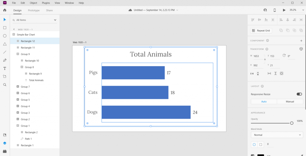
Here is what the Excel Chart looks like in Adobe XD
And here we are in Adobe XD. Looks pretty similar to Figma, doesn’t it?
(See also sketchapp).
Pick it apart and rearrange to your heart’s content.
Ultimately the bar graph is just a single vector path buried within one of the groups. We can stretch it or recolor. As long as you keep the main chart pieces together, the graph will remain in the right proportion.
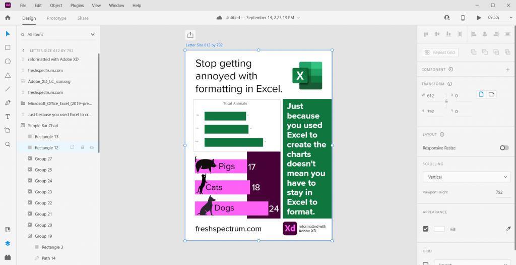
The best part about using a tool like this? We have total control over what goes where. And we can shift elements pixel by pixel.

Bonus. Want to save your new infographic as a PDF?
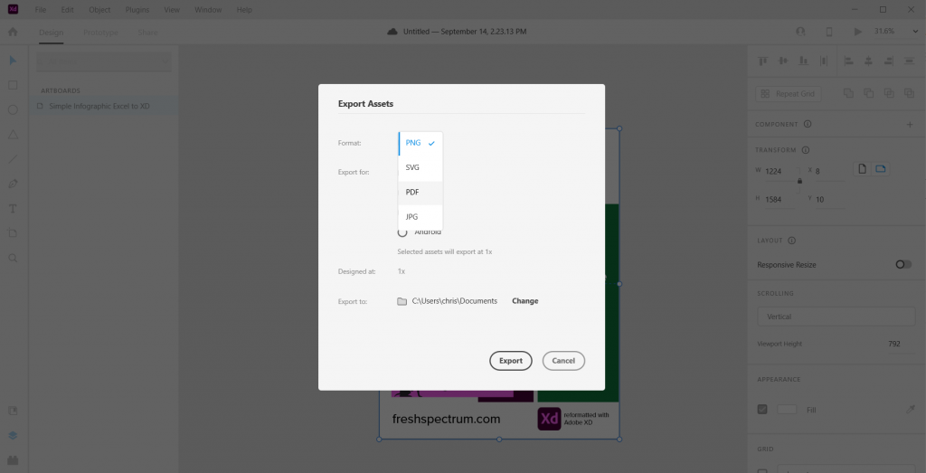
No problem.
