This is an Eval Central archive copy, find the original at evalacademy.com.
Evaluators do not often share their evaluation reports. The organization or client that the evaluator works for usually owns the report, which can make sharing them difficult. But sometimes it can be helpful to see what and how information is presented in an evaluation report.
A few years ago, we completed an evaluation for a breast cancer clinic. In honour of Breast Cancer Awareness month, we thought we would highlight some excerpts from that report to help inspire your next evaluation report!
-
Describing the evaluation
In our reports we like to acquaint the audience with an overview of the evaluation near the beginning of the report. In the evaluation overview, we try to provide a high level understanding of the evaluation plan and how it was developed.
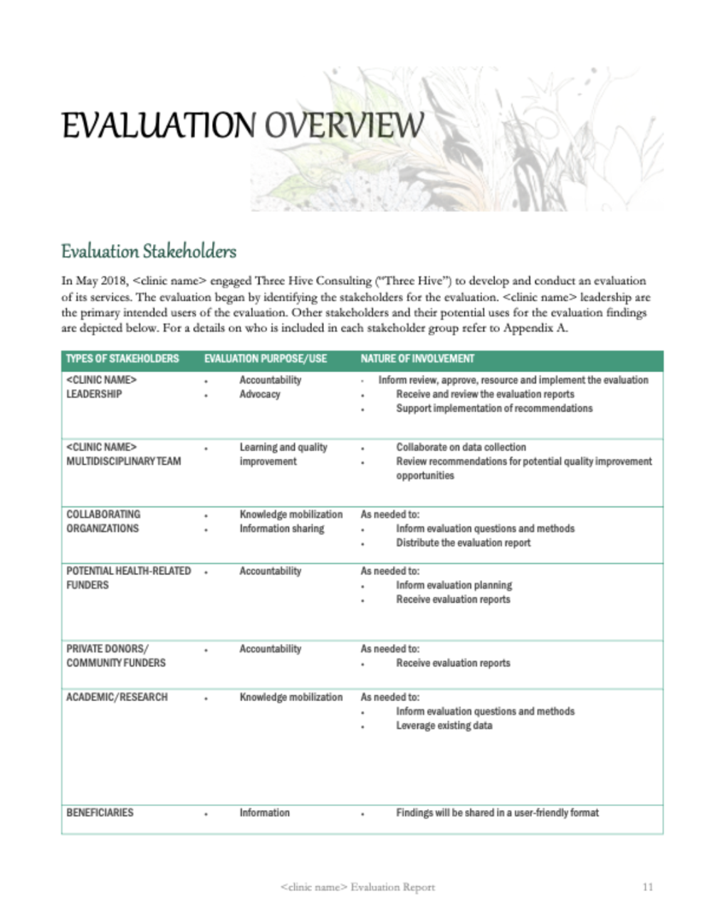
For this evaluation, the stakeholders requested we include an abbreviated stakeholder matrix that we co-created at the beginning of our evaluation planning.
An evaluation can’t be all things to all people, and by including a stakeholder matrix identifying the primary intended users, we showed that all stakeholders were considered and involved in the evaluation in some way (as outlined in the “nature of involvement” column).
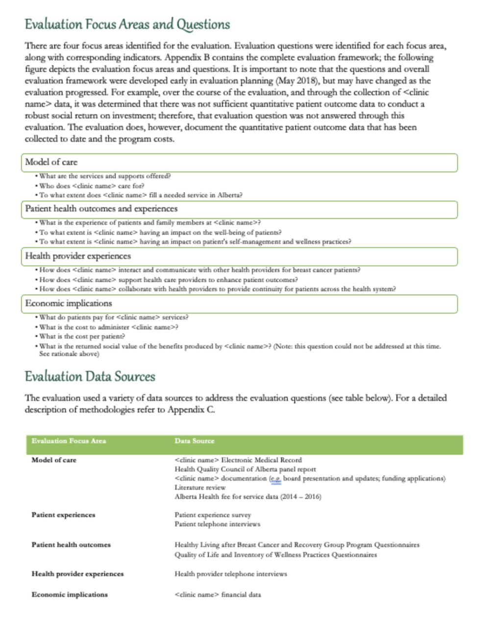
This evaluation had four focus areas:
-
Describing the model of care,
-
Reporting on patient outcomes,
-
Reporting on health provider outcomes, and
-
Describing the costs.
Each focus area had corresponding evaluation questions. These questions were answered using mixed methods. We don’t want to overwhelm the reader by going into the detailed minutia of our methods, so usually we append that at the back of the report and include a high level overview of our data sources near the beginning of the report.
2. Describing the clinic
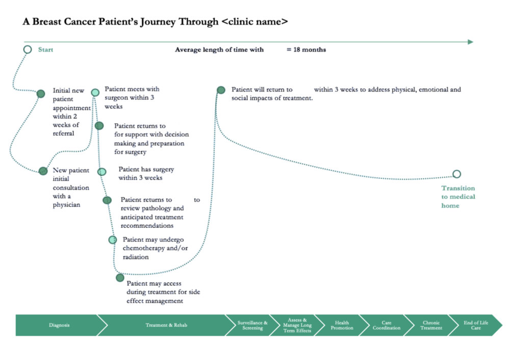
In this evaluation we needed to describe the clinic and its model of care (see evaluation questions under model of care). We did so using narrative and a number of figures, including the ones below.
This figure was created using PowerPoint and shows a breast cancer patient’s journey and the clinic’s role in that journey.
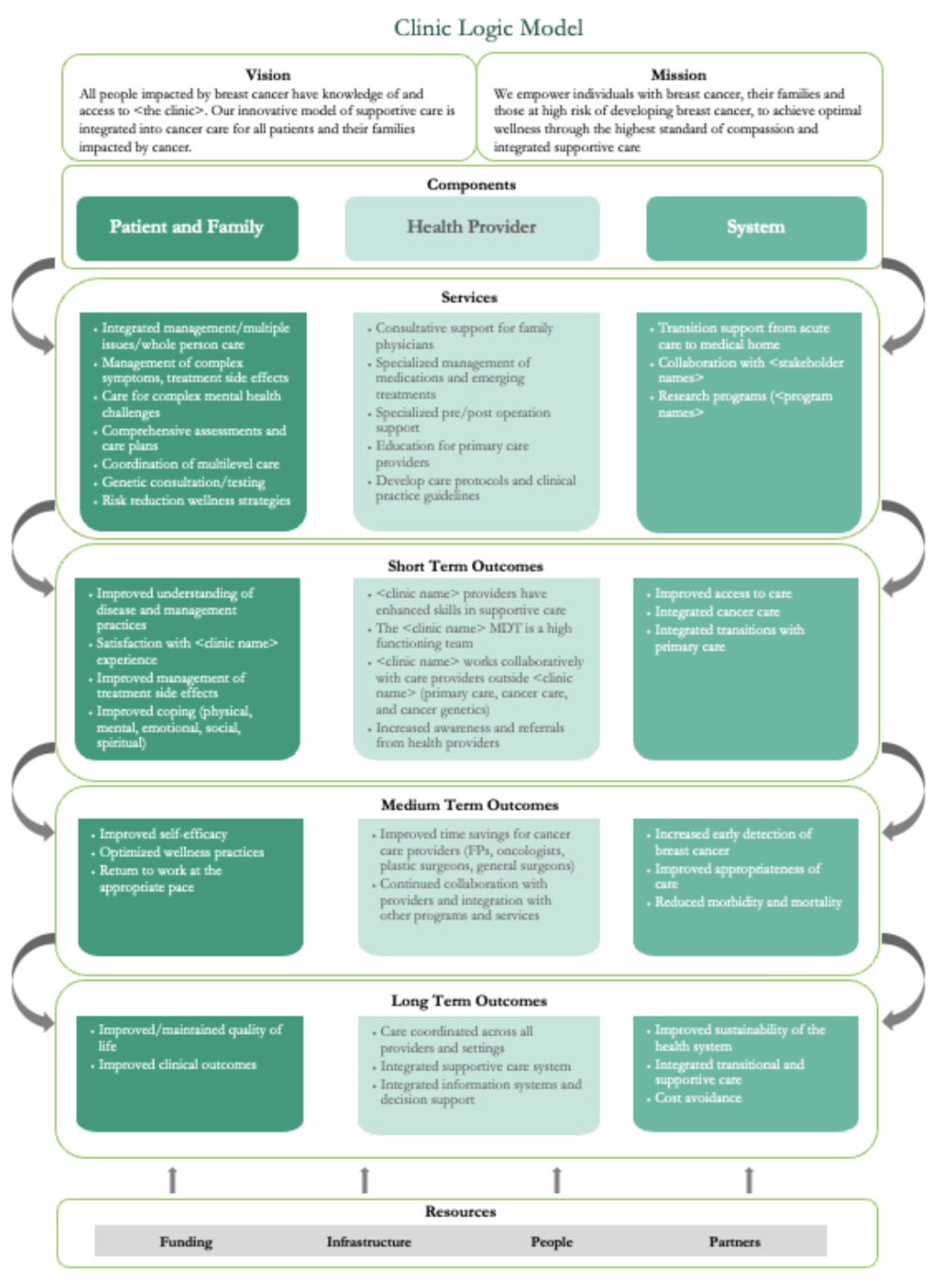
Logic Models can be a great communication tool to describe a program. There was a more detailed logic model created for this clinic; however, for the purposes of this report we simplified it to this one-page overview using SmartArt. (We know SmartArt isn’t for everyone! Check out this article by Dr. Echo Rivera for some SmartArt alternatives.)
3. Describing the findings
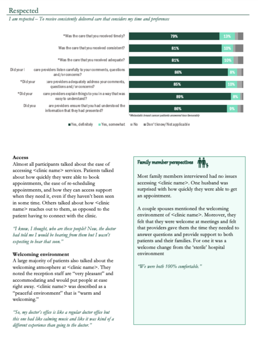
We collected survey data and interview data from patients and family members. We wanted to present that information in a cohesive way instead of using headings like “patient survey findings,” “patient interview findings,” and “family interview findings.” Instead, we used the Canadian Partnership Against Cancer’s pillars of a positive patient experience frame how the results were reported.
We showed the relevant survey findings and incorporated interview findings from both patients and family members. Family member perspectives were highlighted with a call out box and an icon to cue the reader that the information was from family members and not patients.
Unfortunately, we can’t share with you excerpts from the report where we helped interpret the findings and recommended next steps, since these are specific to the clinic and their stakeholders. However, we hope we have provided you with some inspiration to help inspire your next evaluation report.
If you’re looking for more reporting ideas and inspiration, check out our Six Hacks For Renovating Your Evaluation Report series of articles. Or feel free to reach out to one of our Eval Academy coaches.
Sign up for our newsletter
We’ll let you know about our new content, and curate the best new evaluation resources from around the web!
We respect your privacy.
Thank you!