This is an Eval Central archive copy, find the original at freshspectrum.com.
Design is a process. So is creativity. In today’s post I’ll walk you through the process I would use to design an executive summary style report using Canva.
Step 1. Simple Mini Personas
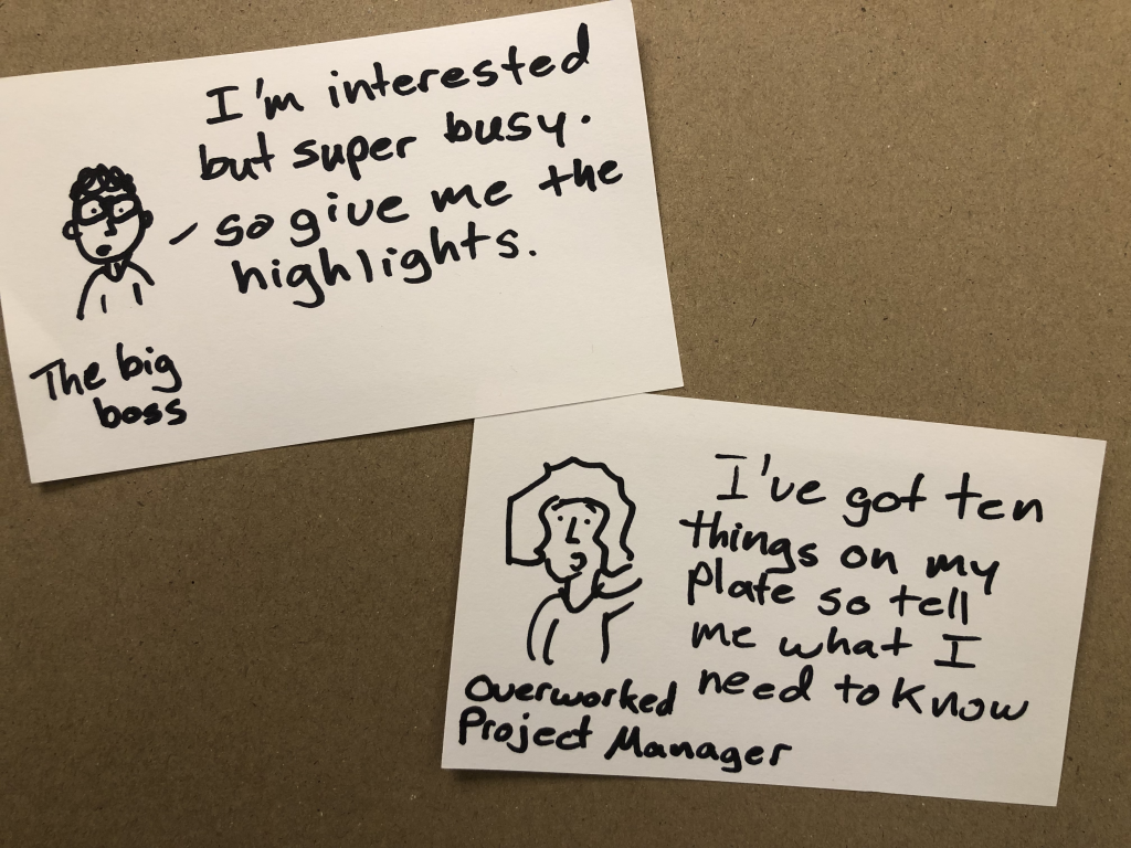
Take a notecard and draw a little picture of a person. Don’t worry about the art, stick figures are fine. Then give them a little quote as if they are talking directly to you, the report designer telling you what they would like to read.
I used to have a more involved process for personas in the past, but simple is easy and easy is more likely not to be skipped.
Step 2. Pick a Type of Report
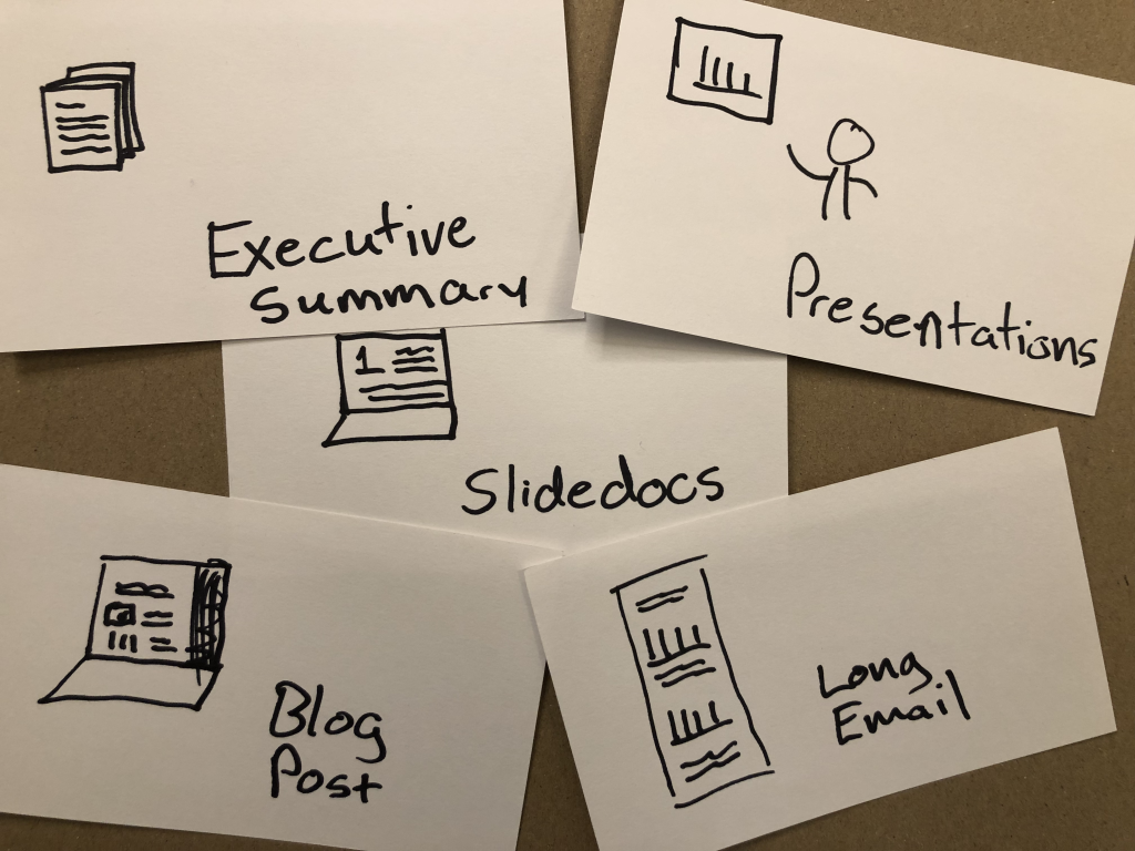
So I titled this post as designing an executive summary. But here’s the thing, there are other options that you could use to reach the same audience with the same types of information.
An executive summary is pretty status quo, so is a presentation. But something like a slidedoc, blog post, or long email could fulfill the same purpose. And they also might be more likely to be read.
For the sake of this blog post, let’s pretend you work in a fairly old-fashioned organization who balk at something beyond the status quo. And at least at the moment, you’re not in the mood to ruffle feathers.
Step 3. Peruse Existing Canva Templates
Yes, this step happens before you start writing.
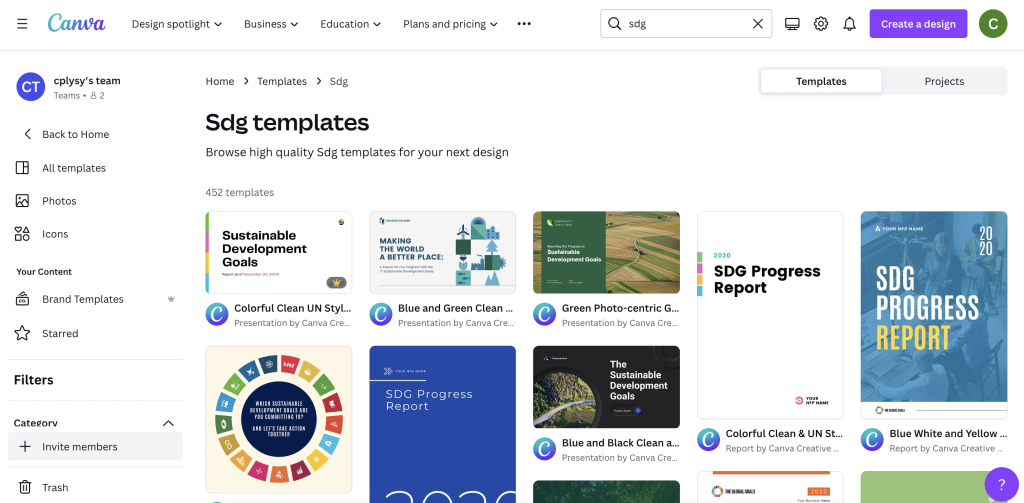
You can search reports, but you can also put in other search terms that might get you closer to the kind of report you want to write. Our goal here is not to settle on our final report style, but find a report style that just feels right for the audience we are trying to reach.
I found nice sets of templates Canva has in their library on building out SDG Progress Reports. There are bunch here to choose from and they work really well as basic templates for evaluation reports.
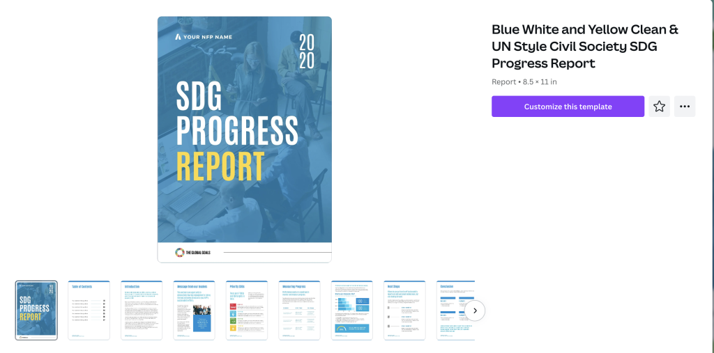
Clicking on a template will show you the different page layouts offered at the start.
I have seen executive summaries that are 2 pages, 4 pages, 6 pages, and some that are far longer. For most situations though I suggest going as short as possible but still delivering your key insights.
Step 4. Build a Basic Report Spread.
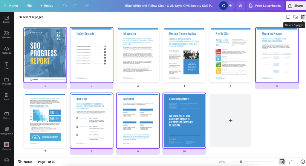
Given the shorter format, you’ll likely only need a few of the pages inside the spread. Since we are talking a super short report, you will likely NOT use a title page or table of contents. Instead you’ll choose a few of the more heavier content pages.
Let’s say we are creating a 4 page executive summary. You think this should give you enough room to say what you need to say. Using the base template page layouts, choose 4 that feel the way you want your report to look.
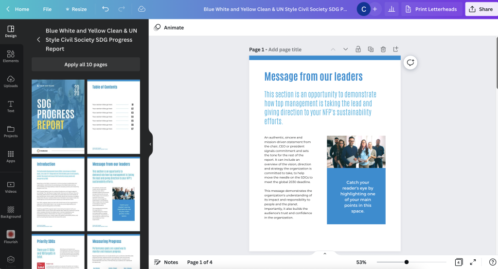
The title page for your Executive Summary should have space for a title, a sub title, some narrative, and picture or chart.
Step 5. Open up Word or Google Docs
Canva is a better design tool than word processor. For the writing part you’re better working in a program designed for writing.
The difference between this process and most other report writing processes is that we have a goal in mind. Based on template you chose, you have a basic idea of how many words you can write on each page.
If you write lots more, or lots less, this will change the look of the report. In other words, it will break the template. If that’s your choice, do this intentionally. You might even want to reconfigure your report design to make sure it still works for the text you are writing.
Step 6. Fill your Template with your Words
Okay, now it’s time to fill your template. This will probably involve a bit of redesign and tweaking, but you’re going to be in far better shape than if you had just started this whole process with a draft in Word.
I’d suggest sharing as a standard PDF. But you can also download as a PowerPoint if you need to codesign the final document with others on your team.
Want to learn more about my reporting approach?
I have a free eBook for that. You’ll also find other free goodies in my resource library.