This is an Eval Central archive copy, find the original at freshspectrum.com.
So welcome to a new series of blog posts. Each will be a type of design walkthrough. In these posts I will start with a chart or piece of information found in a real report and adapt it into something different (not always better, but always different).
I’ll walk you through my design process as I go and show you my reasoning throughout.

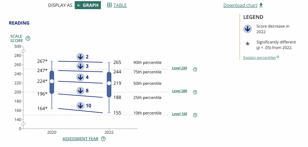
My starting point. A 2022 NAEP Long-Term Trend Assessment Report.
So I was strolling through some report highlights from a recent National Assessment of Educational Progress (NAEP) report (Reading and mathematics scores decline during COVID-19 pandemic) when I came across this chart.

It kind of looks like some version of 5 string guitar tablature and it took me a minute to decipher. It’s a little busy but all in all it does deliver a little story if you can figure out how to read the chart.
Basically reading scores for 9 year old students dropped between 2020 and 2022. The drop was bigger for lower performing kids. Students in the 10th percentile scored 10 points lower in reading in 2022 compared to how students in the 10th percentile scored in 2020.
The gist: COVID happened and the NAEP reading scores went down, but it was worse for lower performing students.
Same was true for math, but for this adaptation I’m going to stick with just reading.
Are the percentiles hiding the story?
So the drop of scores from 2020 to 2022 across all percentiles is pretty clear. On the NAEP page they shared this through a line graph starting in 1970. Across that entire span the numbers don’t change very often or by very much.
There is only a total 12 point shift between 1970 and 2020, and most of the changes were gradual. Except for last year. That’s an interesting story all on its own, but for the graphic I want to create I’m going to focus on the differences between low performers and high performers.

One thing I learned early in my career is that it’s a good idea to start with the basics, even if they feel completely clear. In this case, since I’ll be zooming in on 2020 to 2022 for the percentiles, it’s a good idea to just start with a matching chart that just shows the overall 2 year average drop.
Now that I have that one, it’s time to break down the data into the percentiles. While the original NAEP chart is accurate, the focus we really want is on the differences between 2020 and 2022 for each of the percentile groups. So separating each percentile into its own chart will help provide that focus.
Can you see how simply splitting up a chart can make it easier to process the information? We already know by default that the 90th percentile is going to have higher scores than the 10th, we don’t need to see them in the same chart to confirm that point.
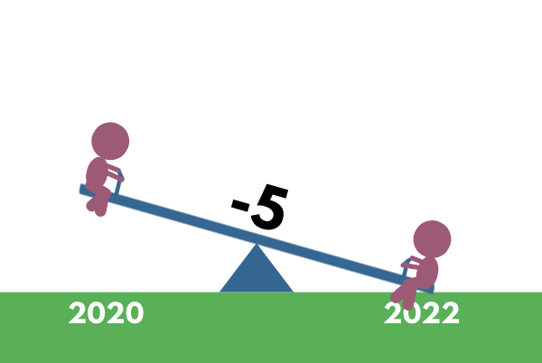
Is that a seesaw?
Alright, that’s the boring stuff, now let’s play a little.
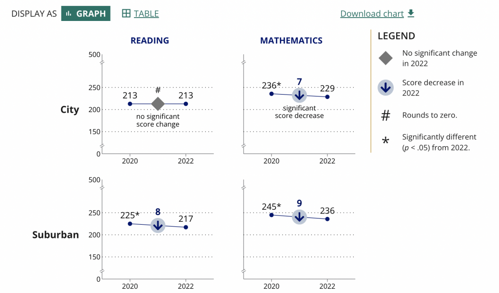
So after scrolling down the page, I noticed they had other charts as well.

Essentially it’s a two data point line graph. Some people will call this a slope graph.
Given that we’re looking at just the averages we could probably zoom in a little on the actual data by reducing the range on the Y axis.
They ended up using the same scale for all the charts in the report (which I understand). But the average doesn’t vary that much over time so you only get a little bit of a drop. The scale is larger because of the larger range between the 10th and 90th percentiles.
So to make the point a little clearer as to how much of a drop happened, they put the number in bold in the middle above an arrow in a circle. It definitely calls attention to the change.
These ones seem very reminiscent of a seesaw…which gave me an idea.

The seesaw graph. Yes, technically you could call it a line graph or a slopegraph. But do they have little children on each end? I think not.
The difference though is that my goal with this one is to present year to year change. And since I’m visualizing change, and not specific scores, I can go ahead and put all the percentiles on the same plane.
As with all line graphs & slopegraphs (and charts in general) the actual comparative size of the y-axis and x-axis is going to make a big difference.

Even if you couldn’t see the story quickly before, I’m sure you can now. That’s quite a difference between the lower performing percentiles (10th & 25th) and the higher performing percentiles (75th & 90th).
And in defense of my more extreme comparison, a ten point difference is extreme when you consider that the average scores didn’t fluctuate more than 12 total points in the last 50 years.
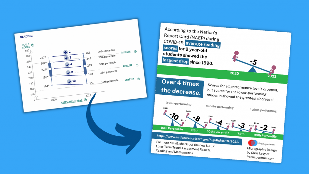
Pulling it all together into a Micrographic.
Micrographics can be little illustrated stories like this one, that you can easily share on social media. If you’re interested, I have a free 10 part email course on Micrographic design.
Here is the micrographic I pulled together from today’s charts.
Canva NAEP Reading Seesaw Graph Template by cplysy
Want the Canva & Flourish Templates from Today’s Post?
All my templates are available exclusively to members of my Designing with Chris workshop. If you’re in the workshop, here is the link for the set of templates.
If you’re not in the workshop, just know it’s always open, and you can join us today!