This is an Eval Central archive copy, find the original at freshspectrum.com.
One of the cool things about teaching data design is that I get to personally learn from the people who take my workshops.
Today’s concept comes from Celestyna Galicki. This is the second time I’ve featured one of Celestyna’s creations (see her post on Shadow Logic Models).
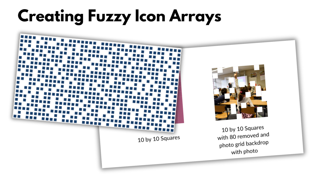
If you have ever taken one of my workshops you’ll probably know that I love using icon arrays. You don’t need fancy tools, at the most basic level you can just copy and paste shapes. But Celestyna came up with an interesting way to display the array data that tweaks the visual story quite a bit. So I asked her if she would share her process on this blog.
Simple Tweaks with Icon Arrays (Celestyna’s section)
Simple tweaks to popular data visualizations can change what they communicate and how they are interpreted by the audience. For example, we have 800 squares (representing units of something) and we want to illustrate the scale and impact if we remove 200 of them.

The standard way to do it would be to grey out the 200 squares…

… or to delete them, which will work in a slide or video transition where they disappear from the starting picture:

We can also remove the squares randomly and create an animated transition in which the starting picture becomes full of holes. This is what I’ve done, and it worked very well for the story I was telling.

See, the “cut a piece off” reduction still leaves us with a very solid pattern. The implication is that the new situation will work in the same way, only on a smaller scale. What I wanted to say is that the change will leave us with something that will work in a new, different way, and presenting it in this form effectively underscored this message.
If you want to illustrate a change in numbers, ask: What does this change mean for how things work? How can we reflect this in how we show this change? That set of squares can be a floor and when holes appear whoever walks on it can fall through, but it could also be a wall in which we knock out a few bricks to let in some light and create space for innovation while the wall is still stands and serves its purpose. Or it could be a net that can handle the smaller holes but will lose its functionality if there is a big enough hole. Which of these visual metaphors fits the story you’re telling?
(You could make the visual metaphor explicit by making the squares look like floor tiles or bricks in a wall. I don’t, for two reasons: I do not have time, and I find that it works well enough when the audience discovers that meaning on their own – “this looks like ….!”. What you write in the report or speak in the presentation can guide them towards this interpretation.)
Did you use any modifications of common graphs or visualisations to support the meaning of the story you were telling? Share in the comments!
Playing around with Fuzzy Icon Arrays in Canva (Chris’ section)
Celestyna’s icon array made me think of a pixelated photo. So I thought, what if we actually purposefully pixelated to tell a story about what a photo shows and does not show. I ended up putting this together in Canva.
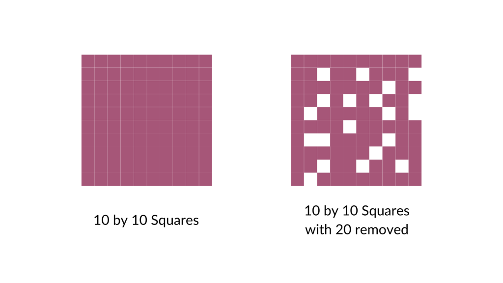
I started by turning a bunch of squares into a ten by ten grid (so 100 little squares). Then I arbitrarily removed 20 (leaving 80).
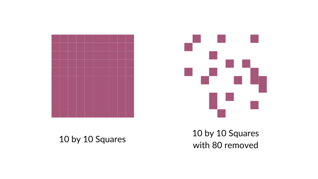
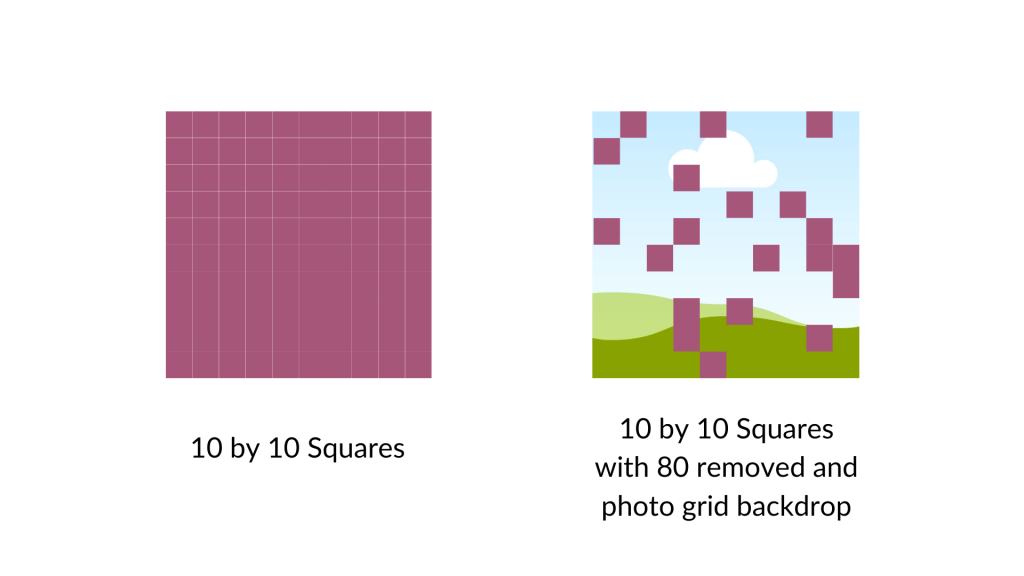
And then I did it again, removing 80 (leaving 20).
For the next step I went ahead and put a square photo grid behind my array. Now only the removed pieces will show the grid.
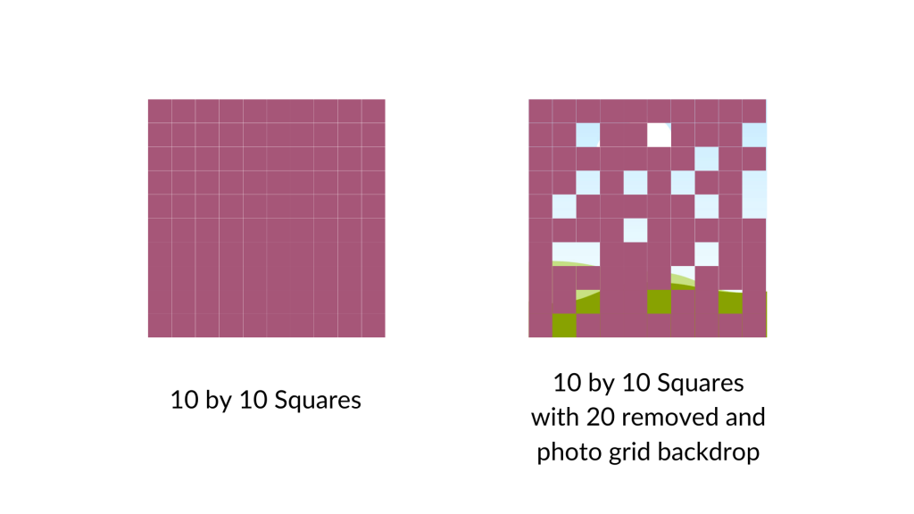
If you wanted to do something like this I would say it works better if you treat the background image as your base. So if you want to show 80 out of 100, remove 80 (not 20). You’ll see what I mean in a second.
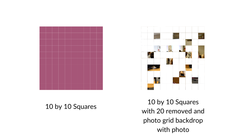
Here is the grid with 20 squares removed and the remaining squares turned the same color as the background. As you can see, the picture is really fuzzy as we are only seeing it through 20%.
Now here is that same picture with the 80 squares removed. You can see almost the full picture.
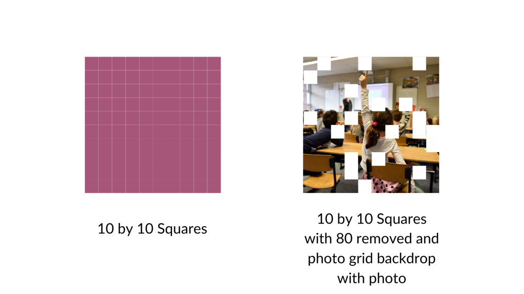
I could see this being a really cool way to show off response rates to surveys (especially when doing a census approach). It gives you a sense of the missing data, and how we can still see the big picture. But if we were to have a lower response rate, the picture would show up less. A nice visual metaphor while showing off real data.
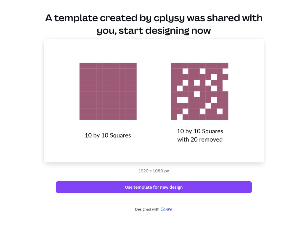
Want to access my Fuzzy Icon Array Canva Template?
Just follow the link below (just make sure to sign into your Canva account first). Also, it’s okay if you only have a free account as I only used free Canva elements for this template.
