This is an Eval Central archive copy, find the original at evalacademy.com.
This article is rated as:


Pie charts are a widely and (often) inappropriately used form of data visualization. Their simplicity makes them appealing to visualize parts of a whole. However, pie charts are often misused, leading to the misinterpretation or distortion of data. Below, I’ll outline some common misuses of pie charts and offer practical suggestions for improving your data visualizations.
Too Many Categories
A common misuse of the pie chart is presenting too many categories (or slices) in a single chart. Pie charts with numerous slices quickly become cluttered and difficult to read. This inhibits interpretation of the chart, making it impossible to discern between slices or to compare between slices accurately.
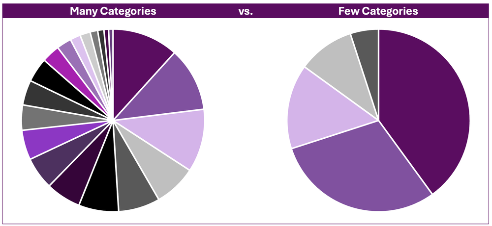
The Fix
If you decide to use a pie chart, consider grouping smaller categories or like categories together to reduce the number of slices in the pie chart and improve its readability. However, sometimes aggregating data together is not appropriate. For these data, consider bar and column charts as better alternatives, as they more effectively display categorical data.
Close Comparisons
Pie charts are not well suited to presenting data requiring precise comparisons between categories. That is, slices that are close in size are difficult to distinguish between. This is because angles are more difficult to interpret (Skau, D. and Kosara, R., 2016) relative to lengths (e.g., as in the bars in bar charts).
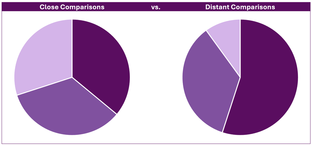
The Fix
Bar or column charts are more suitable for visualizing close comparisons between categories. Bars allow for easier comparison, as the length of each bar is easily interpreted relative to distinguishing between similar angles in a pie chart.
3D Pie Charts
Using 3D pie charts further distorts our ability to read them. The 3D perspective can make some slices appear disproportionately larger due to their relative position within the visual. That is, segments that are closer appear larger relative to slices farther back, regardless of their actual proportions.
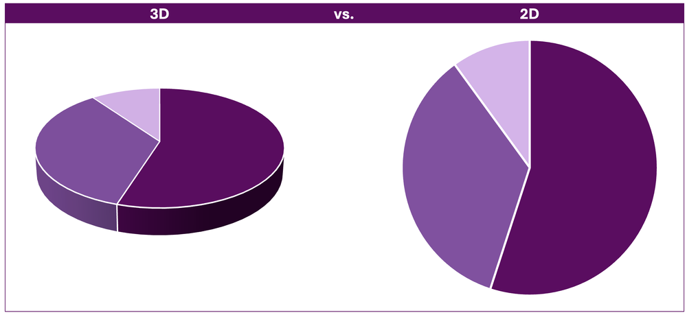
The Fix
This fix is simple: do not use 3D charts. Standard 2D charts are superior in visualizing data (for all chart types, including pie charts) compared to 3D charts. Use 2D pie charts for easier interpretation.
Unsorted Categories
Another issue in pie charts is when categories are plotted in a seemingly random order. Without the logical ordering of categories (e.g., largest to smallest) it becomes difficult to extract meaningful insights from the data.
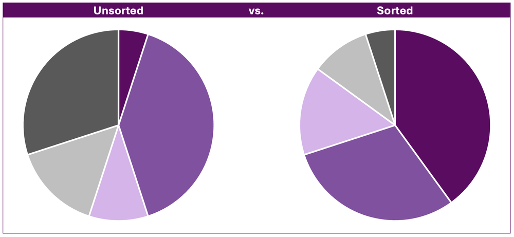
The Fix
Ordering categories from largest to smallest improves the readability of pie charts. The intent is to draw attention to the largest categories first, which are often the most important.
Non-Proportional Data
Pie charts are useful for visualizing the proportions of a whole. Using pie charts to visualize non-proportional data (i.e., proportions exceeding 100%) often leads to confusion as it is designed to represent a complete whole only.
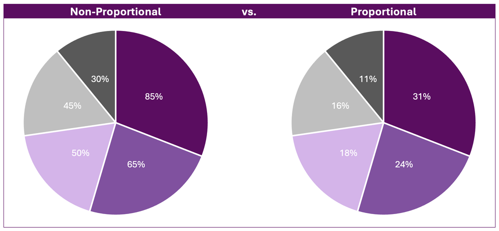
*While identical in appearance, the above example illustrates how misleading non-proportional data are when visualized using pie charts. The first slice, 85%, clearly does not represent 85% of the total pie chart. Therefore, it is difficult to gain meaningful insights from a chart the requires the reader to both interpret the overall percentage of each slice and the relative proportion of each slice relative to the rest of the pie chart.
The Fix
Use alternative data visualizations, such as bar or column charts. These visualizations are better suited to display non-proportional data, as they show individual values without suggesting a proportional relationship between categories.
Too Much Colour
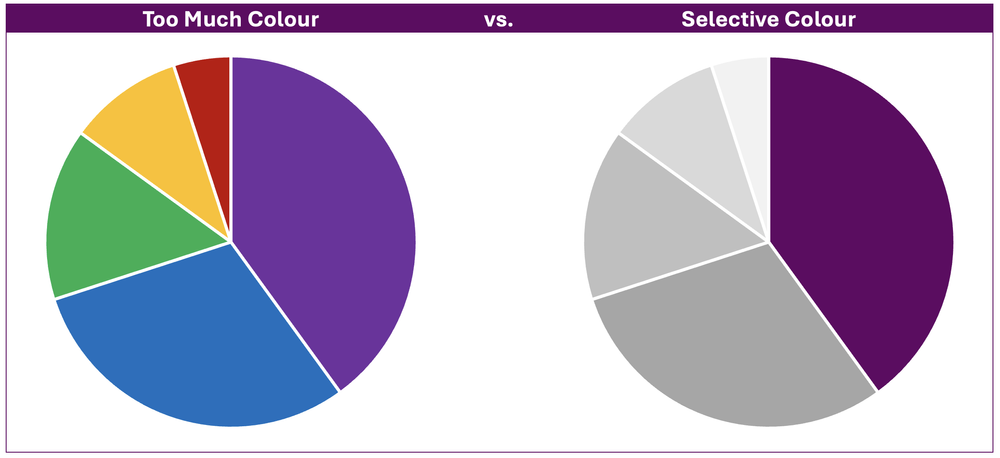
Too much colour in a pie chart can detract from the message of the pie chart. Colour is important for distinguishing between slices, but its overuse can be overwhelming and hard to interpret. Additionally, certain colour combinations can be difficult to distinguish, especially for those with colour vision deficiencies.
The Fix
Use colour strategically to highlight the most important point in your pie chart. Applying muted tones, such as greyscale, to less relevant data allows the primary colour and key message to stand out allowing your pie chart to clearly communicate its main point.
Final Thoughts
Pie charts can be effective when used appropriately. However, they are less effective in visualizing complex data or data requiring close comparisons. Before defaulting to a pie chart, consider alternative data visualizations (such as bar charts) that may be more suitable for communicating the message of your data.
The key to effective data visualization is clarity. Avoiding these common pie chart pitfalls and selecting the right chart type for your data will ensure that your visualizations communicate information both accurately and effectively.