This is an Eval Central archive copy, find the original at freshspectrum.com.
You already know that images are important.
Without visuals there is no way we would be able to process the vast amount of information that we are now exposed to on a daily basis.
An image is a trail marker, a waypoint. It’s a preview of what’s to come, to help you decide before you click to the next page. It’s a support to capture an audience’s attention while standing at a podium (or in a little box on Zoom) speaking our words.
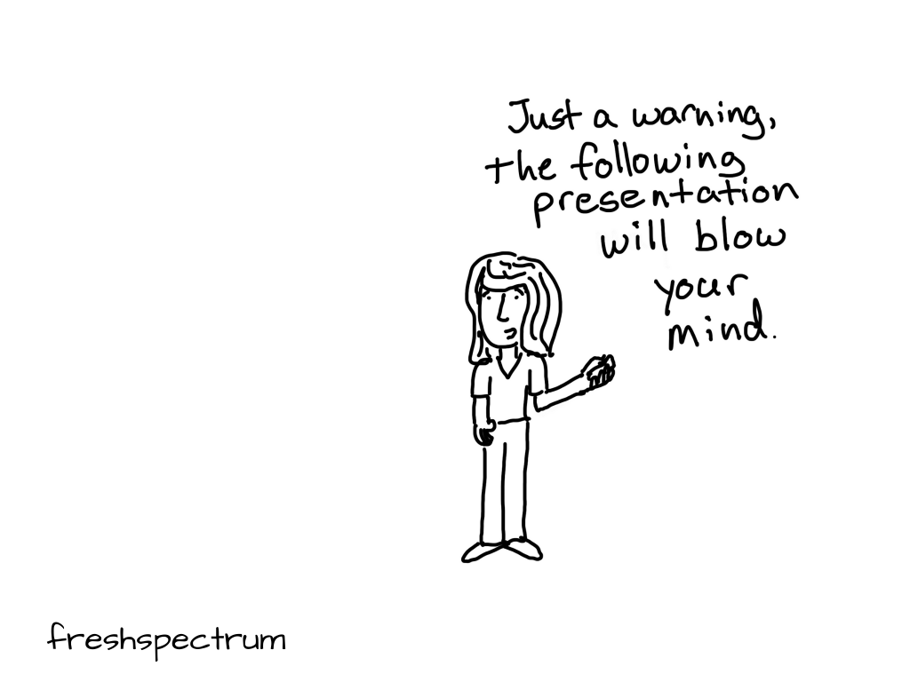
I started drawing cartoons nine years ago because it was fun. But I kept drawing them because it was important. Hundreds of cartoons later, I’d like to think I’ve learned a thing or two about what makes for the right image.
In this week’s email I’ll share some of the important lessons I’ve learned over the years, along with some inspiration.
Your images should not just repeat what is written.
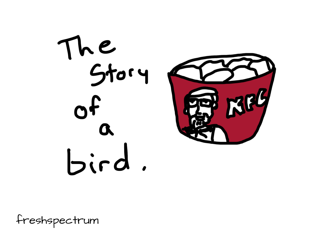
This is a lesson I learned from Maurice Sendak. As an illustrator, slide deck designer, report writer, or data visualizer you have to fight the lazy tendency of just repeating what’s on the page with your visuals. Is simply repeating your written analysis with a chart serving the words?
An illustration is an enlargement, and interpretation of the text, so that the reader will comprehend the words better. As an artist, you are always serving the words.
You must never illustrate exactly what is written. You must find a space in the text so that the pictures can do the work. Then you must let the words take over where words do it best. It’s a funny kind of juggling act.
Sendak, Carle, Provensen, and 20 Other Beloved Illustrators’ Advice to Children on Being an Artist
There is nothing too serious for an image, even a cartoon.
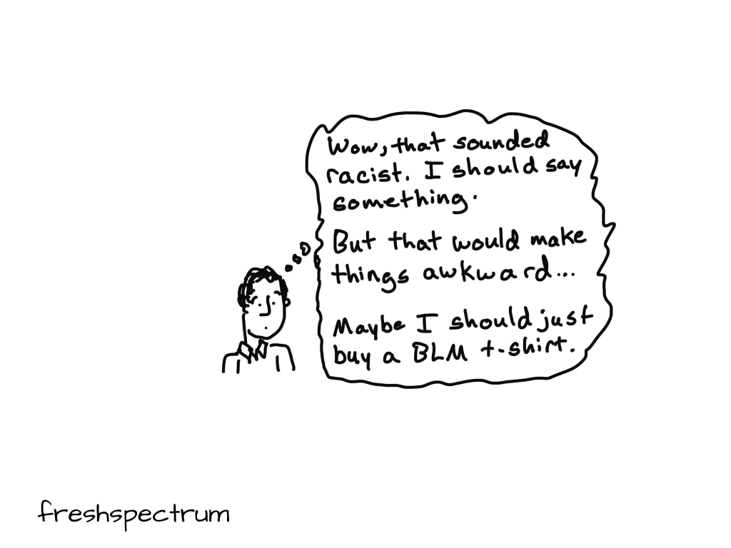
There are times when it’s hard to find the words to approach a tough subject. But I find that the right photograph, chart, cartoon, or comic can create an entry point when words fail.
For inspiration, check out a piece of amazing work created by Ben Passmore.
Your black friend is sitting in a coffee shop, your favorite coffee shop…
Find your own visual voice.
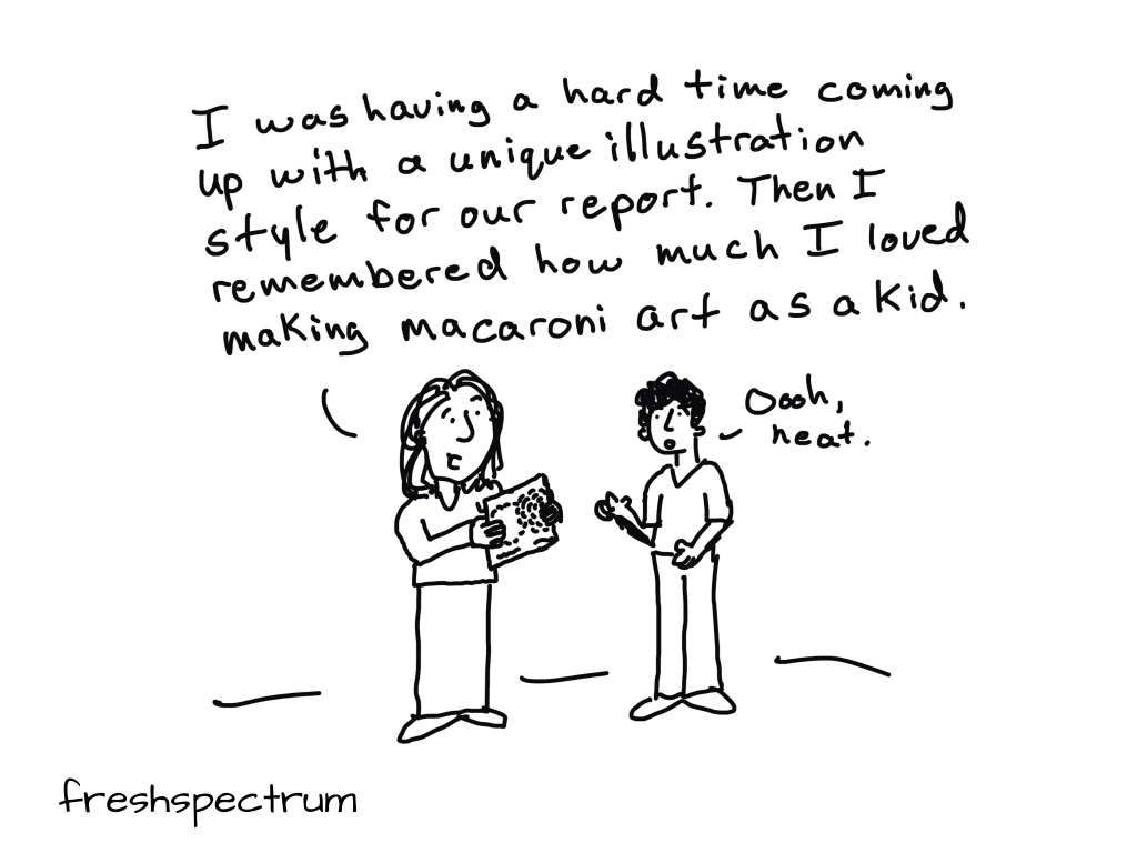
There are many different styles of illustration. Find one that works for you.
I know evaluators who prefer to illustrate their work with art. I know some who prefer to use infographics. I know others who use memes. Katherine Haugh is an evaluator who has also built up expertise as a graphic recorder. Check out some of her work for inspiration.
In addition to presenting on visual note-taking and journey mapping as evaluations tools, I also attended a few interesting sessions. Take a look below to see my visual notes from the sessions I attended.
Contribution, Leadership, Renewal: A Visual Recap of Evaluation 2019
It’s not the quality of the illustration that matters.
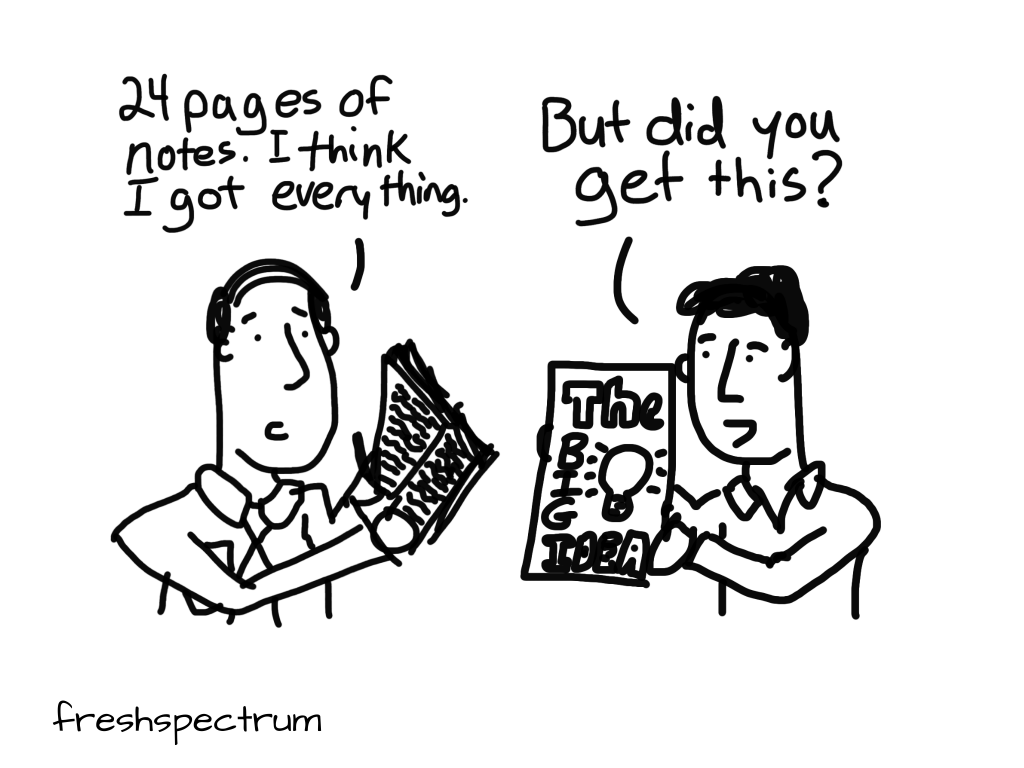
Having the ability to create your own illustrations can save a lot of time.
Lots of evaluators are readers and writers. But many are… how do I say this… “creatively tentative.” Mike Rohde is one of a number of graphic notetakers who has written books with advice for the people who self proclaim, “I can’t draw.”
People relax, try, experiment and are blown away by what they are able to produce of value with visuals when judgement on the quality of the drawing is removed and replaced with a focus on the ideas behind them. I call it ‘Ideas, Not Art.’
“Make ideas, not art”: The Sketchnote Workbook by Mike Rohde
Think of Data Visualization as a form of illustration.
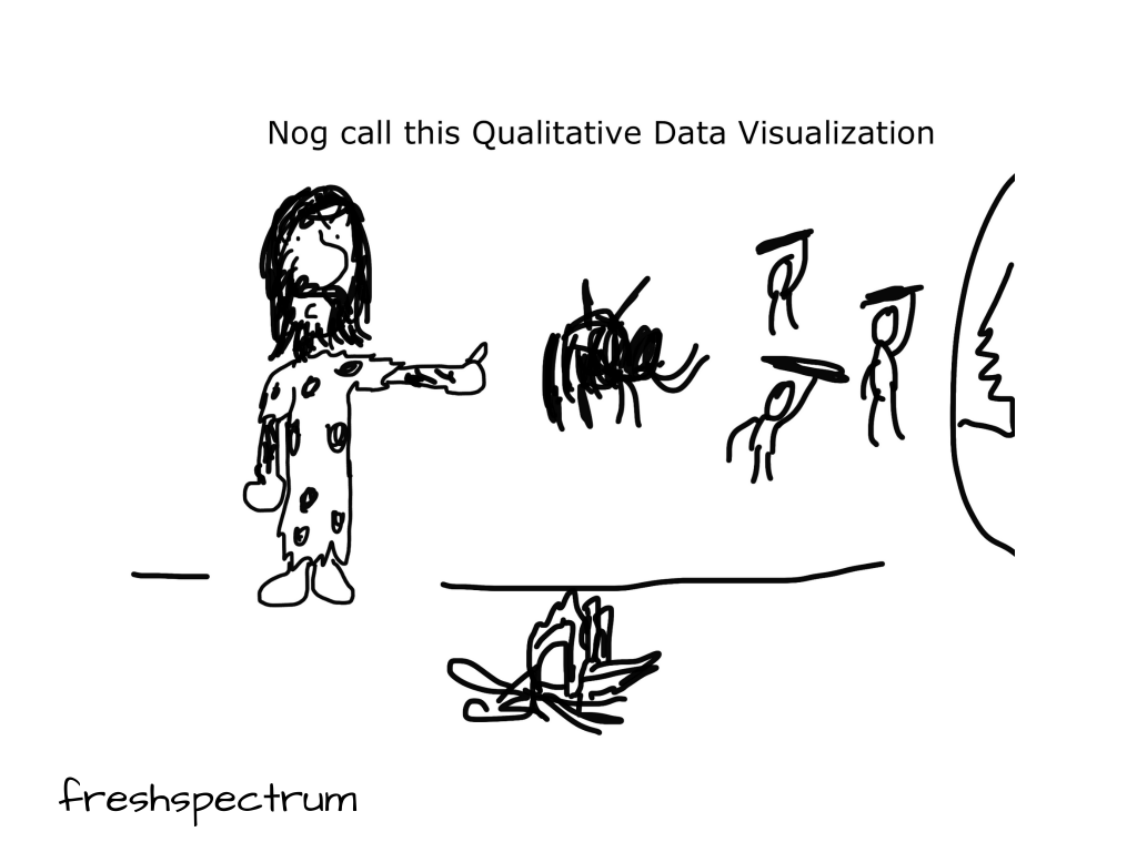
Mostly because it is a form of illustration.
But also because it gives you a purpose beyond simply representing numbers. To play off Maurice Sendak’s advice, as a visualizer you are creating images to serve the data.
I get asked a lot for examples of how to visualize qualitative data, to which I always answer, illustration! Ann K Emery wrote a nice post years ago summarizing a variety of styles.
Are you looking for ways to display your qualitative data? The vast majority of data visualization resources focus on quantitative data. In this article, let’s look at some of your options for qualitative data visualization, like word clouds, photographs, icons, diagrams, and timelines.
Images are a user-experience element.
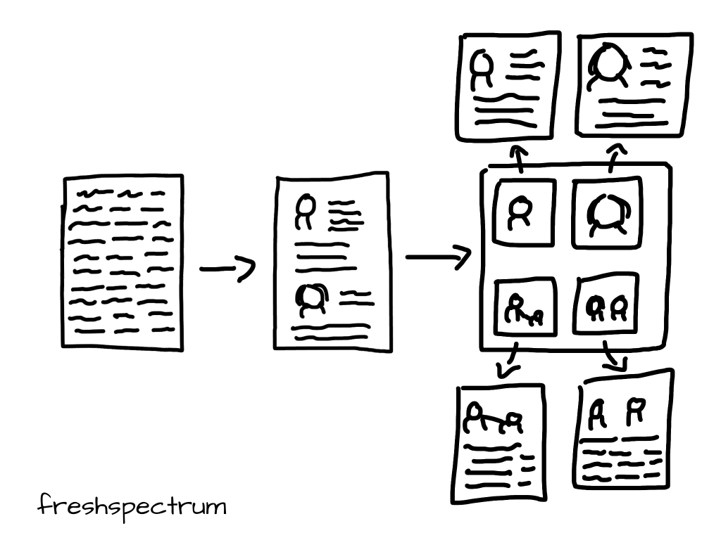
So what does that mean? Well your choice of image is going to interact with a reader’s experience of your work. If you are really serious about how people receive your work, searching stock photo sites for just any image that “feels right” is insufficient.
Also, there is a whole field who studies this kind of stuff. Check out this post by Senior User Experience Designer Aurora Harley.
Videos, animated GIFs, images, and other multimedia components should not be added as “fluff” or to “jazz up” a website, app, or other medium. They are user-experience elements, and must be filmed, designed, and produced with an eye toward usability and interaction.
How to Film and Photograph Online Content for Usability: UX Details for Videos and Images
Just because it can be shared with a simple chart doesn’t mean it should.
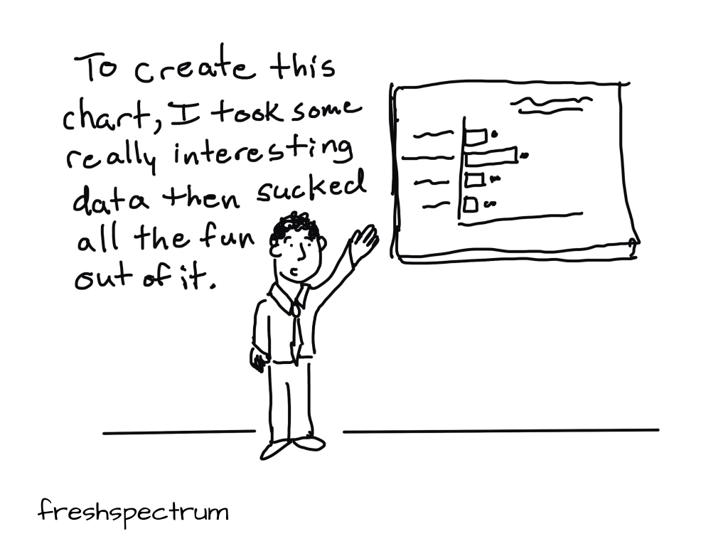
I am a huge fan of Mona Chalabi and her ability to turn simple numbers into influential works of art. Take this infographic for example. The argument could have been made with a simple stacked bar chart or icon array. But the way she presented it, the chart became a story book.
US courts have never looked like the populations they represent. But the overrepresentation of white men on federal benches had started to improve up until recently. According to the American Constitution Society (ACS), “under the Trump administration, this progress has stalled”.