
This is an Eval Central archive copy, find the original at nicoleclarkconsulting.com. Applying for funding doesn’t have to be overwhelming. The post Ask Nicole: How Can I Make My Grant Application Stand Out to Funders? appeared first on Nicole Clark Consulting.
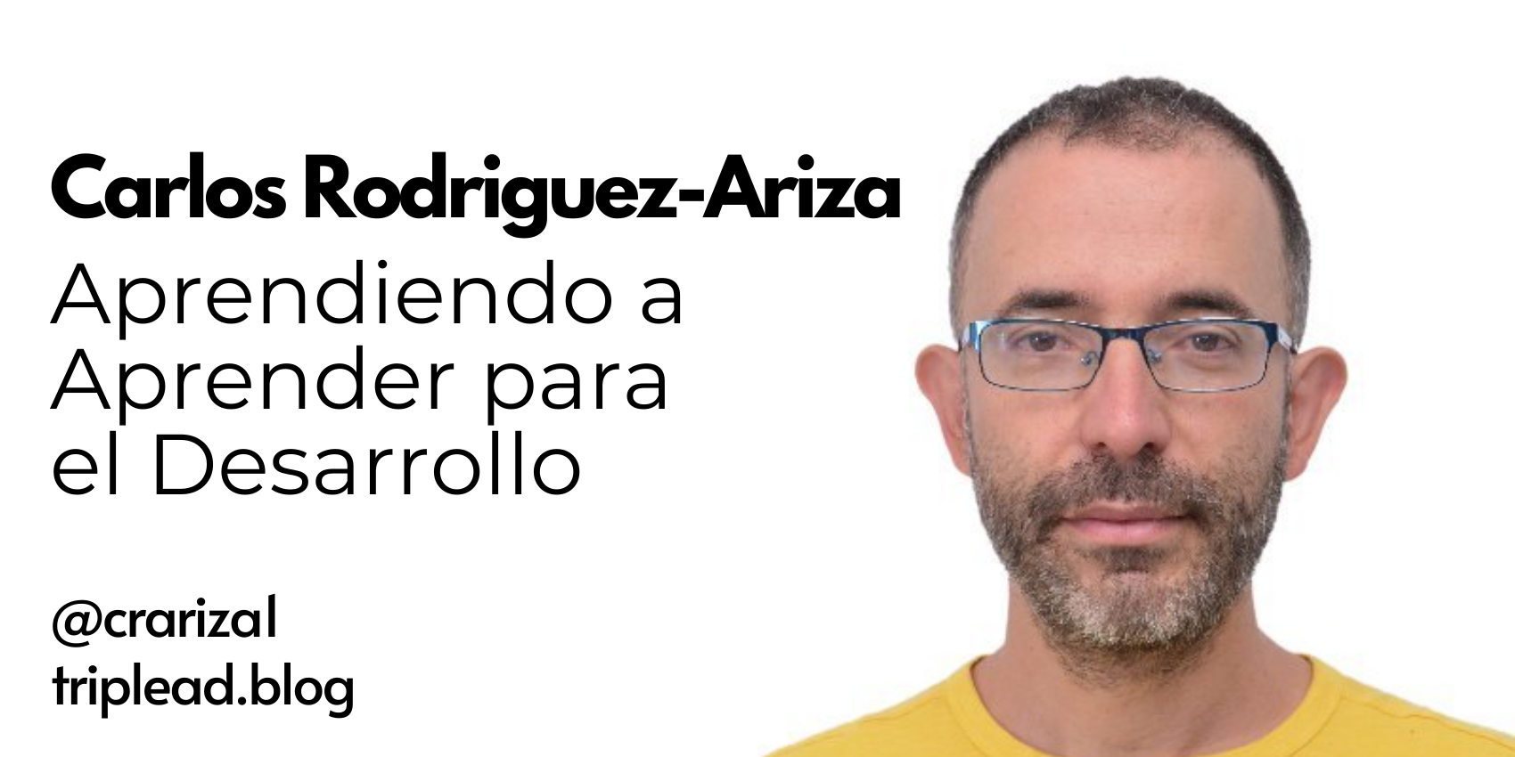
Aprendiendo a Cultivar una Mentalidad Positiva
This is an Eval Central archive copy, find the original at triplead.blog. El libro Pensamiento Positivo de Gill Hasson (2015) es una guía práctica y accesible que busca ayudar a los lectores a desarrollar una mentalidad positiva y resiliente. 1. Resumen general Pensamiento Positivo de Gill Hasson es un libro que sugiere cómo adoptar una […]
Beyond Orientation: Build a Well-Trained Team for Your Program
This is an Eval Central archive copy, find the original at nicoleclarkconsulting.com. A well-trained team makes your program stronger and more impactful. The post Beyond Orientation: Build a Well-Trained Team for Your Program appeared first on Nicole Clark Consulting.
You should build an audience, before you write your report.
This is an Eval Central archive copy, find the original at freshspectrum.com. Time for another report design mindset change. At the most basic level successful communication requires a sender, a message, and a receiver. You, as the report designer, are the sender. The report carries the message. So who is the receiver? For a lot […]
Why to Stop Saying “Mental Model”
This is an Eval Central archive copy, find the original at medium.com/innovationnetwork. Part of our role as evaluators is to communicate learnings so that people can easily understand and translate those learnings for their own work — in many ways, we are failing in this role. As I was working on the Equitable Communications Guide (published last […]
Stop Creating Spork Reports
This is an Eval Central archive copy, find the original at freshspectrum.com. What is a spork report? I want you to imagine visiting a nice little cafe for a light lunch. You decide to order a simple salad and a cup of soup. When the meal shows up, what utensils will you use to eat […]
Desafíos y Renovación: El Problema de las ONG Internacionales
This is an Eval Central archive copy, find the original at triplead.blog. Resumen General: El Problema de las ONGI de Deborah Doane examina los desafíos y críticas que enfrentan las Organizaciones No Gubernamentales Internacionales (ONGI) en el contexto actual. El objetivo principal del libro es analizar cómo estas organizaciones pueden superar sus problemas estructurales y […]
Claves para un Intercambio Efectivo de Conocimientos entre Ciencia y Política
This is an Eval Central archive copy, find the original at triplead.blog. Conectar ciencia y política es crucial para resultados sostenibles. En el artículo «Claves para un Intercambio Efectivo de Conocimientos entre Ciencia y Política» (14 de enero de 2025), se revisaron 56 estudios de caso empíricos para identificar facilitadores clave en esta interfaz. Facilitadores […]
Collaborations that Work: Engaging Schools, Families and Communities
This is an Eval Central archive copy, find the original at nicoleclarkconsulting.com. When everyone –schools, families, and community organizations — pitches in, your program increases its chances of achieving its outcomes. The post Collaborations that Work: Engaging Schools, Families and Communities appeared first on Nicole Clark Consulting.
How long does it take to read a report?
This is an Eval Central archive copy, find the original at freshspectrum.com. Page count is a somewhat useless measure. When I was young, every once and awhile a teacher would allow us to bring in a “cheat sheet” to use when taking a test. I would write in tiny script so that I could fit […]