
This is an Eval Central archive copy, find the original at triplead.blog. Alejandro Guerero, experto de OCDE en evaluación, nos contaba sobre » el Zoo de Indicadores«, donde las métricas se vuelven locas y sólo los más aptos sobreviven. Algunas razones por qué pasa esto: 1. «Miedo a perderse algo». El temor a que […]
How to become a data designer.
This is an Eval Central archive copy, find the original at freshspectrum.com. Ever wonder why some data teams deliver really nice looking reports while others seem like they’re stuck in the late 90s? The more I work with different research and evaluation teams, the more I find that reporting quality usually comes down to the […]

Evaluation Sustainability Plans: Why you need one for your next evaluation project.
This is an Eval Central archive copy, find the original at evalacademy.com. Evaluations are important tools for assessing the effectiveness, efficiency, and impact of programs and initiatives. They provide valuable insights that inform decision-making, resource allocation, and strategic planning. You can discover more reasons why you should evaluate by exploring our infographic here. […]
(Mostly Free) Resources for Learning How to Code Qualitative Data
This is an Eval Central archive copy, find the original at evalacademy.com. What is coding for qualitative data? If you’ve found your way to this article, you probably have an idea of what coding for qualitative data looks like. Hint: It doesn’t require knowing Python, C++ or any other programming language. Qualitative coding is […]
The Frustration of Searching for Evaluation Content
This is an Eval Central archive copy, find the original at evalacademy.com. If you are an evaluator, or someone interested in learning more about evaluation, you might have experienced the frustration of searching for evaluation-related content online. The word evaluation is used in so many different contexts and industries, that it can be […]
Playing the Fool: Why Asking a Few Silly Questions Makes You a Better Evaluator
This is an Eval Central archive copy, find the original at evalacademy.com. As evaluators, it’s our job to ask questions. When I tell people about what my company does, I tell them we help organizations that do good, to do better, by asking the right questions and answering them. Through asking and answering questions, we […]
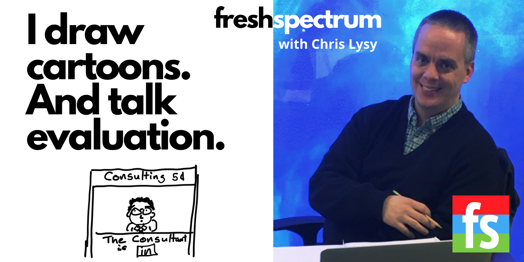
My Cartoon Illustration Process – Realist Evaluation Comics
This is an Eval Central archive copy, find the original at freshspectrum.com. Back in 2017 I was commissioned by the RAMESES II project (funded by *NIHR) to draw a series of cartoons on realist evaluation. They have been made available for royalty-free use at ramesesproject.org, along with a collection of other realist evaluation resources. In […]
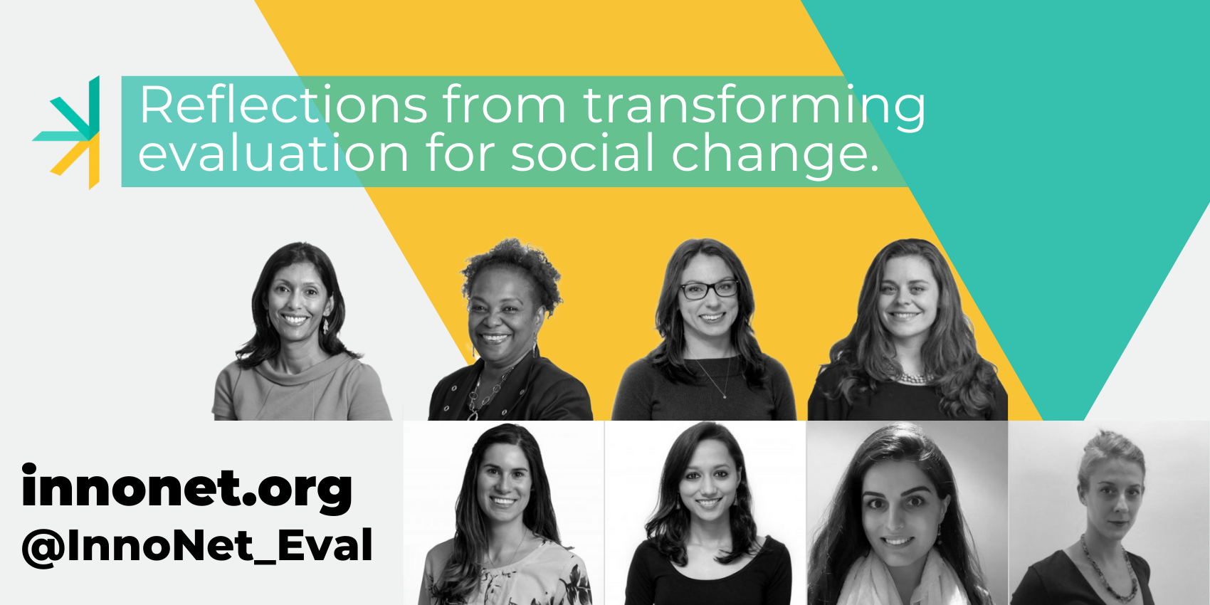
A Meta Reflection on Equitable Communications: Behind-the-Scenes of Creating the Equitable…
This is an Eval Central archive copy, find the original at medium.com/innovationnetwork. A Meta Reflection on Equitable Communications: Behind-the-Scenes of Creating the Equitable Communications Guide After researching ways to share our findings and reports with equity in mind, we realized there wasn’t a go-to resource for equitable communications in the evaluation field. Together, we were […]
Evaluation versus Monitoring
This is an Eval Central archive copy, find the original at freshspectrum.com. Today’s post started as a comic request and turned into a Q&A. Here is the question that came to me from Randi Knox. I’m looking for a comic to communicate the difference between program monitoring vs program evaluation. I didn’t see anything specific […]
Evaluation versus Measurement
This is an Eval Central archive copy, find the original at freshspectrum.com. Today’s post started as a comic request and turned into a Q&A. Here is the question that came to me from Randi Knox. I’m looking for a comic to communicate the difference between program monitoring vs program evaluation. I didn’t see anything specific […]